#2.0~2.7
React JS에는 styled components라는 유용한 라이브러리가 있다.
앱의 다크, 라이트 모드를 손쉽게 설정할 수 있는 등의 기능을 가진다.
설치
$ npm i styled-components

import styled from "styled-components";
사용방법
const Name = styled.tagName`css`;

function App() {
return (
<Name></Name>   or  <Name />
);
}
이름은 어떤 것이든 상관없고(첫 글자는 대문자), tagName은 div, span, text 등 무엇이든 사용이 가능하다.
가장 중요한 것은 백틱을 사용하는 것이다.
그리고 모든 요소가 같지만 한 두가지 부분만 다르게 설정하고 싶을 땐, props를 사용하며 된다.
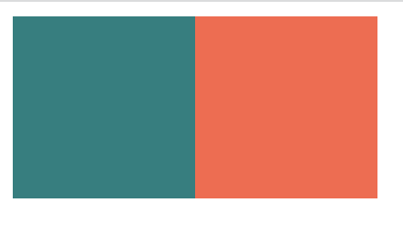
const Box = styled.div`
  background-color: ${(props)=> props.bgColor};
  width: 100px;
  height: 100px;
`;


root.render(
  <Father>
   <Box bgColor="teal" />
   <Box bgColor="tomato" />
  </Father>

 ,
);
결과물
확장하기
const Circle = styled(Box)`   //Box의 요소를 확장함
  border-radius: 50%;
`;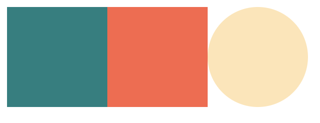
넓이와 높이는 똑같이 100px이면서 색을 bgColor로 따로지정할 수 있는 원인 요소를 만들 수 있었다.
As and Attrs
As
css 스타일은 그대로 유지하면서 태그 속성을 변경하고 싶을 땐 as를 사용하면 된다.
<Box as="a" href="/">
위의 Box의 CSS속성은 그대로 유지하면서 html 태그를 a(앵커)로 변경해 준다.
Attrs
여러 개의 똑같은 요소들이 어떤 속성(Atrribute) 또한 똑같이 사용하길 원하면 attrs를 사용하면 된다.
const Box = styled.div.attrs({required:true})`
...
`;
Animations and Pseudo selectors
애니메이션 기능도 넣기 쉽다.
import {keyframes} from "styled-components";

const aniName = keyframes`
	from{}
    to{}
`;

const Box = styled.div`
	...
    animation: ${aniName} 5s linear infinite;
    span{                // Box안의 span요소도 이렇게 적용 가능
        ...
    }


    &:hover{            // === Box:hover{...} <<얘는 Box{}밖에서 쓰기>>
    	...
    }
`;

function App() {
return {
	<wrap>
    	<Box>
        	<span>🥹</span>
        </Box>
     </wrap>
}
}
기본 css에서 하는 것처럼 사용하면 된다.

만약 태그속성이 아닌 컴포넌트로 지정해서 css를 설정하고 싶다면
${componentName} {
...
}
컴포넌트의 이름을 넣어주면 된다.
예를들어 위의 span을 다른 태그요소로 변경하고 싶은데, 스타일을 그대로 두고 싶을 땐(그 외에 태그 변경사항이 많을 때 유용할 듯) 컴포넌트로 만들고 css를 작성해주면 되는 것이다.
const Emoji = styled.span`
	...
`;

const Box = styled.div`
	....

${Emoji}:hover {
  	...
}
`;
Theme
모든 색상을 가지고 있는 object이다.(어떤 색상이든 사용 가능하다는 뜻 같음..)
(다크, 라이트 모드 설정시 사용!)
사용하기
index.js

import { ThemeProvider} from "styled-components";

const darkTheme = {
...
};

const lightTheme = {
...
};


root.render(
<React.StrictMode>
	<ThemeProvider theme={darkTheme}>
		<App />
	</ThemeProvider>
</React.StrictMode>
)
App.js

const Title = styled.h1`
	color: ${(props)=> props.theme.textColor};
`;

const wrap = styled.div`
	...
    background-color: ${(props) => props.theme.backgroundColor};

`;
App.js의 props.theme.xx; 를 통해 index.js에서 설정한 색상을 가져올 수 있다.
다만 index와 app에서 사용하는 xx부분의 이름이 똑같아야한다.
(다크와 라이트모드는 색상이 서로 반대)
그리고 index.js에서 부분에서 darkTheme이나 lightTheme으로 변경하면 잘 작동된다.
우리가 사용하는 다크 라이트 모드를 변경하기 위해서는 다른 요소가 필요하지만 일단 50%까지! 하고 다음 진도때 더 배우기로 하자.