💼 오늘 작업 내용
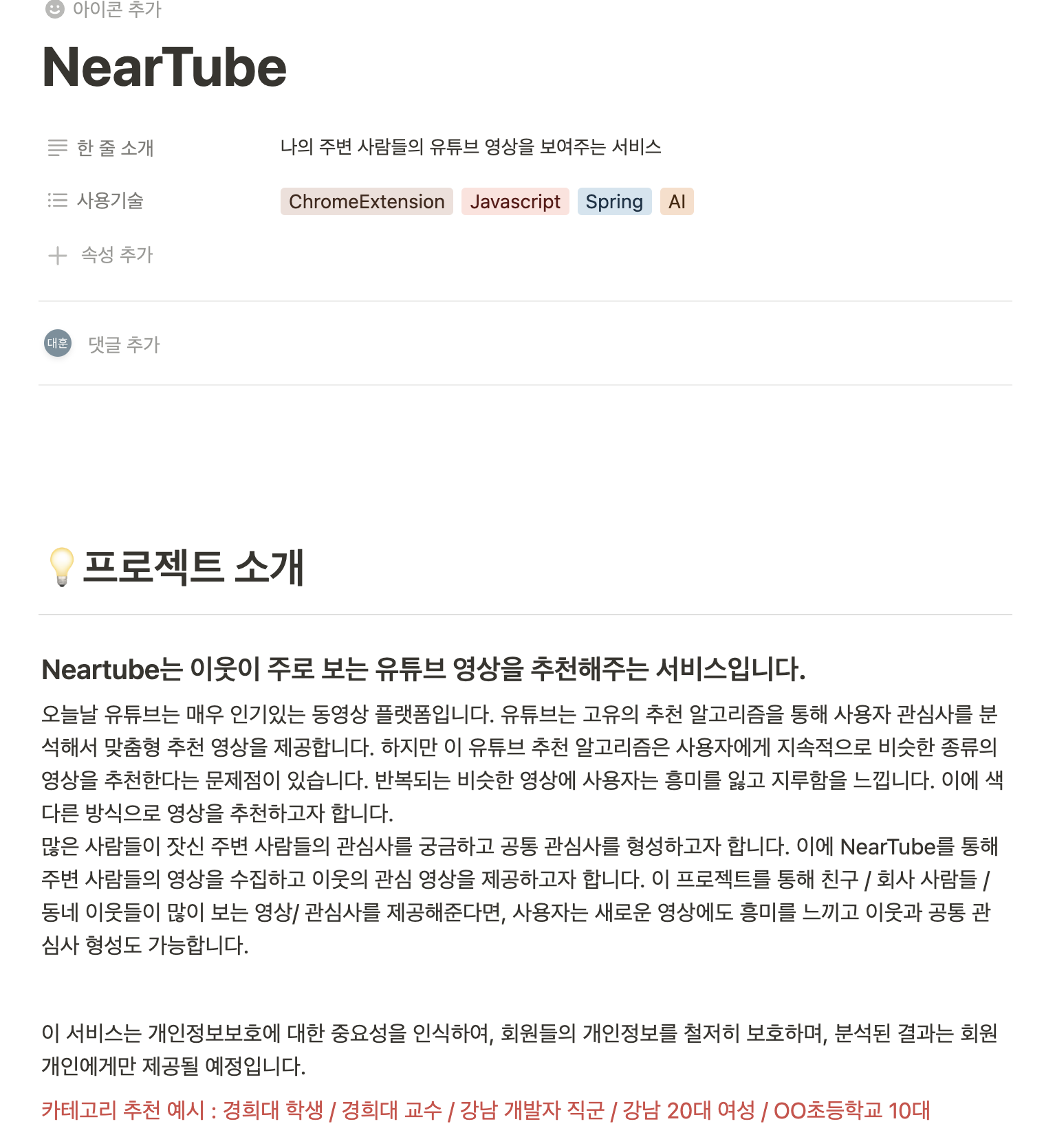
1. NearTube
- 현재까지 NearTube 개발 내용 정리
- github readme 작성
2. Machine Learning
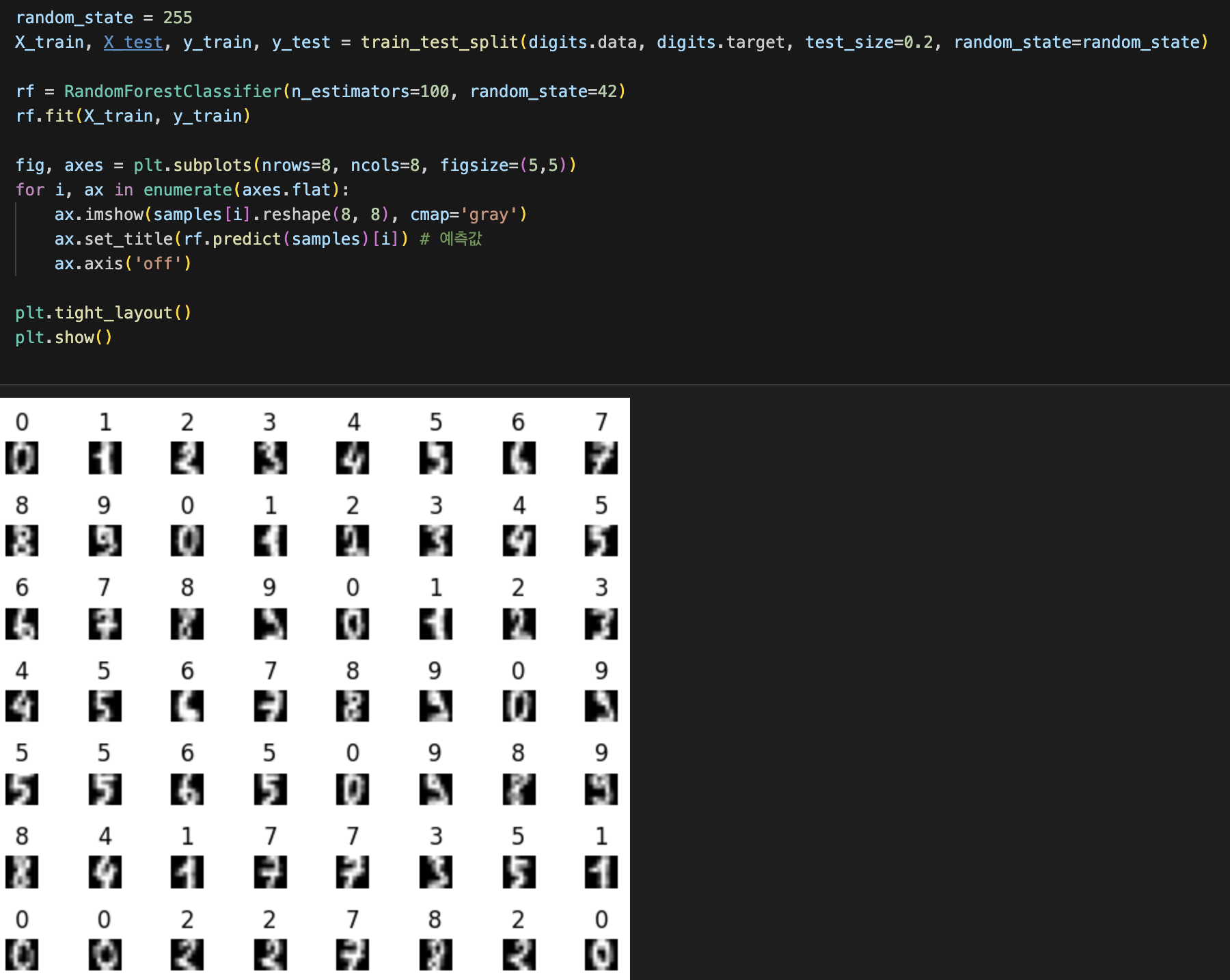
- Classification Random Forest 학습
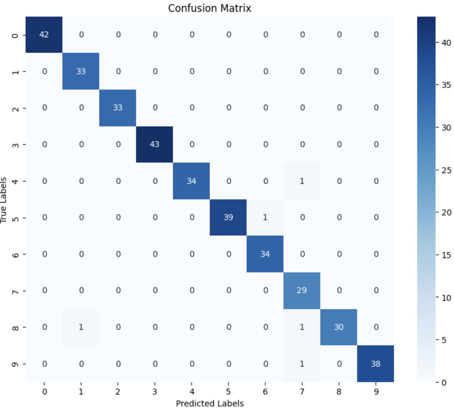
- Confusion Matrix 학습
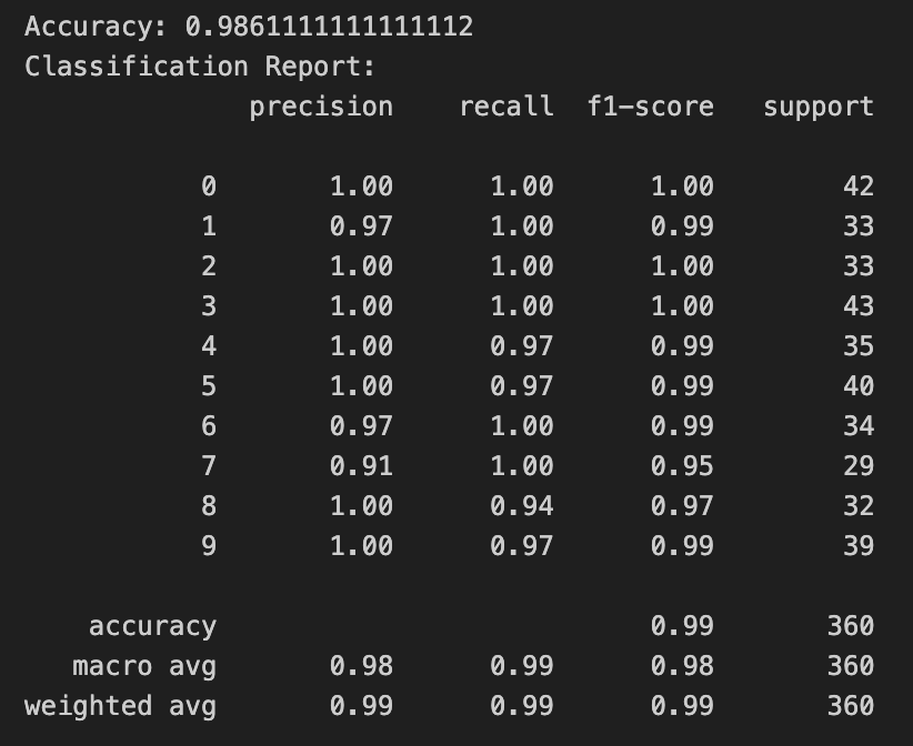
- classification_report 학습
- PCA 주요 성분 분석 학습
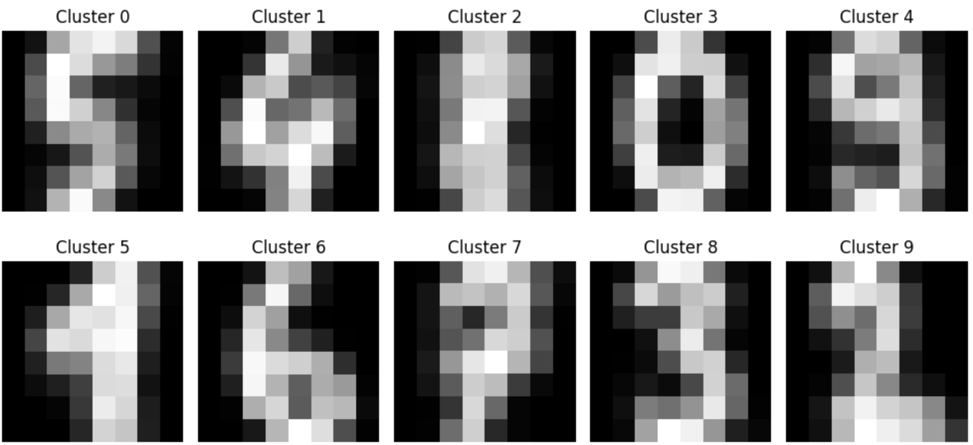
- Clustering Classification 학습
3. 코딩 테스트 공부
- programmers_42883 큰 수 만들기 (난이도 2)
- programmers_12948 핸드폰 번호 가리기 (난이도 1)
- programmers_12925 문자열을 정수로 바꾸기 (난이도 1)
💡 새로 알게된 점
-
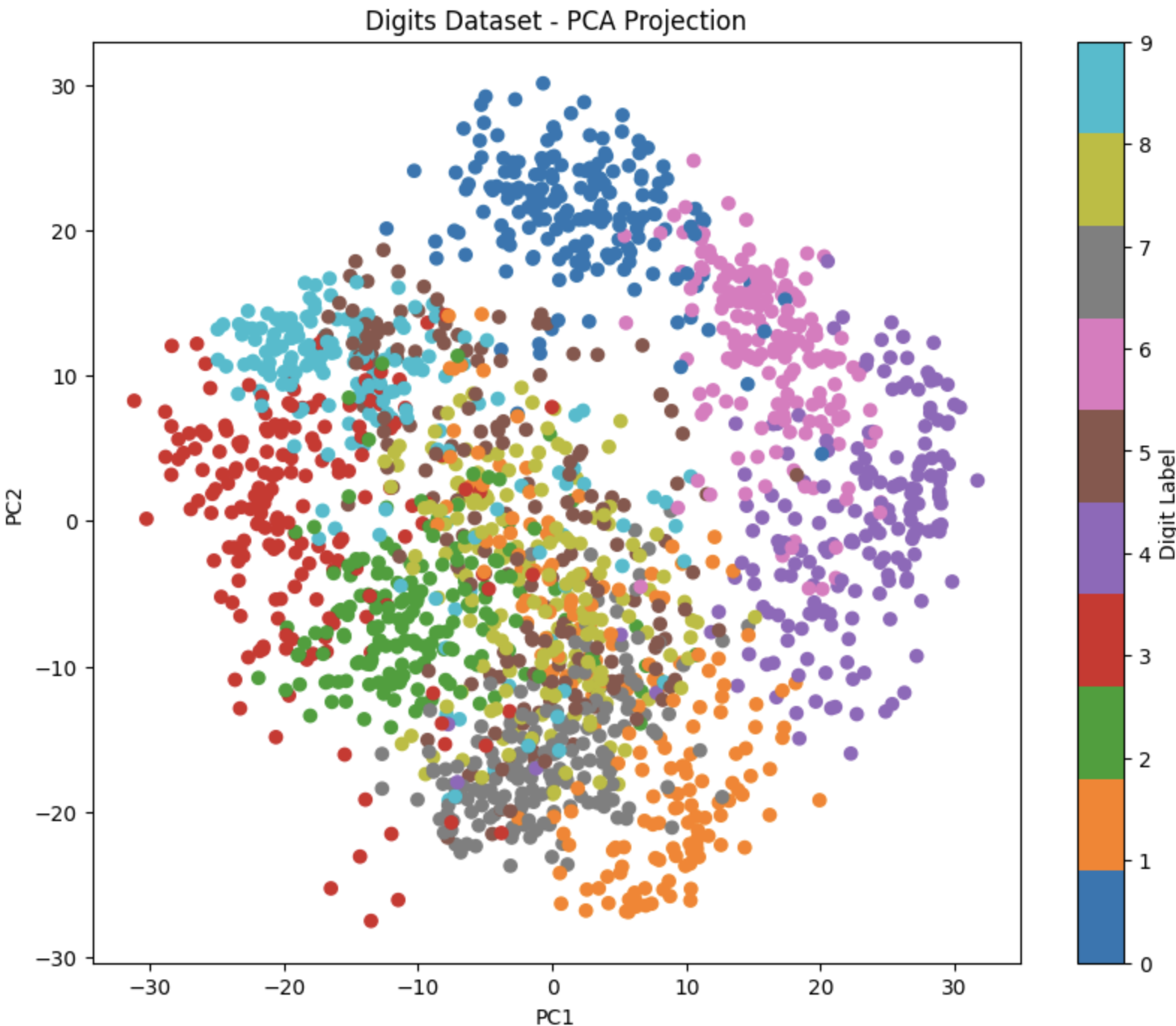
from sklearn.decomposition import PCA해당 라이브러리를 통해서 쉽게 데이터셋 PCA 분석이 가능하다.더 나아가서 component 수를 지정해서 특정 dimension으로 데이터 시각화가 가능하다.
pca = PCA(n_components=2)
X_pca = pca.fit_transform(digits.data)

# Create a scatter plot of the projected data
plt.figure(figsize=(10, 8))
plt.scatter(X_pca[:, 0], X_pca[:, 1], c=digits.target, cmap='tab10')
plt.colorbar(label='Digit Label')
plt.xlabel('PC1')
plt.ylabel('PC2')
plt.title('Digits Dataset - PCA Projection')
plt.show()
하지만 이렇게 시각화를 해서 확인하는 것은 한계가 있다.
dimesion이 1,2,3까지는 괜찮지만 그 이상은 확인하기 힘들다.
따라서 적절한 component 수를 찾기 위해선 시각화가 아닌 다른 방법을 사용해야 된다.
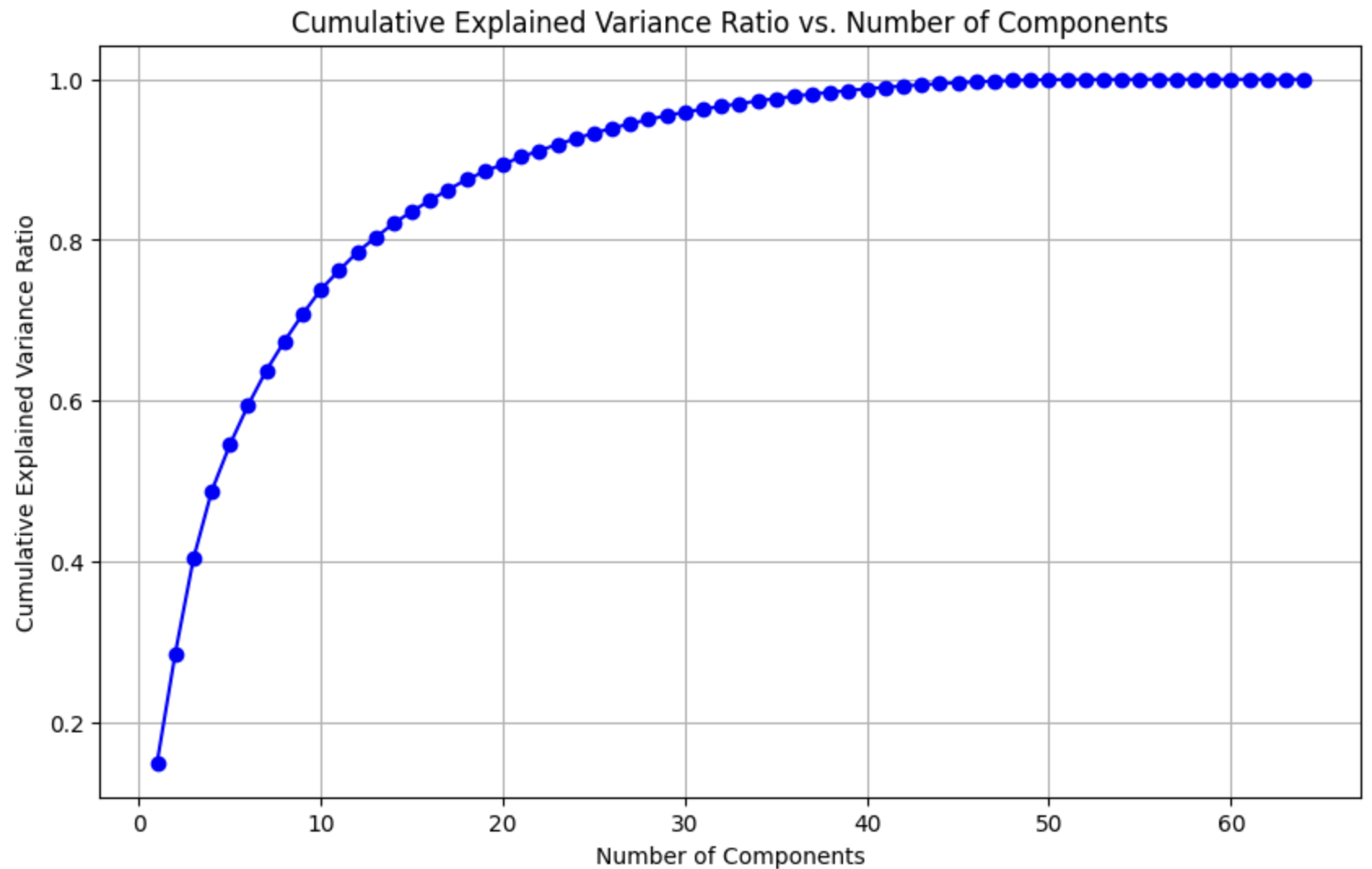
- component 수를 작게 잡을수록 더 적은 데이터로 효과적으로 분류가 가능하다.
pca = PCA(n_components=digits.data.shape[1]) pca.fit(digits.data) cumulative_var_ratio = np.cumsum(pca.explained_variance_ratio_) plt.figure(figsize=(10, 6)) plt.plot(range(1, len(cumulative_var_ratio) + 1), cumulative_var_ratio, marker='o', linestyle='-', color='b') plt.xlabel('Number of Components') plt.ylabel('Cumulative Explained Variance Ratio') plt.title('Cumulative Explained Variance Ratio vs. Number of Components') plt.grid(True) plt.show()pca.explained_variance_ratio를 이용하면 적절한 component 수를 쉽게 구할 수 있다.

Just Do it!