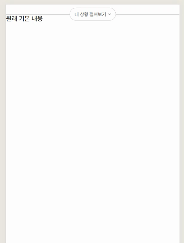
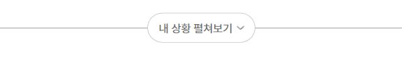
내 상황 펼쳐보기를 누르면 아래에 Content가 나온다
토글 기능 기본 틀
React + styled-components로 틀만 잡았을 경우의 코드다 (onClick 함수 적용은 아래 코드에 추가)
Slack의 메세지 창에서 영감을 받았다.
hr 위에 css after로 올리려다 실패만 하고 있었는데, 그냥 hr 위에 position으로 button을 위치시키면 되는 것이었다.
import React from "react";
import styled from "styled-components";
import HeightInterval from "../Components/HeightInterval.jsx";
import toggleImg from "../img/toggleImg.png";

const App = () => {
  return (
    <>
      <HeightInterval height={24} />
      <Container>
        <hr />
        <Overlay>
          <ToggleButton>
            <ToggleText>내 상황 펼쳐보기</ToggleText>
            <img src={toggleImg} width="8px" height="4px" />
          </ToggleButton>
        </Overlay>
      </Container>
    </>
  );
};

const Container = styled.div`
  position: relative;
`;

const Overlay = styled.div`
  position: absolute;
  top: 0;
  left: 50%;
  transform: translate(-50%, -50%);
`;

const ToggleButton = styled.button`
  width: 115px;
  height: 32px;
  border-radius: 24px;
  border: 0.5px solid rgba(0, 0, 0, 0.2);
  background: #fff;
  display: flex;
  align-items: center;
  justify-content: center;
`;

const ToggleText = styled.div`
  color: rgba(0, 0, 0, 0.6);
  font-family: Pretendard;
  font-size: 12px;
  font-weight: 500;
  margin-right: 4px;
`;

export default App;
onClick 기능 추가
import React, { useState } from "react";
import styled from "styled-components";
import HeightInterval from "../Components/HeightInterval.jsx";
import toggleImg from "../img/toggleImg.png";

const App = () => {
  const [isContentVisible, setIsContentVisible] = useState(false);

  const handleToggleContent = () => {
    setIsContentVisible(!isContentVisible);
  };

  return (
    <>
      <HeightInterval height={24} />
      <Container>
        <HrStyles />
        <Overlay>
          <ToggleButton onClick={handleToggleContent}>
            <ToggleText>내 상황 펼쳐보기</ToggleText>
            <img src={toggleImg} width="8px" height="4px" />
          </ToggleButton>
        </Overlay>
        {isContentVisible && <Content>Content 펼쳐졌다!</Content>}
        원래 기본 내용
      </Container>
    </>
  );
};

const Container = styled.div`
  position: relative;
`;

const Overlay = styled.div`
  position: absolute;
  top: 0;
  left: 50%;
  transform: translate(-50%, -50%);
  z-index: 200; /* 펼쳐지는 Content 보다 값이 커야함 */
`;

const Content = styled.div`
  position: absolute;
  top: 0;
  left: 0;
  width: 100%;
  height: 556px;
  border: 0.5px solid rgba(0, 0, 0, 0.2);
  background: #fff;
  z-index: 100;
  background-color: red;
`;

const ToggleButton = styled.button`
  width: 115px;
  height: 32px;
  border-radius: 24px;
  border: 0.5px solid rgba(0, 0, 0, 0.2);
  background: #fff;
  display: flex;
  align-items: center;
  justify-content: center;
`;

const ToggleText = styled.div`
  color: rgba(0, 0, 0, 0.6);
  font-family: Pretendard;
  font-size: 12px;
  font-weight: 500;
  margin-right: 4px;
`;

const HrStyles = styled.hr`
  border: 0.5px solid rgba(0, 0, 0, 0.2);
  margin: 0;
`;

export default App;

신입개발자. 이젠 서버를 곁들인 velog 꾸미기 : https://velog.io/@ybkim3603/Velog벨로그-사용법-튜토리얼 Git컨벤션: https://velog.io/@shin6403/Git-git-커밋-컨벤션-설정하기 커리어 방향 설정 모음글:https://velog.io/@eon7500/커리어-방향성-설정에-도움되는-글