
Styled Component
항상 프론트엔드 작업 할 때 스트레스 받는 부분이 스타일링이다.
아무리 깔끔하게 CSS 코드를 짜 보려 해도 절대 다시 리팩토링 하고 싶지 않은 괴물을 양성하게 된다.
그래서 이번에는 스타일링을 더 편리하게 컴포넌트화 해서 사용할 수 있게 해주는 Styled Component 라이브러리를 사용해보았다.
설치하기
yarn add styled-components 커맨드를 사용해서 styled component 라이브러리를 dependency에 추가해준다.
사용법
import { ICenterLayoutProps } from "@interfaces/container.layout.interfaces";
import { styled } from "styled-components";

export const CenterLayout = styled.div<ICenterLayoutProps>`
  display: flex;
  width: ${(props) => props.width};
  height: ${(props) => props.height};
  flex-direction: row;
  justify-content: center;
  align-items: center;
`;

export const RowLayout = styled.div`
  display: flex;
  flex-direction: row;
  justify-content: center;
  gap: 10px;
  margin: 1.5vh 0;
  font-size: 12px;
`;
이런 식으로 ` (백틱)으로 감싼 string 안에 css 구문을 적을 수 있다. Props도 받을 수 있는데, CenterLayout 컴포넌트 처럼 문자열 포맷팅 문법을 사용하여 함수를 넘겨주면 된다.
이렇게 선언하고 나면, 다른 컴포넌트에서 import하여 사용하면 된다.
import ViewPasswordIcon from "./ViewPasswordIcon";
import { InputLayout } from "@components/layouts/input.layouts";
import { CenterLayout } from "@components/layouts/container.layouts";
import { IPasswordInputProps } from "@interfaces/input.element.interfaces";
import useInput from "@hooks/useInput";

const PasswordInput = (props: IPasswordInputProps) => {
  const [ref, value, handler] = useInput();
  return (
    <CenterLayout width="100%" height="3vh">
      <InputLayout
        name="password"
        type="password"
        placeholder="Password"
        ref={ref}
        value={value}
        onChange={handler}
        {...props}
      />
      <ViewPasswordIcon ref={ref} />
    </CenterLayout>
  );
};

export default PasswordInput;
이렇게 사용할 수 있다.
Styled Component의 장단점
Styled Component 라이브러리를 사용하면 기존의 스타일링 구조에서 벗어나 ui 컴포넌트 중심의 스타일링을 구현할 수 있다.
그러나, 사용하며 장점도 있었지만 단점도 꽤 느껴졌다.
장점
1) 직관성 및 확장성
그냥 css 파일을 따로 관리 할 때보다 훨씬 직관적이고 파생 요소를 만들기도 쉬웠다.
props를 받아서 바로 css에 적용하는 기능과, 기존의 리액트 컴포넌트를 기반으로 스타일링 할 수 있다는 점도 좋았다.
2) 관리 편의성 및 가독성
코드를 읽을 때도 class나 id, 혹은 태그 기반으로 스타일링을 하지 않고 컴포넌트 기반으로 스타일링을 하다 보니 관련된 요소들이 한 데 모여 있어서 관리 면이나 가독성 면에서 더 편리하다고 느껴졌다.
단점
1) 파일이 많아짐
styled component를 사용 할 때, 나는 보통 태그마다 다른 파일을 만들어서 레이아웃을 만들었는데,
이렇게 하면 styled component 파일이 상당히 많아져서 폴더 구조가 복잡해진다.
2) Props 타입 복잡성 및 drilling
1번 단점의 연장선 상에서, props의 타입이 문제된다. 많아도 너무 많아서, 인터페이스 파일이 과부하가 온다.
또, styled component를 사용하는 리액트 컴포넌트를 만들 때 prop drilling 문제가 빈번하게 일어날 수 있다.
로그인 페이지 만들기
이전 포스트에서 Figma로 디자인을 카피했었는데, 이제 그 디자인에 맞춰서 차례대로 페이지들을 만들어보려 한다.
오늘은 styled component를 사용해서 로그인 페이지를 만들어보자.
디자인은 라이트 모드 다크 모드 모두 작업했었는데, 일단은 라이트 모드만 만들 생각이다.
레이아웃 구상하기
-
여백 처리
일단 좌우의 여백은 모든 페이지에서 같은 수치 만큼 보여야 하기 때문에 페이지마다 margin을 넣는게 비효율적이라고 생각했다.
그래서 먼저 App.css에 해당 속성을 작성해서 모든 페이지에서 양쪽에 여백이 존재하도록 만들어 주었다. 이것은 굳이 styled component를 쓸 이유가 없기에 일반 css 파일을 작성했다. -
페이지 구조 분석
로그인 페이지는 로고와 로그인 폼, 버튼, 그리고 링크 두 개가 있다. -
컴포넌트 구상
a. 일단 styled component로 input의 기본적인 스타일링을 처리한다.
b. hr 태그를 활용해 두 input을 구분한다.
c. password input의 비밀번호 확인 버튼을 지닌 파생형 input 컴포넌트를 제작한다.
d. 버튼을 스타일링한다.
e. 모든 요소를 form에 감싼다.
f. 링크를 작성한다.
g. 페이지에 순서대로 컴포넌트를 붙인다.
useInput 및 useForm 만들기
매번 프론트엔드를 하면서 고민하는 것 중에 하나가 어디서 부터 시작할지다.
당장 기능 구현을 하라고 하면 바로 할 수 있는데, 뒷 일을 생각해서 코드를 짜려고 하면 어디까지 생각해서 짜야 할지 점점 멀어진다.
그런 느낌으로 useInput과 useForm 까지 왔다.
커스텀 훅을 만들 때는 항상 선언부가 간결해야 의미가 있다고 생각한다.
그리고 그 훅이 사용되는 위치가 어디냐에 상관 없어야 하기 때문에 compatibility도 높아야 한다.
useInput
import { RefObject, useRef, useState } from "react";

type UseInputReturnType = [
  RefObject<HTMLInputElement | null>,
  string,
  (event: React.ChangeEvent<HTMLInputElement>) => void
];

const useInput: (
  subscriber?: (event: React.ChangeEvent<HTMLInputElement>) => void
) => UseInputReturnType = (subscriber) => {
  const ref = useRef<HTMLInputElement>(null);
  const [value, setValue] = useState("");
  const handler = (event: React.ChangeEvent<HTMLInputElement>) => {
    subscriber && subscriber(event);
    setValue(event.target.value);
  };
  return [ref, value, handler];
};

export default useInput;
일단 필요한 레벨까지 생각해봤을 때 이렇게 작업할 수 있었다.
파라미터로 해당 input이 change될 때 이벤트를 구독할 함수를 받고, 반환값으로는 ref, value와 handler 함수를 배열로 넘겨준다.
이렇게 하면 한 줄만 작성해도 input 관련한 것을 거의 대부분 (내가 작업했던 범위까지는) 할 수 있다.
useForm
import { useState } from "react";

type UseFormReturnType = [
  (event: React.FormEvent<HTMLFormElement>) => void,
  boolean
];

const useForm: (fields: string[]) => UseFormReturnType = (fields) => {
  const [disabled, setDisabled] = useState(true);

  const onChange = (event: React.FormEvent<HTMLFormElement>) => {
    const inputs = Array.from(event.currentTarget.elements) as HTMLInputElement[];
    const validity = fields.every((field) =>
      inputs.some((input) => input.type === field && input.value.trim() === "")
    );
    setDisabled(validity);
  };

  return [onChange, disabled];
};

export default useForm;
다음은 useForm이다. useForm은 이렇게 작업할 수 있었는데, 사실 완전히 맘에 들지는 않는다.
파라미터와 리턴 값이 최대한 간결하게 유지되도록 하면서 효율적이고 논리적인 코드를 작성하는게 쉽지 않았다.
useForm에서는 먼저 fields라는 파라미터로 form에 들어가는 element들의 type을 넣는데 (나중에 name으로 바꿀 예정),
form에 부착된 onChange 이벤트 핸들러를 통해서 form 안의 모든 input 요소를 탐색하고, value가 비어 있는지 확인한다.
value가 모두 차 있으면 submit 버튼의 disabled 옵션을 푼다.
아닐 경우 disabled로 만든다.
Styled Component 활용하기
커스텀 훅을 만들었으니 이제 styled component를 활용해서 실제 ui를 만들어보자.
Input Layout
import styled from "styled-components";

export const InputLayout = styled.input`
  background-color: "#ffffff";
  width: 100%;
  height: 3vh;
  outline: none;
  border: 0;
  &::placeholder {
    color: "#687888";
    letter-spacing: 0px;
  }
  &::selection {
    color: "#000000";
    background-color: "#A9C3FB";
  }
  &[name="password"] {
    width: calc(100% - 20px);
  }
  &[type="password"] {
    letter-spacing: 5px;
  }
`;
로그인 페이지에 사용되는 input은 이런 식으로 디자인했다. name 속성이 password인지 체크하는 부분은 암호 보이기 아이콘이 들어갈 자리를 마련하기 위함이다.
import { InputLayout } from "@components/layouts/input.layouts";
import { IBorderlessInputProps } from "@interfaces/input.element.interfaces";

const BorderlessInput = (props: IBorderlessInputProps) => {
  return <InputLayout {...props} />;
};

export default BorderlessInput;
이렇게 BorderlessInput이라는 컴포넌트를 따로 만들어서 레이아웃 컴포넌트를 감쌌다.
이유는 추상화에 규칙성을 부여하여 보기 편하게 하기 위해서였지만, 코드가 꼬이게 되는 원인 중 하나였다.
Styled Component를 처음 쓰다 보니 맘에 들지 않게 작성된 부분이 꽤 많다. 다 리팩토링 해야지...
Password Input
import ViewPasswordIcon from "./ViewPasswordIcon";
import { InputLayout } from "@components/layouts/input.layouts";
import { CenterLayout } from "@components/layouts/container.layouts";
import { IPasswordInputProps } from "@interfaces/input.element.interfaces";
import useInput from "@hooks/useInput";

const PasswordInput = (props: IPasswordInputProps) => {
  const [ref, value, handler] = useInput();
  return (
    <CenterLayout width="100%" height="3vh">
      <InputLayout
        name="password"
        type="password"
        placeholder="Password"
        ref={ref}
        value={value}
        onChange={handler}
        {...props}
      />
      <ViewPasswordIcon ref={ref} />
    </CenterLayout>
  );
};

export default PasswordInput;
다음은 PasswordInput이다.
PasswordInput은 이런 식으로 작성했는데, 사용된 컴포넌트들을 먼저 설명하겠다.
Center Layout과 Row Layout
Center Layout은 div 요소에 flex를 주고 row column 모든 방향에 center 정렬을 준 styled component다.
import { ICenterLayoutProps } from "@interfaces/container.layout.interfaces";
import { styled } from "styled-components";

export const CenterLayout = styled.div<ICenterLayoutProps>`
  display: flex;
  width: ${(props) => props.width};
  height: ${(props) => props.height};
  flex-direction: row;
  justify-content: center;
  align-items: center;
`;

export const RowLayout = styled.div`
  display: flex;
  flex-direction: row;
  justify-content: center;
  gap: 10px;
  margin: 1.5vh 0;
  font-size: 12px;
`;
props로 width와 height를 받는다.
Row Layout은 flex를 사용해 요소들을 횡으로 배치하는 역할을 한다.
View Password Icon
import view_password from "@assets/view_password.svg";
import hide_password from "@assets/hide_password.svg";
import { RefObject, useState } from "react";
import { IconLayout } from "@components/layouts/icon.layouts";
import { CenterLayout } from "@components/layouts/container.layouts";

const ViewPasswordIcon = ({ ref }: { ref: RefObject<HTMLInputElement | null> }) => {
  const [viewPassword, setViewPassword] = useState(false);
  return (
    <CenterLayout
      width="20px"
      height="20px"
      onClick={() => {
        if (ref.current) {
          ref.current.type = viewPassword ? "password" : "text";
        }
        setViewPassword((prev) => !prev);
      }}
    >
      {ref.current && ref.current.value !== "" && (
        <IconLayout src={viewPassword ? hide_password : view_password} />
      )}
    </CenterLayout>
  );
};

export default ViewPasswordIcon;
다음은 View Password Icon 컴포넌트인데, ref로 받은 input 요소의 type에 따라서 아이콘을 다르게 보여주는 기능을 가지고 있다.
Icon Layout
import styled from "styled-components";

export const IconLayout = styled.img`
  width: 16px;
  aspect-ratio: 1 / 1;
`;
Icon Layout은 그저 img 태그다. 나중에 아이콘에 배경이 있는 버전도 만들기 위해 베이스로 만들어놓았다.
이렇게 두 input 요소가 완료되었다.
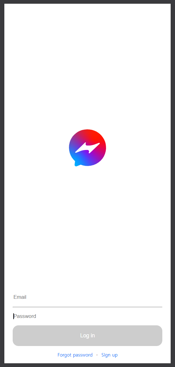
Log in Form
import BorderlessInput from "@components/elements/BorderlessInput";
import PasswordInput from "@components/elements/PasswordInput";
import SemiRoundedButton from "@components/elements/SemiRoundedButton";
import { FormLayout } from "@components/layouts/form.layouts";
import { HorizontalLine } from "@components/layouts/separator.layouts";
import useForm from "@hooks/useForm";
import { useRef } from "react";

const LogInForm = () => {
  const [onChange, disabled] = useForm(["email", "password"]);
  return (
    <FormLayout onChange={onChange} noValidate>
      <BorderlessInput type="email" placeholder="Email" />
      <HorizontalLine />
      <PasswordInput />
      <SemiRoundedButton onSubmit={() => {}} type="submit" disabled={disabled}>
        Log in
      </SemiRoundedButton>
    </FormLayout>
  );
};

export default LogInForm;
다음은 로그인 폼이다. 앞서 만들었던 Borderless Input과 Password Input을 사용한다. 설명하지 않은 세 컴포넌트를 소개한다.
Horizontal Line
import styled from "styled-components";

export const HorizontalLine = styled.hr`
  margin: 1vh 0;
  border-color: #e1e1e1;
`;
Horizontal Line은 이런 구조를 가지는데, 두 input 요소를 구분하기 위한 구분자로 사용된다.
Semi Rounded Button
import { ButtonLayout } from "@components/layouts/button.layouts";
import { ISemiRoundedButtonProps } from "@interfaces/button.element.interfaces";

const SemiRoundedButton = (props: ISemiRoundedButtonProps) => {
  return (
    <ButtonLayout
      onClick={(event) => {
        const button = event.currentTarget as HTMLButtonElement;
        button.style.setProperty("--x", `${event.nativeEvent.offsetX}px`);
        button.style.setProperty("--y", `${event.nativeEvent.offsetY}px`);
      }}
      {...props}
    />
  );
};

export default SemiRoundedButton;
Semi Rounded Button은 그저 Button Layout의 Wrapper Component로 쓰이고 있는데, 이것도 추상화 패턴 생각하다가 잘못 구상한 부분 중 하나다. 나중에 리팩토링해서 다 고칠거다... ㅠㅠ
그 외에 style property를 정하는 부분이 있는데 저건 버튼을 누르는 위치에서 ripple effect가 생성되도록 하는 코드를 짜고있던 부분이다. 일단 제대로 동작하지 않아서 css 부분은 주석처리해놨다.
import styled from "styled-components";

export const ButtonLayout = styled.button`
  --x: 0px;
  --y: 0px;
  width: 100%;
  margin: 1vh 0 0 0;
  aspect-ratio: 7.2 / 1;
  border-radius: 15px;
  border: 0;
  background-color: #0070f6;
  color: white;
  font-size: 14px;
  position: relative;
  overflow: hidden;
  /* &:active:not(:disabled)::after {
    content: "";
    position: absolute;
    border-radius: 50%;
    background: white;
    top: var(--y);
    left: var(--x);
    width: 100px;
    height: 100px;
    opacity: 0.5;
    transform: translate(-50%, -50%) scale(0);
    animation: ripple-animation 0.6s ease-out;
  }

  @keyframes ripple-animation {
    to {
      transform: translate(-50%, -50%) scale(4);
      opacity: 0;
    }
  } */
  &:disabled {
    background-color: #cdcdcd;
  }
`;
Button Layout은 위와 같다.
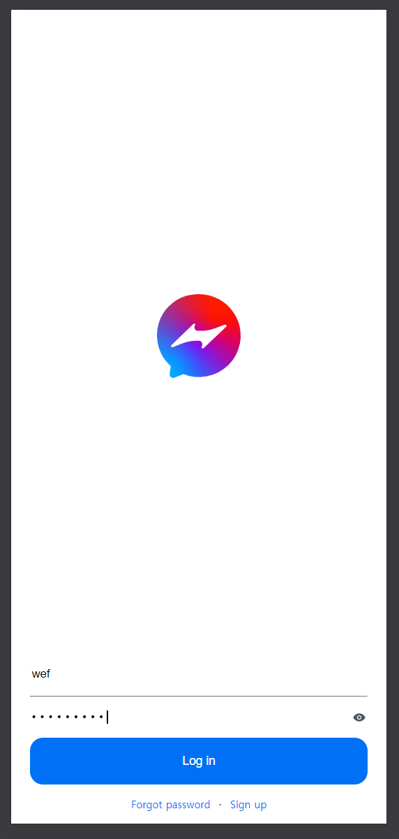
Log in Page
import hessenger from "@assets/hessenger.logo.svg";
import { CenterLayout, RowLayout } from "@components/layouts/container.layouts";
import { LinkLayout } from "@components/layouts/link.layouts";
import LogInForm from "@components/ui/LogInForm";

const LoginPage = () => {
  return (
    <>
      <CenterLayout width="100%" height="80%">
        <img src={hessenger} alt="logo" />
      </CenterLayout>
      <LogInForm />
      <RowLayout>
        <LinkLayout to="/reset">Forgot password</LinkLayout>
        ·
        <LinkLayout to="/signup">Sign up</LinkLayout>
      </RowLayout>
    </>
  );
};

export default LoginPage;
최종적으로 Log in page 컴포넌트는 위와 같이 구성된다.
Link Layout은 React Router Dom 에서 제공하는 Link 컴포넌트를 상속하여 만든 컴포넌트로, 기존 link의 속성을 제거하고 디자인에 맞게 변경한 것이다.
import styled from "styled-components";
import { Link } from "react-router-dom";

export const LinkLayout = styled(Link)`
  display: inline;
  text-decoration: none;
  color: #0070f6;
  font-size: 12px;
`;
이렇게 작성했다.