align
- 요소의 수평 가운데 정렬 방법
- margin을 이용
--> margin: auto 속성 부여 (width 속성값 부여)
(너비를 제오한 나머지 공간을 좌우로 균등하게 나누어 배치) - position을 이용
--> position 부여 후 margin padding 활용 - float을 이용한 좌우정렬
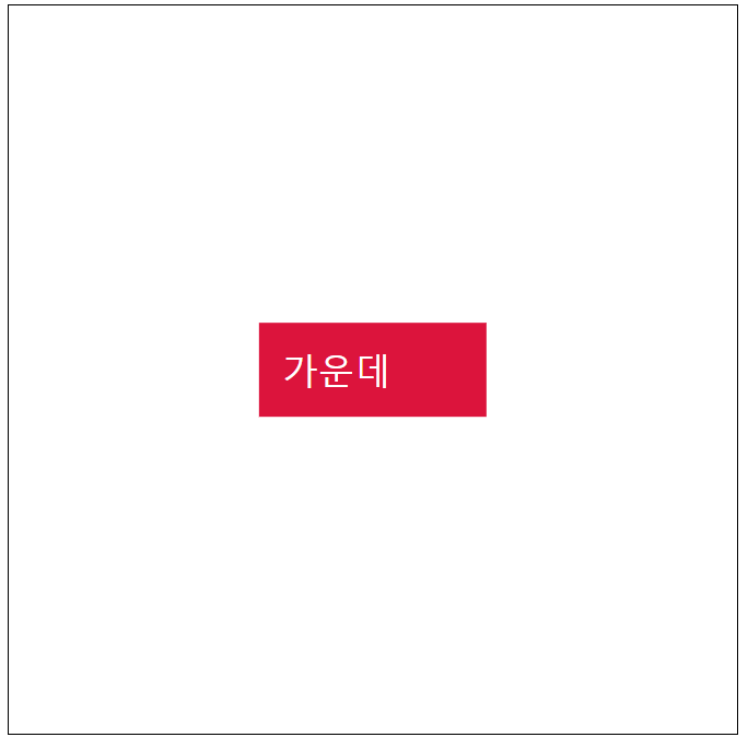
예시
<style>
#maindiv{
    border: 1px solid black;
    width: 800px;
    height: 800px;
    position: relative;
}
#test{
    width: 200px;
    font-size: 40px;
    padding: 25px;
    background-color: crimson;
    color: white;
    position: absolute;
    top:50%;
    left:50%;
    transform: translate(-50%, -50%);
}
</style>
<div id="maindiv">
    <div id="test">
        가운데
    </div>
</div>
예시2
<style>
div{
    width: 200px;
    font-size: 40px;
    background-color: red;
    color: white;
    position: absolute;
    top :50%;
    left: 50%;
    transform: translate(-50%, -50%);
     margin: 10px auto;
}
#maindiv{
    border: 1px solid black;
    width: 800px;
    height: 800px;
    position: relative;
}

#test{
    width: 200px;
    font-size: 40px;
    padding: 25px;
    background-color: crimson;
    color: white;
    position: absolute;
    top:50%;
    left:50%;
    transform: translate(-50%, -50%);
}
</style>
<div id="maindiv">
    <div id="test">
        가운데
    </div>
</div>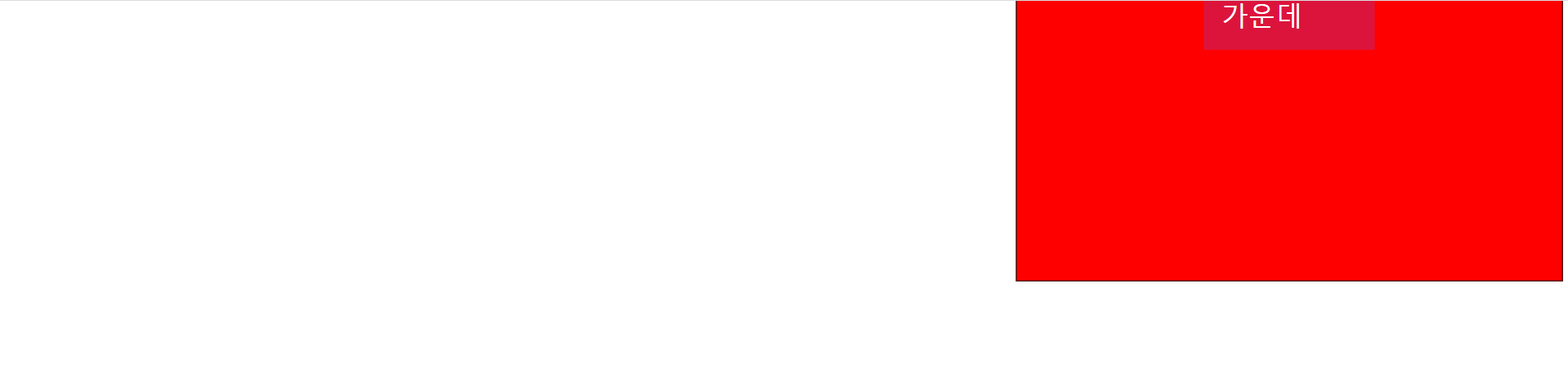
unti and viewport
-
화면의 크기 단위
-
px : 화면을 구성하는 단위
--> 필겟ㄹ은 디바이스 해상도에 따라 상대적인 크기를 갖는다.
--> 장치별로 픽셀의 크기는 제각각이기 때문에 픽셀의 단위는 명확하지 않다.
--> 대부분의 브라우저는 1px 96분의 1인치의 절대단위로 인식한다.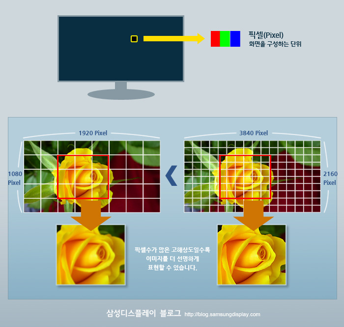
-
% : 백분률 단위의 상대 단위 요소에 지정된 사이즈에 상대적인 사이즈를 설정
-
viewport : 웹 페이지의 가시 영역 (눈에 보이는 영역)
--> viewport의 넓이가 1000px 높이가 600px 가정 후
viewport의 단위
1. vw : viewport 너비의 1/100
ex) 1vw : 10px
2. vh : viewport 높이의 1/100
ex) 1vh : 6px
3. vmin : viewport 넓이 또는 높이 중 작은 쪽의 1/100
ex) 넓이가 1000이고 높이가 600이니 적용 시 6px 적용
4. vmax : viewport 넓이 또는 높이 중 큰 쪽의 1/100
ex) 넓이가 1000이고 높이가 600이니 적용 시 10px 적용
max와 min
- max : HTML 요소가 가질 수 있는 최대 너비
--> max-width로 너비를 설정하면 설정된 너비 이하로 브라우저의 크기가 줄어들 때 스크롤바가 생성된다. - min : 해당 HTML 요소가 가질 수 있는 최소 너비, 넓이
--> min-width로 너비를 설정하면 설정된 너비이하로는 해당 요소가 작아지지 않는다.
--> min-width 속성이 설정된 요소에 width 값을 따로 설정하지 않으면 초기 너비는 100%를 가지게 된다.
--> viewport(브라우저 크기)가 min-width 속성 설정 너비 이하로 줄어든다면 요소의 너비는 더 이상 줄지 않고 수평 스크롤바를 생성하게 된다.
안녕