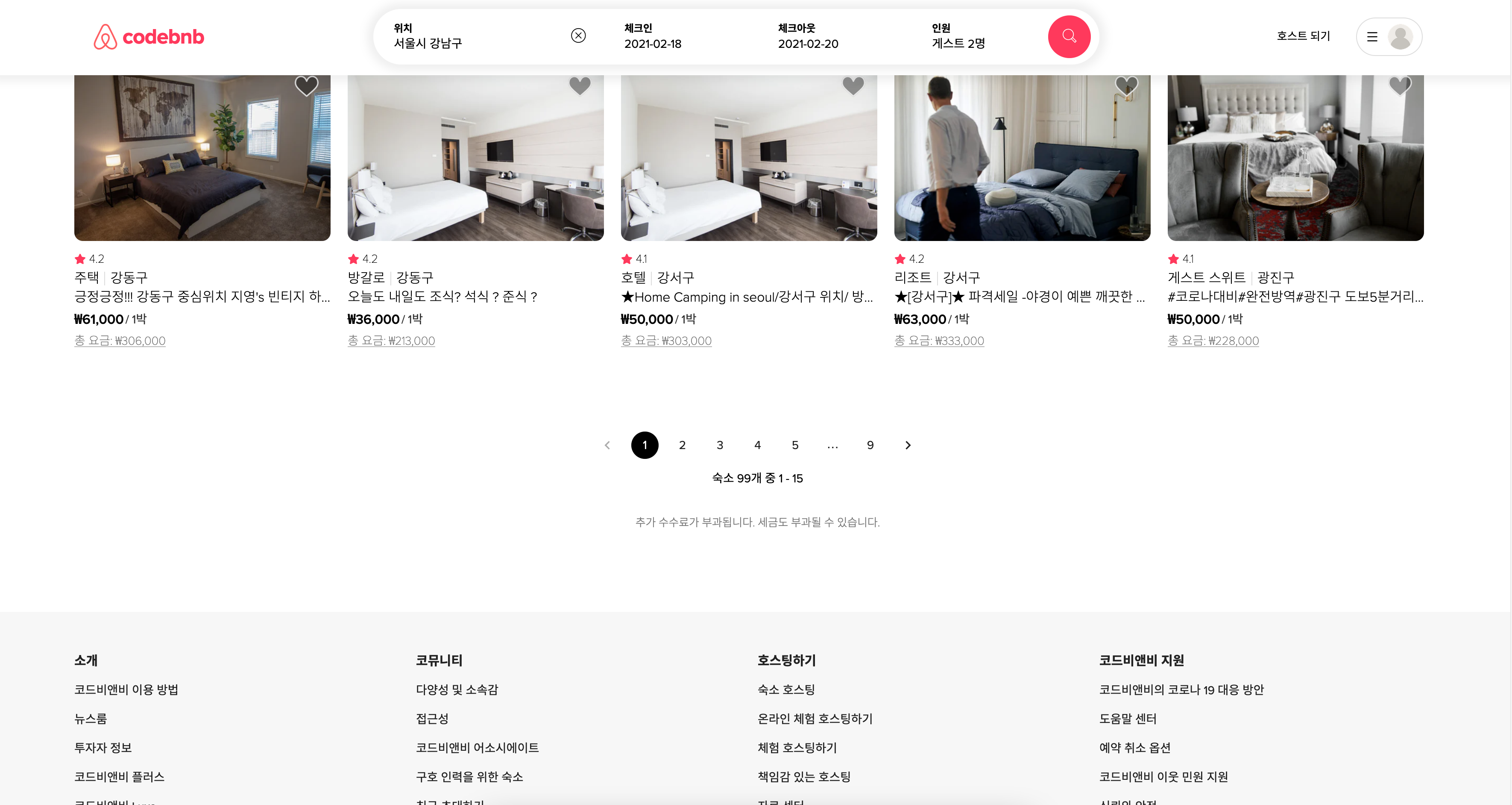
숙소 리스트 페이지에서 직접 제작한 페이지네이션 부분을 Material-UI 를 사용하여 바꾸어보았다.
1. 기존 코드 및 디자인
// 부모 컴포넌트 roomList.js
  const paging = e => {
    const offset = e.target.dataset.index;
    if (!offset) return;
    const nextQueryObj = { ...stringToQuery(history.location.search) };
    nextQueryObj["limit"] = LIMIT;
    nextQueryObj["offset"] = offset * LIMIT;
    const nextString = queryToString(nextQueryObj);
    history.push(`/roomlist${nextString}`);
    fetch(`${API}/homes?${nextString}`)
      .then(res => res.json())
      .then(data => setHomes(data.homes));
  };
페이지네이션 기능만큼 쉬운 건 없을 거라고 생각했는데.. 자식 컴포넌트인 페이지 버튼에 Dataset 속성을 적용하여, 이벤트 타겟으로 해당 데이터셋에 접근하여 페이지를 이동시켰다. 기존 query string 을 미리 만들어 둔 stringToQuery() 함수로 잘랐다가, queryToString() 함수로 이어붙였다.
// 자식 컴포넌트 pageButtons.js
const PageButtons = ({ paging, homesCount }) => {
  return (
    <Pagination>
      <PageBtnContainer onClick={paging}>
        <PrevPage className="noClick" />
        {[...Array(5)].map((_, idx) => (
          <PageBtn data-index={idx + 1}>{idx + 1}</PageBtn>
        ))}
        <NextPage />
      </PageBtnContainer>
      <PageRange>숙소 {homesCount}개 중 1 - 15</PageRange>
      <AdditionalFee>추가 수수료가 부과됩니다. 세금도 부과될 수 있습니다.</AdditionalFee>
    </Pagination>
  );
};
const Pagination = styled.div`
${flexCenter};
flex-direction: column;
margin-bottom: 60px;
height: 160px;
`;
const PageBtnContainer = styled.div`
${flexCenter}
margin-bottom: 14px;
`;
const PageBtn = styled.div`
${flexCenter};
margin: 0 12px;
width: 32px;
height: 32px;
border-radius: 50%;
font-size: ${props => props.theme.fontSizeSmall};
font-weight: ${props => props.theme.fontWeightMedium};
cursor: pointer;
&:hover {
background: rgba(0, 0, 0, 0.05);
}
`;
const NextPage = styled(PageBtn)`
margin: 0 16px;
position: relative;
border-radius: 50%;
cursor: pointer;
background: none;
&::before,
&::after {
content: "";
position: absolute;
width: 26%;
height: 4%;
top: 41%;
left: 52%;
background: #000;
z-index: 2;
transform: translate(-50%, -50%) rotate(45deg);
transition: all 0.2s linear;
}
&::after {
z-index: 3;
top: 59%;
left: 52%;
transform: translate(-50%, -50%) rotate(-45deg);
}
`;
const PrevPage = styled(NextPage)`
transform: rotate(180deg);
`;
const PageRange = styled.div`
margin: 4px;
font-size: ${props => props.theme.fontSizeSmall};
font-weight: ${props => props.theme.fontWeightMedium};
`;
const AdditionalFee = styled.div`
margin: 26px;
font-size: ${props => props.theme.fontSizeExtrasmall};
font-weight: ${props => props.theme.fontWeightRegular};
color: #777;
`;자식 컴포넌트인 페이지 버튼 컴포넌트는 리액트 훅과 Styled-component로 작성했다. NextPage 스타일 컴포넌트에서 화살표 아이콘을 사용하지 않고 직접 ::before, ::after 가상요소를 이용해서 만든 이유는 원하는 화살표 모양을 자유롭게 커스텀하고 싶었기 때문이다.
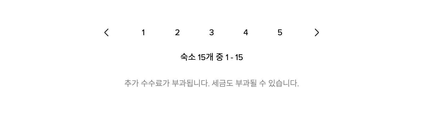
기존 코드에서 딱히 단점은 없고 기능도 정상적으로 작동하지만 아쉬운 점이 있다면 한 페이지 당 15개의 숙소가 렌더되는데 검색 결과가 5페이지를 넘어가는 경우에도 5페이지로 한정돼 있다는 점이었다. 또 현재 페이지가 몇 페이지인지 현재로선 알 수가 없다.
2. 변경한 코드 및 디자인
// 부모 컴포넌트 roomList.js
  const paging = (e, page) => {
    if (!page) return;
    const nextQueryObj = { ...stringToQuery(history.location.search) };
    nextQueryObj["limit"] = LIMIT;
    nextQueryObj["offset"] = page * LIMIT;
    const nextString = queryToString(nextQueryObj);
    history.push(`/roomlist${nextString}`);
    fetch(`${API}/homes?${nextString}`)
      .then(res => res.json())
      .then(data => setHomes(data.homes));
  };
Material-UI 에서 기본으로 제공되는 props 중, onChange 함수가 바로 페이지를 넘기는 함수이고 event와 page를 인자로 받는다. 직접 클릭하거나 화살표를 통해 넘어가려는 타겟 페이지가 바로 인자 page다. Dataset이나 id 등이 필요 없고 material-ui 에서 기본으로 제공되는 기능이니 자식 컴포넌트에서 잘 따라서 써 주기만 하면 된다.
// 자식 컴포넌트 pagination.js
const PaginationRanges = ({ homesCount, paging }) => {
  const history = useHistory();
  const classes = useStyles();

  return (
    <div className={classes.paginationContainer}>
      <Pagination count={homesCount ? parseInt(homesCount / 15) : 1} onChange={paging} className={classes.pages} />
      <div className={classes.pageRange}>숙소 {homesCount ? homesCount : 0}개 중 1 - 15</div>
      <div className={classes.additionalFee}>추가 수수료가 부과됩니다. 세금도 부과될 수 있습니다.</div>
    </div>
  );
};
const useStyles = makeStyles({
paginationContainer: {
marginBottom: "40px",
display: "flex",
flexDirection: "column",
justifyContent: "center",
alignItems: "center",
height: "220px",
"& .MuiPaginationItem-root": {
margin: "0 6px",
fontSize: "14px",
},
"& .MuiPaginationItem-page": {
display: "flex",
justifyContent: "center",
alignItems: "center",
fontFamily: "'proxima-nova', 'Noto Sans KR', sans-serif",
letterSpacing: "-0.1px",
"&.Mui-selected": {
backgroundColor: "black",
color: "white",
},
},
},
pageRange: {
margin: "16px 0 30px",
fontSize: "14px",
fontWeight: "400",
},
additionalFee: {
fontSize: "13px",
fontWeight: "300",
color: "#777",
lineHeight: "30px",
},
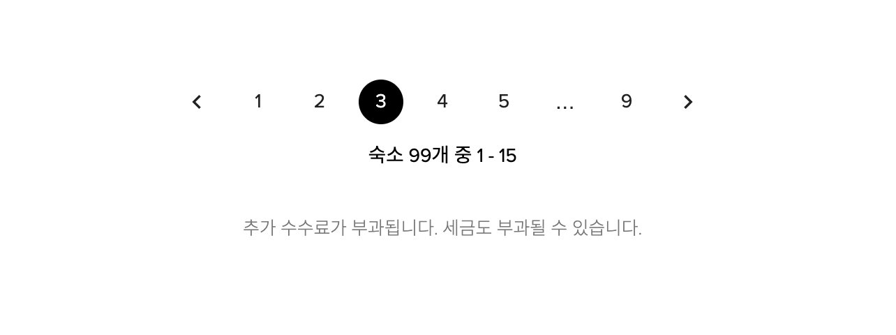
});실제 에어비앤비 사이트에서 페이지 버튼을 살펴보면, 총 숙소 검색결과의 갯수에 따라 맨 뒤 페이지도 동적으로 달라지고, 가까운 5개 페이지를 제외한 페이지들은 ...으로 생략된다. 이것을 실제 사이트처럼 리팩토링해보려고 했는데 코드가 쓸데없이 길어질 것 같아 Material-UI 라이브러리를 가져와서 커스텀해보았다.
makeStyles는 사용자 정의 스타일을 적용할 수 있도록 Material-UI에서 제공하는 리액트 훅이다. <div className={classes.pageRange}> 이런 식으로 클래스네임을 지정해주기만 하면 적용할 수 있어 사용하기 매우 편리하다. 개인적으론 Styled-component보다 사용하기 쉬운 것 같다.
원래는 Material-UI 를 사용하면 기본적으로 Roboto 폰트가 적용된 디자인으로 만들어지는데 나는 실제 에어비앤비 사이트에서 사용하는 폰트를 쓰고 싶어서, 개발자 도구를 참고하여 라이브러리로 감추어진 요소에 접근하여 속성값을 변경해주었다. 또 현재 활성화된 페이지를 명확하게 하기 위해 실제 사이트처럼 검정색 배경에 흰 글씨 컬러로 설정해주었다. 문제 해결 완료!