framer-motion 라이브러리를 사용하여, 리액트에서 복잡한 애니메이션도 쉽게 구현할 수 있다
따라서 공식문서에 나와있는 애니메이션을 직접 구현하며 framer motion 에 대해 알아보려고 한다
설치
설치
npm install framer-motionimport
import { motion } from "framer-motion";기본 사용법
HTML 태그에 적용하기
framer motion 으로 <div></div> 를 animate 할 수 없다
animate 를 하기 위해선 다룰 요소가 import 한 motion 패키지로부터 나와야 한다
따라서 <motion.div></motion.div> 를 사용해서 animate 를 적용시킬 수 있다
물론 div 뿐 아니라 모든 HTML 태그를 motion.<태그> 형태로 써서 사용할 수 있다
styled components 에 적용하기
styled components 와 함께 motion 을 사용하려면 어떻게 하면 될까?
const Box = styled.div`
  width: 200px;
  height: 200px;
  background-color: white;
  border-radius: 10px;
`;
위와 같은 styled-components 를 이용해 만든 Box 컴포넌트가 있다
HTML 태그가 아닌 Box는 motion 패키지 안에 존재하지 않기 때문에 <motion.Box /> 와 같은 방법은 불가능하다
const Box = styled.div``;따라서 이 부분을 아래의 형태로 바꾸어 주는 것으로 사용할 수 있다
const Box = styled(motion.div)``;간단한 애니메이션
공식 문서에 있는 애니메이션을 구현하기 전에 간단한 애니메이션을 구현 해 보자
animate props
애니메이션을 적용시킬 컴포넌트에 animation 속성(properties) 을 추가해주는 것으로 사용이 가능하다
(앞으로 속성은 props 라고 표현)
props 안에 들어가는 내용은 Motion 만을 위한 키워드가 아닌 단순한 css 문
const Components = styled.div`
  display: flex;
  height: 100vh;
  width: 100vw;
  justify-content: center;
  align-items: center;
  background: linear-gradient(135deg, #e09, #d0e);
`;

const Box = styled(motion.div)`
  width: 200px;
  height: 200px;
  background-color: rgba(255, 255, 255, 1);
  border-radius: 25px;
  box-shadow: 0px 0px 15px 3px rgba(0, 0, 0, 0.2);
`;

function App() {
  return (
    <Components>
      <Box />
    </Components>
  );
}
위의 코드에서 Box 컴포넌트에 animation props 을 추가해보자
<Box animate={{ borderRadius: "50%" }} />
위처럼 굉장히 쉽게 애니메이션을 만들 수 있다
transition props
transition props 의 delay 를 사용하면 애니메이션이 언제 시작할 지 정할 수 있다
ex) 2초 후에 애니메이션을 실행
<Box animate={{ borderRadius: "100px" }} transition={{ delay: 2 }} />
transition prop 의 duration 을 사용하면 애니메이션이 완료될 때까지의 시간을 조정해 줄 수 있다
ex) 애니메이션이 완료되는데까지 5초가 걸리도록 조정
<Box animate={{ borderRadius: "100px" }} transition={{ duration: 5 }} />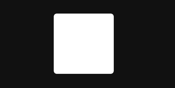
공식 문서의 애니메이션 구현
이제 기본을 파악했으니 공식 문서의 애니메이션을 직접 구현 해 보자 !
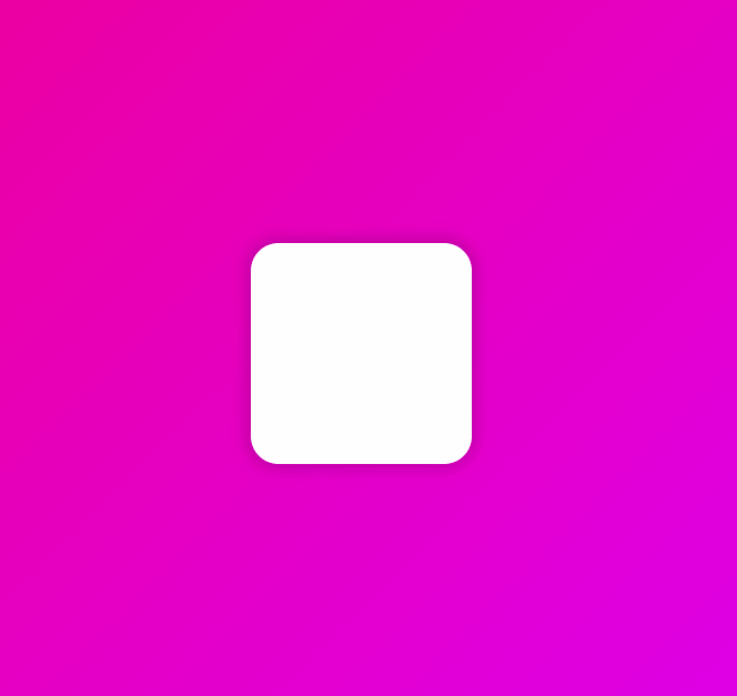
Animation 1 (Animation)
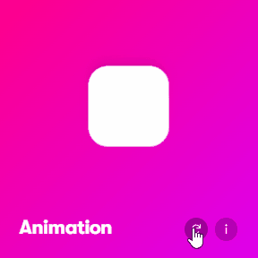
애니메이션을 실행하면 아무 것도 없는 상태에서 박스가 등장하는 것을 볼 수 있다
initial props
이처럼 애니메이션을 시작하는 방식(초기 상태)을 명시하려면, initial props 를 사용하면 되는데,
initial 안에는 내가 원하는 Element 의 초기 상태를 써주면 된다
<Box initial={{ scale: 0 }} />초기 상태에 scale 을 0으로 지정했다
하지만 앱을 실행해도 초기상태 후에 뭘 할지 정해주지 않았기 때문에, 아무것도 없는 모습을 볼 수 있다
애니메이션 props 를 추가해, 실행하면 1초동안 크기를 다시 원래대로 돌리고, 360도 회전하도록 해보자
<Box
  initial={{ scale: 0 }}
  animate={{ scale: 1, rotateZ: 360 }}
  transition={{
    duration: 1,
    type: "spring",
    stiffness: 260,
    damping: 20,
  }}
/>
위와 같은 애니메이션이 완성 되었다
박스가 살짝 튕기는걸 볼 수 있는데 type 을 spring 으로 지정했기 때문이다
위와 같이 transition props 에 type 을 지정해서 여러 효과를 줄 수 있다
stiffness와 damping은 spring 타입을 수정하는 방법인데, 공식문서에서 자세한 내용을 확인할 수 있다
Animation 2 (Variants)
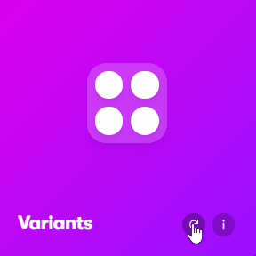
이번엔 공식문서의 두 번째 애니메이션을 구현 해 보자
그 전에 먼저 Variants 에 대해서 알아 볼 필요가 있다
Variants
Variants 는 애니메이션의 Stage 로서, 내 코드를 깔끔하게 만들어주고, 많은 애니메이션들을 하나로 연결시켜준다
Variants 를 만들어 보자
const firstVeriants = {
  start: { scale: 0 },
  end: {
    scale: 1,
    rotateZ: 360,
    transition: {
      duration: 1,
      type: "spring",
      stiffness: 260,
      damping: 20,
      delay: 0.5,
    },
  },
};
Animation 1 파트에서 만들었던 애니메이션을 variant 오브젝트로 만들어 보았다
위에서 했단 내용을 자바스크립트 오브젝트의 형태로 바꿔준 것 뿐이다
start 와 end 는 각각 initial 과 animate 를 의미하며, 그 이름은 마음대로 정해줄 수 있다
Variants를 사용해보자!
Variants 를 사용하는 방법은 아주 간단하다
컴포넌트 안에 variants props 를 사용하면 된다
<Box variants={firstVariants} />그 후, 아래와 같이 initial 과 animate props 에 variant 를 넣어주면 된다
<Box variants={firstVariants} initial="start" animate="end" />단 이 때 start 와 end 는 반드시 내가 만든 variant 오브젝트의 property 여야만 한다
컴포넌트가 굉장히 깔끔해졌을 뿐 아니라 Animation 1 에서 했던 것과 똑같이 애니메이션이 작동하는 것을 볼 수 있다 👍
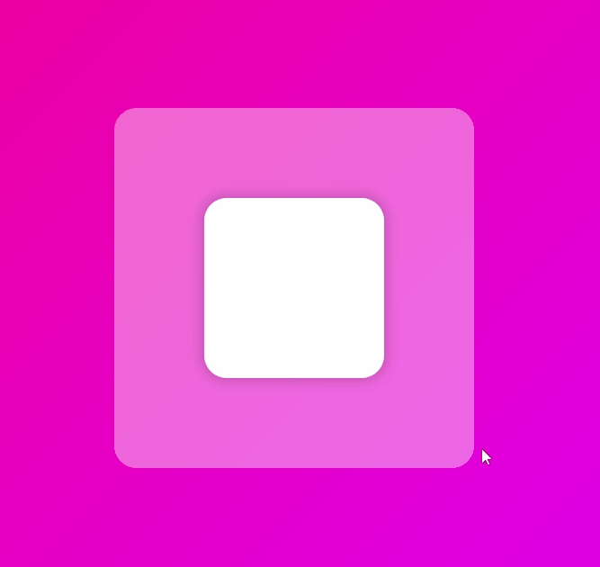
공식문서의 두번째 애니메이션을 구현해보자!
위의 애니메이션을 보면 처음 큰 정사각형이 나타나고, 그 후에 작은 원들이 각각 나타난다
먼저 레이아웃을 만들자
const Box = styled(motion.div)`
  width: 200px;
  height: 200px;
  background-color: rgba(255, 255, 255, 0.4);
  border-radius: 25px;
  box-shadow: 0px 0px 15px 3px rgba(0, 0, 0, 0.2);
  display: grid;
  grid-template-columns: repeat(2, 1fr);
`;

const Circle = styled(motion.div)`
  background-color: white;
  height: 70px;
  width: 70px;
  place-self: center;
  border-radius: 35px;
  box-shadow: 0px 0px 15px 3px rgba(0, 0, 0, 0.2);
`;

function App() {
  return (
    <Components>
      <Box>
        <Circle />
        <Circle />
        <Circle />
        <Circle />
      </Box>
    </Components>
  );
}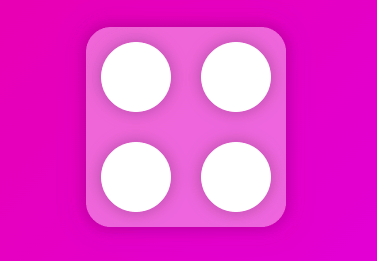
어느정도 레이아웃이 완성됐다
이제 조금전에 다뤄본 variants 오브젝트를 만들어주자
const boxVariants = {
  start: {
    opacity: 0,
    scale: 0.5,
  },
  end: {
    opacity: 1,
    scale: 1,
    transition: {
      type: "spring",
      duration: 0.5,
      bounce: 0.5,
    },
  },
};
초기상태는 투명도가 0, scale 이 0.5
애니메이션을 실행하면 원래의 상태로 돌아가도록 투명도를 1, scale을 1로 설정해줬다
transition 을 이용해서 type 을 물리법칙이 적용되는 spring 으로, 애니메이션이 0.5초 동안 실행되도록 duration 을 0.5, 튕기는 느낌을 주도록 bounce 를 0.5 주었다
그 후, 아래와 같이 props 에 넣어준다
function App() {
  return (
    <Components>
      <Box variants={boxVariants} initial="start" animate="end">
        <Circle />
        <Circle />
        <Circle />
        <Circle />
      </Box>
    </Components>
  );
}
다시 강조하지만 start 와 end 는 반드시 내가 만든 variants 오브젝트의 property 여야만 한다

이것으로 위와 같은 멋진 애니메이션이 만들어졌다
위의 애니메이션을 보면 Box 컴포넌트의 자식인 Circle 에게도 모두 애니메이션이 적용된 것을 확인할 수 있다
즉, 기본적으로 어떤 설정도 없을 때, 보무 컴포넌트가 variants 와 initial, animate prop 을 가지고 있다면, Motion은 이걸 복사해서 자식들에게 준다는 것이다
눈에 보이지는 않지만 자식 컴포넌트인 Circle 의 현재 모습은 사실 아래와 같다
<Circle variants={boxVariants} initial="start" animate="end" />
<Circle variants={boxVariants} initial="start" animate="end" />
<Circle variants={boxVariants} initial="start" animate="end" />
<Circle variants={boxVariants} initial="start" animate="end" />
이미 initial 과 animate props 에 각각 start, end 가 들어있는 상태인 것이다
덕분에 내가 할 일은 Circle 컴포넌트에 줄 variants 만 작성해서 넘겨주면 된다
const circleVariants = {
  start: {
    scale: 0,
  },
  end: {
    scale: 1,
    transition: {
      type: "spring",
      duration: 3,
    },
  },
};

function App() {
  return (
    <Components>
      <Box variants={boxVariants} initial="start" animate="end">
        <Circle variants={circleVariants} />
        <Circle variants={circleVariants} />
        <Circle variants={circleVariants} />
        <Circle variants={circleVariants} />
      </Box>
    </Components>
  );
}
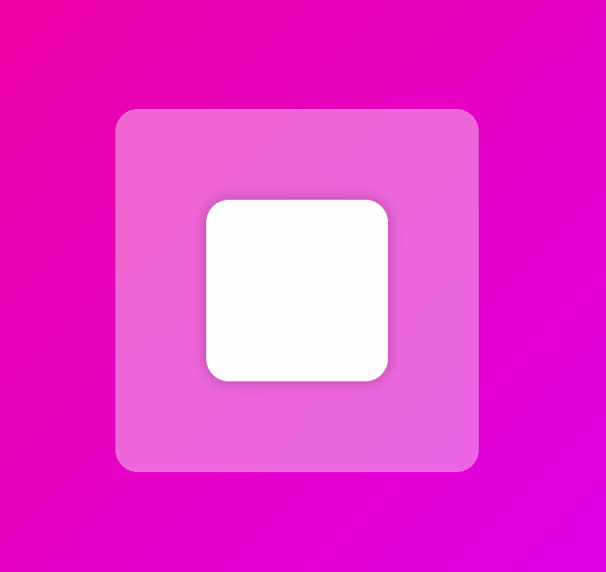
실행된 애니메이션은 위와 같다
아주 편하게 작성할 수 있었다👍
이제 공식문서의 애니메이션처럼 각각의 원이 나타나는 것에 delay 를 줘보자!
어떻게 구현할 수 있을까??
각 원마다 variants 를 만들어서 각각의 원에 delay 를 주는 방법도 있겠지만, 생각만해도 끔찍한 일임을 알 수 있다
그러니 그냥 delay 가 아닌 Motion 에서 지원하는 유틸리티인 delayChildren 을 사용해보자
delayChildren
delayChildren 을 사용하면 부모 컴포넌트에서 모든 자식들에게 delay 를 줄 수 있다
const boxVariants = {
  start: {
    opacity: 0,
    scale: 0.5,
  },
  end: {
    opacity: 1,
    scale: 1,
    transition: {
      type: "spring",
      duration: 0.5,
      bounce: 0.5,
      delayChildren: 0.3,
    },
  },
};

const circleVariants = {
  start: {
    opacity: 0,
    y: 20,
  },
  end: {
    opacity: 1,
    y: 0,
  },
};
circleVariants 에서 delay 를 지우고 부모 컴포넌트인 boxVariants 에 delayChildren 를 추가했다 (아래에서 위로 올라오는 듯한 효과를 주기 위해 x, y 도 추가했다)
모든 자식 컴포넌트에 delay 가 0.3 초 적용되었다
즉, 내가 원하던대로 부모 컴포넌트에서 자식 컴포넌트의 delay를 조정했다
이제 할 일은, staggerChildren 을 사용하는 것이다
staggerChildren
const boxVariants = {
  start: {
    opacity: 0,
    scale: 0.5,
  },
  end: {
    opacity: 1,
    scale: 1,
    transition: {
      type: "spring",
      duration: 0.5,
      bounce: 0.5,
      delayChildren: 0.3,
      staggerChildren: 0.2,
    },
  },
};
부모 컴포넌트에게 staggerChildren 을 추가로 작성했다
이제 Motion은 자동적으로 첫 번째 원에 0.3초 delay를 주고, 두 번째 자식에게 staggerChildren 값인 0.2 를 더한 0.5초, 세 번째에 0.7초 ...

이 모든게 단 한줄의 코드를 추가하는 것으로 가능했다 ㄷㄷ
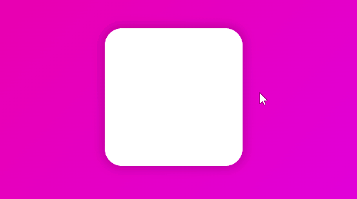
Animation 3 (Gestures)
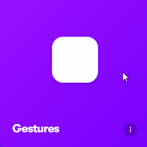
이제 공식문서에 3번째로 나와있는 애니메이션을 구현해보자 !
현재 App.js 의 상태이다
import styled from "styled-components";
import { motion } from "framer-motion";

const Components = styled.div`
  display: flex;
  height: 100vh;
  width: 100vw;
  justify-content: center;
  align-items: center;
  background: linear-gradient(135deg, #e09, #d0e);
`;

const Box = styled(motion.div)`
  width: 200px;
  height: 200px;
  background-color: rgba(255, 255, 255, 1);
  border-radius: 25px;
  box-shadow: 0px 0px 15px 3px rgba(0, 0, 0, 0.2);
`;

const boxVariants = {};

function App() {
  return (
    <Components>
      <Box />
    </Components>
  );
}

export default App;
whileHover
먼저 박스 위에 마우스를 올렸을 때 scale 이 커지도록 해보자
현재 Box 컴포넌트는 motion이 적용된 상태이기 때문에 굉장히 쉽게 구현할 수 있다
whileHover props 를 사용하기만 하면 된다
<Box whileHover={{ scale: 1.2 }} />
whileTap
이번엔 클릭 시에 박스가 원이 되도록 해보자
이것 또한 whileTap props 를 사용하기만 하면 된다
<Box whileHover={{ scale: 1.2 }} whileTap={{ borderRadius: "50%" }} />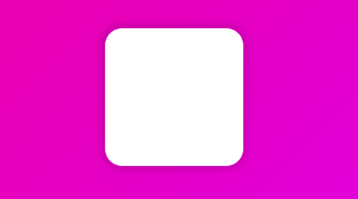
이제 공식문서와 같이 동작하는 애니메이션을 만들어보자
<Box
  whileHover={{ scale: 1.2, rotate: 90 }}
  whileTap={{ borderRadius: "50%", scale: 0.8, rotate: -90 }}
/>
너무 쉽게 구현할 수 있었다
연습 겸, 아래와 같이 Variants 를 사용해서 만들어보자
const boxVariants = {
  hover: { scale: 1.2, rotate: 90 },
  tap: { borderRadius: "50%", scale: 0.8, rotate: -90 },
};

function App() {
  return (
    <Components>
      <Box variants={boxVariants} whileHover="hover" whileTap="tap" />
    </Components>
  );
}
역시 variants를 사용하는 편이 훨씬 깔끔한 느낌이 난다 👍
Animation 4 (Drag)
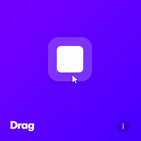
공식문서의 4번째 애니메이션인 위의 애니메이션을 구현해보자!
Drag
드래그를 하는 모습...
뭔가 굉장히 고급 기술처럼 보여서 어려울 것 같지만 깜짝 놀랄 정도로 쉽다
Box 컴포넌트에 drag 속성만 추가하면 끝이다
<Box drag variants={boxVariants} whileHover="hover" whileTap="tap" />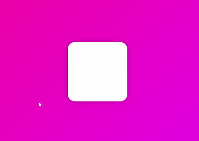
whileDrag 속성을 추가해서 드레그 중 뭔가를 바꿔줄 수도 있다
constraint
이제 드래그는 완성되었으니 한정된 공간에 box를 가둬보자!
boxVariants를 조금 수정했다
const boxVariants = {
  hover: { rotate: 90 },
  tap: { borderRadius: "50%" },
};
먼저 Drag 의 constraint(제약)에 대해 살펴보자
<Box drag="x" variants={boxVariants} whileHover="hover" whileTap="tap" />drag 속성에 x를 주면 x축으로만 y를 주면 y축으로만 drag 할 수 있게 된다
dragConstraints
dragConstraints 는 드래깅이 허용될 수 있는 영역을 말한다
즉, dragConstraints props 을 사용해서 제약이 있는 어떤 공간을 만들 수 있다
<Box
  drag
  dragConstraints={{ top: -50, bottom: 50, left: -50, right: 50 }}
  variants={boxVariants}
  whileHover="hover"
  whileTap="tap"
/>
상하좌우로 50px의 제한을 둔 모습이다
위의 애니메이션을 보면 제한을 넘어서게 되면 위치를 전으로 되돌리는 어떠한 힘이 작용하는 것을 볼 수 있다
공식문서의 애니메이션처럼 드래그가 가능한 박스를 다른 박스안에 넣어보자
const BigBox = styled.div`
  width: 400px;
  height: 400px;
  background-color: rgba(255, 255, 255, 0.4);
  border-radius: 25px;
  display: flex;
  justify-content: center;
  align-items: center;
  overflow: hidden;
`;
위와 같은 컴포넌트를 만들고
<BigBox>
  <Box
    drag
    dragConstraints={{ top: -50, bottom: 50, left: -50, right: 50 }}
    variants={boxVariants}
    whileHover="hover"
    whileTap="tap"
  />
</BigBox>
위와 같이 기존의 Box 를 감싸주었다

이제 'ref' 를 이용해서 큰 박스가 드래깅의 제약이 되도록 해보자
ref 는 코드로 특정 Element를 잡을 수 있는 방법이다
function App() {
  const bigBoxRef = useRef<HTMLDivElement>(null);
  return (
    <Components>
      <BigBox ref={bigBoxRef}>
        <Box
          drag
          dragConstraints={bigBoxRef}
          variants={boxVariants}
          whileHover="hover"
          whileTap="tap"
        />
      </BigBox>
    </Components>
  );
}
레퍼런스를 만들어 BigBox 컴포넌트에 넣어줬다
위처럼 재대로 적용된 것을 볼 수 있다
dragSnapToOrigin
드래깅을 멈췄을 때 Box가 원래위치로 되돌아가게 하고 싶다면 어떻게 하면 될까 ?
dragSnapToOrigin 속성을 사용하면 구현할 수 있다
<Box
  drag
  dragSnapToOrigin
  dragConstraints={bigBoxRef}
  variants={boxVariants}
  whileHover="hover"
  whileTap="tap"
/>
추가로, Box 컴포넌트에 dragElastic 속성을 직접 적용해서 무슨 일이 일어나는지 확인해보자 [0~1의 값, 기본값 0.5]