버튼 들의 종류는 엄청 다양하게 많다.
하지만 지금은 4가지 정도만 알아보자.
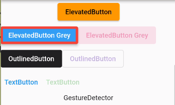
(ElevatedButton, OutlinedButton, TextButton, GestureDetector)
body: Column(
          // mainAxisAlignment: MainAxisAlignment.spaceAround,print("")
          children: [
            ElevatedButton(
              onPressed: () {},
              onLongPress: () {},
              child: const Text('ElevatedButton'),
            ),
            Row(
              children: [
                ElevatedButton(
                  onPressed: () {},
                  style: ElevatedButton.styleFrom(
                    primary: Colors.blue, // 배경색 적용
                    onPrimary: Colors.white, // 글자색 적용
                    side: const BorderSide(
                      color: Colors.red, // border적용
                      width: 5.0,
                    ),
                  ),
                  child: const Text('ElevatedButton Grey'),
                ),
                ElevatedButton(
                  onPressed: null, // 기본값 배경 투명도 0.12, 글자 투명도 0.38
                  style: ElevatedButton.styleFrom(
                    primary: Colors.blue,
                    onSurface: Colors.pink, // 디세이블 값에 컬러주기
                  ),
                  child: const Text('ElevatedButton Grey'),
                ),
              ],
            ),
            Row(
              children: [
                OutlinedButton(
                  onPressed: () {},
                  style: OutlinedButton.styleFrom(
                    primary: Colors.white, // 글자색 적용
                    backgroundColor: Colors.black87, // 배경 적용
                  ),
                  child: const Text('OutlinedButton'),
                ),
                OutlinedButton(
                  onPressed: null,
                  style: OutlinedButton.styleFrom(
                    primary: Colors.blue,
                    onSurface: Colors.deepPurple, // 디세이블 값에 컬러주기
                  ),
                  child: const Text('OutlinedButton'),
                ),
              ],
            ),
            Row(
              children: [
                TextButton(
                  onPressed: () {},
                  style: TextButton.styleFrom(
                    primary: Colors.blue,
                  ),
                  child: const Text('TextButton'),
                ),
                TextButton(
                  onPressed: null,
                  style: TextButton.styleFrom(
                    primary: Colors.blue,
                    onSurface: Colors.green, // 디세이블 값에 컬러주기
                  ),
                  child: const Text('TextButton'),
                ),
              ],
            ),

            // GestureDetector는 화면 박스를 클릭할 때 또는 이미지를 클릭할 때 사용
            /*
            GestureDetector(
              onTap: () {
                // ignore: avoid_print
                print("GestureDetector");
              },
              child: const Text('GestureDetector'),
            )
          ],
          GestureDetector(
              onTap: () {
                // ignore: avoid_print
                print("GestureDetector");
              },
              child: Container(
                color: Colors.blue,
                height: 100,
              ),
            )
            */

        ));