CSS 중급
참고 사이트:
- css이름짓는방법
- 레이아웃 리셋 라이브러리 (굳이 사용할 필요 없이 코드로 작성 가능.)
- css 공부사이트 - selector
- css 공부사이트 - flexbox게임
- css 공부사이트 - flexbox이해
셀렉터 : 클래스(.), id(#)
- id : 하나 밖에 없는 스타일의 경우에 사용
- class : 자주 사용되는 스타일의 경우에 사용
- Selector가 선택할 수 있는 HTML 요소의 범위
- 셀렉터
h1 { }div { } - 전체 셀렉터
* { }
- Tag 셀렉터
section, h1 { } - ID 셀렉터
#only { } - class 셀렉터
.widget { }.center { } - attribute 셀렉터 (암기할 필요는 없습니다)
a[href] { }
p[id="only"] { }
p[class~="out"] { }
p[class|="out"] { }
section[id^="sect"] { }
div[class$="2"] { }
div[class*="w"] { }```
- 후손 셀렉터
header h1 {} - 자식 셀렉터
header > p { }
- 인접 형제 셀렉터
section + p { } - 형제 셀렉터
section ~ p { }
- 가상 클래스
a:link { } a:visited { } a:hover { } a:active { } a:focus { }``` - 요소 상태 셀렉터
input:checked + span { }
input:enabled + span { }
input:disabled + span { }```
- 구조 가상 클래스 셀렉터 (암기할 필요는 없습니다)
p:first-child { }
ul > li:last-child { }
ul > li:nth-child(2n) { }
section > p:nth-child(2n+1) { }
ul > li:first-child { }
li:last-child { }
div > div:nth-child(4) { }
div:nth-last-child(2) { }
section > p:nth-last-child(2n + 1) { }
p:first-of-type { }
div:last-of-type { }
ul:nth-of-type(2) { }
p:nth-last-of-type(1) { } ```
- 부정 셀렉터
input:not([type="password"]) { }
div:not(:nth-of-type(2)) { }```
- 정합성 확인 셀렉터
input[type="text"]:valid { }
input[type="text"]:invalid { }```
- 셀렉터
레이아웃: 화면을 나누는 방법
- 레이아웃 : flexbox, position, float, table, grid
1. HTML 구성하기
대부분의 경우 콘텐츠의 흐름은 좌에서 우, 위에서 아래로 흐릅니다. CSS로 화면을 구분할 때에는 수직분할과 수평분할을 차례대로 적용하여 콘텐츠의 흐름을 따라 작업을 진행.
- [수직분할] 화면을 수직으로 구분하여, 콘텐츠가 가로로 배치.
- [수평분할] 분할된 각각의 요소를 수평으로 구분하여, 내부 콘텐츠가 세로로 배치. 수평으로 구분된 요소에 height 속성을 추가하면, 수평분할을 보다 직관적으로 할 수 있다.
2. 레이아웃 리셋
- HTML 문서는 기본적인 스타일 가짐.
- 태그가 가진 기본 스타일의 약간의 여백이 존재.
- width, height 계산이 여백을 포함하지 않아 계산이 어려움.
- 브라우저(크롬, 사파리 등)마다 여백이나 글꼴과 같은 기본 스타일이 조금씩 다름.
* {  /* 기본 스타일링을 제거하는 CSS 코드 */
  box-sizing: border-box;
  margin: 0;
  padding: 0;
}
: 레이아웃 리셋은 외주업체 작업시 css파일 여러개 섞일수도 있어서 주의
Flexbox로 레이아웃 잡기
- flexbox로 레이아웃을 구성한다는 것은, 박스를 유연하게 늘리거나 줄여 레이아웃을 잡는 방법
display: flex
: 부모에게 flex 줘야 자식이 정렬됨.
조상에게 flex있어도 부모에게 직접적으로 줘야 적용됨.
1. 부모요소
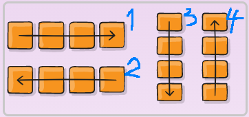
display: flex: 부모 박스요소에 적용 -> 자식 박스의 방향과 크기를 결정하는 레이아웃 구성방법. 기본값으로 자식 요소는 왼쪽부터 차례대로 이어 배치.flex-direction : row (default) | row-reverse | column | column-reverse;
Flex 요소에 방향 지정하는 속성. 자식 박스에 특별한 속성을 주지 않아도, 부모 요소에 의해 자식 요소가 영향을 받음.
- row (default): left to right in ltr; right to left in rtl
- row-reverse: right to left in ltr; left to right in rtl
- column: same as row but top to bottom
- column-reverse: same as row-reverse but bottom to top
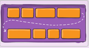
flex-wrap: nowrap (default) | wrap | wrap-reverse;
- nowrap (default): all flex items will be on one line
- wrap: flex items will wrap onto multiple lines, from top to bottom.
- wrap-reverse: flex items will wrap onto multiple lines from bottom to top.
flex-flow: row nowrap (default) | column wrap;
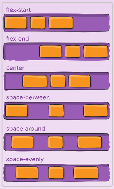
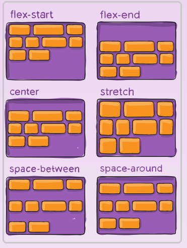
: shorthand for the flex-direction and flex-wrap propertiesjustify-content: flex-start | flex-end | center | space-between | space-around | space-evenly | start | end | left | right ... + safe | unsafe;
- 부모 박스에 justify-content 속성을 적용하면, 자식 박스를 수평으로 정렬
- 참고 MDN
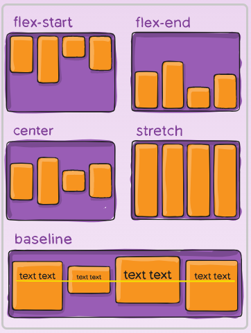
align-items: stretch | flex-start | flex-end | center | baseline | first baseline | last baseline | start | end | self-start | self-end + ... safe | unsafe;
- 부모 박스에 align-items 속성을 적용하면, 자식 박스를 수직으로 정렬
- 참고 MDN
- 콘텐츠 정렬 방법 : Flexbox를 원하는대로 제어하기 위해서는 axis(축)의 개념 이해 필요
- flex-direction : row -> main axis : 수평 , cross axis : 수직
- flex-direction : column -> main axis : 수직 , cross axis : 수평
- justify-content : main axis를 기준으로 정렬
- align-items : cross axis를 기준으로 정렬
align-content: flex-start | flex-end | center | space-between | space-around | space-evenly | stretch | start | end | baseline | first baseline | last baseline + ... safe | unsafe;
2. 자식요소
order: 5; /* default is 0 */
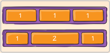
flex-grow: 4; /* default 0 */
flex-shrink: 3; /* default 1 */
- grow, shrink 속성은 단위가 없고, 비율에 따라 결과가 달라짐. 부모 박스 안에 n개의 자식 박스가 있다고 가정. 각 자식 박스가 갖는 grow값의 총 합이 n이라면, grow 속성의 값을 1로 설정하는 것은 1/n 가로 또는 세로길이를 적용한다는 의미. grow 속성의 값을 2로 지정하면, 2/n의 길이를 의미.
- shrink : 0 => 화면 줄였을 때 같이 안준다. 1 => 그 화면 안에서 같이 줄어듬.
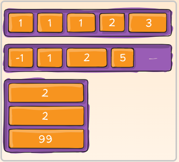
1 => 그 화면 안에서 같이 줄어듬.
- flex-grow 속성의 값이 0인 경우에만 flex-basis 속성의 값이 유지
flex-basis: | auto; /* default auto */
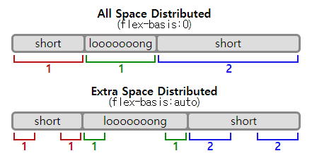
- width와 flex-basis를 동시에 적용하는 경우, flex-basis가 우선 됨.
- 콘텐츠가 많아 자식 박스가 넘치는 경우, width가 정확한 크기를 보장하지 않습니다.
- (flex-basis를 사용하지 않는다면) 콘텐츠가 많아 자식 박스가 넘치는 경우를 대비해, width 대신 max-width를 쓸 수 있습니다.
flex: none | [ <'flex-grow'> <'flex-shrink'>? || <'flex-basis'> ]
flex: 0 1 auto (default);: 자식요소에 flex 속성을 추가하지 않으면 적용되는 기본값
align-self: auto | flex-start | flex-end | center | baseline | stretch;
: align-self는 개별 요소에 적용할 수 있는 또 다른 속성입니다. 이 속성은 align-items가 사용하는 값들을 인자로 받으며, 그 값들은 지정한 요소에만 적용됩니다.
웹 앱 화면 설계하기
와이어프레임(Wireframe)
- 와이어프레임 : 화면 단위의 레이아웃을 설계하는 작업
- 목업 : 실제품을 만들어보기 전, 실물과 비슷하게 시제품을 제작하는 작업
- 프로토타입: 처음부터 종료까지 핵심 동작이 기능하게 구현된 앱 - 프론트엔드 영역
- 하드 코딩 : 데이터를 코드내부에 직접 입력하는 것
- 역동적인 웹 어플리케이션을 만들기 위해서는, HTML 문서에 트윗 작성자, 내용을 변수로 관리하여 값을 동적으로 담아야 하므로 하드코딩을 지양한다.

- 역동적인 웹 어플리케이션을 만들기 위해서는, HTML 문서에 트윗 작성자, 내용을 변수로 관리하여 값을 동적으로 담아야 하므로 하드코딩을 지양한다.
- CSS라이브러리 - 포트폴리오에서는 직접만들어보는게 중요
bootstrap, ant design, material-ui!tab: html 구조 자동 작성- 셀렉터이름으로만 어떤 기능을 하는지 알면 좋음
- css 적용 우선순위 id > class (직접 > 간접)
- 와이어프레임 : 팀원과 서로 생각확인. 구체적 구조 그리기 의 이유로 꼭 해보기
- 목업 툴 : 제플린, 피그
- max-width : 반응형에서 화면이 줄어도 더이상 커지지 않는 크기 - 최대 크기
- min-width : 반응형에서 화면이 커져도 더이상 줄지 않는 크기 - 최소 크기

프론트엔드 개발자