flexbox
display : flex;
박스 내 요소 간의 공간 배분과 정렬 기능을 제공하기 위한 1차원 레이아웃 모델이다.
flexbox를 1차원 레이아웃 모델이다.
레이아웃을 다룰 때 한 번에 하나의 행이나 열만을 다룬다
flexbox를 flex 컨테이너라고도 한다. (요소들을 포함하기 때문)
flex 컨테이너를 만들기 위해서는 컨테이너에 display: flex;를 적용해야 한다.
- 자식이 가진 기본 margin 값을 무시하고 배치한다.
기본값은 flex(행 방향) 이다.
[style.css]
.box{
  width: 50px;
  height: 50px;
  background-color: red;
}
.container{
  display: flex;
}
[index.html]
<body>
  <div class="container">
    <div class="box">가</div>
    <div class="box">나</div>
    <div class="box">다</div>
  </div>
</body>
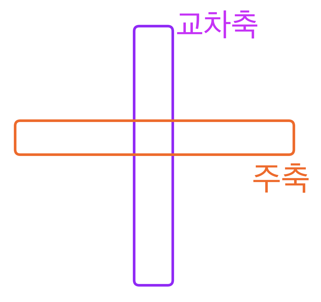
- flexbox에는 주축과 교차축이 있다.
주축은 행이될 수도 열이될 수도 있다. 기본 값은 행이다.
flex-direction
flexbox 내 요소를 배치할 때 사용할 주축 및 방향(정방향, 역방향)을 지정한다.
row : (기본값) 주축은 행이고 방향은 콘텐츠의 방향과 동일
row-reverse : 주축은 행이고 방향은 콘텐츠의 방향과 반대
column : 주축은 열이고 방향은 콘텐츠의 방향과 동일
column-reverse : 주축은 열이고 방향은 콘텐츠의 방향과 반대
[style.css]
.box1{
  width: 50px;
  height: 50px;
  background-color: red;
}
.box2{
  width: 50px;
  height: 50px;
  background-color: orange;
}
.box3{
  width: 50px;
  height: 50px;
  background-color: yellow;
}
.box4{
  width: 50px;
  height: 50px;
  background-color: green;
}
.container1{
  display: flex;
  flex-direction: row;
}
.container2{
  display: flex;
  flex-direction: row-reverse;
}
.container3{
  display: flex;
  flex-direction: column;
}
.container4{
  display: flex;
  flex-direction: column-reverse;
}
[index.html]
<body>
  <div class="container1">
    <div class="box1">가</div>
    <div class="box1">나</div>
    <div class="box1">다</div>
  </div>
  <div class="container2">
    <div class="box2">가</div>
    <div class="box2">나</div>
    <div class="box2">다</div>
  </div>
  <div class="container3">
    <div class="box3">가</div>
    <div class="box3">나</div>
    <div class="box3">다</div>
  </div>
  <div class="container4">
    <div class="box4">가</div>
    <div class="box4">나</div>
    <div class="box4">다</div>
  </div>
</body>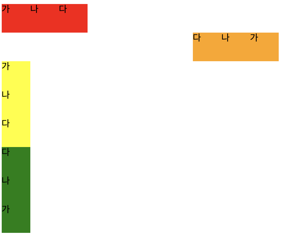
flexbox 다루기
주축 배치 방법 : justify-content
justify-content : center
중간 정렬
justify-content : flex-start
왼쪽 정렬
justify-content : flex-end
오른쪽 정렬
justify-content : space-around
서로 일정한 간격으로 정렬
justify-content : space-between
왼쪽과 오른쪽을 붙이고 정렬
[style.css]
.box1{
  width: 50px;
  height: 50px;
  background-color: red;
}
.box2{
  width: 50px;
  height: 50px;
  background-color: orange;
}
.box3{
  width: 50px;
  height: 50px;
  background-color: yellow;
}
.box4{
  width: 50px;
  height: 50px;
  background-color: green;
}
.box5{
  width: 50px;
  height: 50px;
  background-color: blue;
}
.container1{
  display: flex;
  width: 500px;
  height: 100px;
  border: 2px solid black;
  justify-content: center;
}
.container2{
  display: flex;
  width: 500px;
  height: 100px;
  border: 2px solid black;
  justify-content: flex-start;
}
.container3{
  display: flex;
  width: 500px;
  height: 100px;
  border: 2px solid black;
  justify-content: flex-end;
}
.container4{
  display: flex;
  width: 500px;
  height: 100px;
  border: 2px solid black;
  justify-content: space-around;
}
.container5{
  display: flex;
  width: 500px;
  height: 100px;
  border: 2px solid black;
  justify-content: space-between;
}
[index.html]
<body>
  <div class="container1">
    <div class="box1">가</div>
    <div class="box1">나</div>
    <div class="box1">다</div>
  </div>
  <div class="container2">
    <div class="box2">가</div>
    <div class="box2">나</div>
    <div class="box2">다</div>
  </div>
  <div class="container3">
    <div class="box3">가</div>
    <div class="box3">나</div>
    <div class="box3">다</div>
  </div>
  <div class="container4">
    <div class="box4">가</div>
    <div class="box4">나</div>
    <div class="box4">다</div>
  </div>
  <div class="container5">
    <div class="box5">가</div>
    <div class="box5">나</div>
    <div class="box5">다</div>
  </div>
</body>
교차축 배치 방법 : align-items
justify-content와 비슷하다.
align-items : flex-start
교차축 방향으로 앞쪽으로 정렬한다.
align-items : flex-end
교차축 방향으로 끝에 정렬한다.
align-items : center
교차축 방향으로 중간 정렬한다.
[style.css]
.box1{
  width: 50px;
  height: 50px;
  background-color: red;
}
.box2{
  width: 50px;
  height: 50px;
  background-color: orange;
}
.box3{
  width: 50px;
  height: 50px;
  background-color: yellow;
}
.container1{
  display: flex;
  width: 500px;
  height: 100px;
  border: 2px solid black;
  justify-content: center;
  align-items : flex-start;
}
.container2{
  display: flex;
  width: 500px;
  height: 100px;
  border: 2px solid black;
  justify-content: center;
  align-items: flex-end;
}
.container3{
  display: flex;
  width: 500px;
  height: 100px;
  border: 2px solid black;
  justify-content: center;
  align-items: center;
}
[index.html]
<body>
  <div class="container1">
    <div class="box1">가</div>
    <div class="box1">나</div>
    <div class="box1">다</div>
  </div>
  <div class="container2">
    <div class="box2">가</div>
    <div class="box2">나</div>
    <div class="box2">다</div>
  </div>
  <div class="container3">
    <div class="box3">가</div>
    <div class="box3">나</div>
    <div class="box3">다</div>
  </div>
 </body>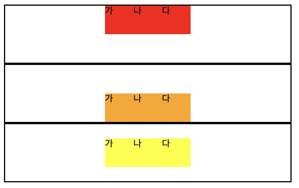
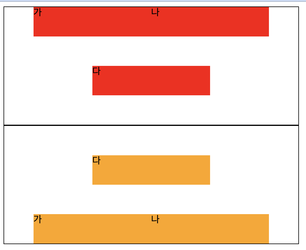
교차축 개별 요소 배치 방법 : align-self
align-self : flex-start
개별 요소를 시작 위치로 정렬
align-self : flex-end
개별 요소를 끝 위치로 정렬
[style.css]
.box1{
  width: 50px;
  height: 50px;
  background-color: red;
}
.box2{
  width: 50px;
  height: 50px;
  background-color: orange;
}
.self1{
  align-self: flex-start;
}
.self2{
  align-self: flex-end;
}
.container1{
  width: 500px;
  height: 200px;
  display: flex;
  justify-content: center;
  align-items: center;
  border: 1px solid black
}
.container2{
  width: 500px;
  height: 200px;
  display: flex;
  justify-content: center;
  align-items: center;
  border: 1px solid black
}
[index.html]
<body>
  <div class="container1">
    <div class="box1">가</div>
    <div class="box1 self1">나</div>
    <div class="box1">다</div>
  </div>
  <div class="container2">
    <div class="box2">가</div>
    <div class="box2 self2">나</div>
    <div class="box2">다</div>
  </div>
</body>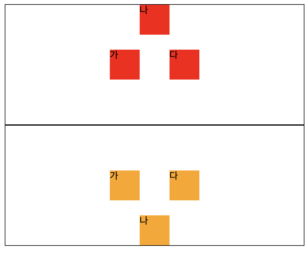
줄 바꿈 여부 : flex-wrap
flex는 자식요소가 부모 요소보다 커질 경우 부모의 크기만큼 줄여버리는 특성을 가지고 있다.
[style.css]
.box1{
  width: 200px;
  height: 50px;
  background-color: red;
}
.box2{
  width: 200px;
  height: 50px;
  background-color: orange;
}
.self1{
  align-self: flex-start;
}
.self2{
  align-self: flex-end;
}
.container1{
  width: 500px;
  height: 200px;
  display: flex;
  justify-content: center;
  align-items: center;
  border: 1px solid black
}
.container2{
  width: 500px;
  height: 200px;
  display: flex;
  justify-content: center;
  align-items: center;
  border: 1px solid black
}
[index.html]
<body>
  <div class="container1">
    <div class="box1">가</div>
    <div class="box1 self1">나</div>
    <div class="box1">다</div>
  </div>
  <div class="container2">
    <div class="box2">가</div>
    <div class="box2 self2">나</div>
    <div class="box2">다</div>
  </div>
</body>
- width를 200으로 설정하여 3개 총 600이지만 각각의 상자를 166.66으로 줄여버렸다.
이럴때 강제로 줄이는 것을 막기위해서 flex-wrap를 사용한다.
flex-wrap : nowrap(기본 값)
위 예제에서는 변화가 없음
flex-wrap : wrap
flex 크기 보다 커지면 줄바꿈을 진행한다.
flex-wrap : wrap-reverse
거꾸로 줄바꿈을 진행한다.
[style.css]
.box1{
  width: 200px;
  height: 50px;
  background-color: red;
}
.box2{
  width: 200px;
  height: 50px;
  background-color: orange;
}
.container1{
  width: 500px;
  height: 200px;
  display: flex;
  justify-content: center;
  border: 1px solid #000000;
  flex-wrap : wrap
}
.container2{
  width: 500px;
  height: 200px;
  display: flex;
  justify-content: center;
  border: 1px solid #000000;
  flex-wrap : wrap-reverse
}
[index.html]
<body>
  <div class="container1">
    <div class="box1">가</div>
    <div class="box1">나</div>
    <div class="box1">다</div>
  </div>
  <div class="container2">
    <div class="box2">가</div>
    <div class="box2">나</div>
    <div class="box2">다</div>
  </div>
</body>