
✅ Picker vs Menu 차이점
| Picker | Menu | |
|---|---|---|
| 사용 목적 | 폼(Form)이나 설정 화면에서 선택지를 제공 | 버튼처럼 동작하며 옵션을 선택할 수 있음 |
| UI 스타일 | WheelPicker 같은 스타일 변경가능 | 팝업 버튼처럼 동작 |
| 커스텀 디자인 | ❌ 제한적 (기본 스타일 유지됨) | ✅ 자유로운 커스텀 가능 |
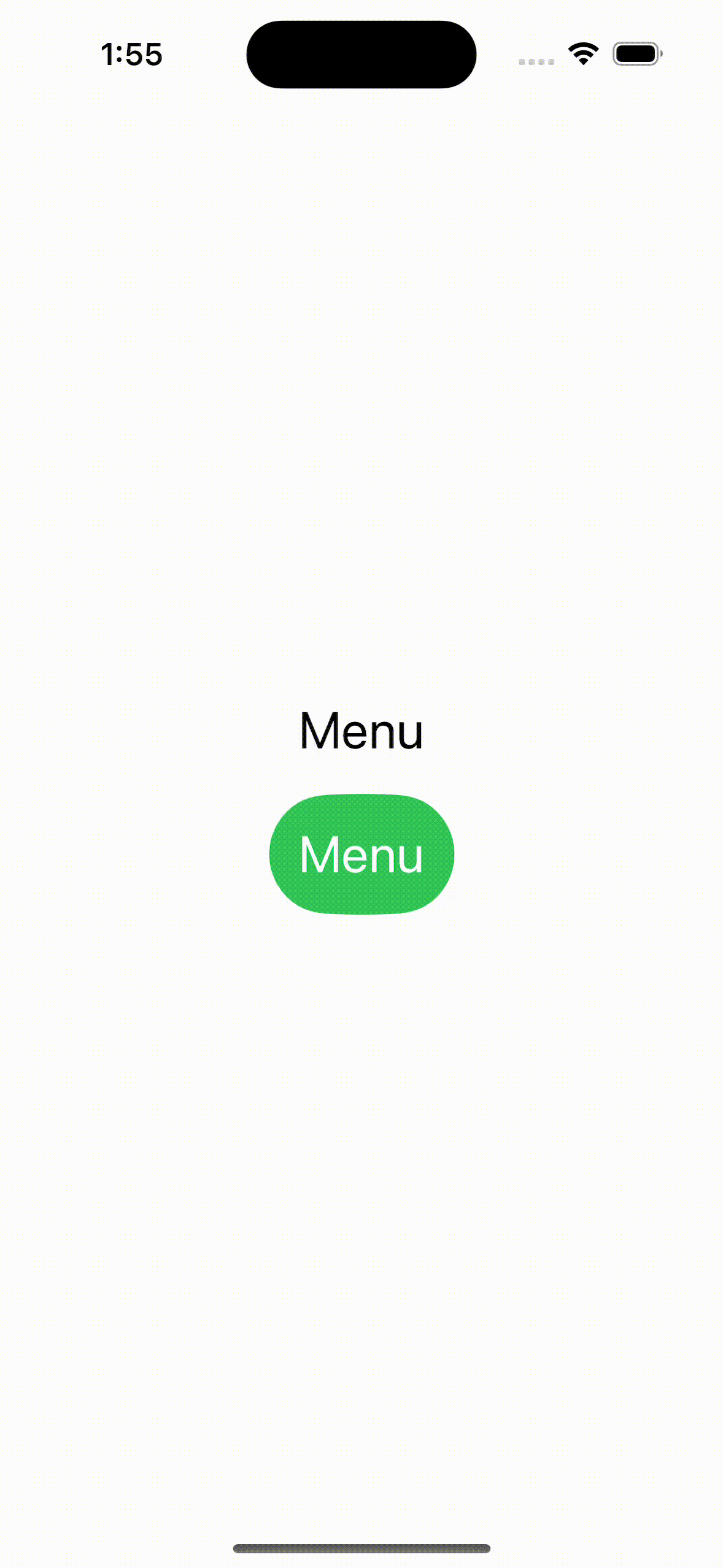
Menu
- menu안에 text를 넣으면 클릭 못하는 회색 글씨로 나온다
- 버튼을 넣으면 클릭할 수 있는 검은색 글씨로 나온다
- 버튼 안에 이미지와 텍스트도 순서가 고정되서 나타난다 변경 불가능
- menu안에 menu 넣는것도 가능
- menu가 어느 방향으로 열리느냐에 따라 menu안의 컨텐츠들의 순서 바뀜
struct Menu: View {

    @State var name = "Menu"

    var body: some View {
        VStack {
            Text("Menu")
            Menu(name) {
                Text("Menu Items")
                Button(action: {}, label: {
                    Image(systemName: "flame")
                    Text("Button")
                })
                Button(action: {}, label: {
                    Image(systemName: "flame")
                    Text("Button")
                })
                Menu("More...") {
                    Text("Menu 2 Items")
                    Button(action: {}, label: {
                        Image(systemName: "flame")
                        Text("Button 2")
                    })
                    Button(action: {}, label: {
                        Image(systemName: "flame")
                        Text("Button 4")
                    })
                }
            }
            .accentColor(.white)
            .padding()
            .background(Capsule().fill(Color.green))

        }
        .font(.title)
    }
}
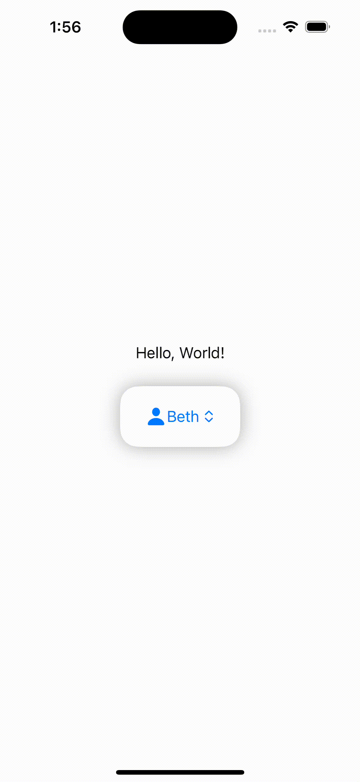
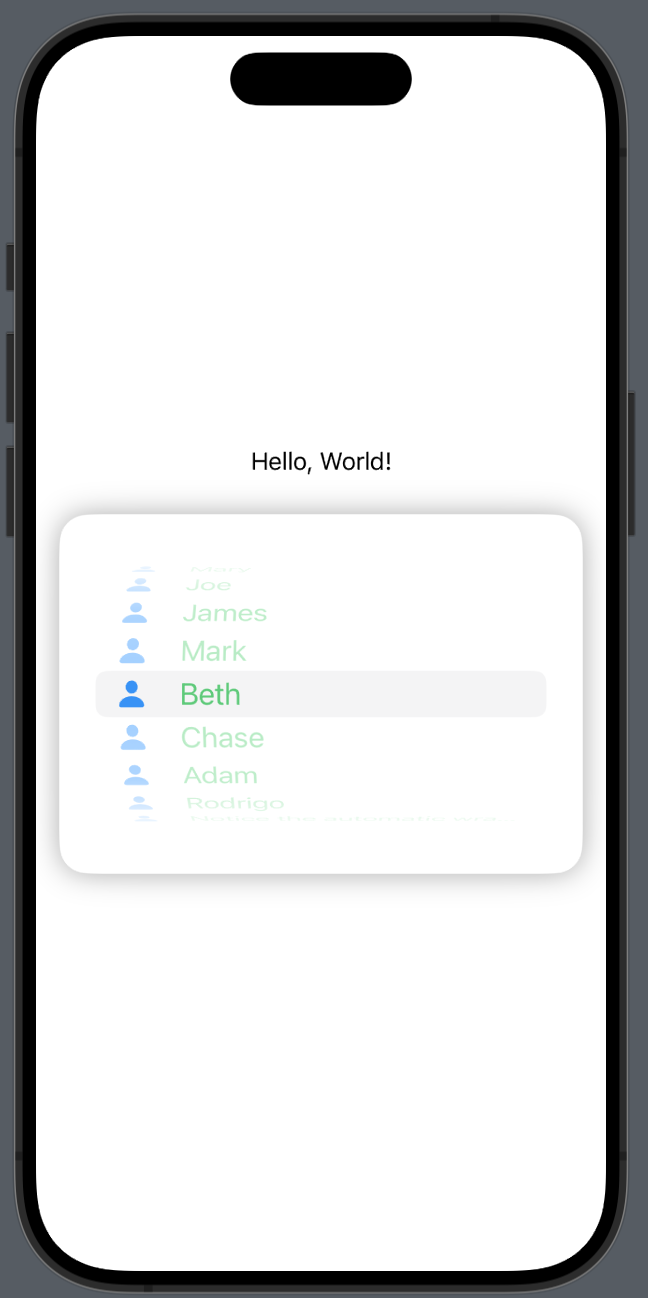
Picker
- picker는 menu와 다르게 선택한 항목의 체크표시와 선택한 항목으로 바뀐다.
- selection으로 선택할때도 태그로 인식하기 때문에 태그 값으로 입력해줘야한다
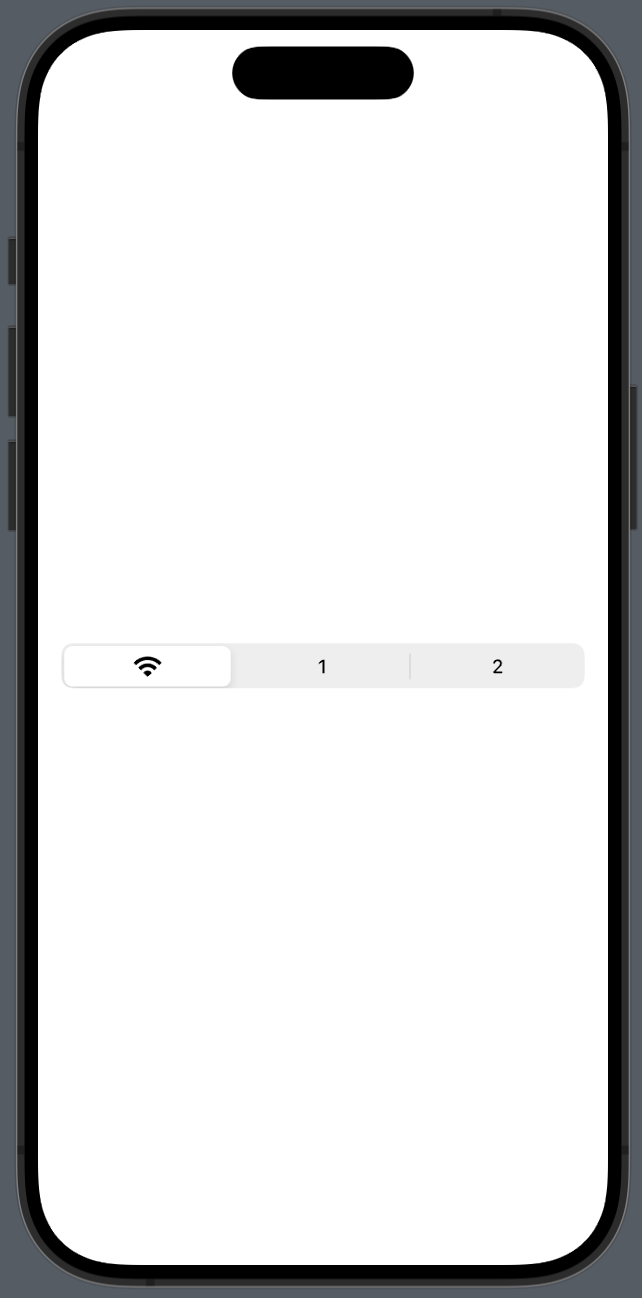
PickerStyle 종류
- automatic
- wheel
- menu
- segmented
- inline
- radioGroup
struct Picker1: View {
    @State private var selection = "Beth"
    var stringArray = ["Mary", "Joe", "James", "Mark", "Beth", "Chase", "Adam", "Rodrigo", "Notice the automatic wrapping when the text is longer"]

    var body: some View {
        VStack {
            Text("Hello, World!")
            Picker(selection: $selection, label: Text("Picker")) {
                ForEach(stringArray, id: \.self) { item in
                    HStack {
                        Image(systemName: "person.fill")
                            .frame(width: 50)
                            .foregroundColor(.blue)
                        Text(item).tag(item)
                            .foregroundColor(.green)
                        Spacer()
                    }
                }
            }
            .padding()
            .background(RoundedRectangle(cornerRadius: 20)
                            .fill(Color.white)
                            .shadow(radius: 10))
            .padding()
        }
    }
}
default
.pickerStyle(WheelPickerStyle())
.pickerStyle(SegmentedPickerStyle())

iOS, Spring developer