음료 프로젝트..뻔한 스피너는 재미가 없다..!
1. Figma로 밑그림그리기
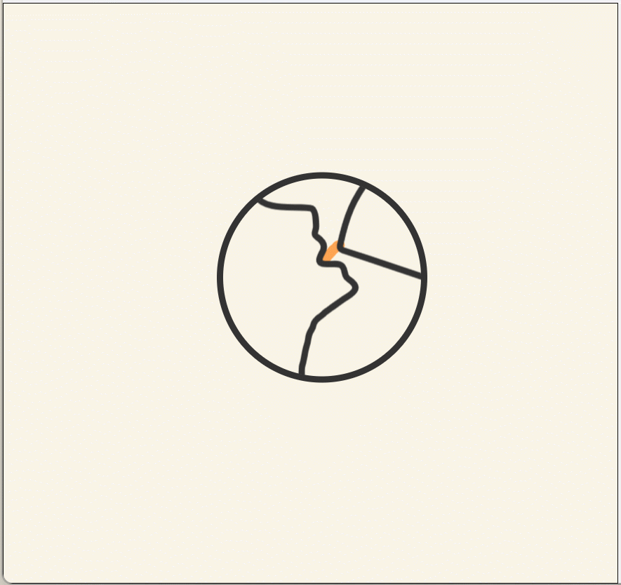
원은 figma 툴대로 나머지는 마우스로 그렸다(마우스 아티스트)
그후, svg로 추출한다
여기서 중요한점... 끊어서 그리면 안되고 어떻게든 미세조정을 해야한다
결과적으로 이렇게 3가지로 구성됨
원래 겉원도 포함했는데 animation에 확대가 적용되면서 css로 대체되었다
2. svg 구성요소에 css, keyframes로 애니메이션 효과 적용하기
svg
svg를 간단하게 알아보자면
- svg는 확장 가능한 벡터 그래픽(Scalable Vector Graphics)으로서 그래픽을 마크업하기 위한 W3C XML의 특수언어(dialect)
- SVG는 2차원 벡터 그래픽을 서술하는 XML 기반의 마크업 언어
- SVG 형식의 벡터 이미지는 손실이나 품질 저하 없이 모든 크기에서 렌더링이 가능하며 현지화 역시 그래픽 편집기 없이도 파일 내의 텍스트를 수정해서 쉽게 처리함
이때, 벡터이미지는 크기를 늘리거나 줄여도 화질에 영향을 받지 않는다
svg에 적용되는 SMIL Animation(지원하지 않는다라는 소리가 있어 왔지만 아직까지 지원됨)의 방법도 있지만 일단 CSS로 구현할 것이다.
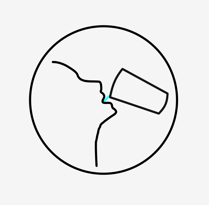
export한 svg 형태는 이러한 형태
(여기서 뽑아낸 svg를 활용하는 것이지 새롭게 그려갈것은 아니니 간단하게만 짚고 넘어가자)
        <svg
          // SVG의 너비 및 높이
          width="100"
          height="100"
          // SVG의 내부 좌표계 정의
          viewBox="0 0 100 100"
          // 채우기(없음)
          fill="none"
          // 네임스페이스
          xmlns="http://www.w3.org/2000/svg"
          css={totalCSS}
        >
          <path
            // 경로 데이터
            d="M54.4807 47.1328C54.0327 길어서 이후 생략"
            // 선 색상
            stroke={bevColor}
            // 선 두께
            strokeWidth="2.5px"
            // 선 끝이 둥글게~ 등
            strokeLinecap="round"
            css={waterMotionCSS}
          />
  		  ...path 2개 더
        </svg>
아무튼..여기서 svg는 불려왔을 뿐 css, keyframe을 사용한다
Wrapper로 원만들기
일단 겉원을 만들어서 감싸준다
넘치는 부분은 hidden속성을 줌으로서 원 바깥으로는 보이지 않게 함
const logoWrapperCSS = css`
  width: 100px;
  height: 100px;
  border: 3px solid var(--gray-color-1);
  border-radius: 50%;
  /* 중요 */
  overflow: hidden;
  ...
`;
각 path에 keyframes animation 적용
여기서 중요한 점
const runtime = 3;이렇게 전체 런타임을 제발 미리 설정해야한다...타이밍이 생명이다
const waterMotionCSS = css`
  opacity: 0%;
  stroke-dasharray: 6;
  animation: ${waterAnimation} ${runtime}s ease-out infinite;
`;

const totalCSS = css`
  animation: ${totalZoom} ${runtime}s ease-in-out infinite;
`;

const cupCSS = css`
  animation: ${rotateAnimation} ${runtime}s ease-in-out infinite;
`;- 이렇게 공통런타임을 설정해둬야 infinite속성을 걸 수 있다
- keyFrames의 경우 %로서 적용되는 시점을 정하고 transform에 scale, rotate, translate를 적절히 사용했다.
const totalZoom = keyframes`
  0% {
    transform: scale(1);
	transform: rotate(20deg) translateX(10px) ;
  }
  20% {
    transform: scale(2) translateY(-5px) ;
  }
  100% {
	transform: scale(2) translateY(-5px) ;
  }
`;- 음료가 흘러나오듯이 그려지는 건 어떻게 해야하나 싶었는데 stroke-dasharray와 stroke-dashoffset를 활용하면 된다.
참고 링크 : https://somv12.tistory.com/17
위 링크의 게시글에서 간단히 설명한 부분이
이런 선이 바로 dash이며
- stroke-dasharray : 점의 길이
- stroke-dashoffset : 점 사이 간격의 길이
그려지는 모션을 만드는 방법은
- stroke-dasharray = stroke-dashoffset = 선길이로 아무것도 보이지 않는 상태로 시작하고
- stroke-dashoffset = 0 으로 라인만 보이도록 함
선의 길이를 구하는 방법은 useRef와 useEffect를 사용하면 된다.
  const ref = useRef(null);

  useEffect(() => {
    const circleLine = (el:any) => {
      if (el) {
        const line = el.getTotalLength();
        el.style.strokeDasharray = line;
        el.style.strokeDashoffset = line;

        console.log(line);
      }
    };

    circleLine(ref.current);
  }, []);
선의 길이가 5.xxx 소수점으로 나와서 6을 썼다
또한, 다른 애니메이션과 맞춰가는 과정에서 opacity를 썼다
const waterAnimation = keyframes`
	10% {
		opacity: 0;
        stroke-dashoffset: 6;
	}
    40% {
		opacity: 1;
        stroke-dashoffset: 0;
    }
	100% {
		opacity: 1;
	}
`;

const waterMotionCSS = css`
  opacity: 0%;
  stroke-dasharray: 6;
  animation: ${waterAnimation} ${runtime}s ease-out infinite;
`;
3. 부가 옵션
프로젝트에 사용된 컬러가 3가지다 보니 마시는 음료의 색을 랜덤으로 들이킬수 있도록 했다.
  const [bevColor, setBevColor] = useState("var(--default-water-color)");

  useEffect(() => {
    const colors = [
      "var(--default-sugar-color)",
      "var(--default-caffein-color)",
      "var(--default-water-color)",
    ];
    const randomColor = colors[Math.floor(Math.random() * colors.length)];
    setBevColor(randomColor);
  }, []);
솔직하게 완벽히 착착 맞아들어가는 완성형 애니메이션 효과를 만들었다고는 할 수 없지만 svg를 그려갈 수 있는 방법 등 새로운 부분들을 흥미롭게 알아갈 수 있었던 경험이라고 생각한다.