개요
이번 포스팅은 Emotion을 이용한 다크모드 구현 및 구현을 위한 디자인 세팅 작업이 주가 될 예정이다.
폰트 설정
폰트는 Noto-Sans와 Pretendard를 고민하다가 Pretendard로 선정했다.
폰트 적용은 index.html에 폰트 관련 link을 추가하여 사용할 수 있다.
<link href="https://fonts.googleapis.com/css2family=Pretendard:wght@400;700;800&display=swap" rel="stylesheet" />이후 프로젝트에서 font-family: 'Pretendard'를 하면 해결된다.
다크모드 구현
Emotion의 ThemeProvider를 이용하여 다크모드를 구현했다.
theme.ts 설정
다크모드 및 라이트모드에서 사용할 테마를 설정했다.
background와 text의 테마가 뒤바뀐것만 확인할 수 있고, 추 후 수정사항이 생기면 업데이트 될 수 있다.
//src/styles/theme.ts
export const lightTheme = {
	colors: {
		background: '#ffffff',
		text: '#1f2937',
		primary: '#0064ff',
		secondary: '#6b7280',
		success: '#22c55e',
		danger: '#ff4242',
		warning: '#eab308',
	},
	spacing: {
		sm: '8px',
		md: '16px',
		lg: '24px',
	},
};

export const darkTheme = {
	colors: {
		background: '#1f2937',
		text: '#ffffff',
		primary: '#0064ff',
		secondary: '#6b7280',
		success: '#22c55e',
		danger: '#ff4242',
		warning: '#eab308',
	},
	spacing: {
		sm: '8px',
		md: '16px',
		lg: '24px',
	},
};
emotion.d.ts 설정
위에서 언급한 theme.ts의 타입을 설정해주어야 한다.
파일 이름 .d.ts는 TypeScript가 파일 확장자 .d.ts를 타입 정의 파일로 자동으로 인식한다.
declare module '@emotion/react'로 사용하는 TypeScript의 모듈 확장을 이용하여 Emotion의 Theme interface를 덮어쓰도록 하였다.
// src/styles/emotion.d.ts
import '@emotion/react';

declare module '@emotion/react' {
	export interface Theme {
		colors: {
			background: string;
			text: string;
			primary: string;
			secondary: string;
			success: string;
			danger: string;
			warning: string;
		};
		spacing: {
			sm: string;
			md: string;
			lg: string;
		};
	}
}
이는 뒤에서 언급할 App.tsx에서 ThemeProvider에 theme 속성을 이용하여 darkTheme, lightTheme이 전달 될 것이며 스타일이 적용될 것 이다.
GlobalStyles.tsx 설정
위의 파일만 이용하여 App.tsx에 스타일 컴포넌트에 font-family를 사용하여 폰트를 적용하고, 하나하나 사용해주어도 된다.
하지만, 모든 태그에서 폰트가 Pretendard로 자동으로 적용되도록 하고싶고, 특수 태그인 h1태그는 Pretendard ExtraBold로 자동으로 설정되도록 하고싶다.
또한, html태그는 아직 background가 설정되지 않아 다크모드로 바꾸어 배경색을 바꾸어도 html태그가 존재하는 바깥 테두리는 하얀색으로 보여 보기가 불편하다.
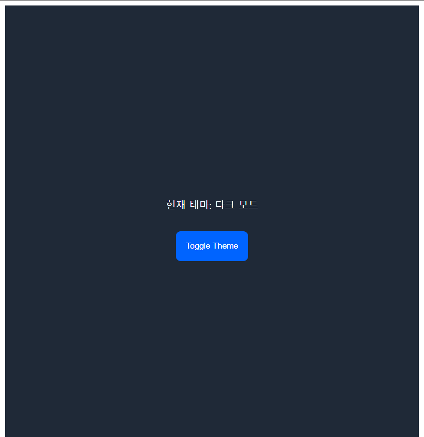
이 사진에서 볼 수 있듯, 바깥 테두리까지 완전히 색깔이 바뀌고 글씨체 또한 하나하나 적용할 필요없이 일괄적으로 적용하고 싶다.
그래서, 글로벌 스타일을 지정하여 모든 스타일 컴포넌트가 일관적인 스타일을 유지하도록 해준다.
// src/styles/GlobalStyles.tsx
import { Global, css, useTheme } from '@emotion/react';

const GlobalStyles = () => {
	const theme = useTheme();

	return (
		<Global
			styles={css`
				* {
					margin: 0;
					padding: 0;
					box-sizing: border-box;
					font-family: 'Pretendard', sans-serif;
				}
				body {
					background-color: ${theme.colors.background};
					color: ${theme.colors.text};
				}
				button {
					all: unset;
					font-family: 'Pretendard', sans-serif;
				}
				h1 {
					font-family: 'Pretendard', sans-serif;
					font-weight: 800;
				}
			`}
		/>
	);
};

export default GlobalStyles;
모든 태그에서 폰트를 지정받을 수 있도록 * 지정자에 이를 설정해주었다.
그래도 버튼 내부의 글씨 등 트리로 파생된 태그에는 폰트가 지정되지 않아 button태그에도 적용될 수 있도록 추가해주었다.
h1태그는 ExtraBold로 지정되도록 font-weight를 800으로 고정하였다.
Emotion에서 제공하는 useTheme은 앞에서 지정한 lightTheme, darkTheme을 생각하면 된다.
App.tsx 설정하기
이제 모든 준비가 끝났다.
App에서 설정한 테마를 불러와 ThemeProvider로 전달하고, 테마를 변경해줄 버튼을 추가하여 기능을 테스트할 수 있다.
다크모드, 라이트모드는 사이트를 나갔다 왔을때, 다시 라이트모드로 초기화 되는 등이 발생한다면 이는 사용자 경험에 좋지않다고 판단하였다.
그래서 localStorage에 사용자의 마지막 테마설정을 유지하여 사이트를 나갔다 오더라도 유지도되록 하였다.
import { ThemeProvider } from '@emotion/react';
import { lightTheme, darkTheme } from './styles/theme';
import { useState } from 'react';
import styled from '@emotion/styled';
import GlobalStyles from './styles/GlobalStyles';

const StyledDiv = styled.div`
	background-color: ${({ theme }) => theme.colors.background};
	color: ${({ theme }) => theme.colors.text};
	min-height: 100vh;
	display: flex;
	flex-direction: column;
	align-items: center;
	justify-content: center;
`;

const StyledButton = styled.button`
	background-color: ${({ theme }) => theme.colors.primary};
	color: ${({ theme }) => theme.colors.text};
	border: none;
	padding: ${({ theme }) => theme.spacing.md};
	border-radius: 8px;
	cursor: pointer;
	margin-top: ${({ theme }) => theme.spacing.md};

	&:hover {
		background-color: ${({ theme }) => theme.colors.secondary};
	}
`;

const App = () => {
	const [isDarkMode, setIsDarkMode] = useState(() => {
		const savedTheme = localStorage.getItem('theme');
		return savedTheme ? JSON.parse(savedTheme) : false;
	});

	const toggleTheme = () => {
		setIsDarkMode((prevMode: Boolean) => {
			const newMode = !prevMode;
			localStorage.setItem('theme', JSON.stringify(newMode));
			return newMode;
		});
	};

	return (
		<ThemeProvider theme={isDarkMode ? darkTheme : lightTheme}>
			<GlobalStyles />
			<StyledDiv>
				<h1>현재 테마: {isDarkMode ? '다크 모드' : '라이트 모드'}</h1>
				<StyledButton onClick={toggleTheme}>Toggle Theme</StyledButton>
			</StyledDiv>
		</ThemeProvider>
	);
};

export default App;
이제, html 부분의 하얀색 테두리와 h1, button태그의 폰트 및 폰트 굵기가 제대로 설정되었는지, 버튼을 눌렀을 때 테마 변경이 제대로 되는지, 나갔다 들어와도 다크모드가 유지되는지를 테스트해보면 된다.
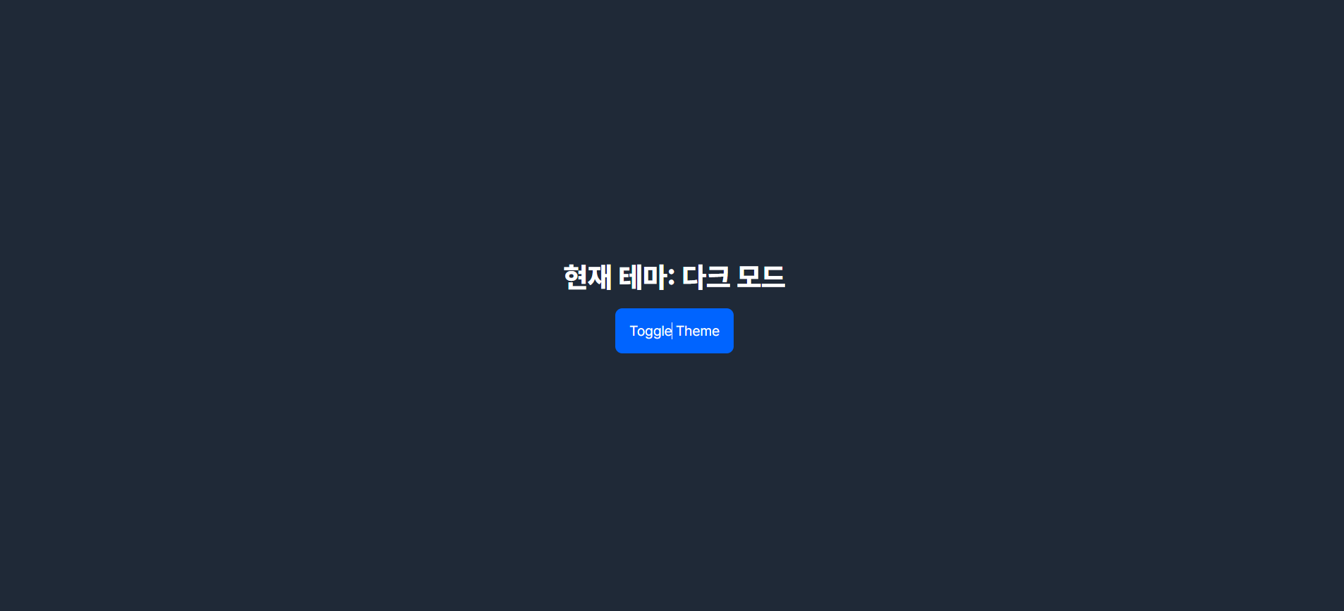
하얀색 테두리는 보이지 않고, 새로고침을 하여도 유지되는 것을 보아 정상적으로 코드를 구성하였다 !
다음 포스팅은 백엔드에서 API 명세서가 나와 이를 활용한 mock API 구현을 할 것 같다.
Summary
- 폰트설정
- theme.ts
- emotion.d.ts
- GlobalStyles.tsx
- App.tsx 버튼 및 새로고침시 테마 유지

마 잘햇네예