
- 일시 : 23.07.28 금요일
- 주제 : 통증관리 시스템 - 분류 3.포인티 디자인 시스템 라이브러리 개발
오늘의 목표
- 스프린트데이에 참여한다.
- Component 페이지에서 Banner를 컴포넌트화 한다.
진행 사항
✅: 완료, 🌀: 진행중, 🆕: 대기
✅ (개인) Component: NavigationBar 개발
- 팀원 리뷰 이후 merge완료
🌀 (개인) Component: Thumbnails 개발
- 팀원 리뷰에 답변 달기
🌀 (개인) Component: Banner 개발
코드 보기 (추후 수정 가능성 있음)
-
파일구조
- Components
- Banner
├─ index.tsx
├─ styles.ts
└─ type.ts
- Banner
- Components
-
index.tsx
import { BannersContainer, BoldText, NormalText, TextStyles } from './styles';
import { IBanners } from './type';

const Banners = ({ type = 'fill', boldText, normalText, src, $reverse = false, $manual = true }: IBanners) => {
  return (
    <BannersContainer type={type} $reverse={$reverse} $manual={$manual}>
      {(normalText || boldText) && (
        <TextStyles as={'div'}>
          <NormalText>{normalText}</NormalText>
          <BoldText>{boldText}</BoldText>
        </TextStyles>
      )}
      {/* 이미지와 텍스트 둘 다 없는 경우, 내용이 없다는 문구 출력 */}
      {src ? <img src={src}></img> : boldText ? null : normalText ? null : <div>내용이 없습니다</div>}
    </BannersContainer>
  );
};

export default Banners;- styles.ts
import styled from 'styled-components';
import { IBanners } from './type';
import { TypographyStyles } from '@lib/foundation';

export const BannersContainer = styled.div<IBanners>`
  display: flex;
  justify-content: space-around;
  align-items: center;
  flex-direction: ${({ $reverse }) => ($reverse ? 'row-reverse' : null)};

  width: 312px;
  height: 80px;

  // 색상 스타일
  color: ${({ type }) => (type === 'fill' ? 'var(--Text_Wh)' : '  var(--Text_900)')};
  background-color: ${({ type }) => (type === 'fill' ? 'var(--Pri_500)' : 'white')};
  // 보더 스타일
  border: 1px solid ${({ type }) => (type === 'outline' ? 'var(--Line_200)' : null)};
  border-radius: 10px;

  cursor: pointer;

  img {
    width: ${({ $manual }) => ($manual ? null : '100%')};
    height: ${({ $manual }) => ($manual ? null : '100%')};
  }
`;

export const TextStyles = styled(TypographyStyles.Caption1)`
  max-height: 80px;
`;

export const NormalText = styled.p<IBanners>`
  // 글자수 초과시
  white-space: normal;
  display: -webkit-box;
  -webkit-box-orient: vertical;
  -webkit-line-clamp: 2;
  overflow: hidden;
`;

export const BoldText = styled(NormalText)`
  font-weight: bold;

  margin-top: 2px;
`;- type.ts
export interface IBanners {
  type?: 'fill' | 'outline';
  normalText?: string;
  boldText?: string;
  src?: string;
  $manual?: boolean;
  $reverse?: boolean;
}
적용코드
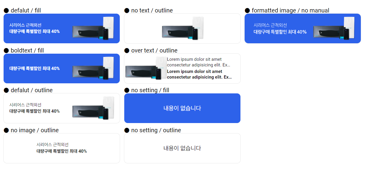
// defalut / fill
<Banners
normalText='시리어스 근적외선'
boldText='대량구매 특별할인 최대 40%'
src={`${URL}/uploads/images/Contents.svg`}
/>
// boldtext / fill
<Banners boldText='대량구매 특별할인 최대 40%' src={`${URL}/uploads/images/Contents.svg`} />
// defalut / outline
<Banners
type='outline'
normalText='시리어스 근적외선'
boldText='대량구매 특별할인 최대 40%'
src={`${URL}/uploads/images/Contents.svg`}
/>
// no image / outline
<Banners type='outline' normalText='시리어스 근적외선' boldText='대량구매 특별할인 최대 40%' />
// no text / outline
<Banners type='outline' src={`${URL}/uploads/images/Contents.svg`} />
// over text / outline
<Banners
type='outline'
normalText='Lorem ipsum dolor sit amet consectetur adipisicing elit. Ex numquam rerum earum nesciunt consequuntur recusandae magnam temporibus delectus quibusdam, consectetur unde. At eveniet suscipit modi, sapiente nulla corrupti maiores voluptatibus!'
boldText='Lorem ipsum dolor sit amet consectetur adipisicing elit. Ex numquam rerum earum nesciunt consequuntur recusandae magnam temporibus delectus quibusdam, consectetur unde. At eveniet suscipit modi, sapiente nulla corrupti maiores voluptatibus!
'
src={`${URL}/uploads/images/Contents.svg`}
$reverse={true}
/>
// no setting / fill
<Banners />
// no setting / outline
<Banners type='outline' />
// formatted image / no manual
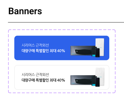
<Banners type='outline' src='./src/Fill.png' $manual={false} />적용화면
회고
어디서부터 어디까지 옵션을 줄까
주어진 디자인에서 배너는 한눈에 보기에도 아주 간단해 보였다. 주어진 옵션은 위 이미지가 전부였기 때문에 바로 작업을 하려고 했지만 막상 어떤 부분들을 props로 받을지 고민하다보니 한도 끝도 없었다. 배너의 특성상 어떤 기업/판매제품의 광고가 들어갈텐데 그렇다면 '그 광고주가 원하는 디자인이 있지 않을까?'라는 가정을 하게되었고 그러면 그쪽에 "저희 배너 크기는 312px*80px입니다" 라고만 전달하면 그 규격에 맞춰 원하는 디자인을 해서 이미지파일로 전달해주지 않을까 싶었다.
하지만 그렇게 되는 경우 그냥 받은 이미지를 넣기만 하면 되므로 굳이 컴포넌트화 시켜 다시 그 컴포넌트를 넣는 이중작업을 할 필요도 없게 된다. 마침 오늘(금요일)은 모든 프로젝트 인원이 모이는 "스프린트데이"어서 이 고민에 대해 담당 멘토님께 직접 여쭤볼 수 있었다.
멘토님은 원하는대로 (내가 생각한대로) 개발해도 된다고 하셔서 나는 주어진 디자인에 보이는 것과 같이 배치할 것이라고 기준으로 두고 개발을 했다. (좌 : 두꺼운텍스트, 일반텍스트, 우: 이미지, 레이아웃)
그러나 개발하다보니 컴포넌트 이용자에게 조금 더 많은 옵션을 주고싶어서 좌우 위치변경, 텍스트가 overflow 되는 경우, 이미지 혹은 텍스트가 없는 경우 등 선택지를 약간 확장시켜주었다. 또한 맨 처음에 생각한 것처럼 만약 배너 자체 이미지를 받는 경우도 생각하여 그 옵션도 추가하였다.
개발자로서 디자이너가 준 시안을 토대로 개발을 하다보면 딱 이거다 하는 명확한 답이 떨어지지 않을때가 있다고 한다. 따라서 원하는 방향을 명확히 하기 위해서는 디자이너와 소통이 필요하다는 생각이 들었다.
길잡이
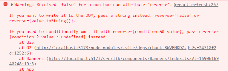
⚠️Warning: Received false for a non-boolean attribute reverse (Transient props)
좌우반전 옵션을 주기위해 type에 reverse : boolean; 을 추가하고 Banner 컴포넌트에 reverse:true 라는 prop를 전달하였더니 콘솔창에 이와 같은 오류 문구가 발생하였다.
-
오류원인
-
해결방법
(styled-components v5 이상)
If you want to prevent props meant to be consumed by styled components from being passed to the underlying React node or rendered to the DOM element, you can prefix the prop name with a dollar sign ($), turning it into a transient prop.
In this example, $draggable isn't rendered to the DOM like draggable is.
const Comp = styled.div`
  color: ${props =>
    props.$draggable || 'black'};
`;

render(
  <Comp $draggable="red" draggable="true">
    Drag me!
  </Comp>
);
참고 레퍼런스
- Stackoverflow
- styled-components 공식문서 - Transient props
- Warning Received
truefor non-boolean attribute :: 마이구미
CSS: 텍스트 말줄임('...')표시 설정
스타일은 자주 사용하지 않으면 까먹게 되는데 텍스트 말줄임 표시도 오랜만에 사용하면서 다시 레퍼런스를 찾아보아야 했다.
참고 레퍼런스
본 후기는 유데미-스나이퍼팩토리 10주 완성 프로젝트캠프 학습 일지 후기로 작성 되었습니다.