
컴포넌트 재사용을 위한 optional style
// Circle.tsx
import styled from "styled-components";

interface ContainerProps {
  bgColor: string;
  borderColor: string;
}
const Container = styled.div<ContainerProps>`
  width: 300px;
  height: 300px;
  border-radius: 150px;
  background-color: ${(props) => props.bgColor};
  border: 5px solid ${(props) => props.borderColor};
`; // must define this styled componnent will get two factors and let TS know those types

interface CircleColorProps {
  bgColor: string;
  borderColor?: string; //optional
}

function Circle({ bgColor, borderColor }: CircleColorProps) {
  return <Container bgColor={bgColor} borderColor={borderColor ?? bgColor} />; // if borderColor not exsists, borderColor = bgColor
}

export default Circle;
Circle 이라는 컴포넌트를 만들었다.
이 컴포넌트는 생성될 때 bgColor와 borderColor 두 가지 인자를 받는데 Container 라는 스타일 컴포넌트를 정의할 때는 배경색과 테두리 색에 들어갈 색상값(string)을 인자로 받는다는 것을 알려준다.
그리고 컴포넌트 생성 함수를 작동시킬 때 위 두 가지 인자중 하나를 optional 속성으로 만들어주고 borderColor에 디폴트 값을 설정해줬다.
import Circle from "./Circle";
function App() {
return (
<div>
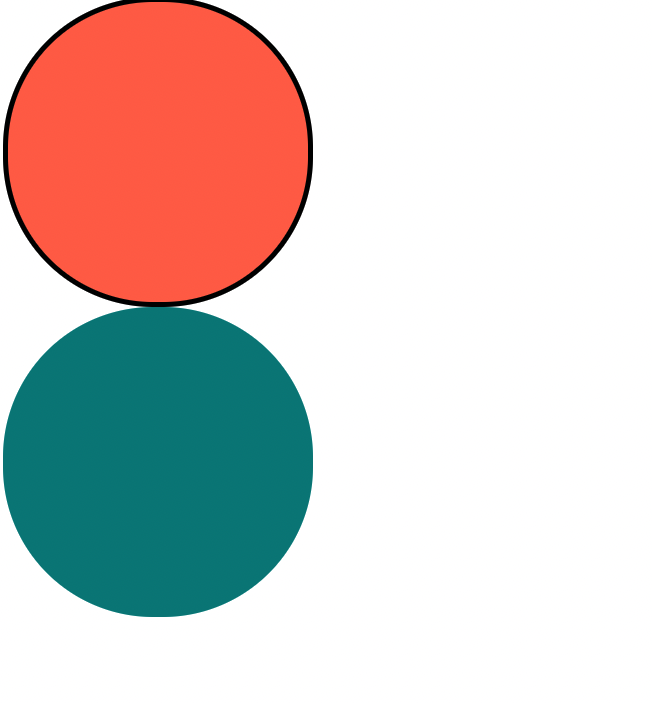
<Circle bgColor="tomato" borderColor="black" />
<Circle bgColor="teal" />
</div>
);
}
export default App;App.tsx에 Circle를 import 해서 위와같이 구현해주면 결과는 아래 사진과 같다.

T.T