Bootstrap 부트스트랩
개발자가 사용하기 쉽게 만든 반응형 웹 제작 프로그램
부트스트랩 탄생배경 (트위터)
- 서로 다른 인터페이스를 사용한 여러 개발자들의 공동작업
- 디지인 불일치, 관리 어려움, 방대한 코드량 → 일관성 유지 불가
- 문제점 개선을 위해 트위터의 개발자와 UI 디자이너가 개발
- 2011년 8월 깃허브 오픈, 2014년 6월 깃허브 첫 번째 프로젝트
부트스트랩은 트위터에서 사용하는 각종 레이아웃, 버튼, 입력창 등의 디자인을 CSS와 Javascript로 만들어 놓은 것이다. 웹 디자이너나 개발자 사이에서는 웹 디자인의 혁명이라고 불릴 정도로 폭발적인 반응을 얻는 프레임워크이다.
부트스트랩 정보 페이지
https://getbootstrap.com/
https://www.w3schools.com/bootstrap5/index.php
🐱🐉주로 사용하는 문법
container

고정폭 콘테이너, 최대폭 콘테이너(fluid) 활용하여 일단, 담기
Navigation
네비게이션 처럼 안내하는 다른 페이지로 가는 버튼
네비게이션 바는 .navbar를 .navbar-expand{-sm|-md|-lg|-xl|-xxl}로 감싸야 하며, color scheme클래스가 필요합니다.
Backgorund 배경 사진 넣기
#fabio {
background:url("fabio.jpg");
background-repeat: no-repeat;
background-size: cover;
background-position: center center;
width: 100%;
height: 1000px;
}

<div id="fabio"></div>
background-size: cover vs contain;
사진이 안들어가서 당황했는데, 그냥 폴더 위치 잘못이였고..
cover>
속성값을 cover로 설정하면 이미지의 비율은 유지하면서, 요소의 모든 영역을 가리도록 크기를 조절한다. 따라서 배경 이미지의 크기가 해당 요소의 크기보다 항상 크거나 같게 되며, 배경 이미지의 일부분이 잘릴 수도 있다.
-> 소속된 엘리먼트를 꽉 채우라는 뜻
contain>
속성값을 contain으로 설정하면 이미지의 비율은 유지하면서, 크기를 가능한 한 크게 조절한다. 단, 배경 이미지의 크기가 해당 요소의 내용(content) 영역을 넘지는 않는다. 따라서 배경 이미지의 크기가 해당 요소의 크기보다 항상 작거나 같게 되며, 배경 이미지가 요소의 일부분은 가리지 못할 수도 있다.
레이아웃 - 그리드 시스템

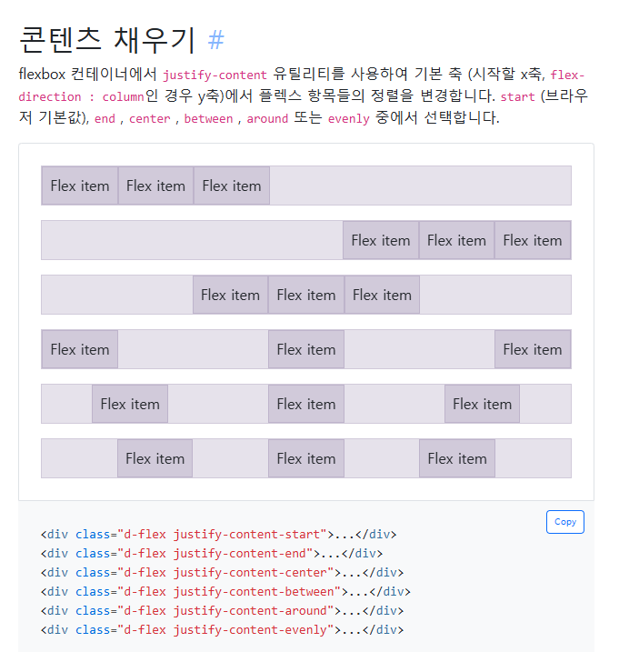
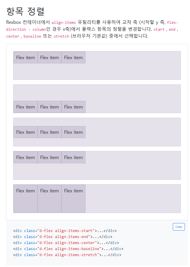
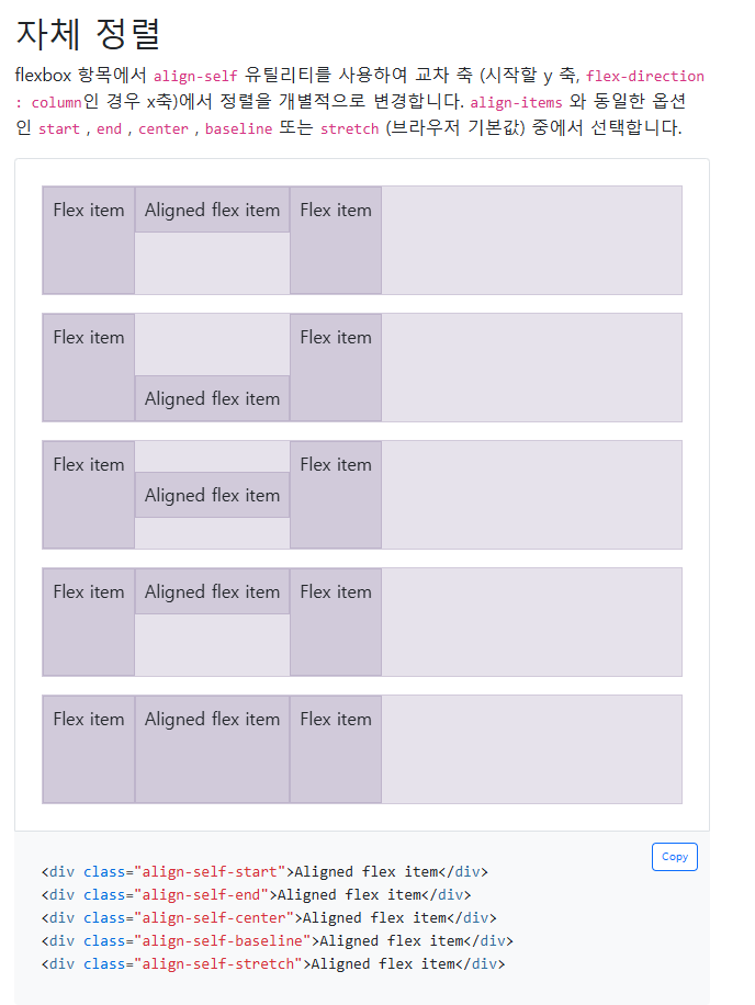
flexbox
반응형 flexbox 유틸리티 세트를 사용해 그리드 열, 네비게이션 바, 구성 요소, 레이아웃의 정렬 및 크기 조정을 신속하게 관리합니다.
등등 굉장히 많음
✒1. 디지털 명함을 완성하시오.
<!doctype html>
<html lang="en">
    <head>
    <meta charset="utf-8">
    <meta name="viewport" content="width=device-width, initial-scale=1">
    <title>Bootstrap demo</title>
    <link href="https://cdn.jsdelivr.net/npm/bootstrap@5.3.3/dist/css/bootstrap.min.css" rel="stylesheet" integrity="sha384-QWTKZyjpPEjISv5WaRU9OFeRpok6YctnYmDr5pNlyT2bRjXh0JMhjY6hW+ALEwIH" crossorigin="anonymous">
    <link rel="stylesheet" href="https://cdn.jsdelivr.net/npm/bootstrap-icons@1.7.1/font/bootstrap-icons.css">
    <style>
        body{
            background-image: url(bg-img.jpg);
            background-position: center;
            background-size: cover;
        }
    </style>
</head>
<body>
    <section class="container">
        <div class="d-flex vh-100 justify-content-center align-items-center">
            <div class="card mb-3 bg-light bg-opacity-75" style="max-width: 540px;">
                <div class="row g-0 p-2 justify-content-center align-items-center">
                    <div class="col-6 col-sm-4">
                        <img src="profile.jpg" alt="" class="img-fluid rounded-circle p-4">
                    </div>
                    <div class="col-sm-8">
                        <div class="card-body text-center text-sm-start">
                            <p class="mb-2">디지털 아티스트</p>
                            <h1 class="card-title">에릭 킴에밀리아</h1>
                            <p class="card-text">This is a wider card with supporting text below as a natural lead-in to additional content. This content is a little bit longer.</p>

                            <a href="#" class="btn btn-dark rounded-pill">
                                <i class="bi bi-house"></i>
                            </a>
                            <a href="#" class="btn btn-danger rounded-pill">
                                <i class="bi bi-youtube"></i>
                            </a>
                            <a href="#" class="btn btn-primary rounded-pill">
                                <i class="bi bi-facebook"></i>
                            </a>
                            <a href="#" class="btn btn-warning rounded-pill">
                                <i class="bi bi-instagram"></i>
                            </a>
                        </div>
                    </div>
                </div>
            </div>
        </div>
    </section>
    <script src="https://cdn.jsdelivr.net/npm/bootstrap@5.3.3/dist/js/bootstrap.bundle.min.js" integrity="sha384-YvpcrYf0tY3lHB60NNkmXc5s9fDVZLESaAA55NDzOxhy9GkcIdslK1eN7N6jIeHz" crossorigin="anonymous"></script>
</body>
</html>
🎈2. 요안도라를 부트스트랩 기반으로 만들어 보시오.
<!doctype html>
<html lang="en">
    <head>
        <meta charset="utf-8">
        <meta name="viewport" content="width=device-width, initial-scale=1">
        <title>Bootstrap demo</title>
        <link href="https://cdn.jsdelivr.net/npm/bootstrap@5.3.3/dist/css/bootstrap.min.css" rel="stylesheet" integrity="sha384-QWTKZyjpPEjISv5WaRU9OFeRpok6YctnYmDr5pNlyT2bRjXh0JMhjY6hW+ALEwIH" crossorigin="anonymous">
        <style>
            header{
                background-image: url('bg.png');
                height: 25%;
                background-position: center;
                background-size: cover;
            }

            nav a{
                color: #ffffff;
                text-decoration: none;
            }

        </style>
    </head>
    <body >
        <section class="container" style="height: 1080px;">
            <header class="d-flex flex-column align-items-end justify-content-end">
                <h1 class="fs-1 me-2 mb-3 fw-bold" style="color: #ffc; text-shadow: 1px 2px 2px #000;">Joandora</h1>
                <h2 class="fs-3 me-2 mb-5 fw-bold" style="color: yellow;">가장 제주다운 수산리집</h2>
            </header>

            <nav class="d-flex align-items-center" style="height: 60px; background-color: #271717;">
                <a href="#" class="mx-5">이용 안내</a>
                <a href="#" class="mx-5">객실 소개</a>
                <a href="#" class="mx-5">예약 방법</a>
                <a href="#" class="mx-5">예약 하기</a>
            </nav>

            <main class="d-flex border justify-content-center">
                <div class="row" style="width: 100%;">
                    <div class="col-md-9">
                        <h3>요안도라 소개</h3>
                        <p>¤ 요안도라는 게스트 하우스(Guest House) 형식의 농어촌 민박입니다</p>
                        <p>성산의 날씨는 다음주 내내 높은 구름에 햇살 가득이라고 합니다. 목요일이면 섭씨 27도까지 오른다고 하지만, 늘 부는 바람이 쾌적한 균형을 잡아 마당에 마당에 나가 앉아 있는 시간이 많아질듯 합니다.
                        <p>오늘은 사진에 보이는 긴 돌담을 따라 들어오는 요안도레 올레 입구에 특곤색의 대문을 달았습니다.</p>
                        <p>내일은 두달 여동안 밖거리에 만든 데스트 하우스에 연백색의 황토 페인트를 칠할 예정입니다. </p>
                        <p>그리고 이것저것 사소한 저이를 마치고 나면, 나이 드시고 젊고 한 미지의 새식구들을 설렘으로 만나고 함께하고, 도시의 바븐 생활로 소원해진 오래된 친구와의 우정을 이 제주에서 새롭게 열어나가기 위해 요안도라를 세상에 알리려고 합니다.</p>

                        <img src="banner2.png" alt="" class="img-fluid" style="width: 100%;">
                    </div>
                    <aside class="col-md-3 bg-success bg-opacity-25 ">
                        <div class="d-flex flex-column justify-content-center">
                            <p style="font-weight: bold;">¤ 알립니다</p>
                            <p style="font-size: 0.9em;">게스트하우스 예약은 전화 070-###-#### 로 직접 통화하시는게 가장 정확하고 빠릅니다. 인터넷 전화이므로 시외 전화 요금이 부과되지 않습니다</p>

                            <img src="joandora3.jpg" alt="" class="img-fluid my-2">
                            <img src="joandora1.jpg" alt="" class="img-fluid my-2">
                            <img src="joandora2.jpg" alt="" class="img-fluid my-2">
                        </div>
                    </aside>
                </div>
            </main>

            <footer class="d-flex flex-column  bg-success py-3">
                <p class="text-center my-1" style="color: #ffffff;"><i>제주특별자치도 남제주군 성산읍 수산리 000 번지 요안도라</i></p>
                <p class="text-center my-1" style="color: #ffffff;"><i>yoan##@naver.com</i></p>
                <p class="text-center my-1" style="color: #ffffff;">Copyright ©. All rights reserved.</p>
            </footer>
        </section>
        <script src="https://cdn.jsdelivr.net/npm/bootstrap@5.3.3/dist/js/bootstrap.bundle.min.js" integrity="sha384-YvpcrYf0tY3lHB60NNkmXc5s9fDVZLESaAA55NDzOxhy9GkcIdslK1eN7N6jIeHz" crossorigin="anonymous"></script>
    </body>
</html>
3줄 요약:
- 부트스트랩 화면 기본 레이 아웃순서는 container -> row -> col 이다
- 부트스트랩은 12개로 나눈 그리드 시스템이다.
- 부트스트랩내에서 디폴트로 적용 되는 속성들은 언제든지 style로 직접 변경 가능하다.