1. Gear 아이콘(설정 아이콘) 회전시키기
'설정' 아이콘인 gear 위에 마우스를 올려 놓았을 때 회전하는 코드를 짜보려고 합니다.
gear 아이콘이 회전하는 것에 집중해 주세요.
☑️Code
@keyframes rotateCog { /*애니메이션 이름*/
    from {
        transform: none;
    }
    to {
        transform: rotateZ(360deg); /*Z축으로 회전*/
    }
}

.screen-header__icons .fa-gear:hover { /*마우스를 올려 놓았을 때*/
    animation: rotateCog 1s linear infinite;
}
☑️transition-timing-function
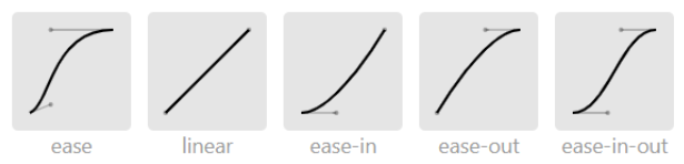
- ease: 천천-빠름-천천
- linear: 등속
- ease-in: 천천-보통
- ease-out: 보통-천천
- ease-in-out: 천천-보통-천천
- cubic-besier: 커스텀
- steps: 뚝뚝 끊어 보여준다.
2. 하트 아이콘을 심장 박동처럼 뛰게 만들기
마우스를 올려 놓았을 때 하트의 움직임에 집중해주세요.
@keyframes heartBeat {
    0%{
        color: white; /*처음엔 흰색이었다가*/
        transform: none;
    }
    50%{
        color: red; /*그다음엔 빨간색으로*/
        transform: scale(1.5); /*하트 크게 만들기*/
    }
    100%{
        color: white; /*다시 원래대로 흰색으로*/
        transform: none;
    }
}

.open-post__heart-count:hover i { /*hover: 마우스를 올리면 애니메이션 작동*/
    will-change: transform;
    animation: heartBeat 1s linear infinite;
}
☑️아래 두 코드의 차이점
.open-post__heart-count:hover i.open-post__heart-count i:hover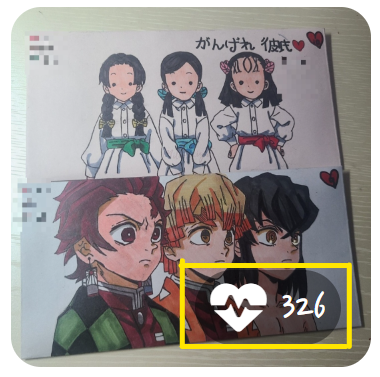
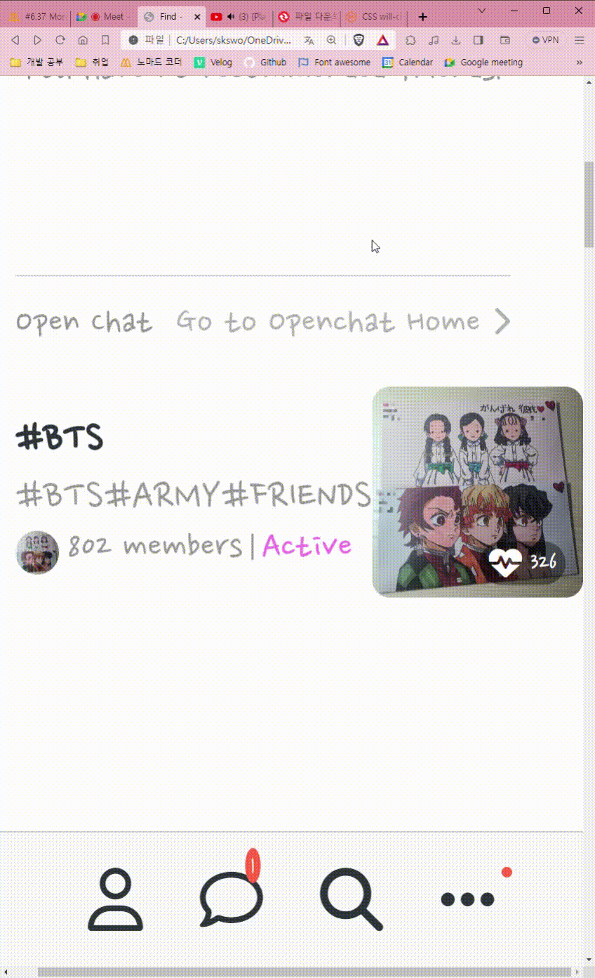
노란색 테두리 안에 있는 검정색 div의 class 명은 open-post__heart-count이다.
첫번째 코드는 이 검정색 div 위에 마우스를 올려 놓았을 때 i(하트)에 애니메이션이 적용된다는 뜻이고,
두번째 코드는 i(하트) 자체 위에 마우스를 올려 놓아야만 비로소 i(하트)에 애니메이션이 적용된다는 뜻이다.
3. CSS will-change
☑️What is 'will-change'?
will-change는 브라우저에게 어떤 것이 변할 것인지(변할 것은 transformation) 미리 예고해 줌으로써 브라우저가 그래픽 카드를 이용해서 애니메이션을 가속화 시킨다. 결과적으로 애니메이션이 좀 더 부드럽게 동작할 수 있도록 해준다.
☑️CSS transform이나 animation의 떨림 문제
CSS transform이나 animation 같은 프로퍼티를 사용할 때 발생하는 깜빡이는 현상을 발생하는 경우가 있다.
<will-change 속성을 적용하지 않은 상태⬇️>
<will-change 속성을 적용한 상태⬇️>
will-change를 적용하지 않은 하트는 transform의 scale이 작은 경우 '미세한 떨림'이 있다. 반면 will-change를 적용한 하트는 어떨까? 떨림 없이 부드럽게 하트가 박동한다.

개발은 즐거워🪇