사용자가 desktop 혹은 laptop 이나 ipad 같은 큰 화면이 아닌, 모바일 폰으로만 내가 만든 웹사이트에 들어오게 하고 싶다면 Mobile Media Query를 사용하면 된다.
일단 모든 html 파일에 다음 코드를 작성한다. 사용자의 화면이 큰 경우, 사용자에게 보여줄 메세지다.
<div id="no-mobile">
	<span>Your Screen is too big😥</span>
</div>
<no-mobile.css>
/* <Chat에서 스크롤 때문에 제대로 가려지지 않는 문제 해결>
- position:fixed 설정
- body에 스크롤 불가 설정 */

#no-mobile {
    display: none;
}

@media screen and (min-width: 400px) {
    #no-mobile {

        position: fixed;
        z-index: 99;
        width: 100vw;
        height: 100vh;
        background-color: var(--yellow);
        top: 0;
        display: flex;
        justify-content: center;
        align-items: center;
        font-size: 32px;
        font-weight: 600;
    }
}

/* 스크롤 불가 설정 */
body {
    margin: 0;
    height: 100%;
    overflow: hidden;
}
일단 사용자 화면에서 Your Screen is too big😥을 안보이게 기본으로 설정 해 주고(#no-mobile {display: none;}), 사용자 화면이 100px보다 크다면 {} 내부의 코드들을 실행한다.
주의할 점은 (min-width: 100px) {}는 반대로 읽어야 한다. ➡️ 만약 100px 보다 크다면 {}를 실행한다.
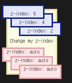
z-index (복습)
z-index의 value가 높을 수록 화면의 가장 맨 위에 위치한다.
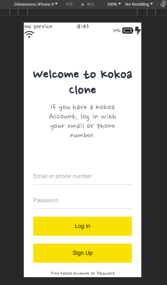
mobile에서 보여지는 화면
사용 device: iphone X
가로 x 세로 = 375 x 812
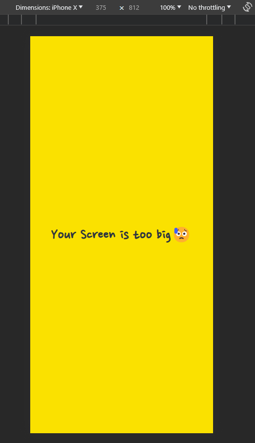
min-width: 400px 일 때 스크린은 안정적으로 보여진다.
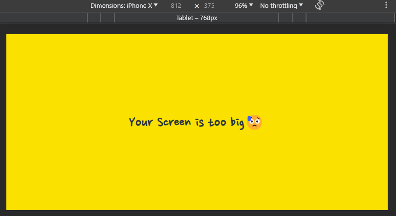
min-width을 스크린 가로 비율 보다 작게 하면 어떻게 될까? 스크린의 가로 길이인 375px보다 1px 작게 min-width: 374px로 설정 해 보자.
#no-mobile {
    display: none;
}

@media screen and (min-width: 374px) {
    #no-mobile {

        position: fixed;
        z-index: 99;
        width: 100vw;
        height: 100vh;
        background-color: var(--yellow);
        top: 0;
        display: flex;
        justify-content: center;
        align-items: center;
        font-size: 32px;
        font-weight: 600;
    }
}

/* 스크롤 불가 설정 */
body {
    margin: 0;
    height: 100%;
    overflow: hidden;
}
가로 모드에서도 마찬가지로 적용이 안된다.

개발은 즐거워🪇