- TodoApp개발일지 github : https://github.com/eugene028/TodoApp_Study_React.git
(이번 버전은 TodoApp 폴더이다.)
참고로 이번 todoApp은 tailwind를 이용한 Css로 두번째 폴더와는 다르다.
인프런의 존 안님의 리액트 A to Z 강의를 참고하였다.
Drag And Drop을 TodoApp에 넣어보자!
Drag And Drop 기능을 구현하는 것은 굉장히 어려운 과정일 것이라고 생각하였는데
이번에 강의를 들으면서 나도 구현해볼 수 있겠다 싶어서 한번 구현해보고자 한다.
Drag And Drop은 아래 문서를 참조하면 된다.
https://developer.mozilla.org/ko/docs/Web/API/HTML_Drag_and_Drop_API
기본적으로 Drag and Drop을 만들 때 고려해야 할 점 세가지를 적어보도록 하겠다.
1. 어떤 것이 draggable인지 확인하고, 설정해야 한다.
2. 사용자가 드래그를 할 때 적절한 애니메이션을 주어서 드래그를 하고 있다는 것을 인식하게 해 준다.
3. 사용자가 드래그를 멈추었는지 확인 가능하도록 세팅한다. -> 애니메이션으로 세팅
4. 클라이언트가 Drag And Drop을 이용하여 위치를 재정렬하였을 때, 새 항목으로 state를 깔끔하게 update 해주어야 한다.
위 네가지를 순서대로 구현하기 위해서 사전적으로 해야 할 작업을 미리미리 하고 진행하도록 해보자.
모듈 react-beautiful-dnd 설치
npm install react-beautiful-dnd --save
위의 명령어를 입력하여 해당 모듈을 설치해준다.
해당 모듈에 대한 자세한 설명은 아래 링크를 참고한다면 확인할 수 있다.
https://www.npmjs.com/package/react-beautiful-dnd
이제 위의 모듈을 이용할 것이므로 모듈을 import하여 정리할 수 있다.
하나하나의 기능을 먼저 살펴보자.
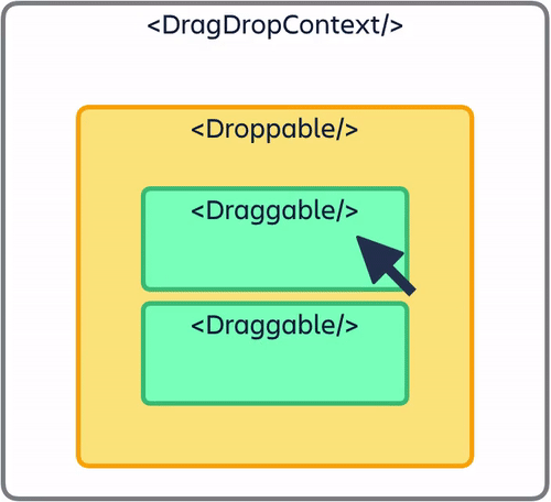
- DragDropContext : drag and Drop 기능을 사용할 부분을 감싸주는 역할을 합니다.
- Droppable : 드랍하여 집어넣을 수 있는 부분을 설정하여 줍니다.
- Draggable : 드래그를 할 수 있는 영역을 설정합니다.
세가지 application에 적용할 수 있도록 List 컴포넌트를 건드려 보자.
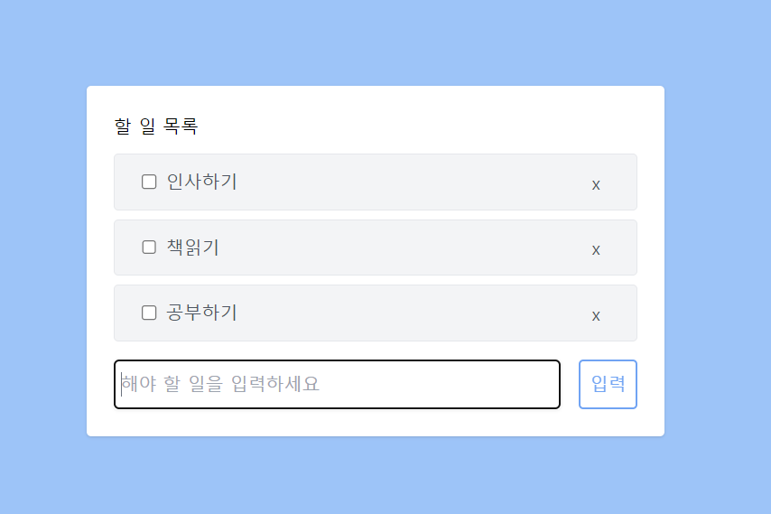
기존 List component에 Drag And Drop 컴포넌트로 만들기
return (
        <div>
          <DragDropContext>
            <Droppable>
                {todo.map((data) => (
                  <Draggable>
                    <div key = {data.id}>
                        <div className='flex items-center justify-between w-full px-4 py-1 my-2 text-gray-600 bg-gray-100 border rounded row'>
                            <div className = "items-center">
                                <input
                                className = 'm-2'
                                type ="checkbox"
                                onChange={() => handleCompleChange(data.id)}
                                defaultChecked={false}/>
                                <span className={data.completed ? 'line-through' : undefined } >{data.title}</span>
                            </div>
                            <div className = "items-center">
                                <button className = "px-4 py-2 float-right" onClick={()=>handleClick(data.id)}>x</button>
                            </div>
                        </div>
                    </div>
                </Draggable>))}
              </Droppable>
          </DragDropContext>
        </div>
이렇게 기존에 만들었던 Todo App의 List에 Drag and Drop 컴포넌트를 넣어주면 된다. 일단 여기까지는 기본 세팅이고, 아직 더 해야 하는 부분들이 조금 남아 있다. 바로 어떤 요소를 Drag And Drop을 해주는지에 대해서 세팅을 해 주어야 한다.
여기서부터는 공식 문서의 힘을 조금 빌려보자.
<DragDropContext>
            <Droppable droppableId='todo'>
                {(provided) => (
                  <div {...provided.droppableProps} ref = {provided.innerRef}>
                    {todo.map((data, index) => (
                      <Draggable
                        key = {data.id}
                        draggableId={data.id.toString()}
                        index = {index}
                        >
                        {(provided, snapshot) => (
                        <div key = {data.id} {...provided.draggableProps} ref = {provided.innerRef} {...provided.dragHandleProps}>
                            <div className='flex items-center justify-between w-full px-4 py-1 my-2 text-gray-600 bg-gray-100 border rounded row'>
                                <div className = "items-center">
                                    <input
                                    className = 'm-2'
                                    type ="checkbox"
                                    onChange={() => handleCompleChange(data.id)}
                                    defaultChecked={false}/>
                                    <span className={data.completed ? 'line-through' : undefined } >
                                      {data.title}
                                    </span>
                                </div>
                                <div className = "items-center">
                                    <button className = "px-4 py-2 float-right"
                                    onClick={()=>handleClick(data.id)}
                                    >
                                      x
                                    </button>
                                </div>
                            </div>
                        </div>
                        )}
                        {provided.placeholder}
                    </Draggable>
                    ))}
                  </div>
                )}
              </Droppable>
          </DragDropContext>
처음에 공부할 때 provided가 뭐지?라는 생각이 들었는데, 공식문서를 보고 하나하나 정리해 보려고 하다 보니까 금방 정리할 수 있었던 것 같다.
Droppable 컴포넌트
해당 컴포넌트는 Draggable 컴포넌트에 의해서 드래그 앤 드롭을 당할 수 있는 친구이다. 그래서 드래그를 해서 끌어온 녀석들을 이 위에 얹어놓을 수 있는 것이다.
- Droppable 컴포넌트의 props
droppableId: 드래그 앤 드롭이 되는 친구가 누구인지 알아보기 위해서는 꼭 있어야 하는 식별자이며, string 형식으로 되어야 한다. 여기서는 다양한 props는 공식 github를 통하여 알 수 있지만 이번 Todo App 프로젝트에는 이것밖에 안쓰였으니까 요걸 사용해보자.
- Children Function
Droppable컴포넌트의 자식 요소로 오는 React 요소들은ReactElement를 반환하는 함수 형식이어야 합니다. 그러므로 함수를 작성해 봅시다.
여기서 잠깐.. ReactElement와 React Component를 같게 생각하면 오산이다.
https://ui.dev/react-elements-vs-react-components
해당 글에 잘 정리되어 있으니까 한번 확인해보고 나중에 시간이 된다면 꼭 포스팅을 할 예정이다.
무튼 아래 코드를 참고해보자.
<Droppable droppableId="droppable-1">
  {(provided, snapshot) => ({
    /*...*/
  })}
</Droppable>
자세히 보니까 함수가 두개의 arugment를 가지고 있다. 정리해보자.
1. Provided : (DroppableProvided)
type DroppableProvided = {|
  innerRef: (?HTMLElement) => void,
  droppableProps: DroppableProps,
  placeholder: ?Node,
|};
이렇게 argument들이 존재할 수 있는데, 각자의 argument들이 어떤 역할을 하는지 알아보자.
provided.innerRef: droppable 함수가 제대로 작동하기 위해서는,provided.innerRef를 ReactElement에서 가장 상위 DOM 노드에 바인딩을 해줘야 할 필요가 있다. 이렇게 하면 DOM 노드를 조회하기 위해서 ReactDom을 이용할 필요가 없다.provided.placeholder: Droppable을 그대로 이용하면 되게 모양이 안예쁜데, 그 예시를 아래에서 볼 수 있다.
그냥 얘네를 옮기면 모양이 되게 찌그러지게 나타나서 빈칸을 무조건 하나 남겨놓아야 한다. 그래서 드래그를 하는 동안에Droppable컴포넌트를 위한 빈 공간을 하나 만들어 주는 것이다. 내부에 표시자를 두어서 모양이 안예쁘게 찌그러지는 것을 방지할 수 있다.provided.droppableProps (DroppableProps):Droppable요소에 적용해야 하는 속성을 포함하는 객체라고 해석할 수 있다.provivded.innerRef에 내가 적용한 요소인 DOM과 같은 속성을 적용해야 하며, 이를 통하여 스타일링이나, DOM의 내용을 찾아가는 속성 또한 포함되어 있는 것이다. 주로 쓰는 형식은 아래와 같다고~
<Droppable droppableId="droppable-1">
  {(provided, snapshot) => (
    <div ref={provided.innerRef} {...provided.droppableProps}>
      Good to go
      {provided.placeholder}
    </div>
  )}
</Droppable>
2. SnapShot : (DroppableStateSnapShot)
type DroppableStateSnapshot = {|
  // Is the Droppable being dragged over?
  isDraggingOver: boolean,
  // What is the id of the draggable that is dragging over the Droppable?
  draggingOverWith: ?DraggableId,
  // What is the id of the draggable that is dragging from this list?
  // Useful for styling the home list when not being dragged over
  draggingFromThisWith: ?DraggableId,
  // Whether or not the placeholder is actively being used.
  // This is useful information when working with virtual lists
  // (See our virtual list pattern)
  isUsingPlaceholder: boolean,
|};
snapshot의 속성으로 쓰일 수 있는 친구들은 다음과 같으며, children 함수는 현재 drag 되고 있는 상태를 관리할 수 있는 툴로 알아두면 될 거 같다. ㅎㅎ Drag and drop의 요소의 기능을 향상시키는 데 쓰이는 것이라고 이해하면 될 듯 하다~ 좀 더 예쁘게 꾸미고 싶다면 이 친구를 알아두자.
Draggable 컴포넌트
Draggable 컴포넌트는 Droppable에 내가 얹을 수 있는 직접적인 요소이다. 이 친구는 그래서 항상 Droppable 친구와 짝꿍이며 같이 다녀야 한다. 정말 신기한 것은 Draggable 컴포넌트를 원래 자기 자리인 Droppable home에 두지 않고 다른 Droppable 자리에 던져 놓을 수 있다. (자유로운 영혼이라서 뭐라든 다 가능하다는 ..그런)
import { Draggable } from 'react-beautiful-dnd';

<Draggable draggableId="draggable-1" index={0}>
  {(provided, snapshot) => (
    <div
      ref={provided.innerRef}
      {...provided.draggableProps}
      {...provided.dragHandleProps}
    >
      <h4>My draggable</h4>
    </div>
  )}
</Draggable>;
이렇게 코드를 작성하여 사용할 수 있다.
- Draggable Props
import type { Node } from 'react';

type Props = {|
  // required
  draggableId: DraggableId,
  index: number,
  children: DraggableChildrenFn,
  // optional
  isDragDisabled: ?boolean,
  disableInteractiveElementBlocking: ?boolean,
  shouldRespectForcePress: ?boolean,
|};
얘네는 필수로 요청하는 props가 있는데 이거 안적어 넣으면 react-beautiful-npm이 오류를 반환한다! 주의!
- (required)draggableId : 식별자이며, 이것은 String 형식으로 제공되어야 한다.
- (required) index : Droppable안의 Draggable 순서를 매칭시키기 위한 숫자로 꼭 필요하다. 그냥 단순하게 생각해서 Draggable의 list index라고 생각하면 마음 편하다. index는 Droppable 안에서 유니크해야 하며, [1, 2, 8] 요딴거 절대 안됨! 그리고 인덱스는 무조건 0부터 시작하지 않아도 됩니다. (만약 틀린게 있다면 콘솔창에서 안내를 해주니까 마음 편하게 먹자.) 위의 소스코드처럼 주로 map을 이용하게 된다.
{
  this.props.items.map((item, index) => (
    <Draggable draggableId={item.id} index={index}>
      {(provided, snapshot) => (
        <div
          ref={provided.innerRef}
          {...provided.draggableProps}
          {...provided.dragHandleProps}
        >
          {item.content}
        </div>
      )}
    </Draggable>
  ));
}- Children funtion
Draggable의 React 자식 요소는 ReactNode를 반환하는 함수여야 합니다!
<Draggable draggableId="draggable-1" index={0}>
  {(provided, snapshot) => (
    <div
      ref={provided.innerRef}
      {...provided.draggableProps}
      {...provided.dragHandleProps}
    >
      Drag me!
    </div>
  )}
</Draggable>
이런 식으로 생겨먹어야 한다~
type DraggableChildrenFn = (
  DraggableProvided,
  DraggableStateSnapshot,
  DraggableRubric,
) => Node;
그리고 이렇게 type을 지정할 수 있는데 어떤 역할을 하는지 하나하나 보도록 하자.
1. provided: (DraggableProvided)
type DraggableProvided = {|
  innerRef: (HTMLElement) => void,
  draggableProps: DraggableProps,
  // will be null if the draggable is disabled
  dragHandleProps: ?DragHandleProps,
|};
Draggable 함수가 잘 작동하기 위해서는 provided object가 잘 적용되어 있어야 한다.
provided.innerRef: Draggable 함수가 잘 작동하기 위해서는 내가 Draggable 노드라고 생각하길 원하는 ReactElement에 innerRef 함수를 바인딩 해야한다.provided.draggableProps (DraggableProps): 데이터의 속성과 인라인 스타일을 지정할 수 있는 객체이다. 이 객체는innerRef를 적용하는 노드와 동일하게 적용해야 한다. 그래야지 드래그의 이동을 제어할 수 있다!!!
style에 언제든지 원하는 스타일 추가할 수 있다구~key: 키는 Draggable의 list를 지정해주는 친구이다. 각각 Draggable 요소에 당연히 key 요소를 부여해야겠지~ list에서 유니크하게 존재해야 하고 index를 포함하고 있으면 안돼!
<Draggable draggableId="draggable-1" index={0}>
  {(provided, snapshot) => (
    <div ref={provided.innerRef} {...provided.draggableProps}>
      Drag me!
    </div>
  )}
</Draggable>

// Note: this will not work directly as we are not applying dragHandleProps
이런 식으로 코드를 지정해서 쓸 수 있다는 점 알아둡세다~
2. SnapShot : (DraggableStateSnapShot)
이 친구도 마찬가지로 SnapShot을 지정할 수 있다. 드래그 상태와 관련된 적은 상태를 내가 직접 관리할 수 있는데, 드래그를 진행하는 동안 Draggable의 모양을 변경할 수 있다. 스타일을 추가할수도 있으니까 참고로 알아두도록 하자!
type DraggableStateSnapshot = {|
  // Set to true if a Draggable is being actively dragged, or if it is drop animating
  // Both active dragging and the drop animation are considered part of the drag
  // *Generally this is the only property you will be using*
  isDragging: boolean,
  // Set to true if a Draggable is drop animating. Not every drag and drop interaction
  // as a drop animation. There is no drop animation when a Draggable is already in its final
  // position when dropped. This is commonly the case when dragging with a keyboard
  isDropAnimating: boolean,
  // Information about a drop animation
  dropAnimation: ?DropAnimation
  // What Droppable (if any) the Draggable is currently over
  draggingOver: ?DroppableId,
  // the id of a draggable that you are combining with
  combineWith: ?DraggableId,
  // if something else is dragging and you are a combine target, then this is the id of the item that is dragging
  combineTargetFor: ?DraggableId,
  // There are two modes that a drag can be in
  // 'FLUID': everything is done in response to highly granular input (eg mouse)
  // 'SNAP': items snap between positions (eg keyboard);
  mode: ?MovementMode,
|};
이렇게 해가지고, 내가 TodoApp에 사용하였던 Drag And Drop에 대한 기본적인 내용들을 정리해보았다. 이제 TodoApp 을 마무리지어보도록 하자!
Drag 하는 요소에 style 적용해보자.
<Draggable
key = {data.id}
draggableId={data.id.toString()}
index = {index}
>
{(provided, snapshot) => (
<div key = {data.id} {...provided.draggableProps} ref = {provided.innerRef} {...provided.dragHandleProps}>
<div className={`${snapshot.isDragging ? "bg-gray-400" : "bg-gray-100"} flex items-center
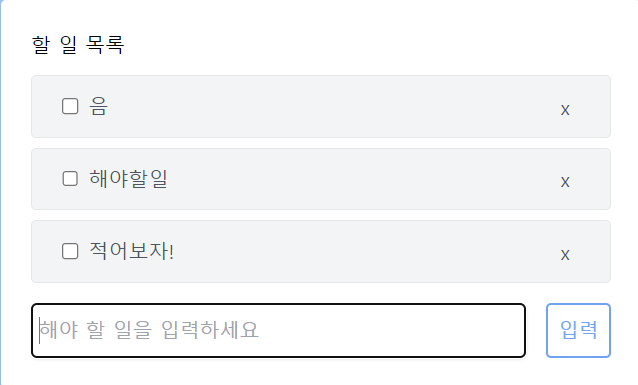
justify-between w-full px-4 py-1 my-2 text-gray-600 bg-gray-100 border rounded row`}>타란~ SnapShot을 이용하여 드래깅하는 중간에 색이 바뀌는 걸 직접 해보았다. 예쁘다~~!!
tailwind를 사용하니 이렇게 동적으로 UI를 구성할 수 있게 되었다. 바로바로 바뀌는 거 볼수도 있고 좋다. 근데 단점은 코드가 길고 복잡해진다는 거?
Dragging 한 이후 데이터의 순서를 정렬해보자.
아직까지 드래그 앤 드롭도 잘 되고, 색도 예쁘게 잘 바뀌는데, 내가 실제로 바꾼 순서가 그대로 적용되지는 않는다. 이러한 현상을 고쳐보도록 하자.
<DragDropContext onDragEnd={handleEnd}>가장 상위 컴포넌트에 드래그가 끝났을 때의 함수를 정의하기 위해서 handleEnd함수를 만들어 주었는데, handleEnd함수에는 무엇이 찍히는지 한번 보도록 하자.
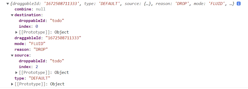
result 결과로 이렇게 찍히는데
목적지와 이 친구의 원래 출신이 나온다. 원래 2번 인덱스였던 친구였는데, 0번 인덱스로 가고 싶었던 거구만?! 이러한 변경사항을 잘 반영할 수 있게끔 함수를 만들어 주어야 하고, 만약 엉뚱한 곳에 Drag And Drop을 하는 경우를 방지하기 위해서 아래 코드도 추가해 두어야지.ㅎㅎ
    const handleEnd = (result) => {
        console.log(result);

        if(!result.destination) return;
      }
이렇게 추가해 두었다~ 이제 마저 handleEnd 함수를 완성해 보도록 하자!
const handleEnd = (result) => {
        console.log(result);

        if(!result.destination) return;
        const newTodoData = todo;

        const [reorderedItem] = newTodoData.splice(result.source.index, 1);
        newTodoData.splice(result.destination.index, 0 , reorderedItem);
        setTodo(newTodoData);
}splice함수를 이용하여 구현을 하게 되는데 참고할 수 있는 공식 문서는 아래 링크를 보도록 하자.
https://developer.mozilla.org/ko/docs/Web/JavaScript/Reference/Global_Objects/Array/splice
코드만 보면 이해가 잘 되지 않으니까 내가 사용한 splice 문법만 간단하게 정리해두려고 한다.
newTodoData.splice(result.source.index,1) : 현재 원천지가 되는 곳의 인덱스 한개만 제거한다. 즉, 기존 요소를 먼저 제거한다는 것이다. 제거한 데이터를 reorderedItem에 저장한다.
그리고 제거한 데이터를 destination.index 즉 목적지에 저장한다. 그리고 setTodo를 통하여 TodoData 최종 세팅한다.
이렇게 해서 Drag And Drop이 잘 수행되는 TodoApp을 만들 수 있었다!