
항상 웹 컴포넌트에 대한 ui를 구성하는 것은 styled-component를 이용하였다. 이번에는 emotion을 사용하게 되면서 커비샵에서 이용하게 될 UI들을 세팅한 과정에 대하여 기록해보고자 한다.
1. emotion이란?
emotion은 styled-component와 마찬가지로 Javascript 환경에서 css를 이용할 수 있게 해주는 라이브러리이다.
사실 emotion와 styled component는 서로 비슷한 문법을 제공하고 있기 때문에 크게 어렵지는 않다.
emotion을 사용하기 위해서는 아래 패키지를 설치해야 한다.
yarn add @emotion/react아래는 emotion 관련 공식 문서이다.
https://emotion.sh/docs/introduction
최근 emotion을 사용하는 이유는?
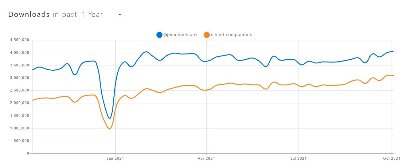
최근 styled component보다 emotion을 사용하는 사람들이 늘어나고 있다. 그 이유는 무엇인지 정리해 보자.!
- props, 조건 등에 따라 스타일을 쉽게 지정할 수 있다.
- 반응형을 쉽고 빠르게 적용할 수 있다.
- styled component의 사용방법을 크게 벗어나지 않고, 가장 중요한 것은 CSS Props 기능을 제공하여 매우 편리하다.
- 최근 핫한!! 서버 사이드 랜더링(SSR)시 세팅이 편리하다.
그럼 emotion의 기본적인 장점들을 알아보았으니 직접 커비샵 style을 하나하나 뜯어보면서 emotion을 어떻게 적용하여 global ui를 세팅하였는지 알아보자.
2. style 폴더 구조
글로벌 UI를 지정하고 자주 쓰는 컴포넌트와 스타일을 지정해 두어 각 컴포넌트에서 중복되는 코드를 최대한 줄이고자 하였다. 폴더 구조는 아래와 같다.
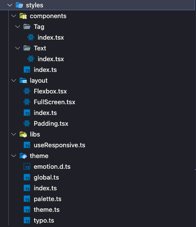
styles 라는 폴더에 스타일 관련한 파일을 모두 담아두고 사용한다.
components는 자주 사용하는 컴포넌트, layout은 레이아웃 관련된 Ui, libs는 반응형 관련한 함수가 들어있으며 theme에는 전체적인 서비스에 대한 색, 타이포, 테마를 지정해 두었다.
index.ts 파일에서 아래와 같이 global, theme 파일을 모듈화한다.
export * from './global';
export * from './theme';
이렇게 사용하고자 하는 파일에 대하여 export를 하지 않으면
아래와 같이 에러가 발생한다.

그러므로 styles 폴더 밖에서 사용하고자 하는 모듈이 있으면 index.ts 파일에서 export 처리를 해 줘야 한다.
3. css 함수 이용하여 typo 작성하기
import { css } from '@emotion/react';
export const calcRem = (px: number) => `${px / 16}rem`;

export const typo = {
  Header_28: css`
    font-family: 'Pretendard';
    font-size: ${calcRem(28)};
    line-height: 150%;
    font-weight: 700;
  `,
  Header_24: css`
    font-family: 'Pretendard';
    font-size: ${calcRem(24)};
    line-height: 150%;
    font-weight: 700;
  `,
  Header_20: css`
    font-family: 'Pretendard';
    font-size: ${calcRem(20)};
    line-height: 150%;
    font-weight: 700;
  `,
}
emotion은 @emotion/react 패키지에서 불러와 css 함수를 사용할 수 있다. css 선언은 객체 형식으로 넘겨도 되고, 문자열 형식으로 넘겨도 된다. 위의 타이포는 문자열 형식으로 넘긴 것이며 객체 형식으로 넘기기 위해서는 아래와 같이 작성해야 한다.
/** @jsxImportSource @emotion/react */
import { css } from "@emotion/react";

function MyComponent() {
  return (
    <div
      css={css({
        backgroundColor: "yellow",
      })}
    >
      노란색 영역
    </div>
  );
}
단, 여기서 주의해야 할 점은 /** @jsxImportSource @emotion/react */ 인데, JSX pragma이다. Babel을 사용하는 경우에는 트랜스파일러한테 JSX 코드를 변환할 때, React의 jsx() 함수를 사용하지 말고, Emotion의 jsx() 함수를 대신 사용하라고 알려주기 위해 사용하는 것이다. 해당 내용을 작성하지 않으면 css 함수에 prop으로 넘겨준 것이 제대로 적용되지 않는다.
4. emotion/react로 Theme 적용하기
이제 테마를 적용해보자. 작성하고자 하는 theme는 총 두가지이다.
1. 팔레트
2. 타이포
두가지를 이용하기 때문에 테마 관련 모듈을 만들어준다.
import { Theme } from '@emotion/react';
import { palette } from './palette';
import { typo } from './typo';

export const theme: Theme = {
  palette,
  typo,
};
타입은 @emotion/react에서 제공해주는 Theme이고, 변수의 이름은 theme이며 만들어 두었던 typo와 palette를 값으로 가지고 있다.
export type TypeOfPalette = typeof palette;
export type KeyOfPalette = keyof typeof palette;

export type KeyofTheme = keyof typeof theme;

export type TypeOfTypo = typeof typo;
export type KeyOfTypo = keyof typeof typo;

export type TextType = {
  typo: KeyOfTypo;
  color: KeyOfPalette;
};
추가로 키와 타입에 대하여 지정해두어 palette의 색, 그리고 theme 변수에 저장된 변수, typo의 글자와 변수를 저장할 수 있도록 하고 TextType을 통하여 타이포와 색을 정해둘 수 있도록 타입을 지정한다.
마지막으로 반응형 웹 페이지에 대한 설정을 지정한다.
export const customMediaQuery = (minWidth: number): string =>
  `@media (min-width: ${minWidth}px)`;

export const media = {
  custom: customMediaQuery,
  pc: customMediaQuery(768),
  mobile: `@media (max-width : 767px)`,
};
테블릿 세로모드부터는 767px이 적용되기 때문에 모바일 미디어 쿼리의 기준을 767px부터 잡았다.
emotion.d.ts파일 수정
타입스크립트를 이용한 프로젝트이기 때문에 테마 객체에 대한 타입 지정이 필수이다.
해당 테마 파일에서 설정한 theme 객체와 동일한 구조의 type을 해당 파일에서 선언해 주어야 한다.
import '@emotion/react';
import { TypeOfPalette, TypeOfTypo } from './theme';

declare module '@emotion/react' {
  export interface Theme {
    palette: TypeOfPalette;
    typo: TypeOfTypo;
  }
}
@emotion/react 모듈을 가지고 와서 Theme 객체 인터페이스에 대한 타입을 지정해주는 것이다.
Theme 제공하기
ThemeProvider 설정
APP 컴포넌트 상위에 ThemeProvider을 추가하면 내부 컴포넌트들이 테마에 접근할 수 있다.
import ReactDOM from 'react-dom/client'
import App from './App'
import { ThemeProvider } from '@emotion/react';
import { BrowserRouter } from 'react-router-dom';
import { globalStyle, theme } from '@styles/theme'
import { worker} from './mocks/browser';
import { RecoilRoot } from 'recoil';

ReactDOM.createRoot(document.getElementById('root') as HTMLElement).render(
    <RecoilRoot>
      <BrowserRouter>
        <Global styles = {pageGlobalStyle}/>
        <ThemeProvider theme = {theme}>
          <App />
        </ThemeProvider>
      </BrowserRouter>
    </RecoilRoot>
)
따단~ 이렇게 하면 테마 사용에 대한 기본적인 세팅은 끝이 난다. props로 직접 생성한 theme 객체를 넘겨 주면 된다.
다른 컴포넌트에서도 테마에 존재하는 타이포와 색에 대하여 자유롭게 접근할 수 있어 중복되는 코드를 줄일 수 있고, 누구나 쉽게 이해할 수 있는 코드를 작성할 수 있게 된다.
5. emotion-reset을 통하여 Global UI 세팅하기
import { css } from "@emotion/react";
import emotionReset from 'emotion-reset';
import { media } from './theme'

export const globalStyle = css`
    ${emotionReset}
    @font-face {
    font-family: 'Pretendard';
    font-style: normal;
    font-weight: 700;
    src: url('https://cdn.jsdelivr.net/gh/Project-Noonnu/noonfonts_2107@1.1/Pretendard-Bold.woff')
      format('woff');
  }
...
`
emotion-reset 라이브러리를 이용하여 emotion 기존 CSS를 리셋한다. 그리고 서비스 전체적으로 적용하기 위한 폰트를 지정해준다. 그리고 각종 ui 요소들 중에서도 리셋이 필요한 부분을 전체적으로 정리해준다.
button {
        background: inherit;
        border: none;
        box-shadow: none;
        border-radius: 0;
        padding: 0;
        overflow: visible;
        cursor: pointer;
    }
    button:focus {
        outline: none;
    }
    input:focus {
        outline: none;
    }
...
모바일도 고려하여 -webkit을 사용하여 나머지 ui요소들도 세세히 정리해준다. 그리고 App이 존재하는 최상단 컴포넌트로 넘어가서 아래와 같이 globalStyle을 지정하여 준다.
import ReactDOM from 'react-dom/client'
import App from './App'
import { css, Global, ThemeProvider } from '@emotion/react';
import { BrowserRouter } from 'react-router-dom';
import { globalStyle, theme } from '@styles/theme'
import { worker} from './mocks/browser';
import { RecoilRoot } from 'recoil';

const pageGlobalStyle = css`
  ${globalStyle}
  body {
    background-color: ${theme.palette.white};
  }
`

ReactDOM.createRoot(document.getElementById('root') as HTMLElement).render(
    <RecoilRoot>
      <BrowserRouter>
        <Global styles = {pageGlobalStyle}/>
        <ThemeProvider theme = {theme}>
          <App />
        </ThemeProvider>
      </BrowserRouter>
    </RecoilRoot>
)emotion/react에서 Global을 불러와 사용하게 되면 쉽게 전체 App에 글로벌 스타일을 적용할 수 있다.
6. 자주 사용하는 UI 컴포넌트 만들기
Layout 만들기
Padding
/** @jsxImportSource @emotion/react */
import { css } from '@emotion/react';
import { HTMLAttributes, ReactNode } from 'react';

interface PaddingProps extends HTMLAttributes<HTMLDivElement> {
  children: ReactNode;
  size?: PaddingSize;
  fill?: boolean;
}

export type PaddingSize =
  | number
  | [number, number]
  | [number, number, number, number];

/**
 * @param size
 * number : 상하좌우 패딩
 * [number,number] : 상하, 좌우
 * [number,number,number,number] : 상, 우, 하, 좌
 * @param fill true: width100%
 */
export const Padding = ({
  children,
  size = [0, 24],
  fill = false,
  ...props
}: PaddingProps) => {
  return (
    <div
      css={css`
        padding: ${typeof size === 'number'
          ? `${size}px`
          : size.length === 2
          ? `${size[0]}px ${size[1]}px`
          : `${size[0]}px ${size[1]}px ${size[2]}px ${size[3]}px`};
        ${fill && 'width : 100%;'}
        box-sizing:border-box;
      `}
      {...props}
    >
      {children}
    </div>
  );
};
Padding컴포넌트를 미리 만들어 두고 padding요소가 필요할때마다 해당 컴포넌트를 불러와 사용할 수 있다.
emotion을 사용하여 Props를 유연하게 관리할 수 있었으므로 이렇게 쉽게 컴포넌트를 만들어낼 수 있었던 것이다. 이렇게 스타일을 입힌 컴포넌트로 생성하여 언제 어디서든 재사용할 수 있다.
이 때 Padding 컴포넌트가 받을 수 있는 props를 PaddingProps로 설정해 두고 children 요소를 감싸게 한다.
Component만들기
Text 컴포넌트
import { css } from '@emotion/react';
import styled from '@emotion/styled';
import { HTMLAttributes } from 'react';
import { KeyOfPalette, KeyOfTypo } from '../../theme'

export interface TextProps extends HTMLAttributes<HTMLSpanElement> {
  as?: 'span' | 'p' | 'h1' | 'h2' | 'h3' | 'h4' | 'h5' | 'h6' | 'div';
  typo: KeyOfTypo;
  color?: KeyOfPalette;
  children: any;
}

export type TextPropsKey = 'typo' | 'color';
/**
 *
 * @param as Text 컴포넌트의 태그 (기본값 span)
 * @param typo Typo theme 선택
 * @param color Palette theme 선택
 */
export const Text = ({
  typo,
  as = 'span',
  color,
  children,
  ...props
}: TextProps) => {
  return (
    <StyledText typoKey={typo} colorKey={color} as={as} {...props}>
        {children}
    </StyledText>
  );
};

const StyledText = styled.span<{ typoKey: KeyOfTypo; colorKey?: KeyOfPalette }>`
  white-space: pre-wrap;
  ${({ typoKey, theme }) => theme.typo[typoKey]}
  ${({ colorKey, theme }) =>
    colorKey &&
    css`
      color: ${theme.palette[colorKey]};
    `}
`;
emotion도 styled-component와 유사하게 styled를 이용하여 컴포넌트를 만들어낼 수 있다.
StyledText라는 컴포넌트를 만들어, typo와 color에 대한 props를 받아온다. 이후, typo와 color를 적용해주고 리턴해준다. as props를 통하여 텍스트 스타일을 지정할 수 있다.
ProductItem 컴포넌트
import styled from '@emotion/styled';

export const ProductItem = styled.div`
    padding: 5px;
    display:flex;
    flex-direction: column;
    gap: 5px;
`
물품의 정보를 담고 있는 목록 컴포넌트를 만들기 위하여 ProductItem 이라는 컴포넌트를 만들어 재사용할 수 있도록 하였다.해당 컴포넌트를 만들었기 때문에 상품 목록 컴포넌트를 여러 곳에 사용하지 않고 전역적으로 쓸 수 있게 되어 코드 작성을 간결히 할 수 있었다.
네이밍은 스타일 관련된 컴포넌트는 style.ts로 작성하여 다른 일반 컴포넌트와 헷갈리지 않도록 하였다.
이렇게 하여 이번 포스팅에서는 emotion을 처음 사용해보면서 느꼈던 장단점과 실용적인 사용법에 대하여 정리해보았다. 앞으로 styled-component보다는 활용성이 무궁무진한 emotion을 자주 사용하게 될 것 같다.