
📊 데이터 시각화 및 Matplotlib, Seaborn, Folium
1. 데이터 시각화 (Data Visualization)
1.1 정의
데이터 시각화란 방대한 양의 데이터를 차트, 그래프, 지도 등 시각적인 요소로 변환하여 표현하는 것입니다. 인간의 뇌는 텍스트보다 이미지를 훨씬 빠르게 처리하므로, 복잡한 데이터 속에서 패턴, 추세, 이상징후를 파악하는 데 필수적입니다.
1.2 중요성
- 빠른 의사결정: 데이터의 의미를 직관적으로 파악하여 신속한 판단을 돕습니다.
- 스토리텔링: 데이터 뒤에 숨겨진 이야기를 효과적으로 전달합니다.
- 패턴 발견: 엑셀 표만으로는 보이지 않는 상관관계나 트렌드를 발견할 수 있습니다.
1.3 필요성
- 복잡한 데이터의 직관적 이해.
- 패턴, 트렌드, 이상치(Outlier) 발견.
- 효과적인 커뮤니케이션 도구 (비전문가도 이해 가능).
1.4 시각화 유형 및 선택
데이터의 목적에 따라 적절한 차트를 선택해야 합니다.
| 분석 목적 | 추천 차트 | 설명 |
|---|---|---|
| 비교 (Comparison) | 막대 차트 (Bar Chart) | 항목 간의 크기를 비교할 때 가장 보편적입니다. |
| 추세 (Trend) | 라인 차트 (Line Chart) | 시간의 흐름에 따른 데이터의 변화를 보여줍니다. |
| 비중 (Composition) | 파이 차트 (Pie Chart) | 전체에서 각 부분이 차지하는 비율을 보여줍니다. |
| 관계 (Relationship) | 산점도 (Scatter Plot) | 두 변수 간의 상관관계를 파악할 때 사용합니다. |
| 분포 (Distribution) | 히스토그램 (Histogram), Box Plot | 데이터의 빈도 분포를 확인할 때 사용합니다. |
| 지리 정보 | 맵 (Map) | 위치 데이터를 지도 위에 시각화합니다. |
2. Matplotlib (파이썬 시각화 라이브러리)
2.1 개요
- Matplotlib은 Python에서 정적, 애니메이션, 대화형 시각화를 생성하기 위한 가장 기초적이고 널리 사용되는 라이브러리입니다.
- MATLAB의 인터페이스와 유사하게 설계되었으며,
NumPy와Pandas와 함께 데이터 과학 분야에서 필수적으로 사용됩니다.
2.2 Pyplot 모듈
matplotlib.pyplot은 Matplotlib을 마치 MATLAB처럼 작동하게 하는 함수들의 모음입니다.- 일반적으로
plt라는 별칭(alias)으로 import 하여 사용합니다.
import matplotlib.pyplot as plt
import numpy as np
2.3 기본 사용법 및 주요 함수
1) 기본 그래프 그리기 (plot)
가장 기본적인 선 그래프를 그립니다.
matplotlib.pyplot.plot(*args, scalex=True, scaley=True, data=None, **kwargs)
# x,y: array-like, float.
# fmt: str, <color><marker><line> 순서 상관 없음. kwargs로 대체 가능
# scalex, scaley: bool
# data: indexable object. 주어지는 경우, x,y에 label name이 와야 함.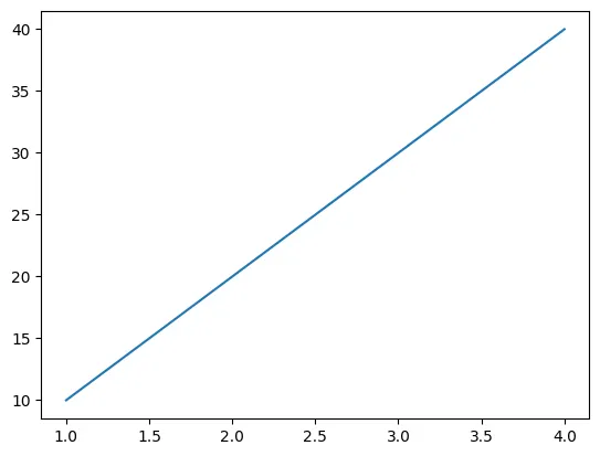
x = [1, 2, 3, 4]
y = [10, 20, 30, 40]
plt.plot(x, y)
plt.show()
2) 산점도 그리기 (scatter)
x와 y의 상관관계를 점으로 표현합니다.
matplotlib.pyplot.scatter(x, y, s=None, c=None, *, marker=None, cmap=None, norm=None, vmin=None, vmax=None, alpha=None, linewidths=None, edgecolors=None, colorizer=None, plotnonfinite=False, data=None, **kwargs)
# x, y: float, array-like (shape (n,))
# s: float, array-like. 제곱값
# c: array-like, list of color, color
# marker: MarkerStyle, Default 'o'
# cmap: str, Colormap
# norm: str, Normalize
# alpha: float[0, 1]. Transparency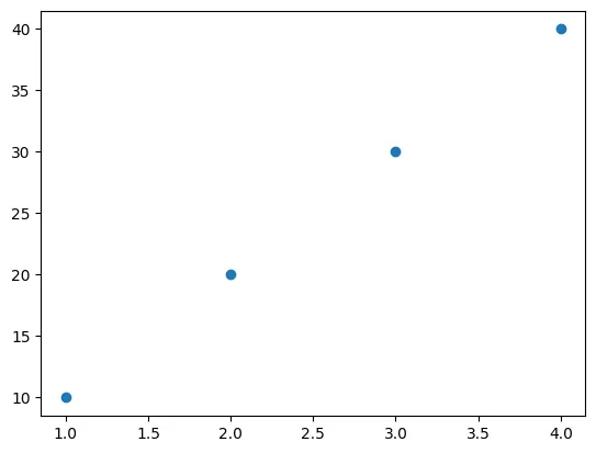
plt.scatter(x, y)
plt.show()
3) 막대 그래프 (bar)
범주형 데이터의 값을 막대로 표현합니다.
matplotlib.pyplot.bar(x, height, width=0.8, bottom=None, *, align='center', data=None, **kwargs)
# x: float, array-like
# height: float, array-like
# width: float, array-like
# bottom: float, array-like. Default 0.
# align: 'center', 'edge'. edge는 bar의 왼쪽을 맞춤. 오른쪽을 맞추려면 width를 음수로.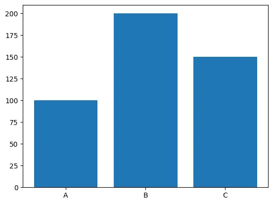
categories = ['A', 'B', 'C']
values = [100, 200, 150]
plt.bar(categories, values)
plt.show()
4) 그래프 꾸미기 (Customization)
- 제목 및 레이블:
plt.title("Graph Title") plt.xlabel("X-axis Label") plt.ylabel("Y-axis Label") - 스타일 및 색상: 선의 종류(
linestyle), 색상(color), 마커(marker) 등을 지정할 수 있습니다. - 범례 (Legend):
plt.legend()를 통해 데이터의 라벨을 표시합니다. - Grid:
plt.grid(True)로 격자를 표시할 수 있습니다.
5) 종합 활용
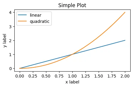
import matplotlib.pyplot as plt
import numpy as np

x = np.linspace(0, 2, 100)  # 0부터 2까지 100개의 구간으로 나눈 데이터 생성

plt.figure(figsize=(5, 2.7)) # 그래프 크기 설정 (인치 단위)
plt.plot(x, x, label='linear')  # 선형 그래프
plt.plot(x, x**2, label='quadratic') # 2차 함수 그래프
plt.xlabel('x label')      # x축 라벨
plt.ylabel('y label')      # y축 라벨
plt.title("Simple Plot")   # 그래프 제목
plt.legend()               # 범례 표시
plt.show()                 # 그래프 출력
2.4 여러 그래프 그리기 (Subplots)
하나의 화면(Figure) 안에 여러 개의 그래프(Axes)를 배치할 수 있습니다.
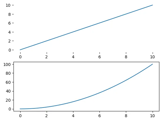
# x 데이터 생성 : 0부터 10까지 100개의 점
x = np.linspace(0, 10, 100)

# 2행 1열의 구조 중 첫 번째 그래프, 축(frame) 없애기
# OO-style로 Axes(ax1, ax2)를 생성
# OO-style: Figure와 Axes를 명시적으로 생성하여 method를 호출
ax1 = plt.subplot(2, 1, 1, frameon=False)
plt.plot(x, x, label='linear')  # 선형 그래프

# 2행 1열의 구조 중 두 번째 그래프, 축(frame) 보이기
ax2 = plt.subplot(2, 1, 2, frameon=True)
plt.plot(x, [i**2 for i in x], label='quadratic') # 2차 함수 그래프

plt.show()
3. Seaborn: 통계적 시각화의 강자
Matplotlib을 기반으로 더 세련된 스타일과 통계적 기능을 제공하는 고수준 라이브러리입니다. Pandas DataFrame과 호환성이 매우 좋습니다.
3.1 주요 특징
- 세련된 스타일: 기본 테마가 예쁘고 가독성이 좋습니다.
- 통계 기능: 데이터의 분포, 회귀선 등을 자동으로 계산해 줍니다.
- 다양한 차트:
relplot(관계),displot(분포),catplot(범주형) 등 목적에 맞는 함수 제공.
3.2 실습 코드 설명
1) 기본 예제 (Relational Plot)
팁 데이터셋을 사용하여 전체 금액과 팁 사이의 관계를 시각화합니다.
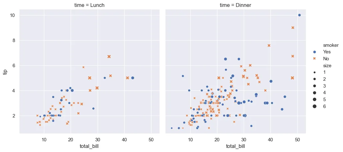
import seaborn as sns

# 기본 테마 적용
sns.set_theme()

# 예제 데이터셋 로드 (팁 데이터)
tips = sns.load_dataset("tips")

# 관계형 그래프 생성 (Relational Plot)
sns.relplot(
    data=tips,
    x="total_bill", y="tip",   # x축: 총 금액, y축: 팁
    col="time",                # 시간대(점심/저녁)별로 컬럼 분리
    hue="smoker",              # 흡연 여부에 따라 색상 다르게
    style="smoker",            # 흡연 여부에 따라 마커 모양 다르게
    size="size",               # 인원수에 따라 점 크기 다르게
)
2) Violin Plot (분포 시각화)
Box Plot과 KDE(밀도) 그래프를 합친 형태로, 데이터의 분포를 풍부하게 보여줍니다.
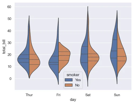
# 요일(day)별 전체 금액(total_bill) 분포를 바이올린 형태로 시각화
sns.violinplot(
    data=tips,
    x="day", y="total_bill",
    hue="smoker",        # 흡연 여부로 쪼개서 비교
    split=True,          # 바이올린을 반으로 갈라 양쪽에 표시
    inner="quart",       # 내부에 사분위수 표시
)
3.3 Seaborn 함수 분류
- Figure Level:
relplot,displot,catplot(여러 그래프를 한 번에 관리) - Axes Level:
scatterplot,lineplot,histplot,barplot,boxplot등 (개별 그래프)
4. Folium: 지리 정보 시각화 (지도)
Python 데이터를 Leaflet.js 기반의 인터랙티브 지도로 시각화해주는 라이브러리입니다.
4.1 기본 사용법
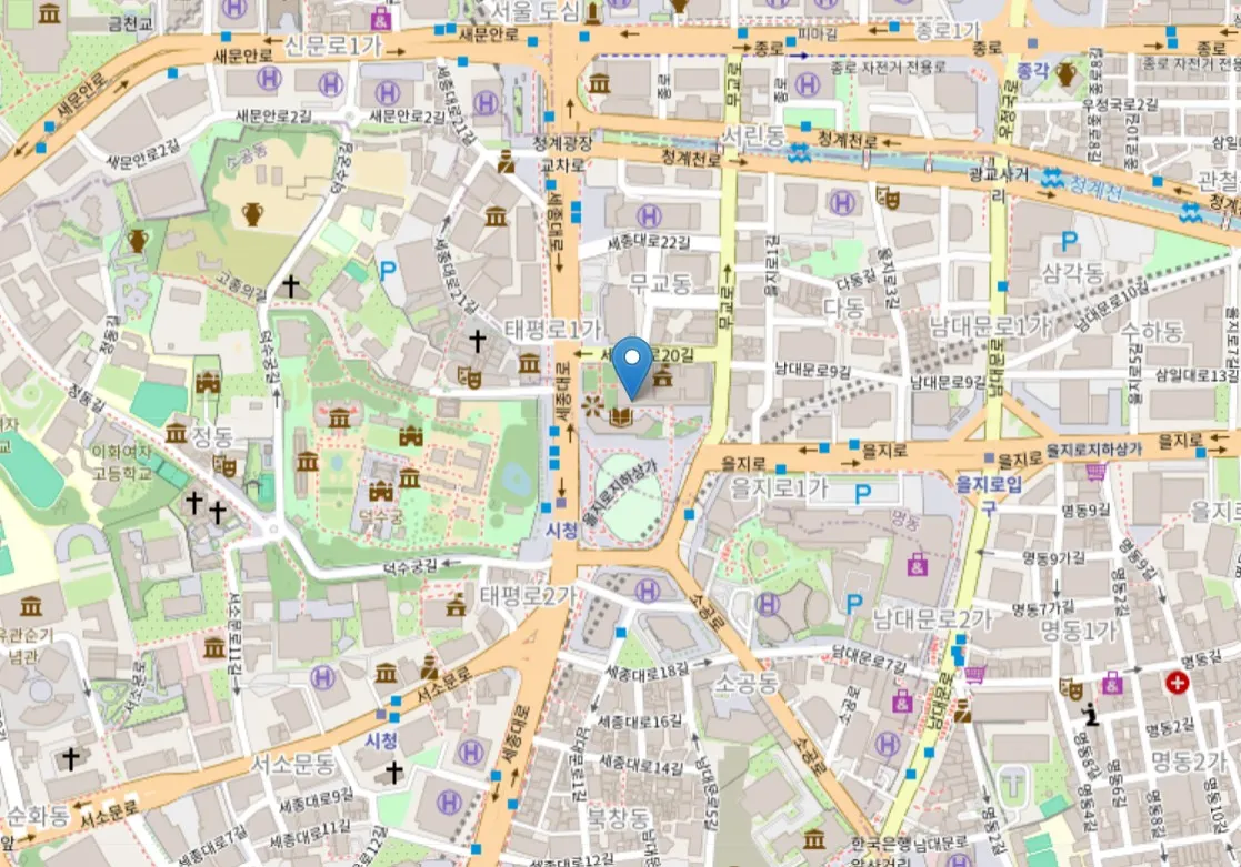
import folium

# 지도 생성 (위도, 경도 중심)
m = folium.Map(location=[37.5665, 126.9780], zoom_start=16)

# 마커 추가
folium.Marker(
    [37.5665, 126.9780],
    popup='Seoul City Hall', # 클릭 시 나오는 팝업
    tooltip='Click me!'      # 마우스 오버 시 나오는 툴팁
).add_to(m)

# 지도 출력 (Jupyter Notebook 환경)
m
4.2 도형 그리기 (CircleMarker vs Circle)
CircleMarker: 줌 레벨과 상관없이 화면상 크기(Pixel)가 고정됨.Circle: 지도상의 실제 반경(Meter)을 가짐 (줌인하면 커짐).
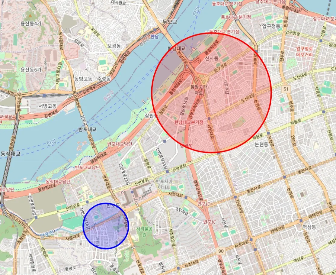
import folium

m = folium.Map(location=[37.5105, 127.0150], zoom_start=14)

# 화면상 크기 고정 (50 픽셀)
folium.CircleMarker(
    location=[37.5, 127.0],
    radius=50,
    color="blue",
    fill=True
).add_to(m)

# 실제 지리적 반경 고정 (1000 미터 = 1km)
folium.Circle(
    location=[37.52, 127.02],
    radius=1000,
    color="red",
    fill=True
).add_to(m)

m
4.3 등치선도 (Choropleth Map)
지역별 통계치(예: 인구 밀도, 실업률)를 색상으로 표현하는 지도입니다. GeoJSON 데이터(지도 경계)와 통계 데이터(CSV 등)을 사용합니다.
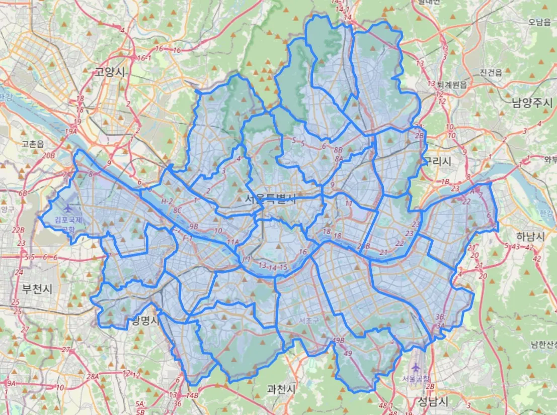
import json
import requests
import folium

df = pd.read_csv('data/code_bas.csv')

r = requests.get('https://raw.githubusercontent.com/southkorea/seoul-maps/master/kostat/2013/json/seoul_municipalities_geo_simple.json')
c = r.content
seoul_geo = json.loads(c)

m = folium.Map(
    location=[37.559819, 126.963895],
    zoom_start=11,
)

folium.GeoJson(
    seoul_geo,
    name='지역구'
).add_to(m)

m
🔗 참고 자료 (References)
데이터 시각화 이론
도구 사용법
- Matplotlib 사용법
- Matplotlib 공식 홈페이지
- Matplotlib Pyplot 튜토리얼
- W3Schools: Matplotlib Pyplot
- 위키독스: Matplotlib 튜토리얼
- 나무위키: Matplotlib
- Seaborn: 예제 갤러리
- Folium: 공식 문서
- 데이터 시각화 가이드: Tableau 시각화 정의