
CustomInput란?
CustomEditText를 참조하여,EditText외적인 레이아웃 요소를 추가하는LinearLayout기반의 클래스입니다.
CustomInput 소스 먼저 보기
요구 사항
해당 피그마 디자인을 통해 파악한 요구 사항은 다음과 같습니다:
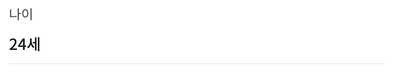
- 상단 label 텍스트
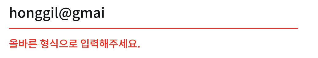
- 하단 error 안내 텍스트
1. Label
EditText에서는 기본적으로 hint 속성을 통해 입력 전 해당 입력란에 대한 안내를 합니다. 하지만 입력이 시작되면 hint는 사라지기 때문에, 복잡한 입력폼에서는 일관된 안내가 필요합니다. 이에 따라,TextView를EditText위에 붙여서 label을 만들어 입력 상태와 무관하게 일관된 안내를 제공하려 합니다.
1-1. 초기화와 사용자 정의 메서드
class CustomInput @JvmOverloads constructor(
    context: Context, attrs: AttributeSet? = null, defStyleAttr: Int = 0
) : LinearLayout(context, attrs, defStyleAttr) {
	...변수들
	private val label: AppCompatTextView
    private val errorText: AppCompatTextView // <- 1-2에서

	init {
    	label = AppCompatTextView(context).apply {
            visibility = GONE
            textSize = 12f
            setTextColor(ContextCompat.getColor(context, R.color.label))
        }

        addView(
            label, LayoutParams(
                LayoutParams.WRAP_CONTENT,
                LayoutParams.WRAP_CONTENT
            )
        )

        ... 다른 초기화 소스들
        context.theme.obtainStyledAttributes(
            attrs,
            R.styleable.CustomEditText,
            0, 0
        ).apply {
            try {
                val labelText = getString(R.styleable.CustomEditText_labelText)
                val errorTextValue = getString(R.styleable.CustomEditText_errorText) // <- 1-2에서

                setLabel(labelText)
                setErrorText(errorTextValue) // <- 1-2에서
                errorText.visibility = GONE
            } finally {
                recycle()
            }
        }

    }

    ... 다른 메서드들
    fun setLabel(text: String?) {
        if (!text.isNullOrEmpty()) {
            label.text = text
            label.visibility = VISIBLE
        } else {
            label.visibility = GONE
        }
    }
}- label이라는
TextView변수를 선언하고init{}블록에서 초기화 후addView()메서드를 통해 레이아웃에 추가했습니다. setLabel()메서드를 통해 label의 텍스트를 설정하고, 값이 없을 때는 숨길 수 있도록 visibility를 제어합니다.obtainStyledAttributes()메서드를 사용해 XML에서 정의된 속성을 읽어와 label과 error 텍스트를 설정합니다.
1-2. 사용 예시
<패키지.CustomInput
	android:id="@+id/et_petAge"
	android:layout_width="match_parent"
	android:layout_height="wrap_content"
	app:labelText="나이"
	app:errorText="올바른 나이를 입력해주세요"
	android:hint="나이"
android:inputType="number" />- XML에서
CustomInput을 사용할 때,app:labelText와 같은 사용자 정의 속성을 통해 label 텍스트를 전달합니다. - 이 값은
init{}내 obtainStyledAttributes()에서 받아와 setLabel() 메서드로 처리됩니다. - 이 구조를 통해 label은 다음과 같은 방식으로 작동합니다:
- 기본적으로 visibility = GONE 상태로 숨겨짐.
- XML 또는 코드에서 label 텍스트를 설정하면 노출.
setLabel()메서드를 통해 필요에 따라 노출 시점을 조정 가능.
2. ErrorText
ErrorText는
CustomEditText의 값 검증 결과와 연동되는TextView입니다. 기본적으로 유효성 검증에서 정의된 에러 케이스일 때 노출됩니다.
private val customEditText: CustomEditText
private val label: AppCompatTextView
private val errorText: AppCompatTextView

init {
    ... CustomInput의 초기화 소스들

    customEditText.onValidListener = {
        if (it) {
            errorText.visibility = GONE
        } else {
            errorText.visibility = VISIBLE
        }
    }
}CustomEditText의 onValidListener를 사용하여 값 검증 결과에 따라 ErrorText의 visibility를 제어합니다.- XML에서 정의된 errorText 속성 값을 받아 setErrorText() 메서드로 연결합니다.
- 에러가 발생할 때마다 미리 정의된 에러 메시지를 보여줍니다.
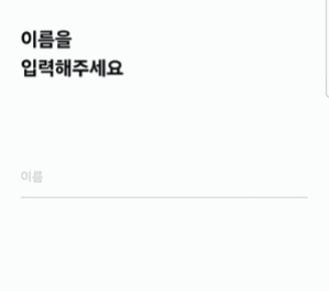
실제 동작
3줄 요약
- 사용자 안내를 위해,
label과errorText를 추가해 입력 상태와 에러를 표시했습니다. - XML 속성과 메서드로 label과 error 텍스트를 설정하고, 값 검증 결과에 따라 자동으로 표시 여부를 제어했습니다.
- 명확한 피드백을 통해 사용자가 올바르게 입력하도록 유도했습니다.