
안드로이드에는 Toast, AlertDialog와 같은 기본 메시지 수단들이 있습니다. 이를 확장하여 앱 테마에 맞는 커스텀 Alert을 구현해보겠습니다.
1. 뷰 바인딩 및 다이얼로그 생성
CustomAlertBinding.inflate(layoutInflater)를 사용하여 커스텀 레이아웃을 바인딩합니다. 이때,CustomAlertBinding은 미리 정의된 XML 레이아웃을 참조하게 됩니다.
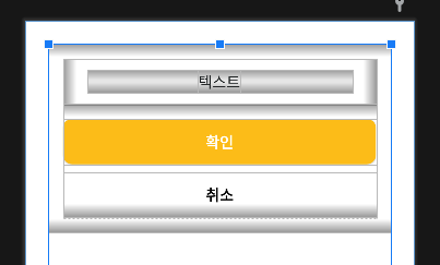
1-1. custom_alert.xml
미리 정의된 레이아웃은 아래와 같습니다:
<FrameLayout xmlns:android="http://schemas.android.com/apk/res/android"
    xmlns:app="http://schemas.android.com/apk/res-auto"
    ...기본 속성들>

    <com.google.android.material.card.MaterialCardView
        ...기본 속성들
        android:background="@android:color/transparent"
        app:cardElevation="0dp"
        app:cardForegroundColor="@color/transparent"
        app:shapeAppearanceOverlay="@style/AlertCornersRounded">

        <LinearLayout
            ...기본 속성들
            android:background="@drawable/bg_alert">

            <LinearLayout
                android:id="@+id/llDlgTitleLayout"
                ...기본 속성들
                android:visibility="gone">

                <TextView
                    android:id="@+id/txvDlgTitle"
                    ...기본 속성들/>
            </LinearLayout>

            <LinearLayout
                ...기본 속성들>

                <com.withpet.mobile.ui.custom.MaxHeightScrollView
                    ...기본 속성들
                    app:maxHeight="@dimen/height_dlg_max_300">

                    <LinearLayout
                        android:id="@+id/llDlgContentLayout"
                        ...기본 속성들>

                        <TextView
                            android:id="@+id/txvDlgContent"
                            ...기본 속성들/>
                    </LinearLayout>
                </com.withpet.mobile.ui.custom.MaxHeightScrollView>
            </LinearLayout>

            <LinearLayout
                ...기본 속성들>

                <androidx.appcompat.widget.AppCompatButton
                    android:id="@+id/btnDlgPositive"
                    android:text="확인"
                    ...기본 속성들/>

                <androidx.appcompat.widget.AppCompatButton
                    android:id="@+id/btnDlgNegative"
                    android:text="취소"
                    ...기본 속성들/>
            </LinearLayout>
        </LinearLayout>
    </com.google.android.material.card.MaterialCardView>
</FrameLayout>
이 XML 레이아웃은 다이얼로그 창의 기본적인 틀을 정의합니다:
<FrameLayout>: 투명한 배경과 정확한 크기를 유지하기 위해 사용됩니다.<MaterialCardView>: 디자인에 맞춘 곡선 모서리를 제공하기 위해 사용합니다.<MaxHeightScrollView>: 콘텐츠가 화면을 초과하지 않도록 최대 높이를 설정하여 스크롤 가능하게 만드는 커스텀 뷰입니다.<AppCompatButton>: 긍정 및 부정 버튼으로, 각 버튼에는 모서리 둥근 디자인이 적용되었습니다.
이 레이아웃을 AlertDialog.Builder(this)로 생성된 다이얼로그에 setView() 메서드를 통해 적용합니다.
2. 매개변수 연결
이 함수는 사용자가 필요한 메시지와 동작을 쉽게 설정할 수 있도록 여러 매개변수를 받습니다:
fun showAlert(
    message: String,
    title: String? = null,
    positiveText: String? = null,
    negativeText: String? = null,
    onCancel: (() -> Unit)? = null,
    onPress: (() -> Unit)? = null
) {
    // AlertDialog 생성 및 설정
}- message (필수): 다이얼로그에 표시될 주요 메시지입니다.
- title (선택): 다이얼로그의 제목을 표시합니다.
- positiveText / negativeText (선택): 긍정/부정 버튼의 텍스트를 설정합니다.
- onPress (선택): 긍정 버튼을 눌렀을 때 실행될 콜백 함수입니다.
- onCancel (선택): 부정 버튼을 눌렀을 때 실행될 콜백 함수이며, 부정버튼 노출 조건에 대한 분기점입니다.
message는 필수적으로 받아야 하는 값이고, 나머지 매개변수는 선택 사항으로 설정되어 있습니다.
onCancel을 별도로 전달 안할경우 부정 버튼 visible을 GONE 처리하여 가립니다.
// 메시지와 긍정 버튼 텍스트 설정
binding.txvDlgContent.text = message
binding.btnDlgPositive.text = positiveText ?: "확인"

// 긍정 버튼 리스너 설정
binding.btnDlgPositive.setOnClickListener {
    onPress?.invoke() // onPress 콜백 실행
    dialog.dismiss()
}

// 부정적인 버튼 처리 (onCancel이 null인 경우 숨김)
if (onCancel != null) {
    binding.btnDlgNegative.text = negativeText ?: "취소"
    binding.btnDlgNegative.visibility = View.VISIBLE
    binding.btnDlgNegative.setOnClickListener {
        onCancel.invoke() // onCancel 콜백 실행
        dialog.dismiss()
    }
} else {
    binding.btnDlgNegative.visibility = View.GONE
}
3. 기타 설정
다이얼로그가 표시될 때의 시각적 효과나 안전한 실행을 위해 추가적인 설정을 합니다.
window?.setBackgroundDrawableResource(android.R.color.transparent)- 다이얼로그의 배경을 미리 정의해둔 RGB값으로 투명하게 설정합니다.
if (!isFinishing && !isDestroyed)- 액티비티가 종료 중이거나 이미 파괴된 상태가 아니라는 것을 확인하여, 불필요한 다이얼로그 표시를 방지합니다.
- 비동기 작업이 지연되어 다이얼로그가 필요 없는 시점에서 뜨는 것을 막기 위한 안전 장치입니다.
정상적으로 모든 설정이 완료되면, dialog.show()를 호출하여 다이얼로그가 화면에 표시됩니다.
정상적으로 구현된 showAlert 함수는 간단하게 호출할 수 있습니다.
1버튼 Alert
showAlert("비밀번호를 입력해주세요")

// onPress를 넣고 싶다면

showAlert("비밀번호를 입력해주세요"){
	etPassword.requestFocus()
}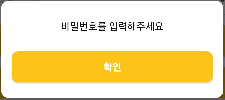
위처럼 최소한의 매개변수만 입력해 필수 메시지만 전달할 수도 있고,
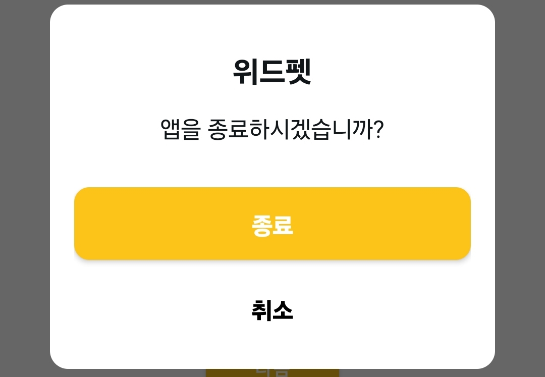
2버튼 Alert
showAlert(
    "엡을 종료하시겠습니까?",
    "위드펫",
    onPress = {},
    onCancel = {},
)
처럼 제목과 콜백 함수를 추가하여 최대한의 기능을 활용할 수 있습니다.
3줄 요약
- Custom Alert는 기본
AlertDialog를 확장하여 앱 테마에 맞춘 디자인과 기능을 제공합니다. - XML 레이아웃을 사용해 커스텀 디자인을 적용하고, 곡선 모서리와 투명한 배경 등 시각적 요소를 설정했습니다.
- message, title, 버튼 텍스트 및 콜백 함수를 매개변수로 받아 사용자가 원하는 방식으로 쉽게 구성할 수 있습니다.