HTML/CSS 활용 체크포인트
[ 계산기 목업 ]
레이아웃
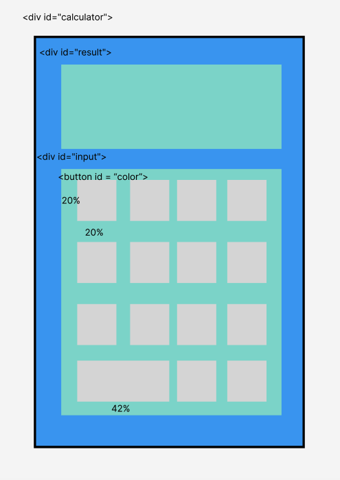
- Calculator의 레이아웃은 내부의 2개의 영역과 하단 영역의 버튼을 grow 속성과 %단위를 사용해 정렬해야 겠다 생각하고 구성했다.
HTML
<!DOCTYPE html>
<html lang="eng">

<head>
    <meta charset="UTF-8">
    <meta http-equiv="X-UA-Compatible" content="IE=edge">
    <meta name="viewport" content="width=device-width, initial-scale=1.0">
    <title>Document</title>
    <link rel="stylesheet" href="style.css">
</head>

<body>

    <div id="calculator">
        <section id="result" class ="black">0</section>

        <section id="input">
            <!-- <div id="input_section1"> -->
            <!-- <div id="function"> -->
                <!-- 흰색 ---   Result,
                    노랑 ---- +,-
                    파랑 --- /, .
                    빨강 --- 1,2,4,5
                    검정 --- 9
                -->
            <button class="button white">7</button>
            <button class="button red">8</button>
            <button class="button">9</button>
            <button class="button yellow">+</button>
            <button class="button red">4</button>
            <button class="button red">5</button>
            <button class="button">6</button>
            <button class="button yellow">-</button>
            <button class="button">1</button>
            <button id="zero" class="button">2</button>
            <button class="button black">3</button>

            <button class="button">x</button>
            <button id="testzero" class="button">0</button>

            <button class="button blue fill">.</button>

            <button class="button blue">/</button>


        </section>
    </div>
    <section id="frame"></section>
</body>

</html> - 레이아웃의 방식으로 태그를 사용해 구성하고 css에서 디자인적으로 활용하기 위해 색깔 클래스를 지정
- 추가로 액자 디자인을 담당한 frame색션을 추가로 지정했는데 다음에는 calculator 부모 태그로 지정해 디자인해야 할 것 같음
CSS
#calculator{
    margin-right:8.5vw;
    background-color: #1c1c1c;
    border: 1px solid #1c1c1c;
    display: flex;
    flex-direction: column;
    margin-bottom: 0;
    margin-bottom: 3vw;
    width: 18.5%;
    height: 55%;
    line-height: 7.5vw;
    /* min-width: 30vh; 가로 최소값 지정해 가로는 고정한 상태에서 반응함 */
    font-size:100rem;
    z-index: 1;
}
#frame{
    background-color: white;
    border:1vw solid #8B4513;
    width: 24vw;
    height: 38vw;
    position: absolute;
    margin-right:8.5vw;

}


#result{
    /* border: 1px solid red; */
    flex: 1.5;
    margin:3.3%;
    font-size: 3vw;
    text-align: right;

}

#input{
    /* border:1px solid red; */
    flex-grow: 3;
    display: flex;
    flex-direction: row;
    flex-wrap: wrap;
    position: relative;
    /* padding:0 */
}

.
.
.
.
.
.
#number{

    display: flex;
    flex-wrap: wrap;
    justify-content: space-between;
    padding : 0;
    margin:0;

}


button{

    /* border:1px solid red; */
    /* height: 50px;  위와 같은 이유*/
    height: 20%;  /* 버튼의 크기기준 */
    width: 20%;
    flex-grow: 1;
    box-shadow: none;
    border :none;
    text-decoration: none;
    /* padding: 0 10px */
    -webkit-appearance: none;
    -moz-appearance: none;
    appearance: none;
    font-size: 2vw;
}
#testzero{
    width: 45%;
}


*{
    box-sizing: border-box;
    padding: 0%;/* 패팅과 마진을 모두 각자의 부모의 %로 적용해 같은 비율로 움직여 콘텐츠가 빠져 나가지 않는 것 같다*/
    margin:1.5%;
}

.red{
    background-color: red;
}
.black{
    background-color: black;
    color: white;
}
.white{
    background-color: white;
}
.yellow{
    background-color: yellow;
}

.blue{
    background-color: blue;
    color: white;
}- 나름 중요하다 생각되는 코드만 남겼다
- 완변 반응형에 도전하기 위해 가로 세로를 지정하는 단위는 %와 vw, vh를 주로 사용해 의도한 대로 최대한 작아지고 커져도 비율이 유지되도록 구현
-몬드리안의 그림의 느낌을 표현하기 위해 버튼의 기본 속성을 오히려 제거하는 등 노력했지만 나중에 더 시간이 되면 다양한 디자인적 요소를 수정 및 적용해 보고 싶음
간단한 웹앱 만들기 체크포인트
- if(!조건) === (if(조건 === false) )기억하기!!
- 지정된 최소한의 변수를 통해 설계
- 태그담은변수.textContent => 텍스트 부분 가르키기
- target. 클릭된 HTML 엘리면트의 정보를 가져옴 (. 뒤에 무엇을 적느냐에 따라 정보의 종류가 달라지는듯 하다)
후기
- 과제로 출제된 기본, advanced, nightmare중 앞 2단계는 편하게 했지만 마지막 nightmare 단계를 설계하며 어려움을 많이 느낌
- 지정된 변수를 활용하고 반복적으로 사용가능한 변수를 최대한 활용하며 지정하는 변수 수를 줄이는 노력을 해야할 것같다.

공부 일기장