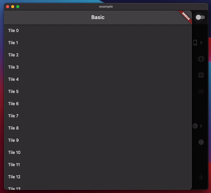
Flutter Tablet UI
ResponsiveUI vs AdaptiveUI
*Flutter 공식 문서 참고
Responsive design is about fitting the UI into the space and
Adaptive design is about the UI being usable in the space.
ResponsiveDesign은 공간에 UI를 맞추는 것. 즉, 동적인 방식으로 해상도 별로 유연하게 크기가 조정되는 것이고,
AdaptiveDesign은 공간 내에서 사용 가능한 UI. 즉, 정적인 방식으로 화면 크기 별로 다른 레이아웃을 제공해 최적화된 경험을 제공하는 것이다.
| 특성 | Responsive UI | Adaptive UI |
|---|---|---|
| 조정 방식 | 유연한 비율 기반 크기 조정 | 조건에 따라 별도의 레이아웃 선택 |
| 코드 관리 | 한 가지 레이아웃으로 해결 가능 | 여러 레이아웃 파일 필요 |
| 디자인 정밀도 | 모든 디바이스에 평균적으로 대응 | 디바이스별 최적화 가능 |
| 사용 사례 | 간단한 앱, 비율 기반으로 잘 맞는 경우 | 고정된 레이아웃이 중요한 경우 |
일반적인 AdaptiveUI 접근 방식
1. Abstract(추상화)
데이터 추상화 및 공통 위젯 준비.
- Dialogs: both fullscreen and modal
- Navigation UI: both rail(큰 화면) and bottom bar(작은 화면) 둘 다에서 사용할 수 있는 Destination 객체 준비
- Custom layout: such as "is the UI area taller or wider?"
2. Measure(위젯 크기 측정)
위젯 사이즈를 측정하는 방법 두 가지 중 선택 해야함
2-1 MediaQuery
MediaQuery.sizeOf: 실제 기기의 화면 크기를 측정.
절대적인 화면 크기를 바탕으로 Widget을 그리는 방법.
MediaQueryData.fromView: 현재 View 기준으로 사이즈 측정해 줌.
fromWindow 는 deprecated 되었음. fromView 사용을 권장.
Tablet은 화면 분할이나 다른 이유로 앱이 기기 화면 사이즈 전체를 사용하지 않을 때가 많음.
ex) MediaQueryData.fromView(View.of(context));사용 시, 주의할 점
- MedialQuery.of() 사용 시, 화면 사이즈 외에 다른 context가 변경될 때에도 rebuild 되기 때문에 화면 사이즈 변경 시에만 rebuild 되도록 하려면 성능 이슈로 sizeOf 사용을 권장함.
- 화면 크기가 변경될 때마다 위젯 트리를 다시 구성하기 때문에 build method 내부에서 초기화 되었을 때만 화면 크기 변화를 감지할 수 있음.
2-2 LayoutBuilder
부모 Widget의 크기를 기반으로 BoxConstraints 객체를 반환하고 이를 바탕으로 Widget을 그리는 방법
- BoxConstraints 가로 세로 크기의 최소, 최대 범위를 정의하는 객체
즉, 위젯 트리 기반으로 부모 Widget의 사이즈를 보고 가능한 범위를 제공 받아 위젯을 그리는 방식을 말함. 자식 Widget이 고정된 사이즈가 아니고, 부모 위젯의 크기에 영향을 받을 때(부모위젯이 변경되면 함께 변경 되어야 할 때)에 사용하면 적합하다.
아래 예시는 LayoutBuilder를 사용해 가로 사이즈가 500 초과이면 박스 2개, 이하이면 박스를 1개만 그리는 예시 코드
import 'package:flutter/material.dart';
void main() => runApp(const MyApp());
class MyApp extends StatelessWidget {
const MyApp({Key key}) : super(key: key);
Widget build(BuildContext context) {
return const MaterialApp(
title:'Test LayoutBuilder',
home: LayoutBuilder_Widget(),
);
}
}
class LayoutBuilder_Widget extends StatelessWidget {
const LayoutBuilder_Widget({Key key}) : super(key: key);
Widget build(BuildContext context) {
return Scaffold(
appBar: AppBar(title: const Text('Test LayoutBuilder')),
body: LayoutBuilder(
builder: (BuildContext context, BoxConstraints constraints) {
//print(constraints.maxWidth);
if (constraints.maxWidth > 500) {
return _buildLandScape();
} else {
return _buildPortrait();
}
},
),
);
}
Widget _buildPortrait() {
return Center(
child: Container(
height: 100.0,
width: 100.0,
color: Colors.red,
),
);
}
Widget _buildLandScape() {
return Center(
child: Row(
mainAxisAlignment: MainAxisAlignment.spaceEvenly,
children: <Widget>[
Container(
height: 100.0,
width: 100.0,
color: Colors.red,
),
Container(
height: 100.0,
width: 100.0,
color: Colors.yellow,
),
],
),
);
}
}3. Branch
이제 사이즈 측정이 끝나면 보여 줄 UI widget을 선택 해야함.
예를들면, BottomNavigationBar는 Material가이드에 따라 가로 600pixel 이하 일 때, 사용 하기를 권장 하고 있음.(그 이상은 RailNavigation 사용 권장함.)
(* fold 모든 시리즈는 펼쳤을 때 가로 사이즈 600 이상)
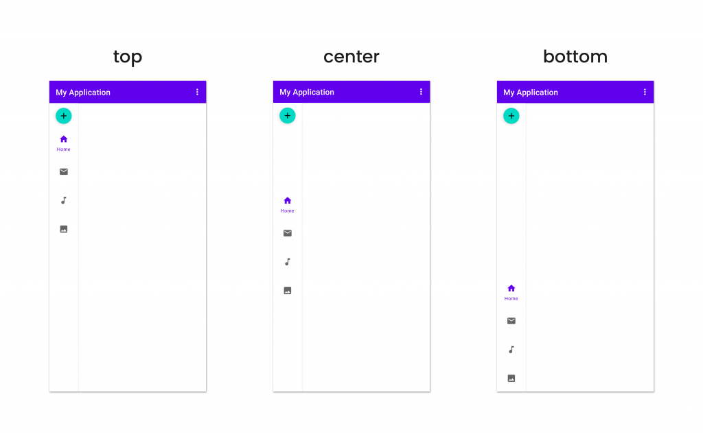 Rail Navigation Rail Navigation |  Bottom Navigation Bottom Navigation |
|---|
Capability & Policy
Flutter 가이드라인에 따르면 Capability와 Policy에 대한 정의를 내려 다양한 디바이스 화면에서 함께 쓸 수 있도록 정의 해서 사용하라고 가이드를 하고 있음.
Use a Capability class to define what the code can do
코드 혹은 디바이스에서 할 수 있는것들을 정의.
- 존재하는 API
- OS 제약 사항
- 물리적 하드웨어
등을 Capability에 정의해 두고 사용할 것을 권장함.
컴파일 혹은 런타임 체크에 포함됨.
Use a Policy class (or classes depending on complexity) to define what the code should do
코드가 해야만 하는 것들을 정의
- AppStore 가이드라인
- 디자인 선호
- 서버사이드에서 사용 가능한 특징들
- 호스트 장치를 나타내는 Assets 나 Copy.
Policies 구현체는 compile, runtime, or RPC checks 구현체 들에서 사용할 수 있게 정의 해야함.
// Define policy
class Policy {
  bool shouldAllowPurchaseClick() {
    // Banned by Apple App Store guidelines.
    return !Platform.isIOS;
  }
}

// In UI code
TextSpan(
  text: 'Buy in browser',
  style: new TextStyle(color: Colors.blue),
  recognizer: shouldAllowPurchaseClick ? TapGestureRecognizer()
    ..onTap = () { launch('<some url>') : null;
  } : null,
Pub-Dev 라이브러리
AdaptiveUI 구현 시 활용될 라이브러리
Sizer
사용 방법
1. Wrap MaterialApp with Sizer widget
Sizer(
  builder: (context, orientation, screenType) {
    return MaterialApp(
      home: HomePage(),
    );
  },
);
2-1. Widget Size
Container(
  width: Adaptive.w(20),    // This will take 20% of the screen's width
  height: 30.5.h     // This will take 30.5% of the screen's height
)
2-2. Font size
Text(
'Sizer',
style: TextStyle(fontSize: 15.dp),
// 15.sp can also be used instead of .dp
// To know their differences, check #FAQ
)
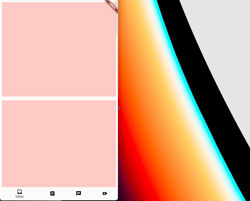
// 얘도 MediaQuery.textScalerOf(context) 사용 하면 될거같은데AdaptiveScaffold
화면 크기별로 다른 UI를 줄 수 있고 그 UI 가 변경될 때 마다 자연스러운 전환 애니메이션을 주기에 편함.
Widget build(BuildContext context) {
// Define the children to display within the body at different breakpoints.
final List<Widget> children = <Widget>[
for (int i = 0; i < 10; i++)
Padding(
padding: const EdgeInsets.all(8.0),
child: Container(
color: const Color.fromARGB(255, 255, 201, 197),
height: 400,
),
)
];
return AdaptiveScaffold(
// An option to override the default transition duration.
transitionDuration: Duration(milliseconds: _transitionDuration),
// An option to override the default breakpoints used for small, medium,
// mediumLarge, large, and extraLarge.
smallBreakpoint: const Breakpoint(endWidth: 700),
mediumBreakpoint: const Breakpoint(beginWidth: 700, endWidth: 1000),
mediumLargeBreakpoint: const Breakpoint(beginWidth: 1000, endWidth: 1200),
largeBreakpoint: const Breakpoint(beginWidth: 1200, endWidth: 1600),
extraLargeBreakpoint: const Breakpoint(beginWidth: 1600),
useDrawer: false,
selectedIndex: _selectedTab,
onSelectedIndexChange: (int index) {
setState(() {
_selectedTab = index;
});
},
destinations: const <NavigationDestination>[
NavigationDestination(
icon: Icon(Icons.inbox_outlined),
selectedIcon: Icon(Icons.inbox),
label: 'Inbox',
),
NavigationDestination(
icon: Icon(Icons.article_outlined),
selectedIcon: Icon(Icons.article),
label: 'Articles',
),
NavigationDestination(
icon: Icon(Icons.chat_outlined),
selectedIcon: Icon(Icons.chat),
label: 'Chat',
),
NavigationDestination(
icon: Icon(Icons.video_call_outlined),
selectedIcon: Icon(Icons.video_call),
label: 'Video',
),
NavigationDestination(
icon: Icon(Icons.home_outlined),
selectedIcon: Icon(Icons.home),
label: 'Inbox',
),
],
smallBody: (_) => ListView.builder(
itemCount: children.length,
itemBuilder: (_, int idx) => children[idx],
),
body: (_) => GridView.count(crossAxisCount: 2, children: children),
mediumLargeBody: (_) =>
GridView.count(crossAxisCount: 3, children: children),
largeBody: (_) => GridView.count(crossAxisCount: 4, children: children),
extraLargeBody: (_) =>
GridView.count(crossAxisCount: 5, children: children),
// Define a default secondaryBody.
// Override the default secondaryBody during the smallBreakpoint to be
// empty. Must use AdaptiveScaffold.emptyBuilder to ensure it is properly
// overridden.
smallSecondaryBody: AdaptiveScaffold.emptyBuilder,
secondaryBody: (_) => Container(
color: const Color.fromARGB(255, 234, 158, 192),
),
mediumLargeSecondaryBody: (_) => Container(
color: const Color.fromARGB(255, 234, 158, 192),
),
largeSecondaryBody: (_) => Container(
color: const Color.fromARGB(255, 234, 158, 192),
),
extraLargeSecondaryBody: (_) => Container(
color: const Color.fromARGB(255, 234, 158, 192),
),
);
}미리보기
Device Preview
기기별 미리 보기UI를 제공함.
UI 테스트를 위해 미리보기 project를 추가해서 사용하면 UI 테스트가 편할 것으로 보임.
사용 하지 않은 것들과 이유
flutter_adaptive_layout
screen size 별로 widget이 build됨. Branch 단계에서 유용하기는 하나, AdaptiveScaffold 사용하는 것이 더 편해보임.
responsive_builder
다양한 Layout 지원을 위해 watch, mobile, tablet, desktop 등을 지원함.
naming이 애매한 부분이 있고(기기별로 지원하지 않는 앱이 더 많음), 우리의 용도와는 맞지 않음.
Material 기준으로 compact, medium, expanded 정도 세가지로 분류하고 isPortrait, isLandscape을 구분하는 Extension 지원하는 것이 더 나아 보임.
기타
실 기기나 에뮬레이터에 테스트 한번에 돌리고 싶을 때
- Android Studio
flutter run -d all- VSCode: Config file Setting
참고 링크