block vs inline-block vs inline
- block
    before
    <span>SPAN</span>
    after
span {
display:block;
background: yellow;
height: 50px;
margin: 20px;
padding: 10px;
}
block 속성일 경우 차례대로 줄바꿈이 일어나며 width는 기본적으로 100%가 된다.
- inline-block
block과는 달리 줄바꿈이 일어나지 않으며 width는 글자 크기에 맞게 결정된다.
- inline
inline-block과 유사하지만 가장 큰 차이로 inline 같은 경우에는 width와 height 속성을 사용할 수 없다.
margin vs padding
    <div id="box1">
      100*100 <br />
      margin-left
    </div>
    <div id="box2">
      100*100 <br />
      padding-top
    </div>
body {
margin: 0;
}
div {
width: 100px;
height: 100px;
font-weight: bold;
}
#box1 {
background-color: green;
margin-left: 10px;
}
#box2 {
background-color: blue;
padding-top: 30px;
}
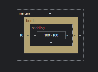
- margin : border를 기준으로 바깥으로 상하좌우 여백 생성
- padding : border를 기준으로 안쪽으로 상하좌우 여백 생성
content-box vs border-box
box-sizing 속성에는 content-box, border-box가 있는데
    <div id="container">
      <div id="inner">
        안쪽 box
      </div>
    </div>
#container {
width: 300px;
padding: 10px;
background-color: yellow;
border: 2px solid red;
}
#inner {
/* box-sizing: content-box; //기본값 */
box-sizing: border-box;
width: 100%;
height: 200px;
border: 2px solid green;
background-color: lightgreen;
padding: 30px;
}
container의 경우에는 width는 300px로 지정했지만 개발자 도구로 가보면

300px + (10px+10px)(padding-left,padding-right)+2px+2px(border-left+border-right) = 324px로
실제로 보이는 크기는 324px이 된다.
border-box를 쓰면 width를 지정했을 때 브라우저가 그 width 그대로 보이게 된다.
하지만 일부 요소에만 적용하게 되면 헷갈릴 수 있기 때문에
차라리 이렇게
* {
  box-sizing: border-box;
}
CSS selector
- child combinator
div > spandiv 태그 바로 밑에 있는 span 태그 하나만 선택이 된다.
- adjacent selector
li:nth-of-type + li현재 선택한 요소의 바로 다음 요소를 선택한다.
- general sibling combinator
p ~ span가상 클래스 selector
<div class="box">
	<p>1. p태그1</p>
	<span>2. span태그1</span>
	<p>3. p태그2</p>
	<span>4. span태그2</span>
	<p>5. p태그3</p>
</div>
/* 부모 요소(.box)의 특정 자식 요소(span) 중 2번째 */
.box > span:nth-of-type(2) {
color: blue;
}
/* 부모 요소(.box)의 특정 자식 요소(p) 중 마지막 */
.box > p:last-child {
color: red;
}
/* 부모 요소(.box)의 특정 자식 요소(p) 중 마지막에서 3번째 */
.box > p:nth-last-child(3) {
color: green;
}
/* 부모 요소(.box)의 특정 자식 요소(p) 중 첫번째 */
.box > p:first-of-type {
color: pink;
}
/* 부모 요소(.box)의 특정 자식 요소(span) 중 첫번째 */
.box > span:first-of-type {
color: wheat;
}
그렇다면 first-of-type과 first-child의 차이는 무엇일까? 찾아봤다.
first-child의 경우에는 특정 자식 요소가 부모 요소의 첫번째에 위치할 때만 적용이 되고
first-of-type은 특정 요소에 상관없이 부모 요소의 첫번째 자식으로 오기만 하면 적용이 된다고 한다.
역시 css가 가장 어렵다...
참고 자료

블로그 이전했습니다. https://nextjs-blog-haseungdev.vercel.app/