Next.js에서 styled-component 설정부터 사용하기까지 (+ TypeScript)

몇주전부터 동아리에서 진행하는 next로 하는 프로젝트가 있었다.
프로젝트를 진행하면서 props를 써야되는 상황이 왔고, 관련 자료를 찾아보다가
next에서 styled-components를 쓸 수 있다는 희소식을 얻게 되었다.
나와 같은 상황에서 삽질하면서 module.css를 쓰지말고 편하게 react에서 쓰던 styled-component를 next.js에서 사용하기 위한 초기 설정부터 사용까지 달려보자 (+ TypeScript)
초기 설정
next에서 styled-component를 쓸려면 몇가지의 초기설정이 필요하다.
우선 당연하게도 styled-components를 install 해줘야한다.
npm i styled-componentsinstall을 해주고 난 뒤 총 두가지를 더 다운을 받아줘야된다.
npm i --save-dev babel-plugin-styled-components
npm i babel-preset-next
(TypeScript는 styled-components의 type을 정해줘야되기 때문에 install을 하나 더 해줘야한다.)
(타입스크립트일때만)
npm i --save-dev @types/styled-components그리고 .src부분에 .babelrc라는 파일을 하나 추가해준다.
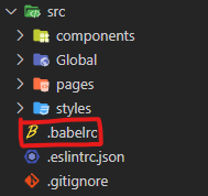
.babelrc
{
  "presets": ["next/babel"],
  "plugins": [["styled-components", { "ssr": true }]]
}
위의 내용을 babelrc에 넣어준다.
그리고 난뒤 pages파일안에 _document.js라는 파일을 하나 더 넣어준다.
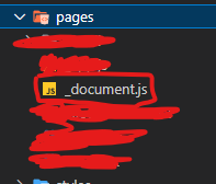
_document.js
import Document from "next/document";
import { ServerStyleSheet } from "styled-components";

export default class MyDocument extends Document {
  static async getInitialProps(ctx) {
    const sheet = new ServerStyleSheet();
    const originalRenderPage = ctx.renderPage;

    try {
      ctx.renderPage = () =>
        originalRenderPage({
          enhanceApp: (App) => (props) =>
            sheet.collectStyles(<App {...props} />),
        });

      const initialProps = await Document.getInitialProps(ctx);
      return {
        ...initialProps,
        styles: (
          <>
            {initialProps.styles}
            {sheet.getStyleElement()}
          </>
        ),
      };
    } finally {
      sheet.seal();
    }
  }
}
위와 같이 내용을 넣어준다.
(만약 TypeScript일시 _document 파일을 js로 만든 뒤, tsconfig.json 파일의 include부분을 고쳐주면 된다.)
tsconfig.json
"include": [
    ...
    "src/pages/_document.js"
  ],
위와 같이 초기설정을 했다면 아마도 다른 문제가 없으면 styled-components가 잘 작동 될 것이다.
이제 사용을 해보자
사용하기
간단하게 Button을 꾸며보았다.
ButtonStyle.tsx
import styled from "styled-components";

...

export const ButtonStyle = styled.button`
  background-color: rgba(21, 86, 247, 0.8);
  padding: 1rem;
  box-shadow: none;
  font-size: 1rem;
  color: white;
  border: none;
  border-radius: 5px;
  font-weight: bold;
  &:hover {
    background-color: rgba(21, 86, 247, 0.9);
  }
  &:active {
    background-color: rgba(21, 86, 247);
  }
  margin-top: 3rem;
`;

...
Button.tsx
import * as S from "../styles/ButtonStyle";

const Button = ()=>{
  return (
    <>
    	...
    	<S.ButtonStyle>제출하기</S.ButtonStyle>
    	...
    </>
    );
};

export default Button;
실제 ui

이렇게 잘 적용된걸 알 수 있다.
출처 :
https://record22.tistory.com/128
https://garniel23.tistory.com/m/entry/%EC%97%90%EB%9F%AC-%ED%95%B4%EA%B2%B0-styled-components-Could-not-find-declaration-file
(감사합니다)