왜 반존대하지
월요일이라 그런지 힘이 없다..
오늘은 users 테이블 EDA를 진행해봤다
사실 어제 집 와서 바로 해보려고 했는데 너무 피곤해서 오늘 7시에 일어나서 미리 해봤다
시각화를 많이 해서 은근 재밌는거같기두.. 아직 갈길이 구만리지만..
각자 한 테이블씩 맡아서 진행하다보니 다같이 하는 것보다 책임감도 생기고 역할 분담도 돼서 좋은 듯 하다
이상치 분석
- 이상치 제거를 위해 먼저 전체 데이터 시각화를 진행
#데이터 분포
users1.hist(bins=20, figsize=(12, 6), color='green')
plt.tight_layout()
plt.show()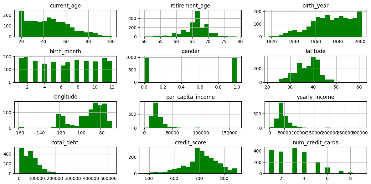
✅ 전체 데이터셋을 봤을 때 나이가 음수 등 이상치는 없는 것으로 보임
#boxplot 3컬럼씩 나눠서
cols = list(users1)
cols

for i in range(0, len(cols), 3):
    plt.figure(figsize=(12, 5))
    sns.boxplot(data=users1[cols[i:i+3]])
    plt.tight_layout()
    plt.show()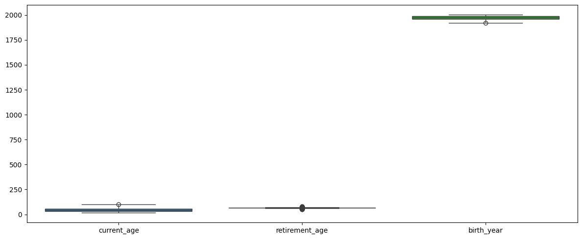
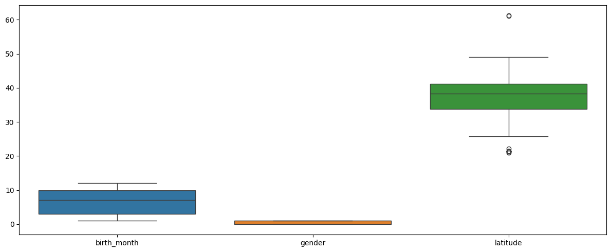
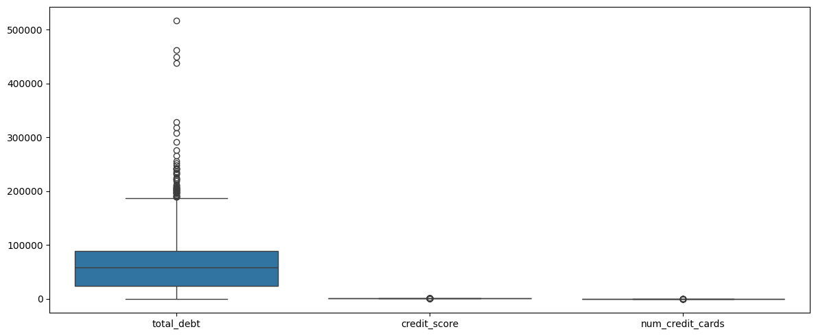
✅ boxplot으로 시각화했을 때 눈에 띄는 컬럼들 존재
각 컬럼들 따로 시각화
#인당 소득 히스토그램
users1['per_capita_income'].hist(bins=20, color='orange', figsize=(8, 4))
plt.show()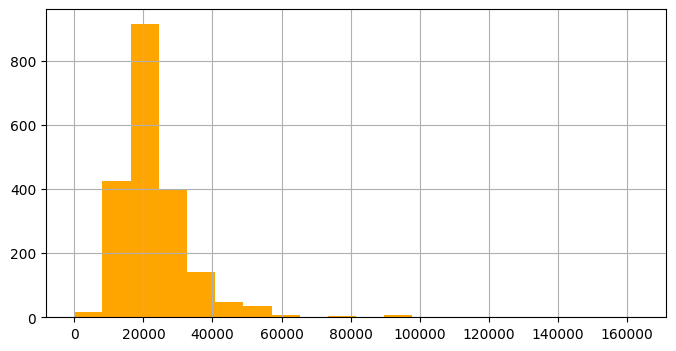
#고소득자만 따로 인당 소득 컬럼 확인
df = users[users['per_capita_income'] > 80000].reset_index(drop=True)
df
#연간 소득 히스토그램 확인
users1['yearly_income'].hist(bins=20, color='orange', figsize=(8, 4))
plt.show()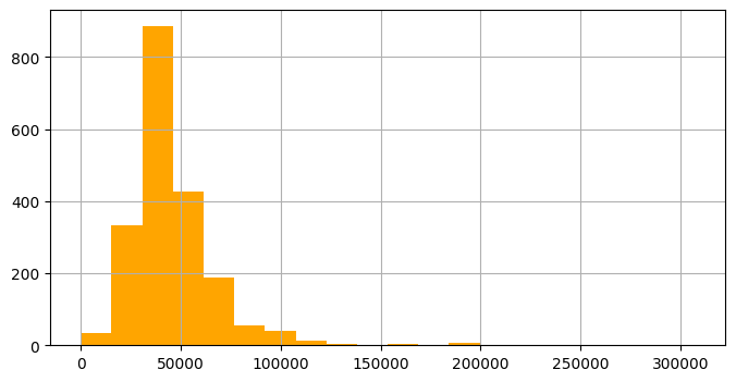
#고소득자만 따로 연간 소득 컬럼 확인
df = users[users['yearly_income'] > 150000].reset_index(drop=True)
df
#연간 소득 컬럼 확인
df = users[users['yearly_income'] > 150000].reset_index(drop=True)
df
#총 부채 히스토그램
users1['total_debt'].hist(bins=20, color='orange', figsize=(8, 4))
plt.show()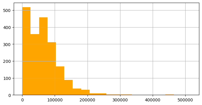
#부채 많은 사람만 따로 총 부채 컬럼 확인
df = users[users['total_debt'] > 250000].reset_index(drop=True)
df
#위 세가지 조건 모두 만족하는 데이터
df_total = users[(users['per_capita_income'] > 80000) & (users['yearly_income'] > 150000) & (users['total_debt'] > 250000)].reset_index(drop=True)
df_total
#부채 제외 고소득자만
df_2 = users[(users['per_capita_income'] > 80000) & (users['yearly_income'] > 150000)].reset_index(drop=True)
df_2세 조건 모두 만족하는 컬럼 적음 => ✅ 결론: 총 부채가 많다고 소득이 높은 것 무조건 아님
고소득자 vs 전체 분포 비교
#고소득자 vs 전체 분포
df1 = df_2.drop('address', axis=1)
df1

columns = ['current_age', 'retirement_age', 'per_capita_income', 'yearly_income', 'total_debt', 'credit_score']

for col in columns:
    plt.figure(figsize=(6, 4))
    sns.kdeplot(data=users, x=col, label='total', fill=True, alpha=0.4)
    sns.kdeplot(data=df1, x=col, label='high_income', fill=True, alpha=0.6)
    plt.title(f'{col} difference')
    plt.legend()
    plt.tight_layout()
    plt.show()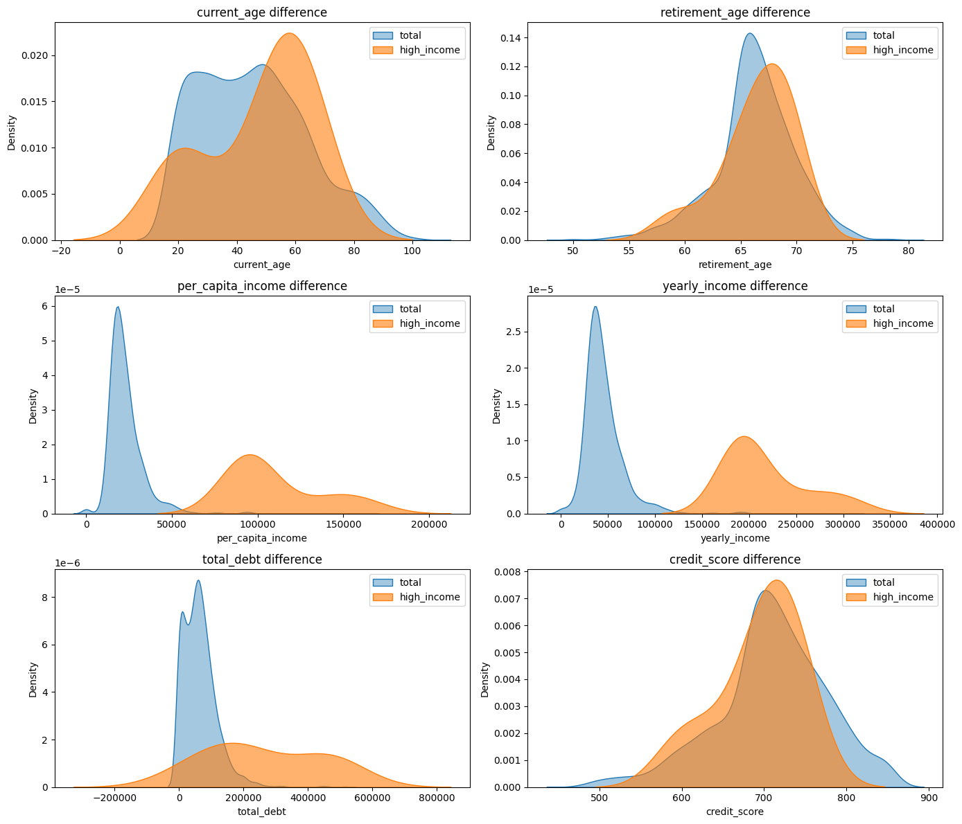
✅ 해석
1. 전체에 비하면 고소득자의 연령대가 높음. 40~80대에 가장 많이 분포
2. 총 부채가 전체는 적은 금액에 몰려있지만, 고소득자는 0에서 큰 값까지 고르게 분포
3. 신용점수는 큰 차이 X, 고소득자라고 더 높은 신용점수 X
지리 분포
sns.scatterplot(data=users, x='longitude', y='latitude', hue='gender', palette='Set1')
plt.title("Geographical Distribution of Users")
plt.show()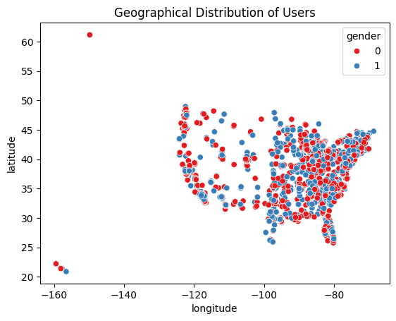
위도+경도로 미국 지도로 나오는거 너무 신 기 해..
여기서 경도 -150도 나오는게 이상치라 생각해 위도+경도 찾는 사이트에서 찾아보니 저 지역은 하와이였다 ... ㄷㄷㄷ 위도 60도 이상은 알래스카... 너무 재 밋 어
컬럼 간 상관관계 확인
corr_matrix = users1.corr()
plt.figure(figsize=(10, 8))

mask = np.triu(np.ones_like(corr_matrix, dtype=bool))
sns.heatmap(corr_matrix,annot=True, cmap='BrBG', linewidths=0.5, mask=mask, fmt=".2f")
plt.title("Heatmap")
plt.show()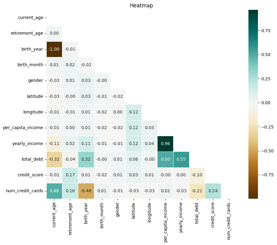
✅ 해석
1. 연간 소득과 인당 소득은 아주 높은 상관관계 (당연)
2. 나이가 많을 수록 발급 신용카드 많음
3. 나이가 적을수록 부채 적음
4. 신용 점수와 발급 신용 카드 약한 양의 상관관계
5. 소득 높을수록 부채 있을 가능성 있음
6. 신용 점수와 소득간의 상관관계 없음
신용 등급별로 나눠 시각화
- 다음 기준으로 등급별로 나눠줌
# 구간 기준
bins = [300, 600, 660, 780, 850]
labels = ['Poor', 'Fair', 'Good', 'Excellent']  # 등급 라벨

# 등급 컬럼 추가
users['credit_grade'] = pd.cut(users['credit_score'], bins=bins, labels=labels, include_lowest=True)

#각 등급 개수 확인
users['credit_grade'].value_counts()
#시각화
sns.countplot(data=users, x='credit_grade', order=labels, palette='Set2')
plt.title('Credit Score distribution')
plt.xlabel('Credit Score')
plt.ylabel('customer count')
plt.tight_layout()
plt.show()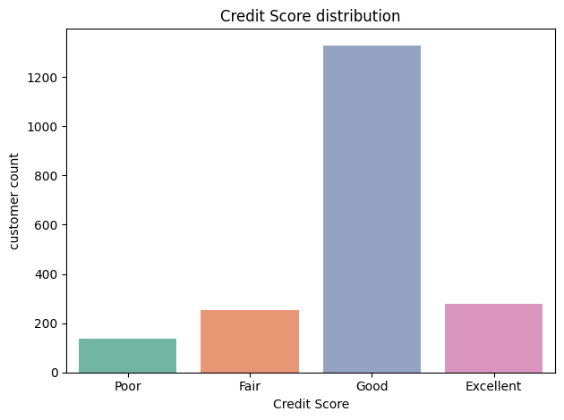
#poor 분포
poor.hist(bins=20, figsize=(12, 6), color='green')
plt.tight_layout()
plt.show()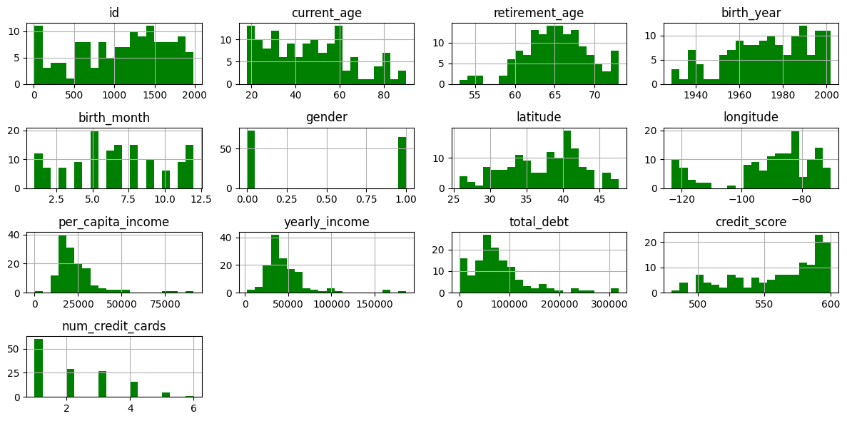
poor vs 전체
columns = ['current_age', 'retirement_age', 'per_capita_income', 'yearly_income', 'total_debt', 'credit_score']

fig, axes = plt.subplots(nrows=3, ncols=2, figsize=(14, 12))

axes = axes.flatten()

for i, col in enumerate(columns):
    sns.kdeplot(data=users, x=col, label='total', fill=True, alpha=0.4, ax=axes[i])
    sns.kdeplot(data=poor, x=col, label='poor_label', fill=True, alpha=0.6, ax=axes[i])
    axes[i].set_title(f'{col} difference')
    axes[i].legend()

plt.tight_layout()
plt.show()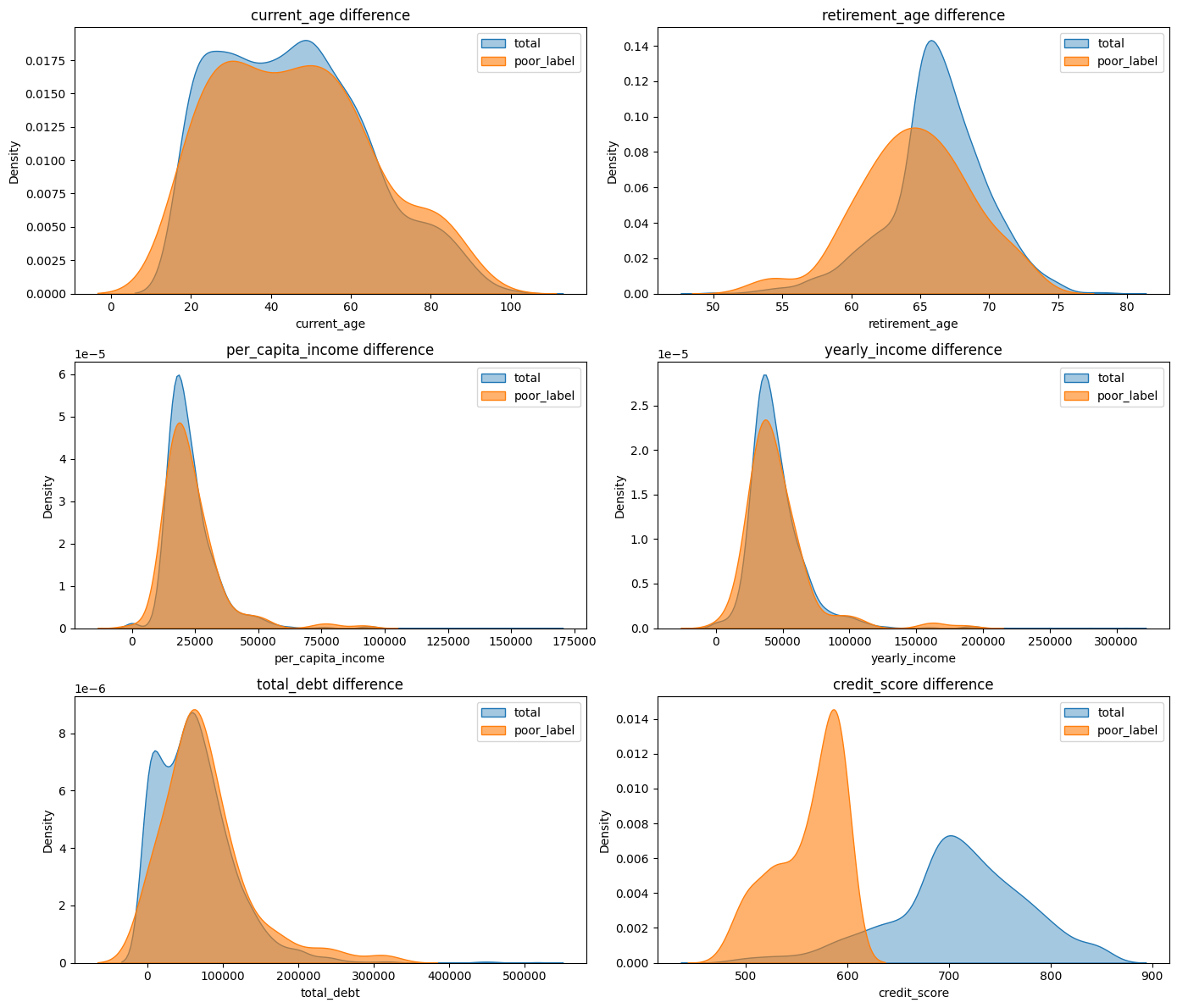
✅ 은퇴나이가 평균보다 적고, 소득이 평균보다 약간씩 낮음. 이외엔 크게 눈에 띄게 낮은 수치 X
excellent vs 전체
columns = ['current_age', 'retirement_age', 'per_capita_income', 'yearly_income', 'total_debt', 'credit_score']

fig, axes = plt.subplots(nrows=3, ncols=2, figsize=(14, 12))

axes = axes.flatten()

for i, col in enumerate(columns):
    sns.kdeplot(data=users, x=col, label='total', fill=True, alpha=0.4, ax=axes[i])
    sns.kdeplot(data=ex, x=col, label='ex_label', fill=True, alpha=0.6, ax=axes[i])
    axes[i].set_title(f'{col} difference')
    axes[i].legend()

plt.tight_layout()
plt.show()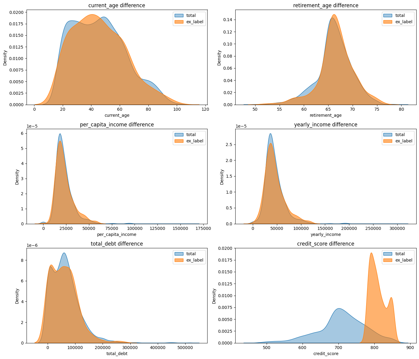
부채가 평균보다 조금 낮다는거 이외에 눈에 띄는 수치 X
transaction 테이블의 결제 금액 join
trans = pd.read_csv(r'C:\Users\gmlfl\Desktop\내배캠\1조 팀프로젝트\raw data\transactions_data.csv', parse_dates=['date'])
trans['year'] = trans['date'].dt.year

# 필요한 열만 불러오기기
df_2017 = trans[trans['year'] >= 2017]
trans = df_2017[['client_id','amount']]
trans

#'$' 제거
trans['amount'] = trans['amount'].str.replace('$', '', regex=False)
trans['amount'] = pd.to_numeric(trans['amount'], errors='coerce')
trans

# 결제 취소 제거
trans = trans[trans['amount'] > 0]
trans

#필요없는 컬럼 제거
user2 = users.drop(['address', 'birth_month'], axis=1)
user2

# id 기준 trans, users join
merge_ = pd.merge(user2, trans, how='left', left_on='id', right_on='client_id')
merge_
여기까지 중복값을 전혀 생각 못했다..
결제금액과 나머지 상관계수 확인
#결제 금액 추가한 상관관계
corr_matrix = merge_.corr()
plt.figure(figsize=(10, 8))

mask = np.triu(np.ones_like(corr_matrix, dtype=bool))
sns.heatmap(corr_matrix,annot=True, cmap='BrBG', linewidths=0.5, mask=mask, fmt=".2f")
plt.title("Heatmap")
plt.show()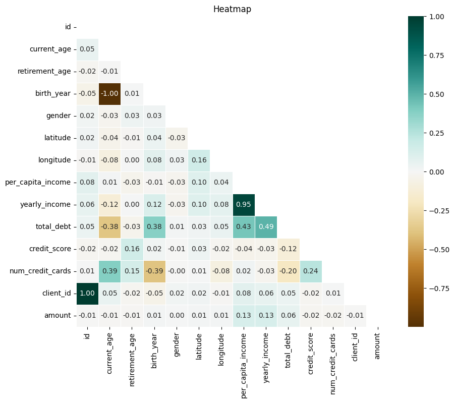
결제 금액과 소득 수준은 아주 약한 양의 상관관계.. 라고 생각했지만..
id 기준 group by, amount 평균치
# NaN 값이 있는 행은 제외해야 groupby가 정상적으로 작동함
trans_clean = merge_.dropna(subset=['client_id', 'amount'])

# groupby + aggregate
grouped = trans_clean.groupby('client_id').agg({
    'amount': 'mean',              # amount는 평균
    'id': 'first',
    'current_age': 'first',
    'retirement_age': 'first',
    'birth_year': 'first',
    'gender': 'first',
    'latitude': 'first',
    'longitude': 'first',
    'per_capita_income': 'first',
    'yearly_income': 'first',
    'total_debt': 'first',
    'credit_score': 'first',
    'num_credit_cards': 'first'
}).reset_index()
grouped
전체 고객 2000명 중 1212행만 남아서 이유를 생각해보니 2017년부터 데이터 추출해서였다. 2010년부터 했을 시 데이터 달라지는진 모르겠음..
# groupby 한 값으로 다시 상관계수 추출
corr_matrix = grouped.corr()
plt.figure(figsize=(10, 8))

mask = np.triu(np.ones_like(corr_matrix, dtype=bool))
sns.heatmap(corr_matrix,annot=True, cmap='BrBG', linewidths=0.5, mask=mask, fmt=".2f")
plt.title("Heatmap")
plt.show()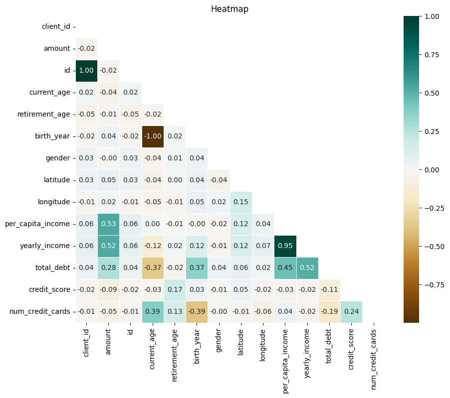
✅ 해석: 결제 금액 높을수록 소득 높음! 부채와도 약간의 상관관계 (고소득자와 동일)
#전체 테이블(groupby X) 중 결제 금액만 따로 분포 보기
merge_['amount'].hist(bins=20, color='orange', figsize=(8, 4))
plt.show()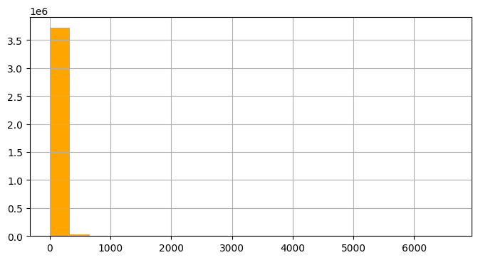
group by 이전 amount 시각화 했을때 이런 기형적인.. 그래프가 나온다.
#결제 금액 1000 이상만 추출
df_high = merge_[merge_['amount'] > 1000].reset_index(drop=True)
df_high
추출해보니 2600개의 행으로 전체 3백만 행 중 극소수, 일부 소수가 극단적 결제 금액, 전체 평균을 대변하지 못함
# id 기준 groupby, amount 평균 금액으로 다시 추출
grouped['amount'].hist(bins=20, color='orange', figsize=(8, 4))
plt.show()
# '평균' 결제 금액이 100 이상만 추출
df_avg = grouped[grouped['amount'] > 100].reset_index(drop=True)
df_avg
비교해보니 최고 금액 결제자 <> 평균 결제 금액 높은 사람..
아예 amount 1000 이상인 사람들만 groupby 하는게 더 정확한 값일지?
# 최고 결제 금액 높은 사람은 소득도 높은지 확인
df_high.hist(bins=20, figsize=(12, 6), color='green')
plt.tight_layout()
plt.show()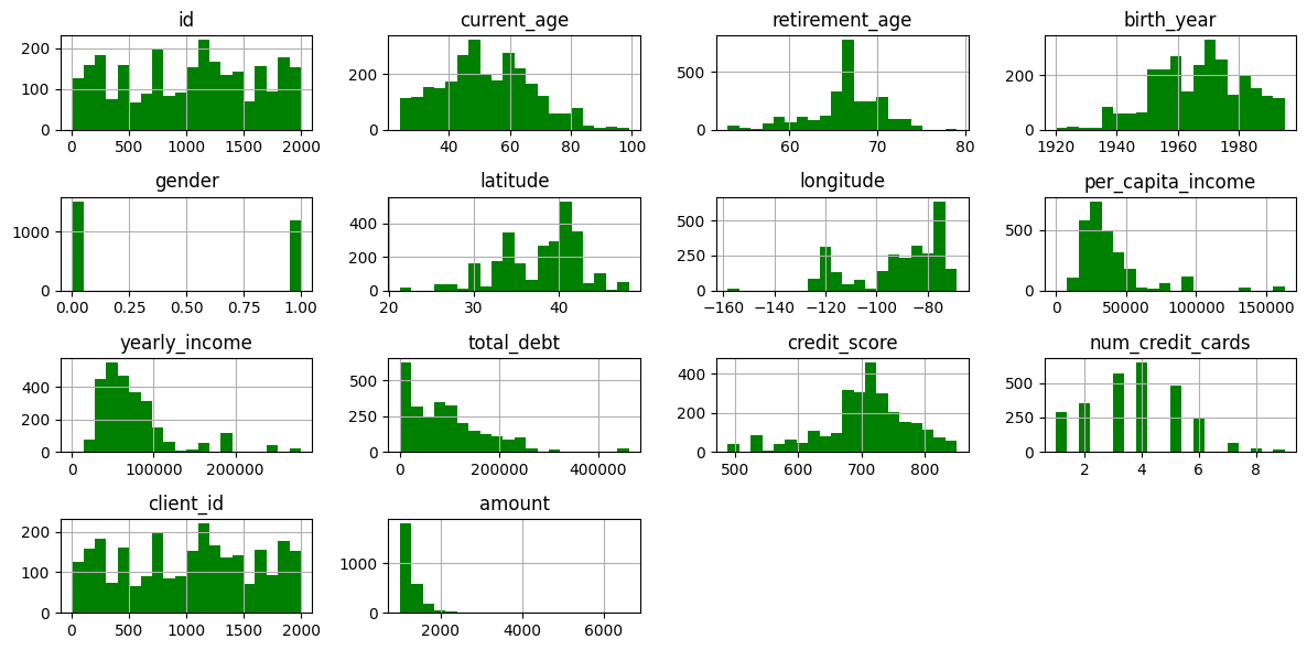
이렇게만 하니까 잘 보이지 않아 전체 분포와 비교해보았다
최고 금액 vs 전체와 비교
columns = ['current_age', 'retirement_age', 'per_capita_income', 'yearly_income', 'total_debt', 'credit_score']

fig, axes = plt.subplots(nrows=3, ncols=2, figsize=(14, 12))

axes = axes.flatten()

for i, col in enumerate(columns):
    sns.kdeplot(data=users, x=col, label='total', fill=True, alpha=0.4, ax=axes[i])
    sns.kdeplot(data=df_high, x=col, label='high_amount', fill=True, alpha=0.6, ax=axes[i])
    axes[i].set_title(f'{col} difference')
    axes[i].legend()

plt.tight_layout()
plt.show()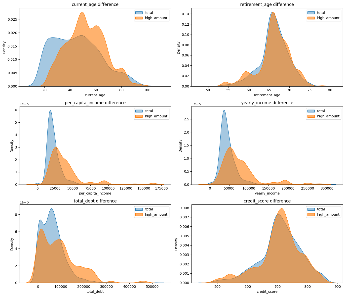
✅ 해석
1. 나이는 40~80대 가장 많음 (고소득자와 동일)
2. 인당, 연간 소득 평균보다 고르게 분포
3. 부채 역시 고르게 분포
평균 결제 금액 vs 전체 비교
columns = ['current_age', 'retirement_age', 'per_capita_income', 'yearly_income', 'total_debt', 'credit_score']

fig, axes = plt.subplots(nrows=3, ncols=2, figsize=(14, 12))

axes = axes.flatten()

for i, col in enumerate(columns):
    sns.kdeplot(data=users, x=col, label='total', fill=True, alpha=0.4, ax=axes[i])
    sns.kdeplot(data=df_avg, x=col, label='avg_amount', fill=True, alpha=0.6, ax=axes[i])
    axes[i].set_title(f'{col} difference')
    axes[i].legend()

plt.tight_layout()
plt.show()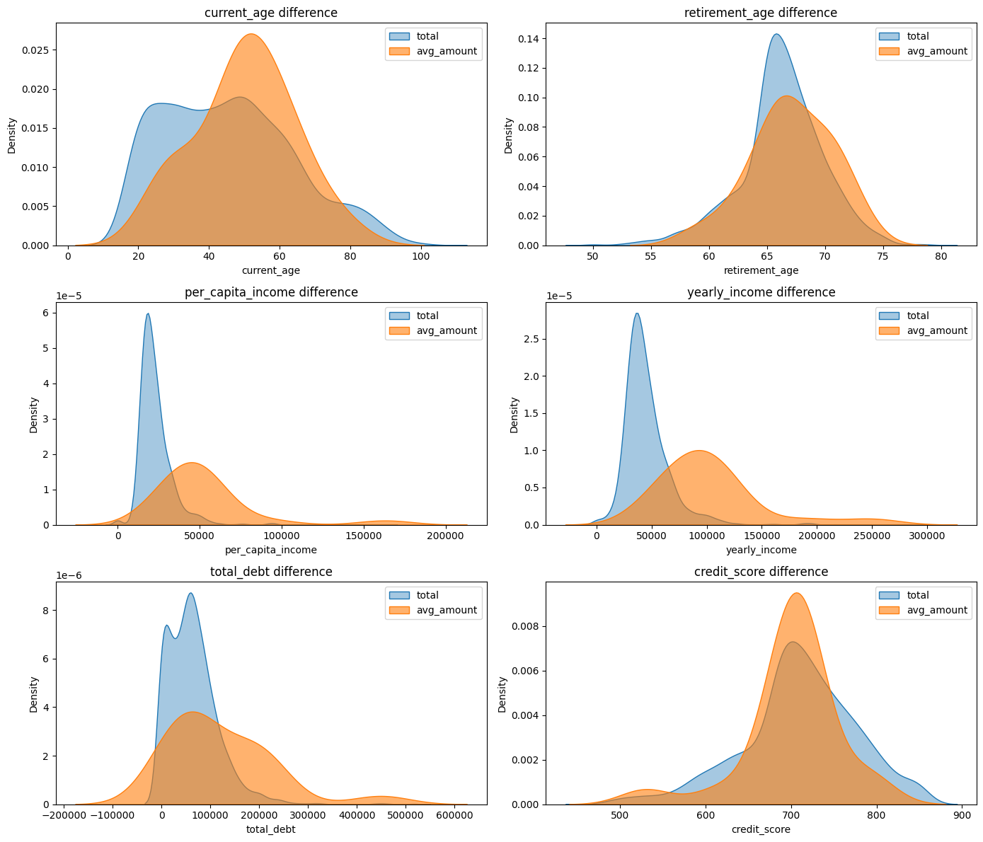
높은 평균 결제 금액, 최고 결제 금액 둘 다 고소득자와 동일한 그래프로 나타남 => 소득이 높을수록 결제 금액 증가!
중간에 df로 중복해서 컬럼 이름을 정의했다가 결과가 아무리봐도 이상해서 코드 살펴보고 바꿨더니 생각한 결과대로 나왔다 ^.^.. 이름 늘 다르게 써주는거 잊지 말기..
뭔가 많이 한거같은데 돌이켜보면 별거 없는거같기도 하고 ,.....
소득 기준을 내 임의대로 숫자를 넣은 것이라 명확한 기준(상위 10%) 이 필요할 듯 하다..
users 테이블만 좀 봤지 아직 transaction 의 amount만 조인해서 내일은 테이블 모두 조인하고 클린한 데이터로 뭐든 시작해보는걸 목표로 해야지~.. 파이팅