CSS를 사용하여 html 레이아웃을 구성할 때 float, flex, grid의 속성을 사용.
float란?
원래 이미지와 텍스트 배치 용도로 등장했지만, 요즘에는 삽화 뿐만 아니라 레이아웃을 잡을 때도 사용.
float : none, left, right ;
float 속성이 여러개일 경우 상단에서부터 순서대로 배치
clear
float 속성이 적용된 후에는 clear 속성을 사용하여, 이후에 등장하는 요소들이 더 이상 float 속성에 영향을 받지 않도록 설정.
clear : both (float: left 또는 float: right 값 모두 해제.) left, right ;
overflow
요소내의 컨텐츠가 자신을 감싸고 있는 컨테이너 요소보다 크면, 해당 요소의 일부가 밖으로 흘러넘치게 되는데 이때 어떻게 보여줄지를 결정.
overflow : visible, hidden, scroll, auto ;
float 사용 시 주의사항
float 속성을 사용하면 block 요소로 바뀐다.(inline 요소에 float 속성을 적용하면 display 값이 block으로 바뀐다.)
display 값이 flex, grid인 요소의 item에 float을 적용해도 block 요소가 되지 않는다.
※ inline 요소에 float 속성을 적용하면 block으로 바뀌는 것과 관련하여 position: absolute, fixed 속성도 부여하면 block으로 바뀐다.
참고자료
https://developer.mozilla.org/en-US/docs/Web/CSS/float
https://developer.mozilla.org/ko/docs/Web/CSS/clear
https://developer.mozilla.org/ko/docs/Web/CSS/overflow
https://www.w3schools.com/css/css_overflow.asp
flex란?
레이아웃 배치 전용 기능. Flexible Box, Flexbox라고도 불림.
container가 Flex의 영향을 받는 전체 공간이고, 설정된 속성에 따라 각각의 item이 어떤 형태로 배치되는 것.
<div class="container">
	<div class="item">helloflex</div>
	<div class="item">abc</div>
	<div class="item">helloflex</div>
</div>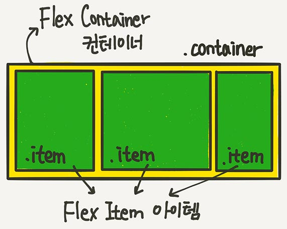
.container {
display : flex;
// flex 적용을 위한 필수 code?
// item 자동 row 배치
// item width, 실제 width 만큼. (inline 요소 처럼)
// item height, container의 높이만큼. (column 레이아웃을 만들때 용이)
}
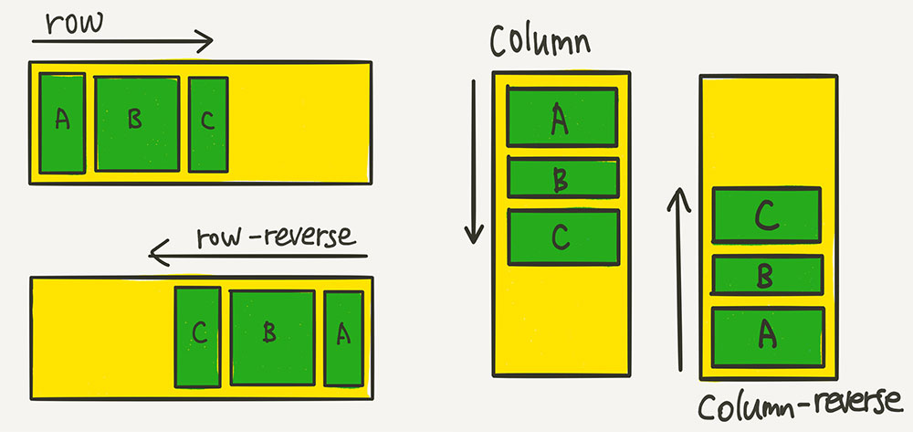
container 속성
.container {
// 배치 방향 설정
flex-direction : row(기본값) / column / row-reverse / column-reverse;
}
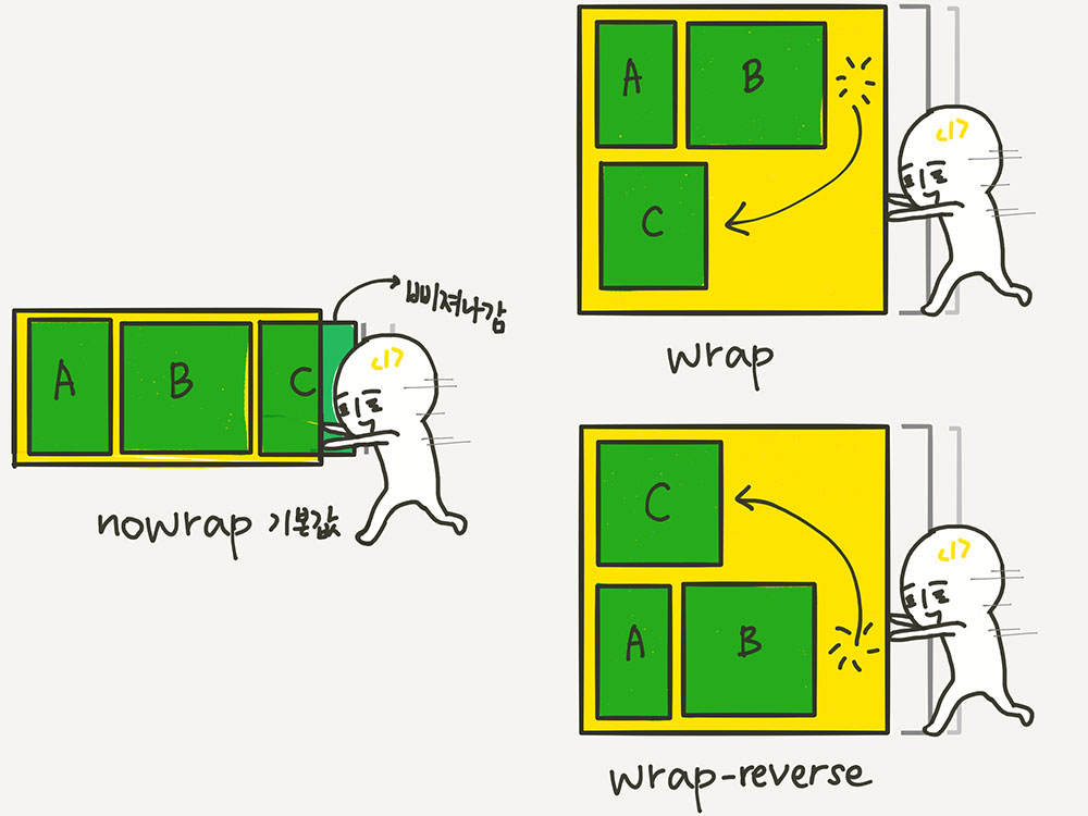
.container {
// 줄바꿈 처리 설정
flex-wrap : nowrap(기본값) / wrap / wrap-reverse;
}
.container {
// flex-dierction + flex-wrap 한번에.
flex-flow : row wrap (Ex)
}
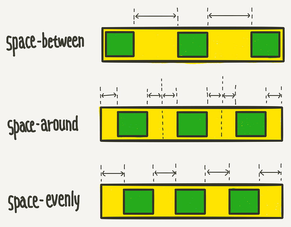
.container {
// justify? 수평 방향 정렬.
justify-content : flex-start(기본값) / flex-end / center / space-between / space-aroud / space-evenly;
}
.container {
// align? 수직 방향 정렬.
align-items : stretch(기본값) / flex-start / flex-end / center / baseline;
// flex-wrap : wrap 상태에서 item 2줄 이상일 때
align-content : stretch / flex-start / flex-end / center / space-between / space-around / space-evenly;
}
item 속성
.item {
// item 기본 크기 지정.
// flex-direction이 row일 때는 너비, column일 때는 높이
// flex-basis vs width vs felx-basis + width
flex-basis : 각종 단위의 수 ;
}
.item {
// container 여백을 채우기 위한 item 크기 확장 조절.
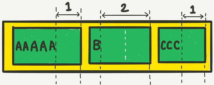
// flex-grow에 들어가는 숫자의 의미는, 아이템들의 flex-basis를 제외한 여백 부분을 flex-grow에 지정된 숫자의 비율로 나누어 가진다!
flex-grow : 0(기본값) / 1 / ...
// nth-child(n), 부모안에 모든 요소 중 n번째 요소.
.item:nth-child(1) { flex-grow: 1; }
.item:nth-child(2) { flex-grow: 2; }
.item:nth-child(3) { flex-grow: 1; }
}
.item {
// container 공간 부족 시 item 크기 축소 조절.
// 0보다 큰 값이면 flex-basis보다 작아짐.
// flex-shrink : 0 , item의 크기가 flex-basis보다 작아지지 않기 때문에 고정폭의 column을 만들 때 용이. 고정 크기는 width로 설정.
flex-shrink : 1(기본값) / 0 / ... ;
}
.item {
// flex-grow + flex-shrink + flex-basis 한번에.
flex: 1 1 auto;
// flex-grow: 1; flex-shrink: 1; flex-basis: auto;
// 축약형 flex 설정 주의.
flex: 1;
// flex-grow: 1; flex-shrink: 1; flex-basis: 0%;
flex: 1 500px;
// flex-grow: 1; flex-shrink: 1; flex-basis: 500px;
}
.item {
// align-items가 전체 아이템의 수직축 방향 정렬이라면, align-self는 해당 아이템의 수직축 방향 정렬.
// 기본값은 auto로, 기본적으로 align-items 설정을 상속 받음.
// align-self는 align-items보다 우선권.
align-self: auto(기본값) / stretch / flex-start / flex-end / center / baseline;
}
Holy Grail Layout
https://www.opentutorials.org/course/2418/13526
참고자료
https://studiomeal.com/archives/197
https://opentutorials.org/course/2418/13526
grid란?
flex vs grid
flex 한 방향 레이아웃 시스템 (1차원)
grid 두 방향(가로-세로) 레이아웃 시스템 (2차원)
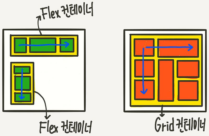
flex와 마찬가지로, container와 item의 구조.
<div class="container">
	<div class="item">A</div>
	<div class="item">B</div>
	<div class="item">C</div>
	<div class="item">D</div>
	<div class="item">E</div>
	<div class="item">F</div>
	<div class="item">G</div>
	<div class="item">H</div>
	<div class="item">I</div>
</div>
.container {
display : grid;
// grid 적용을 위한 필수 code?
}
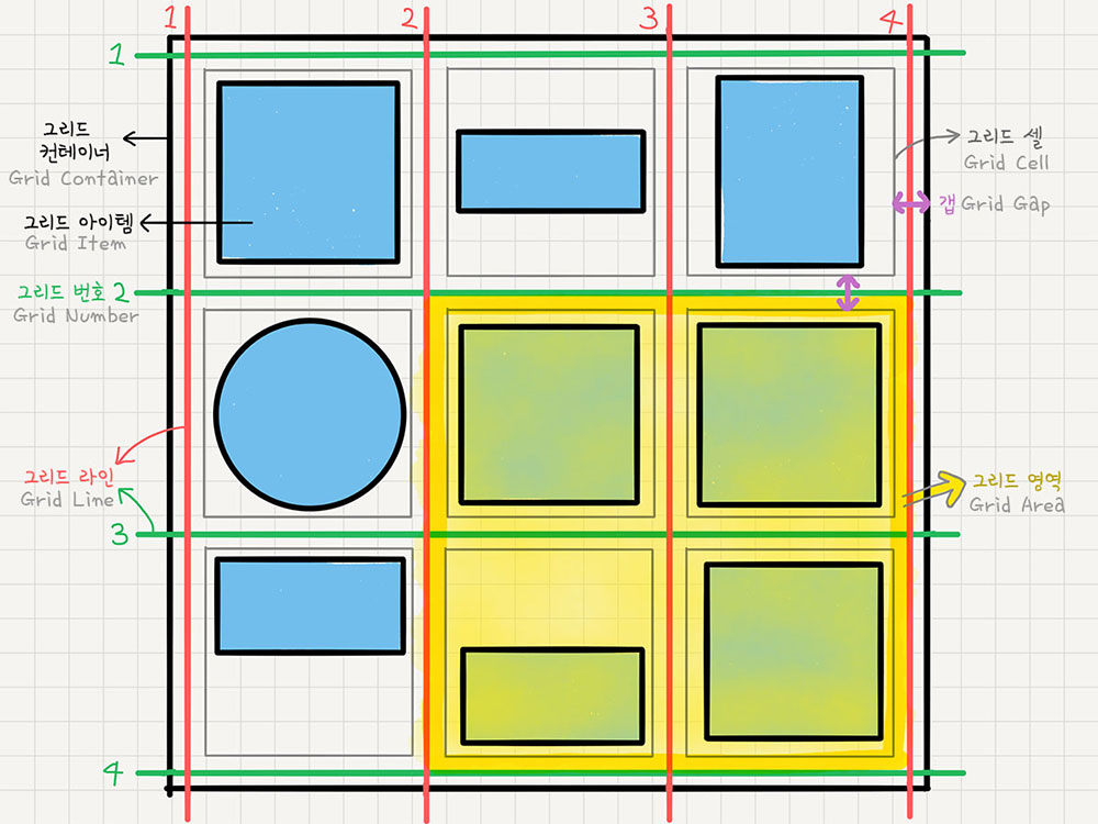
용어 정리
-
그리드 컨테이너 (grid container)
display: grid를 적용하는, grid의 전체 영역.
Grid 컨테이너 안의 요소들이 grid 규칙의 영향을 받아 정렬.
<div class=”container”></div>이부분이 grid container. -
그리드 아이템 (grid item)
Grid 컨테이너의 자식 요소들.
이 아이템들이 Grid 규칙에 의해 배치.
<div class=”item”></div>이부분이 grid item. -
그리드 트랙 (grid track)
grid의 행(row) 또는 열(column). -
그리드 셀 (grid cell)
grid의 한 칸을 가리키는 말.
grid 아이템 하나가 들어가는 “가상의 칸(틀)”.
실제 html 요소<div>는 grid item. -
그리드 라인(grid line)
grid 셀을 구분하는 선. -
그리드 번호(grid number)
grid 라인의 각 번호. -
그리드 갭(grid gap)
grid 셀 사이의 간격. -
그리드 영역(grid area)
grid 라인으로 둘러싸인 사각형 영역으로, 그리드 셀의 집합.
container 속성
.container{
// gird 트랙의 크기를 지정.
grid-template-columns: ;
grid-template-rows: ;
grid-template-columns: 200px 200px 500px
.
// fr(fraction), 비율을 의미
// 1fr 1fr 1fr = 1:1:1 비율인 3개의 column
.
// repeat 함수
// repeat(3, 1fr) = 1fr 1fr 1fr
.
// minmax 함수
// minmax(100px, auto) 최소 100px, 최대는 자동으로(auto) 늘어나게...
.
// auto-fill, auto-fit
}
.container {
// 셀 사이의 간격을 설정.
row-gap: 10px;
column-gap: 20px;
// row-gap + column-gap 한번에
gap: 10px 20px;
}
.container {
// grid-template-rows의 업그레이드?
// row 개수를 미리 알 수 없는 경우.
grid-auto-rows: ;
grid-auto-columns: ;
}
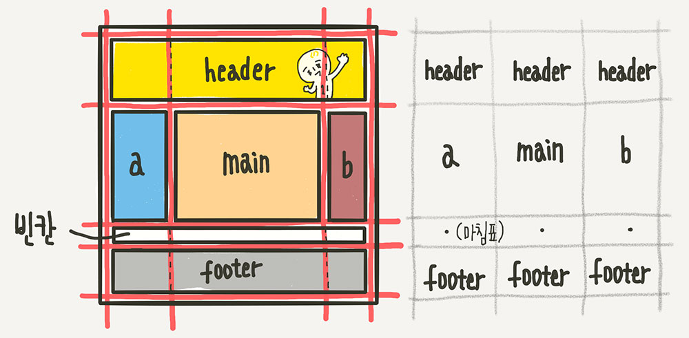
.container {
// 각 영역(Grid Area)에 이름을 붙이고, 그 이름을 이용해서 배치하는 방법.
grid-template-areas:
"header header header"
" a main b "
" . . . "
"footer footer footer";
}
+ 각 영역의 이름은 해당 아이템 요소에 grid-area 속성으로 지정.
이름 값에 따옴표가 없는 것에 주의.
.header { grid-area: header; }
.sidebar-a { grid-area: a; }
.main-content { grid-area: main; }
.sidebar-b { grid-area: b; }
.footer { grid-area: footer; }
.container {
// item이 자동 배치되는 흐름을 결정하는 속성.
grid-auto-flow: dense / ... ;
dense는 기본적으로 빈 셀을 채움.
}
.container {
// item을 수직(column축)방향 정렬.
align-items: stretch / start / center / end ;
// item을 수평(row축)방향 정렬.
justify-items: stretch / start / center / end ;
// align-items + justify-items 한번에
place-items: center start;
}
.container {
// Grid 아이템들의 높이를 모두 합한 값이 Grid 컨테이너의 높이보다 작을 때 Grid 아이템들을 통째로 정렬.
align-content: stretch / start / center / end / space-between / space-around / space-evenly;
// Grid 아이템들의 너비를 모두 합한 값이 Grid 컨테이너의 너비보다 작을 때 Grid 아이템들을 통째로 정렬.
justify-content: stretch / start / center / end / space-between / space-around / space-evenly;
// align-content + justify-content 한번에
place-content: space-between center;
}
item 속성
.item:nth-child(1) {
// 각 셀의 영역을 지정.
grid-column-start: 1;
grid-column-end: 3;
grid-column: 1 / 3;
// grid-column-start + grid-column-end 한번에
}
.item {
// 해당 아이템 수직(column축) 방향으로 정렬
align-self: stretch / start / center / end;
// 해당 아이템을 수평(row축) 방향으로 정렬
justify-self: stretch / start / center / end;
// place-self = align-self + justify-self
place-self: start center;
}
// 각 아이템들의 시각적 나열 순서를 결정하는 속성.
// 숫자값이 들어가며, 작은 숫자일 수록 먼저 배치.
.item:nth-child(1) { order: 3; }
// z-index
// z-index로 Z축 정렬.
// 숫자가 클 수록 위로 올라옴.
참고자료
https://studiomeal.com/archives/533
https://caniuse.com/?search=grid