<!DOCTYPE html>
<html lang="en">
<head>
  <meta charset="utf-8">
  <meta name="viewport" content="width:blah">
기본구조
containers
.container: fixed width container.container-fluid: full width container
그리드 시스템
- 한 페이지를 12개의 컬럼으로 나눠서 사용
<div class="col-xs-12">- col-size-컬럼갯수
- xs: 휴대전화의 경우. 너비 768px 미만
- sm: 태블릿. 너비 768px 이상
- md: 소형 노트북. 너비 992px 이상
- lg: 노트북 및 데스크탑. 너비 1200px 이상
- col-size-컬럼갯수
Typhography
글자색
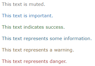
.text-muted.text-primary.text-success.text-info.text-warning.text-danger
배경색
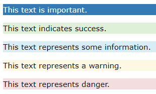
.bg-primary.bg-success.bg-info.bg-warning.bg-danger
정렬
갈 길이 멀다