지금까지는 float나 inline-block 을 통해서
block요소들을 옆으로 배치했었는데
flex를 이용해서 좀 더 편하게 할 수 있는 방법을 배우는 중이다
<div class="flex-container">
	<div class="box"></div>
	<div class="box"></div>
	<div class="box"></div>
</div>
이런식으로 되어있으면
css파일로 들어가서 부모 태그인
.flex-container {
	display: flex; # 이렇게만 하면 알아서 옆으로 쇽쇽 붙음
    justify-content: center # 요거까지 하면 가운데로 이쁘게 붙음!
}

우측 정렬 : flex-end
좌측 정렬 : flex-start
그 외 space-between...

세로배치도 가능!
flex-direction: column  # 세로배치 쌉가능 row는 기존 그대로임
flex-wrap: wrap; # 이게 적용되면 요소가 크면 아래로 자동으로 내려감!


# flex 이용시상하정렬
align-items: center;

# 정확히 가운데 정렬하는 방법
justify-content:
align-items: center;
반응형에서 엄청 유용할거임!
flex-grow: 1;  # 박스크기를 비율로 설정이 가능!

특히 네비게이션 바 만들 때 많이 사용!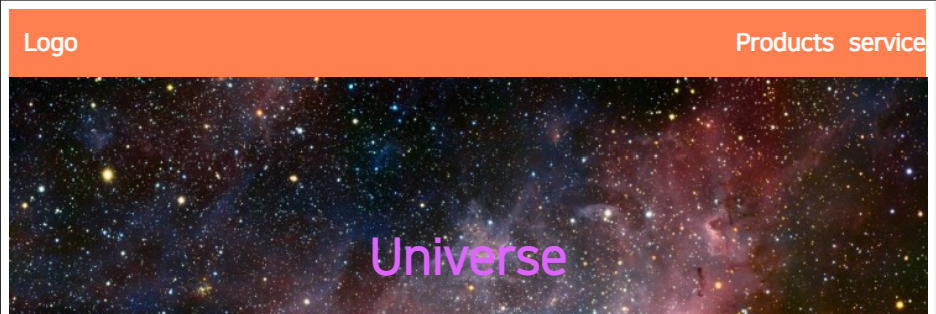
코드는 이런식으로!
<div class="mainflex-container">
        <div class="flex-container"><h2>Logo</h2></div>
        <div class="flex-container" style="flex-grow: 2"><h2>Products</h2></div>
        <div class="flex-container" ><h2>service</h2></div>
</div>

.mainflex-container {
    display: flex;
}

.flex-container {
    text-align: right;
    background-color: coral;
}

---
css

.flex-container {
    padding-left: 15px;
    color: white;
}
다들 한번씩 만들어보자고!

잔디심는 코린이