✍🏻 리액트 다크모드 구현하기
사용자 경험을 최상으로 이끌어주는 디자인 트렌드 다크모드 UI.
애플, 구글, 인스타그램, 페이스북 등 세계적인 브랜드들이 이 다크모드 기능을 애용하기 시작하며 UI/UX에 필수적인 기능 중 하나가 됐습니다.
Web frontend 개발자로써 다크모드 기능을 구현하는 것 또한 필수적일 터, 인터넷에서 야금야금 정보를 모아 리액트 애플리케이션에 다크모드 기능을 구현해보았습니다.
- 자세한 코드는 gparkkii's github에서 확인 가능합니다.
🤔 어떻게 구현할까?
우선 다크모드 UI 적용을 위해 생각해보아야 할 요소들은
✔️ 다크모드 테마 스타일 세팅
✔️ 다크모드 테마 상태관리
✔️ 다크모드 테마 변경 및 유지기능
등이 있습니다.
✅ 다크모드 테마 스타일 세팅
최근 emotion을 많이 사용하고 있었던지라 emotion을 통해 다크모드를 구현해보고 싶었지만 styled-components가 글로벌 스타일 적용 및 css 초기화를 위한 기능들이 훨씬 잘 구현되어있어 다크모드 테마 스타일 세팅 라이브러리로 styled-components를 선택했습니다.
✅ 다크모드 테마 상태관리
다크모드 테마 상태관리를 위해 필요한 기능으로는 redux, context api 등을 고려해보았습니다.
나중에 필요한 테마들의 양이 많아지면 redux가 필요해지지 않을까? 싶었지만 우선 'dark' 또는 'light' 두개의 value로 스타일이 바뀌기 때문에 굳이 redux를 쓸 필요없이 전역적 상태관리를 도와주는 context api를 사용하기로 했습니다.
✅ 다크모드 테마 변경 및 유지기능
다크모드 테마가 변경되면 새로고침을 하거나 페이지를 옮길때에도 그 기능이 유지되어야 합니다.
변경 및 유지방법은 기능을 구현하며 생각해보기로하고 바로 프로그래밍을 시작했습니다.
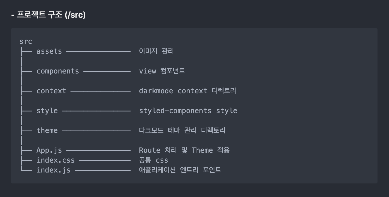
📝 Application Structure
우선 다크모드 구현을 위한 간단한 애플리케이션을 만들것임으로 create-react-app으로 리액트를 설치합니다.
✅ 필요한 패키지 설치
스타일 적용을 위한 styled-components 와 라우트 처리를 위해 react-router-dom을 설치합니다.
styled-reset은 글로벌 스타일을 지정할 때 필요한 라이브러리로 styled-components를 통해 css초기화를 할 수 있도록 도와줍니다.
$ npm install --save styled-components
$ npm install --save styled-reset
$ npm install --save react-router-dom
✅ 폴더 구조 잡기
본격적인 프로그래밍 작업에 앞서 기본 구조를 먼저 세팅했습니다.
📝 다크모드 스타일 세팅
✅ theme 설정
다크모드 UI를 보면 배경화면, 폰트 또는 버튼의 색상 등이 균일하게 사용됩니다.
이와 같이 기본적으로 사용될 background color, text color, border color 등은 하드코딩을 줄이기 위해 theme으로 세팅해줬습니다.
파일 디렉토리 : /theme - theme.js 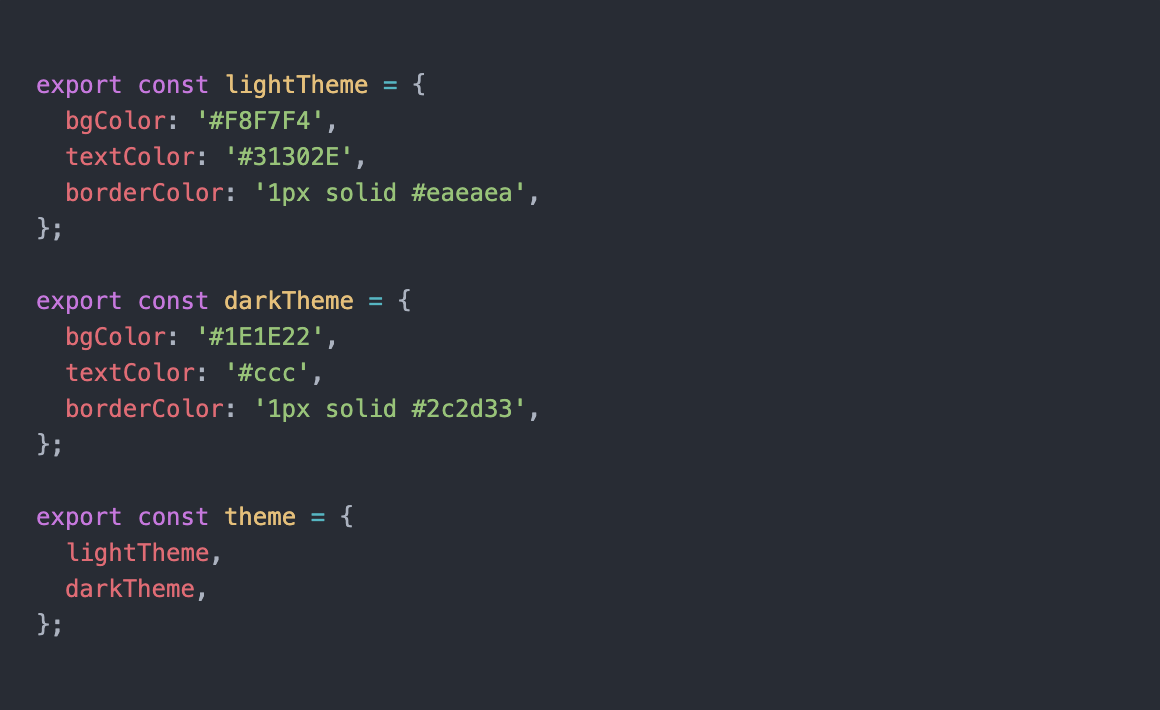
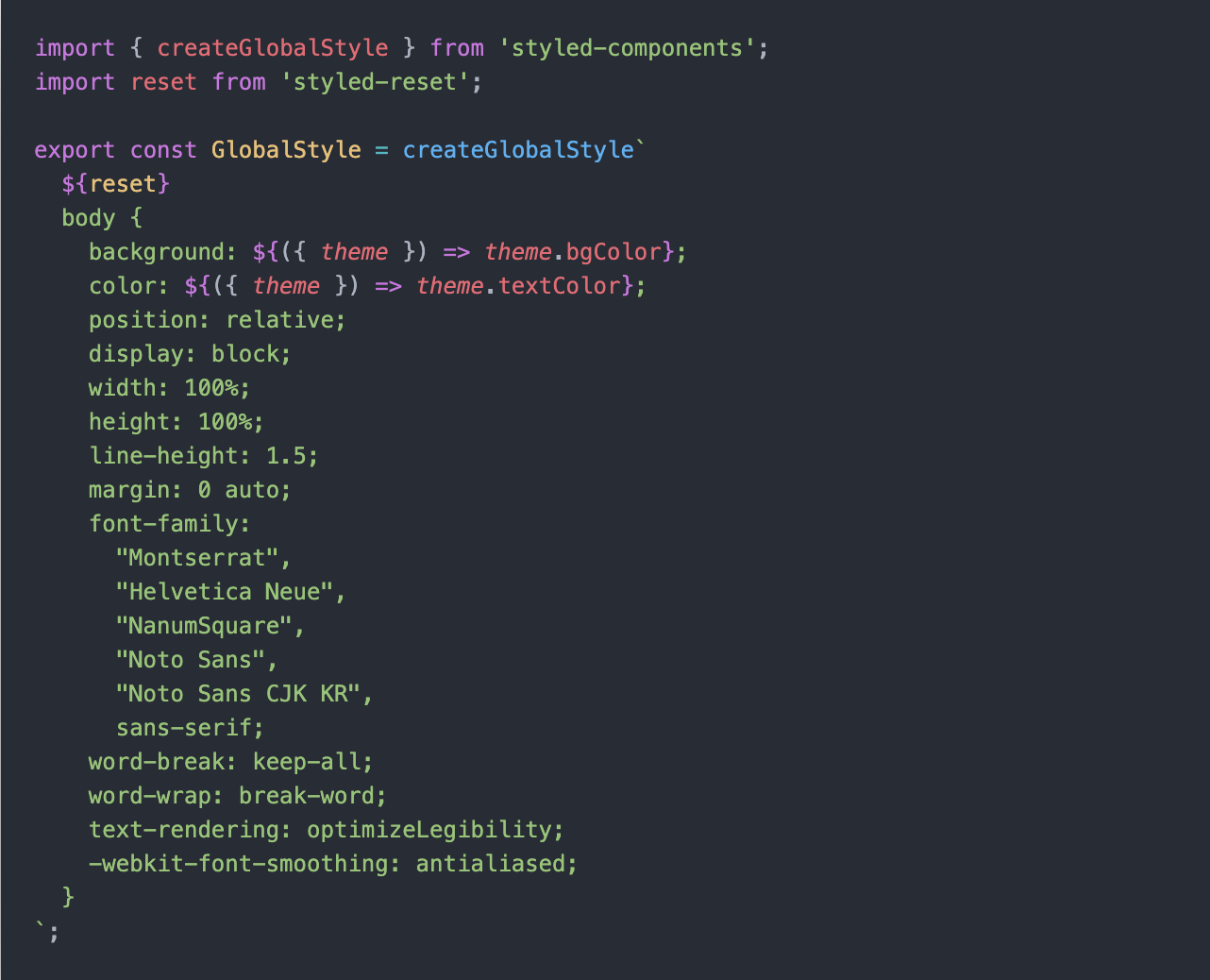
✅ global style 설정
글로벌 스타일 적용을 위해 설치한 styled-reset을 사용합니다.
다크모드 애플리케이션의 배경화면 및 폰트 색상 변경을 글로벌스타일로 한번에 관리해줄 수 있기때문에 설정해 주는 것이 좋습니다.
파일 디렉토리 : /theme - GlobalStyle.js

// styled-reset 사용방법
import {createGlobalStyle} from 'styled-components'; // 글로벌 스타일 적용을 도와주는 styled-components내장 메서드
import reset from 'styled-reset';

export const GlobalStyle = createGlobalStyle`
	${reset}
	body{
		`주로 사용하는 css 초기화 스타일을 적용해주면 된다.`
	}
`
📝 다크모드 Context API
✅ ThemeProvider 커스텀
다크모드인지 라이트모드인지 상태관리를 하기 위해 context 폴더에 themeProvider.js 파일을 만들어줍니다.
파일 디렉토리 : /context - themeProvider.js Provider로 제공하게 될 Context 객체 생성
// context 기본 형태
const ThemeContext = createContext({});
Context API는 전역적 상태관리를 도와주기 때문에 일일이 props로 state를 넘겨줄 필요가 없습니다. 따라서 이 Context API를 통해 사용자가 어느 컴포넌트에서든 'dark'모드인지 'light'모드인지 알 수 있도록 다크모드와 라이트모드 state, 그리고 그에 해당하는 darkTheme, lightTheme을 함께 넘겨주면 됩니다.
import { lightTheme, darkTheme } from '../theme/theme';
import { createContext, useState, useContext, useCallback } from 'react';
import { ThemeProvider as StyledProvider } from 'styled-components';

const ThemeProvider = ({children}) => {
  const [ThemeMode, setThemeMode] = useState('light');
  const themeObject = ThemeMode === 'light' ? lightTheme : darkTheme;

  return(
    <ThemeContext.Provider value={{ ThemeMode, setThemeMode }}>
      <StyledProvider theme={themeObject}> // styled-components에서 제공하는 메서드
        { children }
      </StyledProvider>
    </ThemeContext.Provider>
  )
}

function useTheme() {
  const context = useContext(ThemeContext);
  const { ThemeMode, setThemeMode } = context;

  const toggleTheme = useCallback(() => {
    if (ThemeMode === "light") {
      setThemeMode("dark");
    }
    else {
      setThemeMode("light")
    };
  }, [ThemeMode]);

  return [ ThemeMode, toggleTheme];
}

export { ThemeProvider, useTheme };- Provider로 넘길 context value를 지정하고 (ThemeMode, themeObject)
- useTheme()이란 custom hook을 통해 'light' 와 'dark' 테마의 토글 기능을 처리했습니다.
✅ ThemeProvider 적용
위와 같이 커스텀한 ThemeProvider를 최상위 파일 app.js에 라우트와 함께 적용합니다.
function App() {
  return (
    <BrowserRouter>
      <ThemeProvider>
        <GlobalStyle />
        <Suspense fallback={<div>...loading</div>}>
          <Switch>
            <Route exact path="/" component={Main}/>
            <Route exact path="/sub" component={Sub}/>
          </Switch>
        </Suspense>
      </ThemeProvider>
    </BrowserRouter>
  );
}
export default App;
이제 ThemeProvider를 통해 지정한 context value를 app.js에서 감싸준 모든 컴포넌트에서 사용할 수 있게 됐습니다.
📝 다크모드 토글 버튼 생성
다크모드를 적용하기 위해 필요한 토글버튼은 보통 헤더 바로 밑 부분 (메인콘텐츠의 상단 부분)이나 floating action button으로 처리를 합니다.
✅ 토글버튼 UI
이렇게 화려한 효과를 주기도 하지만 다크모드 기능을 구현하는데 초점을 두고 있기 때문에 스타일링에 많은 시간을 쏟지않고 기능 표현이 확실한 Floating Action Button을 커스텀하기로 했습니다.
토글 버튼이 위치할 파일에 useTheme을 사용하여 테마모드와 토글기능을 props로 전달합니다.
const AppLayout = ({children}) => {
  const [ThemeMode, toggleTheme] = useTheme();
  return (
    <WrapContainer>
      <Header />
      <ThemeToggle toggle={toggleTheme} mode={ThemeMode}>
        DarkMode
      </ThemeToggle>
      <FlexContainer>{children}</FlexContainer>
    </WrapContainer>
  )
}
export default AppLayout;
토글 버튼 스타일링 및 props 적용
import React from 'react';
import styled from 'styled-components';

function ThemeToggle({ toggle, mode }) {
  return (
    <ToggleWrapper onClick={toggle} mode={mode}>
      {mode === 'dark' ? '🌚' : '🌝'}
    </ToggleWrapper>
  );
}

export default ThemeToggle;

const ToggleWrapper = styled.button`
  position: fixed;
  z-index: 999999;
  bottom: 4%;
  right: 3%;

  background-color: ${props => props.theme.bgColor};
  border: ${props => props.theme.borderColor};
  font-size: 20px;

  display: flex;
  justify-content: center;
  align-items: center;
  width: 96px;
  height: 48px;
  border-radius: 30px;
  box-shadow: ${
    props => props.mode === 'dark' ? '0px 5px 10px rgba(40, 40, 40, 1), 0px 2px 4px rgba(40, 40, 40, 1)'
    : '0 5px 10px rgba(100, 100, 100, 0.15), 0 2px 4px rgba(100, 100, 100, 0.15)'
  }
`;
토글버튼에도 바로 다크모드 테마 적용을 해봤습니다.
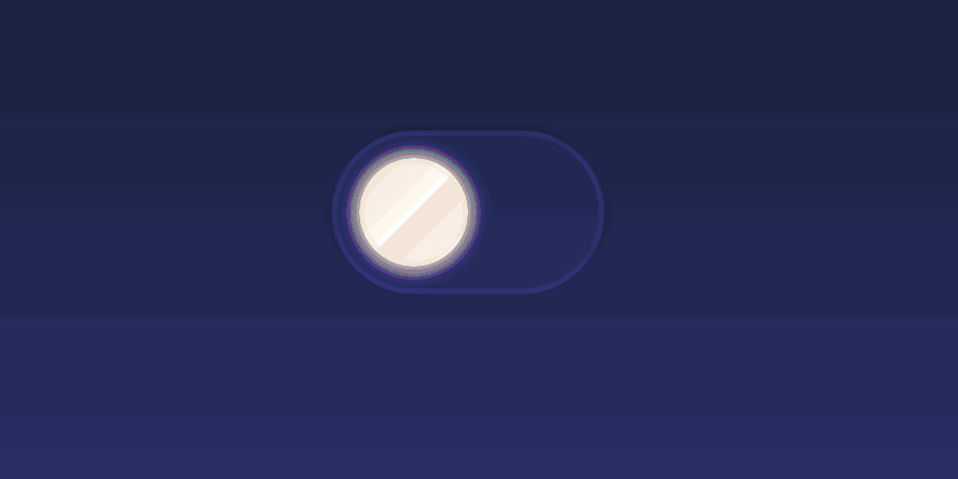
✅ 토글버튼 결과물
.gif)
📝 다크모드의 지속성
이렇게 완성된 다크모드 기능은 완벽하게 동작하는듯 했습니다. 하지만 새로고침을 하거나 웹에 재접근 시 선택했던 테마가 유지되지 않는 버그가 있었습니다.
.gif)
분명히 다크모드인 상태에서 새로고침을 했지만 light mode로 바뀌는 이유는 themeProvider의 초기값이 light로 지정되있기 때문이었습니다.
const ThemeProvider = ({children}) => {
  const [ThemeMode, setThemeMode] = useState('light');
  const themeObject = ThemeMode === 'light' ? lightTheme : darkTheme;
  ...
  ...
}
새로 렌더링 했을 때도 선택했던 테마를 유지하기 위해서 테마의 상태를 저장할 보관소가 필요합니다.
로컬 스토리지는 웹사이트에서 사용자가 작업한 내용을 유지하기 위한 용도로 자주 사용되기 때문에 사용자가 지정한 테마 값을 보관하기위한 local storage기능을 추가했습니다.
const ThemeContext = createContext({});

const ThemeProvider = ({children}) => {
  const LocalTheme = window.localStorage.getItem('theme') || 'light';
  const [ThemeMode, setThemeMode] = useState(LocalTheme);
  const themeObject = ThemeMode === 'light' ? lightTheme : darkTheme;

  return(
    <ThemeContext.Provider value={{ ThemeMode, setThemeMode }}>
      <StyledProvider theme={themeObject}>
        { children }
      </StyledProvider>
    </ThemeContext.Provider>
  )
}

function useTheme() {
  const context = useContext(ThemeContext);
  const { ThemeMode, setThemeMode } = context;

  const toggleTheme = useCallback(() => {
    if (ThemeMode === "light") {
      setThemeMode("dark");
      window.localStorage.setItem('theme', 'dark');
    }
    else {
      setThemeMode("light")
      window.localStorage.setItem('theme', 'light');
    };
  }, [ThemeMode]);

  return [ ThemeMode, toggleTheme];
}

export { ThemeProvider, useTheme };.gif)
반응형 UI로 만들었기 때문에 이번엔 모바일 화면으로 테스트 해봤습니다.
초반에 아키텍쳐를 미리 잘 짜놔서 context api부분만 수정해주면 되니 너무 편리하네요😙
이렇게 버그픽스를 하고나니 새로고침시에도 기존 테마가 유지되며 잘 작동합니다.
하지만 새로고침시에 약간 깜빡거리는 현상이 발생하네요.
이 부분은 어떻게 고치면 좋을지 공부를 좀 더 해봐야겠습니다🧐
📝 다크모드 마무리
🔎 그 외 짜잘짜잘한 review
*️⃣ useTheme() 이용방법
useTheme()으로 현재 상태의 테마를 불러와 그에 따라 기능을 구현할 수 있습니다.
저는 테마에 따라 메인페이지에 current mode를 표시해주는 간단한 기능을 추가했습니다.
사실 토글버튼과 똑같은 기능이라 특별한건 없죠🤓
테마에 따라 특정하고 싶은 기능이 있을 시 이렇게 커스텀 훅을 이용할 수 있습니다.
import React from 'react';
import { useTheme } from '../context/themeProvider';
import AppLayout from './AppLayout';
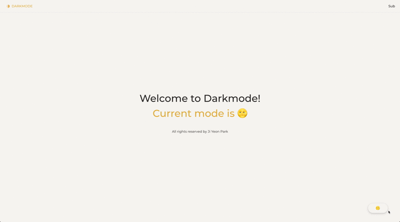
const Main = () => {
const ThemeMode = useTheme();
const CurrentMode = ThemeMode[0] === 'light' ? '🌝' : '🌚';
return (
<AppLayout>
<h2> Welcome to {''}
<ColoredText>Current mode is {CurrentMode}</ColoredText>
</h2>
</AppLayout>
)
}
export default Main;*️⃣ 컴포넌트별 커스텀 스타일 지정하기
theme.js에 지정한 스타일 외에 따로 스타일을 커스텀 하고 싶은 경우가 있을 수 있습니다.
얘를 들어 다크모드 일 경우 테마에 정해진 textColor 외에 다른 textColor를 사용하고 싶은 경우가 있을 수 있죠.
저는 버튼에 있는 border color를 원래 지정한 테마 스타일과 다르게 커스텀해보았습니다.
const Sub = () => {
  const ThemeMode = useTheme();
  return (
    <AppLayout>
      <h2> ...SubPage </h2>
      <Link to='/'>
        <StyledButton theme={ThemeMode[0]}>
          Go back to Home
        </StyledButton>
      </Link>
    </AppLayout>
  )
}

export default Sub;

const StyledButton = styled.button`
  width: 240px;
  height: 56px;
  border-radius: 4px;
  border: ${props => props.theme === 'light' ? '1px solid #31302E' : '1px solid #bbb'};
  color:  ${props => props.theme === 'light' ? '#31302E' : '#bbb'};
`
원래 있는 테마를 적용할 경우 코드는 props로 넘겨줄 필요없이 border: ${({ theme }) => theme.borderColor}; 이렇게 간단하게 적용됩니다.
하지만 커스텀하고 싶을 경우 테마 상태를 props로 넘겨줘야 하기 때문에 다시 useTheme()을 통해 테마를 불러오고, 그에 상응하는 스타일을 지정해줘야합니다.
  border: ${props => props.theme === 'light' ? '1px solid #31302E' : '1px solid #bbb'};
  color:  ${props => props.theme === 'light' ? '#31302E' : '#bbb'};
저는 모노톤으로 깔끔하게 구현하고 싶어 큰 차이는 없게 구현했지만 이렇게 테마를 넘겨줌으로써 조금 더 다채로운 다크모드 스타일링이 가능해지겠죠😎
🌟 다크모드 완성!

완성된 결과물입니다. 심플하게 잘 구현한거같아서 마음에 듭니다🥰
아직 배포를 해보진 않았기 때문에 다른 프로젝트들에 적용해보면서 버그들을 fix하고 기능을 더 develop 해나갈 계획입니다.
👉 궁금한 사항이 있거나 더 좋은 구현 방법이 있을 시 댓글로 마음껏 남겨주세요

7개의 댓글


안녕하세요!
해당 글을 보고 많은 도움이 되었습니다.
해당 글을 참고하여 프로젝트에 적용했는데 "새로고침시에 약간 깜빡거리는 현상" 문제가 저도 발생했고 해당 문제를 해결하여 공유하고자 댓글을 달고자 합니다.
nextjs 프레임워크에 적용해서 약간 다를 수 있지만, 공유하고자 합니다.
해당 글을 참고하였는데 간단하게 정리하면,
root 컴포넌트에 mounted state 를 할당하여 마운트 될 때 렌더링을 하여 문제를 해결했습니다.
실제 적용한 내용을 보면 좀 더 쉽게 이해가 될 거 같아 변경 커밋도 첨부합니다.
좋은 글 감사하고 많은 도움이 됐습니다!!


잘보고 갑니당!