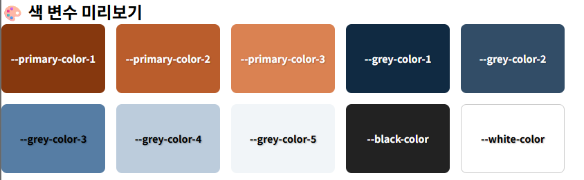
💡 “색 미리보기 카드”란?
--primary-color-1,--grey-color-3같은 색 변수들을
화면에 **한눈에 시각적으로 보여주는 박스(UI)**를 말해요!
📌 왜 좋을까?
- 변수 이름만 봐서는 색을 감 잡기 어려우니까…
- 이렇게 **색을 미리 "시각화"**하면 연습할 때 훨씬 편해요!
- 디자인 가이드처럼 만들 수 있음 (디자이너 감성 + 개발자 스킬 UP)
✅ 예시로 보여줄게요!
<!DOCTYPE html>
<html lang="ko">
<head>
  <meta charset="UTF-8">
  <title>색 변수 미리보기</title>
  <style>
    :root {
      --primary-color-1: hsl(21, 81%, 29%);
      --primary-color-2: hsl(21, 62%, 45%);
      --primary-color-3: hsl(21, 65%, 59%);
      --grey-color-1: #102a42;
      --grey-color-2: hsl(209, 34%, 30%);
      --grey-color-3: hsl(210, 31%, 49%);
      --grey-color-4: hsl(210, 31%, 80%);
      --grey-color-5: hsl(210, 36%, 96%);
      --white-color: #fff;
      --black-color: #222;
    }

    body {
      font-family: sans-serif;
      padding: 2rem;
      background: var(--grey-color-5);
    }

    .color-card {
      display: flex;
      flex-wrap: wrap;
      gap: 1rem;
    }

    .color-box {
      width: 150px;
      height: 100px;
      border-radius: 0.5rem;
      color: #fff;
      display: flex;
      align-items: center;
      justify-content: center;
      font-size: 0.9rem;
      font-weight: bold;
      text-shadow: 1px 1px 2px rgba(0,0,0,0.3);
    }

    .primary-1 { background: var(--primary-color-1); }
    .primary-2 { background: var(--primary-color-2); }
    .primary-3 { background: var(--primary-color-3); }

    .grey-1 { background: var(--grey-color-1); }
    .grey-2 { background: var(--grey-color-2); }
    .grey-3 { background: var(--grey-color-3); color: #000; }
    .grey-4 { background: var(--grey-color-4); color: #000; }
    .grey-5 { background: var(--grey-color-5); color: #000; }

    .white { background: var(--white-color); color: #000; border: 1px solid #ccc; }
    .black { background: var(--black-color); }
  </style>
</head>
<body>
  <h2>🎨 색 변수 미리보기</h2>
  <div class="color-card">
    <div class="color-box primary-1">--primary-color-1</div>
    <div class="color-box primary-2">--primary-color-2</div>
    <div class="color-box primary-3">--primary-color-3</div>

    <div class="color-box grey-1">--grey-color-1</div>
    <div class="color-box grey-2">--grey-color-2</div>
    <div class="color-box grey-3">--grey-color-3</div>
    <div class="color-box grey-4">--grey-color-4</div>
    <div class="color-box grey-5">--grey-color-5</div>

    <div class="color-box black">--black-color</div>
    <div class="color-box white">--white-color</div>
  </div>
</body>
</html>
🔍 이걸 어떻게 쓰냐면:
- 위 HTML 파일을 만들어서 브라우저로 열어보면
- 각 색상 변수들이 박스에 색깔로 딱딱 보임
"아 이게 primary 1이구나","grey 3이 이런 톤이네"감 잡을 수 있다.
🔧 팁
디자인할 때 계속 꺼내서 보는 색 팔레트처럼 쓸 수 있다
(디자인 시스템 느낌 😎)

코린이🌱 / 개인적인 공부기록 공간입니다, 제로베이스부트캠프 수강중...😄