7월 7일 수
학습한 내용
진도와 학습한 내용을 작성, 소스파일을 실행한 결과 첨부
ex_6

html
<link rel="stylesheet" type="text/css" href="css/style.css"><div class="transform"></div>
<div class="transition"></div>
<div class="animation"></div>/*transform: rotate(45deg);*/
/*transform: scale(2, 3);*/
/*transform: skew(10deg, 20deg);*/
/*transform: translate(100px, 100px);*/
/*margin-left: 300px;
margin-top: 500px;*/}
.transition {
width: 300px;
height: 300px;
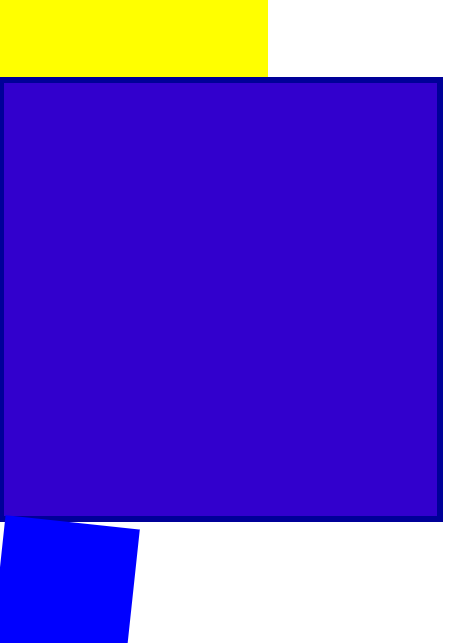
background-color: yellow;
/*transition-property: width;
transition-duration: 2s;
transition-timing-function: linear;
transition-delay: 1s;*/

transition: width 2s linear , height 1s linear;
}
.transition:hover {
width: 600px;
height: 600px;
}
.animation {
width: 300px;
height: 300px;
background-color: yellow;
animation-name: changeWidth;
animation-duration: 3s;
animation-timing-function: linear;
animation-delay: 1s;

animation-iteration-count: infinite;
animation-direction: alternate;  /*진행방향, normal, alternate반복-iteration-count생각하기 */
}
/from~to(0%~100%)/
@keyframes changeWidth {
0%{
width: 300px;
height: 300px;
background-color: yellow;
}
50%{
	background-color: blue;
}
100% {
	width: 600px;
	height: 600px;
	background-color: red;
	border:  solid 10px blue;
}
}
.spin-lion {
width: 150px;
height: 150px;
background-color: blue;
/*animation-name: spinLion;
animation-duration: 1.5s;
animation-timing-function: linear;
animation-iteration-count: infinite;
animation-direction: alternate;
*/

-webkit-animation: spinLion 1.5s Linear infinite alternate 1s;
animation: spinLion 1.5s Linear infinite alternate 1s;
}
@-webkit-keyframes spinLion {
from{
-webkit-transform: rotate(-10deg);
}

to {
	-webkit-transform: rotate(10deg);
}
}
@keyframes spinLion {
from{
transform: rotate(-10deg);
}

to {
	transform: rotate(10deg);
}
}
프로젝트 애니메이션
html
<link rel="stylesheet" type="text/css" href="css/style.css"> <!-- <nav class="mouse-animation">
<ul>
<li><a href="#">메뉴1</a></li>
<li><a href="#">메뉴2</a></li>
<li><a href="#">메뉴3</a></li>
<li><a href="#">메뉴4</a></li>
</ul>
</nav> -->
<div class="move-box"></div>
<div class="outer-border">
<div class="inner-border"></div>
</div>
<div class="mario-container">
<div class="mario-coin"></div>
<div class="mario-box"></div>
</div>
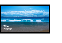
<div class="hover-image">
<img src="https://images.template.net/wp-content/uploads/2015/08/Extraordinary-Beach-Background-Free-Download.png">
<div class="image-info">
<h2>Title</h2>
<p>Parapragh</p>
</div>
</div>ul {
list-style: none;
}
a {
text-decoration: none;
color: #000000;
}
.mouse-animation li {
width: 250px;
background-color: rgba(0, 0, 0, 1);
padding: 20px;
border-top: solid 5px #dfdfdf;
transition: opactiy 0.5s, margin-left 0.5s;
}
.mouse-animation li:hover {
background-color: rgba(0, 0, 0, 0.5)
margin-left: 10px;
}
.mouse-animation li a {
color: red;
font-size: 20px;
}
.move-box {
position: relative;
width: 200px;
height: 200px;
background-color: red;
animation-name: moveBox;
animation-duration: 10s;
animation-timing-function: linear;
animation-delay: 1s;
animation-iteration-count: infinite;
animation-direction: alternate;
animation-play-state: running;
animation-fill-mode: backwards;
}
@keyframes moveBox{
0%{
background-color: green;
left: 0;
top: 0;
}

25%{
	background-color: yellow;
	left: 500px;
	top: 0;
}

50% {

	background-color: gray;
	left: 500px;
	top: 500px;
	border-radius: 50%;
}

75%{
	background-color: blue;
	left: 0;
	top: 500px;
}
100% {
	background-color: red;
	left: 0;
	top: 0;
}
}
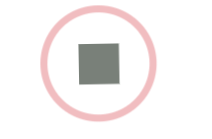
.outer-border {
display: flex;
justify-content: center;
align-items: center;
width: 200px;
height: 200px;
border:  solid 15px red;
border-radius: 50%;

margin: 0 auto;
margin-top:  200px;

animation:  outerBorder 2s infinite;
}
@keyframes outerBorder {
0% { border-color: red; transform: scale(1);}
25% { border-color: yellow; transform: scale(1.2); }
50% { border-color: blue; transform: scale(1.3); }
75% { border-color: green; transform: scale(1.2);}
100% { border-color: pink; transform: scale(1);}
}
.inner-border {
box-sizing: border-box;
width: 75px;
height: 75px;
border: 5px solid purple;
animation: innerBorder 2s infinite;}
@keyframes innerBorder {
0% { transform: rotate(0deg); }
25% { border-color: blue; border-width: 10px; }
50% { border-color: yellow; border-width: 20px; }
75% { border-color: green; border-width: 40px; }
100% { border-color: gray; border-width: 40px; transform: rotate(360deg); }
}
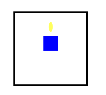
.mario-container {
position: relative;
width: 500px;
height: 500px;
border: solid 10px black;
margin: 0 auto;
margin-top: 200px;
}
.mario-container .mario-coin {
position: relative;
width: 70px;
height: 70px;
background-color: yellow;
border-radius: 50%;
margin: 0 auto;
margin-top: 100px;

animation: jumpCoin 0.8s linear infinite ;
}
@keyframes jumpCoin {
0% { transform: translateY(0px);
opacity: 1;
}
50% { transform: translateY(-100px) rotateY(180deg);
	opacity: 0;
}

100% { transform: translateY(-100px) rotate(360deg);
		opacity: 0;
 }
}
.mario-container .mario-box {
width: 100px;
height: 100px;
background-color: blue;
margin: 0 auto;

animation: jumpBox 0.5s linear infinite alternate;
}
@keyframes jumpBox {
0% { transform: translateY(0px); }
50% { transform: translateY(-10px); }
100% { transform: translateY(0px); }
}
.hover-image {
cursor: pointer;
overflow: hidden;
position: relative;
width: 400px;
border: solid 10px #000000;
}
.hover-image img {
width: 100%;
vertical-align: middle;  /*img 자체 하단 공백을 가지고 있는 걸 제거하는 명령어, 기본값으로 넣어줘야함*/
}
.hover-image:hover img {
transform: scale(1.3);
transition: transform 1s linear;
}
.hover-image .image-info {
box-sizing: border-box;
position: absolute;
width: 100%;
background-color: rgba(0, 0, 0, 0.5);
padding: 20px;

left: 0;
bottom: -85px;

transition: bottom 0.3s linear ;
}
.hover-image:hover .image-info {
bottom: 0;
}
.hover-image .image-info h2,
.hover-image .image-info p{
margin: 0;
padding: 0;
color: #ffffff;
}
.hover-image .image-info h2 {
font-size: 20px;
}
.hover-image .image-info p {
font-size: 15px;
}
메모장 필기
rotate 속성 2차원 회전효과
음수 왼쪽으로
양수 오른쪽으로
scale(2 , 3) 위드 값 2배 헤이트값 3배
내가 선택한 영역의 비율로 홛대 축소
크기를 줄이고 싶을 때는 소수점 단위 입력
skew(10deg, 20deg)
3차원적인 회전효과 적용
(x축으로 회전, y축으로 회전)
음수 양수 모두 적용 다능
강사님은 실무에서 별로 쓰지 않지만 해외 유저들은 자주 사용한다고 한다.
transform: translate(100px, 100px);
상자의 위치 바뀜
내가 선택한 영역의 오브젝트의 위치를 변경할 때 사용
(x축, y축)
최근에는 트랜스레이트로 배치 작업을 하기도 한다.
주의사항
브라우저별로 호환 문제가 생길 수도 있기 때문에
프리픽스 접두사를 붙여야한다.
-webkit-transform
-moz-transform
-ms-transform
-o-transform
하위 버전까지 고려해야 할 때는 프리픽스를 붙여줘야한다.
transition-property: width;
적용 범위
transition-duration: 2s;
현화 속도 2초만에 변화완료
transition-timing-function: linear;
변화 속도 동일하게
transition-delay: 1s;
한줄쓰기
transition: width 2s linear 1s;
듀레이션, 딜레이 순서만 잘 지켜주기
1초 후에 변화 시작
stylie
width -> widows로 자꾸 되네
animation-fill-mode: backwards;;
자연스럽게 보이기 위해서 0%일 때 색상이 사용자에게
처음 부터 보여주게 하는 속성
학습한 내용 중 어려웠던 점 또는 해결못한 것들
kids gao 웹 사이트에 들어있는 css의 애니메이션 효과에 대해서 배웠다. 수업을 따라가는데는 어렵지 않았지만 다 배우고나서 혼자서 코드를 짜게 된다면 전체적인 틀을 생각해내는 것이 많이 어려울 것 같다는 생각이 들었다.
해결방법 작성
학습 소감
실습을 진행하면서 가장 보람찬 결과물이 나온 수업이었다. 키즈가오 사이트 예시를 보면서 이런 걸 코드로 나타내려면 엄청 복잡하겠네라는 생각을 했었다. 그런데 막상 실천을 해보니까 어렵긴 어려운데 생각만큼 그렇게 난이도가 있는 작업은 아니구나 싶었다. 그렇지만 이미 만들어진 결과물을 카피하는 것은 쉬운 편이지만 처음 부터 작업을 한다면 어떻게 구상해야할지 막막할 것 같다. 유튜브에서 UI,UX 포트폴리오를 리딩해주는 영상을 보았다. 흔히 웹 디자인이라 불리는 영역이다. 처음에는 디자인도 프론트엔드가 진행하는 줄 알았는데 디자인을 받아서 수행시켜주는 게 프론트엔드의 역할이라고 한다. 그 경계가 조금 헷갈린다. 어쨌든 다행인 것은 디자인을 받아서 설계를 하는 것이니 시작 부터 막막하지는 않을 것 같기도 하다. 마지막으로 조금 겁이난다. 겁도 없이 프로그래머에 발을 디딘 건 아닌지 감당해낼 수 있는지 걱정이 앞선다.