
프로젝트를 하던 중, 파이 차트를 만들 일이 있었다. 간단한 차트라 라이브러리를 쓰면 더 복잡해 질 것 같다는 생각에 직접 SVG를 이용해 만들어 보기로 했다.
원 그리기
원은 circle 태그를 이용해 간단하게 그릴 수 있다.
<svg
  viewBox="0 0 100 100"
  width={300}
  height={300}
  xmlns="http://www.w3.org/2000/svg"
  >
  <circle r={50} cx={50} cy={50} fill="red" />
</svg>
❶ width, height
width, height를 300px로 설정하여 정사각형을 그린다.
❷ viewBox
viewBox="<min-x> <min-y> <width> <height>"<min-x>와 <min-y>는 SVG가 그려지는 영역의 시작점, <width>와 <height>는 영역의 가로, 세로 길이로 생각할 수 있다.
필자는 viewBox="0 0 100 100"으로 설정하여 아래와 같은 좌표를 가지도록 하였다.
❸ r
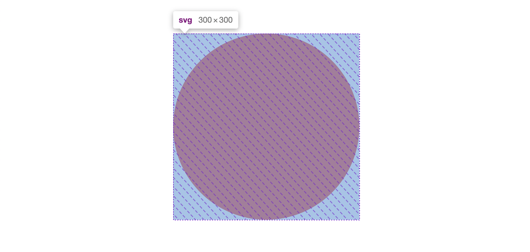
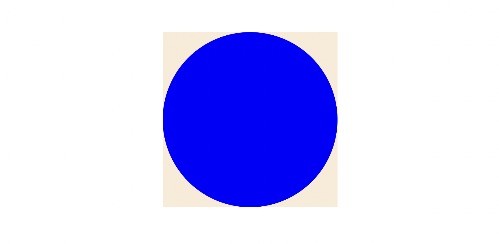
SVG 영역을 다 채우기 위해 반지름을 50으로 설정하였다.
(0, 0)을 원의 중심으로 하여 반지름 50인 원이 아래와 같이 그려진다.
❹ cx, cy
원이 잘리는 현상을 고치기 위해 원의 중심을 옮겨줄 것이다.
각각 50으로 설정하여 아래와 같이 그려지도록 수정한다.

부분만 그리기
차트는 하나의 원을 데이터의 비율에 맞게 나눠가지고 있는 형태가 되어야 하는데, 문제는 부분만 그린 뒤 색을 채울 수 없다는 것이다. 따라서 stroke를 활용해 원을 그려야 한다.
<svg
  viewBox="0 0 100 100"
  width={300}
  height={300}
  xmlns="http://www.w3.org/2000/svg"
  >
  <circle
    r={50}
    cx={50}
    cy={50}
    fill="transparent"
    stroke="blue"
    strokeWidth="10"
  />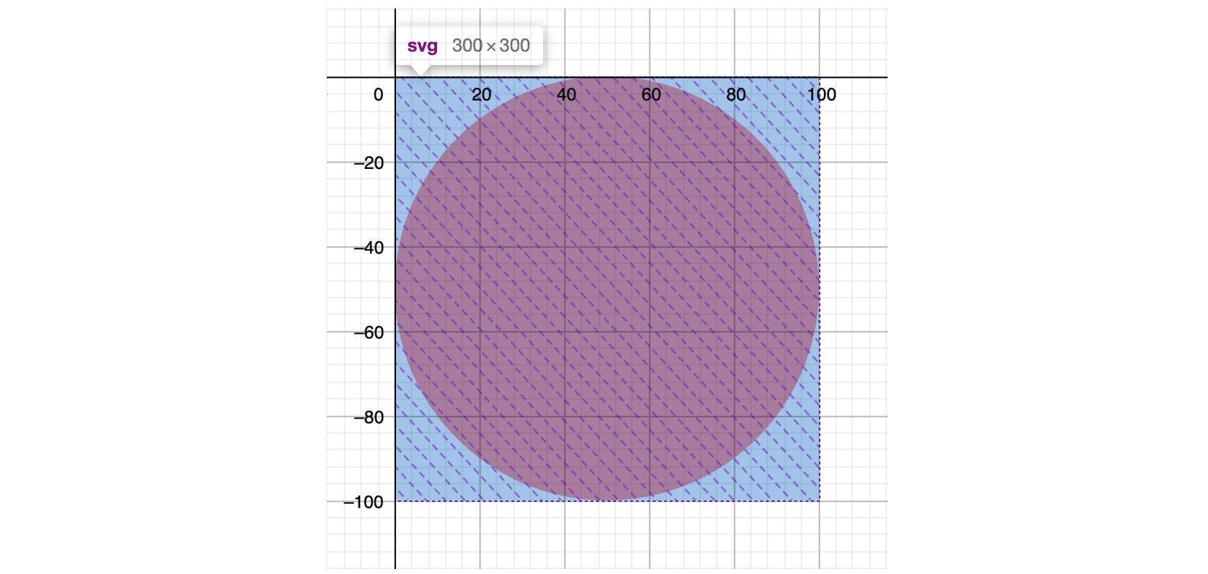
</svg>fill을 투명으로 변경해 주고, 파란색 stroke를 추가해 주었다.
inner stroke가 아닌, center stroke이기 때문에 아래와 같이 그려지게 된다.

그렇다면, stroke로 가운데 빈 공간 없이 원을 칠하려면 어떻게 해야 할까?
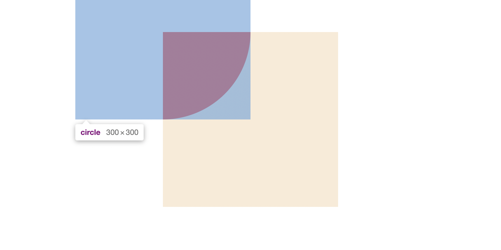
strokeWidth를 r의 두 배로 설정해 주면 된다.
하지만 반지름의 두 배인 100으로 설정해 주었더니 아래 이미지처럼 SVG 영역을 벗어나게 된다.
실제 그려지는 원의 크기가 반지름의 4배이므로 r="25", strokeWidth="50"으로 변경해 주면 제대로 원이 나타난다.
strokeDasharray
점선을 그릴 때 사용하는 속성으로, 부분만 그리는 데 이용할 수 있다.
<circle stroke="blue" strokeWidth={10} strokeDasharray={10} />❶ 하나의 값만 입력하면 선과 공백이 같은 길이로 그려지게 되며 아래와 같은 이미지가 된다.

❷ 두 개의 값을 입력하면 첫 번째 값이 선의 길이가 되고, 두 번째 값이 공백의 길이가 된다.
<circle stroke="blue" strokeWidth={10} strokeDasharray="5 15" />
❷처럼 두 개의 값을 입력하여 원을 부분만 그릴 수 있다.
첫 번째 값에는 원주 * 데이터의 비율을 계산하여 얼마나 선을 그릴 것인지 입력하고, 두 번째 값에는 원주에서 첫 번째 값을 뺀 길이를 주어 나머지는 공백으로 그려지도록 하면 된다.
원주는 2πr로 구할 수 있으므로 아래와 같은 코드를 작성해 준다.
const datas = [0.25];

const Pie = () => {
  const radius = 25;
  const circumference = 2 * Math.PI * radius;

  return (
    <svg viewBox="0 0 100 100" width={300} height={300}>
      {datas.map((ratio) => {
        const strokeLength = circumference * ratio;
        const spaceLength = circumference - strokeLength;

        return (
          <circle
            r={radius}
            cx={50}
            cy={50}
            fill="transparent"
            stroke="blue"
            strokeWidth={radius * 2}
            strokeDasharray={`${strokeLength} ${spaceLength}`}
          />
        );
      })}
    </svg>
  );
};
다음과 같은 결과를 확인할 수 있다.

그런데 원이 (cx, cy + r)에서부터 시작하지 않고 (cx + r, cy)부터 그려진 것을 볼 수가 있다. 이를 해결하기 위해 원을 돌려주어야 한다.
transform="rotate(deg, cx, cy)"위 속성을 통해 원 회전이 가능하다.
transform="rotate(-90, 50, 50)을 추가하여 원이 아래 사진과 같이 그려지도록 해 준다.

차트 완성하기
색을 다르게 표시해 주기 위해서 데이터 구조를 조금 변경했다.
const datas = [
  { color: "blue", ratio: 0.75 },
  { color: "red", ratio: 0.25 },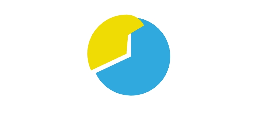
];stroke={data.color}로 각 데이터마다 다른 색상을 적용해 주었더니, 아래와 같은 결과가 나온다.

빨간 원은 파란 원이 다 그려진 부분부터 그려져야 원하는 차트 모양이 나올 것이다.
strokeDashoffset
위 속성을 통해 점선이 시작되는 부분을 조정할 수 있다.
필자는 아래와 같이 let을 사용하여 offset을 계산해 주었지만, 다른 방법으로 계산해도 상관없다.
const Pie = () => {
  ...
  let filled = 0;

  return (
    <svg ...>
      {datas.map(({ color, ratio }) => {
        ...
        const offset = filled * circumference;
        filled += ratio;

        return (
          <circle strokeDashoffset={-offset} ... />
        );
      })}
    </svg>
  );
};
드디어 파이 차트를 완성했다!
아래에서 전체 코드를 확인할 수 있다.
모바일
왜 저래...?
그런데 필자는 모바일(특히 삼성 기기)에서 보았을 때 차트가 이상하게 그려지는 현상이 발생했다. 정확한 원인은 아직 모르겠지만 해결한 방법도 간단하게 적어보려고 한다.
strokeDasharray={`${strokeLength.toFixed(2)} ${spaceLength.toFixed(2)}`}위 코드처럼 strokeDasharray에 입력되는 값의 소수점을 제한해 주자 해결되었다.
전체 코드
const datas = [
  { color: "blue", ratio: 0.75 },
  { color: "red", ratio: 0.25 },
];

const Pie = () => {
  const radius = 25;
  const circumference = 2 * Math.PI * radius;
  let filled = 0;

  return (
    <div className="flex items-center justify-center p-12">
      <svg viewBox="0 0 100 100" width={300} height={300}>
        {datas.map(({ color, ratio }) => {
          const strokeLength = circumference * ratio;
          const spaceLength = circumference - strokeLength;
          const offset = filled * circumference;
          filled += ratio;

          return (
            <circle
              r={radius}
              cx={50}
              cy={50}
              fill="transparent"
              stroke={color}
              strokeWidth={radius * 2}
              strokeDasharray={`${strokeLength} ${spaceLength}`}
              strokeDashoffset={-offset}
              transform="rotate(-90, 50, 50)"
            />
          );
        })}
      </svg>
    </div>
  );
};
참고