항해 99 실전 프로젝트를 하면서 스타일 컴포넌트를 재사용성이 많이 떨어지게 작업하였다.
지난 스터디에서 HOC 패턴에 대해 알게되었다.
HOC 패턴을 적용하면 위의 문제를 해결할 수 있을 것 같았다.
-
다 같은 버튼 스타일인데 어떨 때는 button 태그를 쓰고 어떨 때는 a 태그(Link 태그), label 태그를 사용하기도 했다. 다 같은 스타일인데 그때마다 별도로 만들어서 관리가 되지 않는 느낌을 받았다.
-
기본 스타일은 같은데 변화를 줘야 할 때가 있었다. 그때도 마찬가지로 props로 동적 스타일을 구현하기보다 팀원들이 각각 컴포넌트를 만들게 되었다. 그래서 전체 사이트의 버튼 스타일에 수정사항이 생기면 개별 컴포넌트를 수정하게 되었다.
HOC 패턴(고차 컴포넌트)
고차 컴포넌트(HOC, Higher Order Component)는 컴포넌트 로직을 재사용하기 위한 React의 고급 기술입니다. 고차 컴포넌트(HOC)는 React API의 일부가 아니며, React의 구성적 특성에서 나오는 패턴입니다.
리액트 공식 문서 발췌
- 같은 로직을 여러 컴포넌트에서 재사용하는 방법 중 하나
- 앱 전반적으로 재사용 가능한 로직을 여러 컴포넌트들이 쓸 수 있게 해 준다.
- 반복 사용되는 코드, 스타일에 적용할 수 있다.
예시 코드
function withStyles(Component) {
  return props => {
    const style = { padding: '0.2rem', margin: '1rem' }
    return <Component style={style} {...props} />
  }
}

const Button = () = <button>Click me!</button>
const Text = () => <p>Hello World!</p>

const StyledButton = withStyles(Button)
const StyledText = withStyles(Text)
내가 작성한 예제 - button 스타일 고차 컴포넌트
- 스타일 컴포넌트는 인자로 넘겨받은 컴포넌트에 스타일을 적용, 다양한 태그에 동일한 스타일 구현
- 필요에 따라 스타일을 별도로 지정한 변수를 넘겨주워 스타일 확장
button.jsx
import React from 'react';
import styled from 'styled-components';
const withStyledButton = (Component, styles) => {
const StyledComponent = styled(Component)`
max-width: 360px;
width: 100%;
padding: 12px 16px;
margin-bottom: 12px;
border-radius: 6px;
border: none;
box-sizing: border-box;
color: white;
background-color: #3498db;
text-align: center;
font-size: 16px;
cursor: pointer;
&.secondary {
}
&:hover {
background-color: #2980b9;
}
&:active {
background-color: #2980b9;
}
&:focus {
background-color: #3498db;
}
${styles}
`;
// 고차 컴포넌트 반환
return StyledComponent;
};
const secondaryStyles = `
background-color: red;
&:focus {
background-color: red;
}
`;
const blockStyles = `
display:block;
`;
const Button = ({ children, ...restProps }) => {
return <button {...restProps}>{children}</button>;
};
const Label = ({ children, ...restProps }) => {
return <label {...restProps}>{children}</label>;
};
const Atag = ({ children, ...restProps }) => {
return <a {...restProps}>{children}</a>;
};
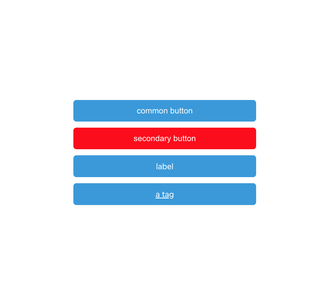
export const StyledButton = withStyledButton(Button, secondaryStyles);
export const CommonButton = withStyledButton(Button);
export const StyledLabel = withStyledButton(Label, blockStyles);
export const StyledAtag = withStyledButton(Atag, blockStyles);
export default Button;
App.jsx
import './App.css';
import { StyledButton, StyledLabel, StyledAtag, CommonButton } from './Button';
function App() {
    const onClickHandler = () => {
        alert('click');
    };
    return (
        <div
            style={{
                width: '100%',
                height: '100vh',
                display: 'flex',
                flexDirection: 'column',
                justifyContent: 'center',
                alignItems: 'center',
            }}
        >
            <CommonButton>common button</CommonButton>
            <StyledButton onClick={onClickHandler}>secondary button</StyledButton>
            <StyledLabel>label</StyledLabel>
            <StyledAtag href="#">a tag</StyledAtag>
        </div>
    );
}

export default App;