cornerRadius를 조정하는 방법은 이전에 설명한 바와 같다. 또한, 버튼의 색상이나 테두리의 굵기... 같은 버튼 속성들은 적절한 옵션을 조정하고 style을 적용하는 방식으로 수정할 수 있다.
    <style name="OutlinedButtonStyle" parent="Widget.MaterialComponents.Button.OutlinedButton">
        <item name="backgroundTint">@color/btn_bg_selection_color_selector</item>
        <item name="android:textColor">@color/btn_text_color_selector</item>
        <item name="strokeColor">@color/btn_bg_stroke_color_selector</item>
        <item name="android:textAppearance">@style/ButtonText</item>
        <item name="android:textStyle">bold</item>
    </style>
parent를 Widget.Material3.뭐시기 가 아니라 Widget.MaterialComponents.뭐시기 로 두어야 한다.
Material3으로 해놓고 style을 적용시켜봐도 적용이 안되더라.. 이유는 모르겠다.
아무튼, 이렇게 하면 모든 문제가 해결되었다! 라고 생각했는데..
테두리 굵기를 버튼의 Status 마다 다르게 설정해야하는 경우
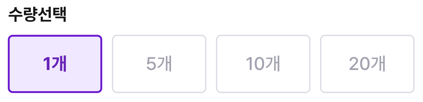
현재 제작하고 있는 프로젝트에서, Toggle Button의 디자인이 다음과 같다.
보면 테두리 굵기가 일정한게 아니라, 선택된 버튼의 굵기가 더 굵고, 선택되지 않은 버튼은 얇다.
테두리의 굵기 속성은 strokeWidth로 조정할 수 있는데, 처음에는 color selector를 만들어서 색상을 조절했듯이
width도 selector를 제작하려고 했다.
하지만, width를 status에 따라 조절하는 selector를 제작할 수는 없는 것 같았다.(가능할 수도 있겠지만 방법을 모르겠음)
그래서, 기존에 제작한 MaterialButtonToggleGroup 을 상속하여 만든 클래스에서 버튼의 상태에 따라서 테두리를 결정해주면 되지 않을까? 라는 막연한 생각이 들었다.
상위 클래스에 제작되어있는 함수 중 뭔가 Change가 들어간 메소드라면.. 하고 뒤져본 결과!
childDrawableStateChanged
자식 뷰의 Drawable state가 변화되는 것을 감지하는 메소드가 있었다. (ViewGroup에 정의된 함수이다)
    override fun childDrawableStateChanged(child: View) {
        super.childDrawableStateChanged(child)
        (child as MaterialButton).strokeWidth = if (child.isChecked) 2.dp else 1.dp
    }
클래스의 자식 뷰는 항상 MaterialButton이므로 cast하여 strokeWidth를 조절해주었다.
사실 이 메소드가 아니라 상태 변화를 감지만 할 수 있으면 어떤 메소드든 가능하다고 생각한다.
아니면, 해당 ViewGroup을 사용하는 Activity/Fragment에서 addOnButtonCheckedListener 를 달아줘도 된다고 생각한다.
하지만, 그렇게 하면 Activity 마다 돌아가면서 eventListener를 추가해주는 작업이 필요하므로 매우 귀찮을 것이다.
이렇게 클래스 내부에 적용 시켜두면 알아서 적용되니까 편리하다~