배경속성
웹 문서를 꾸미기 위해 배경 이미지나 여러 속성들을 적용할 수 있다.
[기본형]
1. background-color
: 배경에 색상을 지정함. 색상명이나 #hex, rgb, rgba 와 같은 속성값을 사용함.
2. background-image
: 배경 이미지를 넣을 수 있음. url()속성값을 사용하며 ()사이에 이미지 경로가 들어감.
3. background-repeat
: 배경 반복 여부를 지정함. 배경속성은 바둑판 배열로 반복되는 것이 기본값임.
[속성값]
- no-repeat : 반복하지 않음. 불러온 배경 이미지를 1번만 보여줌.
- repeat-x : 배경 이미지를 가로로 반복함.
- repeat-y : 배경 이미지를 세로로 반복함.
4. background-attachment
: 배경을 스크롤에 따라 고정할지 같이 스크롤할지 정함.
[속성값]
- fixed : 스크롤을 따라 움직이지 않고 제자리에 고정함.
- scroll : 기본값으로 스크롤이 움직이면 배경이 위로 올라감.
5. background-position
: 배경의 위치를 지정함.
[속성값]
- px
- left : 영역의 왼쪽으로 정렬함.
- center : 배경을 가로나 세로 가운데로 정렬함.
- right : 영역의 오른쪽으로 정렬함
- top :영역의 위로 정렬함.
- bottom : 영역의 아래로 정렬함.
6. background-size
: 배경의 크기를 지정함.
[속성값]
- px , %
- cover : 배경 이미지를 가로 영역에 맞춰 채움.
- contain : 배경 이미지를 세로 영역에 맞춰 채움.
<!-- css -->
<style>
        body{
            /* 스크롤 만들기 위해 높이 지정 */
            height: 2000px;
        }
        .back1{
            width: 500px;
            height: 300px;
            margin: 40px;
            background-color: blanchedalmond;
            /* 배경 이미지 */
            /* 배경 이미지 여러개 불러올 경우 ","로 구분, 먼저 불러온 이미지가 위쪽에 위치 */
            /* css로 불러온 이미지는 선택되지 않는다. */

            background-image: url(./img/icon.png), url(./img/back.jpg);
            background-size: 10%;
            background-repeat: repeat-x;
        }

     </style>
</head>
<body>
    <div class="back1"></div>
</body>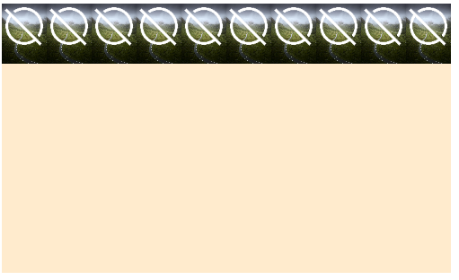
background-repeat: repeat-y;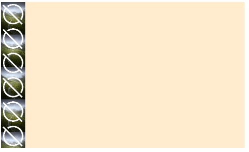
background-position: 100px 50px; /* 값을 1개만 쓰면 가로, 세로 동일하게 적용*/
background-size: cover; 
<!-- css -->
     <style>
        *{
            margin: 0;
            padding: 0;
        }
        body{
            /* 스크롤 만들기 위해 높이 지정 */
            height: 2000px;
        }
        .back2{
            width: 40vw;
            height: 300px;
            margin: 40px;
            background: url(./img/back.jpg) no-repeat ;
            background-color: lightgoldenrodyellow;
            /* 영역의 가로 사이즈에 맞춰서 이미지를 정비율로 100%를 채운다. */
            background-size: 100% ; /* 위아래 빈 공간이 생길 수 있다 */
            background-size: cover ;
            background-size: contain;
            background-position: center center ;
            /*
            ====    background 속성 한꺼번에 쓸 때  =====
            background: url() 반복여부 가로위치 세로위치 컬러 / 사이즈 ;
            background: url() 반복여부 가로위치 세로위치 사이즈 ;
             */

        }
     </style>
</head>
<body>
    <div class="back2"></div>
</body>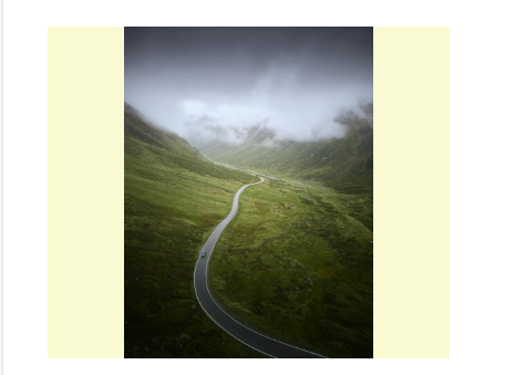
<!-- css -->
<style>
*{
margin: 0;
padding: 0;
}
body{
/* 스크롤 만들기 위해 높이 지정 */
height: 2000px;
}
.back3{
width: 100%;
height: 400px;
background-color: azure;
background-image: url(./img/back.jpg);
background-size: 100%;
background-position: center top;
background-attachment: scroll;
background-attachment: fixed;
color:white;
text-align: center;
box-sizing: border-box;
padding: 120px 40px;
}
.back3 > h2{
font-size: 30px;
margin-bottom: 20px;
}
.back3 p{
font-size: 18px;
}
</style>
</head>
<body>
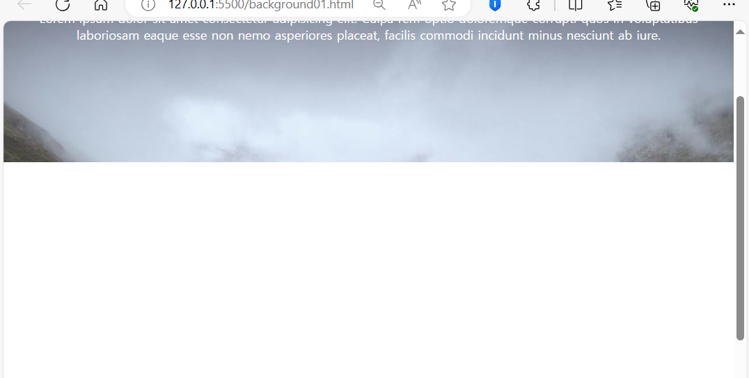
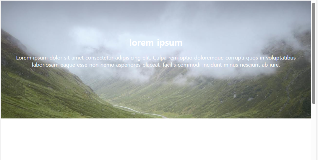
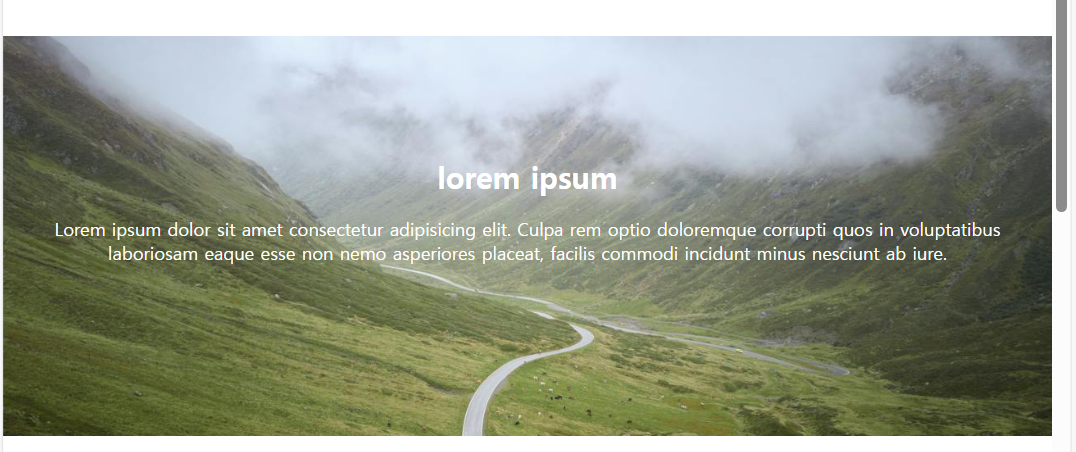
<div class="back3">
<h2>lorem ipsum </h2>
<p>Lorem ipsum dolor sit amet consectetur adipisicing elit. Culpa rem optio doloremque corrupti quos in voluptatibus laboriosam eaque esse non nemo asperiores placeat, facilis commodi incidunt minus nesciunt ab iure.</p>
</div>
</body>background-attachment: scroll; 인 경우
기본값으로 스크롤이 움직이면 배경이 위로 올라감.
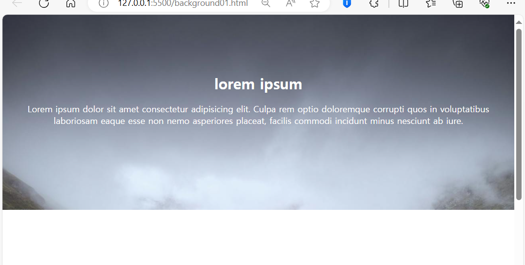
background-attachment: fixed; 인 경우
배경화면이 스크롤을 따라 움직이지 않고 제자리에 고정함.
background 속성 한꺼번에 쓸 때
- background: url() 반복여부 가로위치 세로위치 컬러 / 사이즈 ;
- background: url() 반복여부 가로위치 세로위치 사이즈 ;
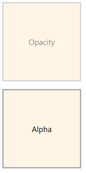
투명도를 조절하는 opacity와 alpha
컨텐츠에 투명도를 적용하고 싶을 때 opacity와 alpha를 이용할 수 있다.
투명도는 0~1 까지의 값을 입력할 수 있고, 소숫점 단위로 투명도를 조절할 수 있다.
0이 완전 투명한 상태를 뜻하며 1이 완전히 선명한 상태를 의미함.
opacity의 경우 영역안에 포함된 border, 컨텐츠까지 모두 투명하게 만들고
alpha의 경우 컨텐츠와 border를 제외한 배경영역만 투명하게 만든다.
[기본형]
- opacity : 0~1 ; => opacity는 '속성명'
- background-color : rgba(red,green,blue,alpha) ; => alpha는 '속성값'
 <!-- css -->
     <style>
        div{
            width: 300px;
            height: 300px;
            border: 5px solid darkgrey ;
            font-size: 30px;
            text-align: center;
            line-height: 300px;
            margin-bottom: 30px;
        }
        /* Opacity */
        .box1{
            background-color: blanchedalmond;
            opacity: 0.5;
        }
        .box2{
            background-color: rgba(255, 235, 205,0.5);

        }

     </style>
</head>
<body>
    <div class="box1">Opacity</div>
    <div class="box2">Alpha</div>

</body>