🎬 CSS만으로 이미지 슬라이드 만들기
대다수의 이미지 슬라이드는 자바스크립트를 활용하여 만들지만, 이번에는 CSS와 HTML만으로 이미지 슬라이드를 만들어 보는 건 어떨까 해서 만들어 보았다. 구글링해보니 꽤 많은 수의 포스트가 있었고, 그 중에서 가장 마음에 드는 블로그의 포스트를 참조하여 구현해 보았다.
<div class="slider">
<input type="radio" name="slide" id="slide1" checked>
<input type="radio" name="slide" id="slide2">
<input type="radio" name="slide" id="slide3">
<input type="radio" name="slide" id="slide4">
<input type="radio" name="slide" id="slide5">
<input type="radio" name="slide" id="slide6">
<input type="radio" name="slide" id="slide7">
<input type="radio" name="slide" id="slide8">
<input type="radio" name="slide" id="slide9">
<ul id="imgholder" class="imgs">
<li><img src="imgs/gallery/photo_1.jpg"></li>
<li><img src="imgs/gallery/photo_2.jpg"></li>
<li><img src="imgs/gallery/photo_3.jpg"></li>
<li><img src="imgs/gallery/photo_4.jpg"></li>
<li><img src="imgs/gallery/photo_5.jpg"></li>
<li><img src="imgs/gallery/photo_6.jpg"></li>
<li><img src="imgs/gallery/photo_7.jpg"></li>
<li><img src="imgs/gallery/photo_8.jpg"></li>
<li><img src="imgs/gallery/photo_9.jpg"></li>
</ul>
<div class="bullets">
<label for="slide1"> </label>
<label for="slide2"> </label>
<label for="slide3"> </label>
<label for="slide4"> </label>
<label for="slide5"> </label>
<label for="slide6"> </label>
<label for="slide7"> </label>
<label for="slide8"> </label>
<label for="slide9"> </label>
</div>
</div>슬라이드의 HTML 구조이다. 슬라이드의 이동은 input type의 라디오 박스를 클릭하여 이동하게 구현하였고, 실제 클릭 이동 구현은 하단에 bullets라는 label 태그를 만들어 라디오 박스와 연동되게 만들었다. 즉, 하단의 bullets를 클릭하면 라디오 박스가 클릭되어 이동하게 되는 것이다.
.slider {
  width: 800px;
  height: 600px;
  position: relative;
  padding-top: 50px;
  max-width: 100%;
  margin: 0 auto;
  overflow: hidden; /* 현재 슬라이드 오른쪽에 위치한 나머지 슬라이드 들이 보이지 않도록 가림 */
  z-index: 0;
}

.slider input[type="radio"] {
  display: none;
}
슬라이드의 기본 CSS 구조이다. margin: 0 auto;를 주어 슬라이드를 가운데 정렬하고, overflow: hidden; 속성을 통해 현재 슬라이드 오른쪽에 위치한 나머지 이미지들이 보이지 않도록 하였다. 라디오 박스와 연결된 bullets를 클릭하면 우측에 위치한 보이지 않는 이미지들이 좌측으로 이동하며 보여지게 되는 구조이다.
ul.imgs {
  padding: 0;
  margin: 0;
  list-style: none;
}

ul.imgs li {
  position: absolute;
  left: 640px;
  transition-delay: 1s; /* 새 슬라이드가 이동해 오는 동안 이전 슬라이드 이미지가 배경이 보이도록 지연 */
  width: 800px !important;
  padding: 0;
  margin: 0;
}
슬라이드 이미지 목록의 css 구조이다. left: 640px;를 줘서 기본적으로 슬라이드 영역 크기 오른쪽에 위치하게 하고, 개별 슬라이드의 transition delay를 1초를 줘서 슬라이드가 이동하는 동안 배경이 웹 페이지 배경으로 보이는 문제를 해결해준다.
.bullets {
  position: absolute;
  left: 50%;
  transform: translateX(-50%);
  bottom: 20px;
  z-index: 2;
}

.bullets label {
  display: inline-block;
  border-radius: 50%;
  background-color: rgba(0, 0, 0, 0.55);
  width: 20px;
  height: 20px;
  cursor: pointer;
}
/* 현재 선택된 불릿 배경 흰색으로 구분 표시 */
.slider
  input[type="radio"]:nth-child(1):checked
  ~ .bullets
  > label:nth-child(1) {
  background-color: #fff;
}

(...)
bullets의 CSS 구조이다. bullets는 라디오 박스와 조합된 <label> 태그로 만든다. <label> 태그를 슬라이드 하단 중앙에 배치한 후, 선택된 bullets를 흰색으로 구분 표시했다.
.slider input[type="radio"]:nth-child(1):checked ~ ul.imgs > li:nth-child(1) {
  left: 0;
  transition: 0.5s;
  z-index: 1;
}
.slider input[type="radio"]:nth-child(2):checked ~ ul.imgs > li:nth-child(2) {
  left: 0;
  transition: 0.5s;
  z-index: 1;
}
.slider input[type="radio"]:nth-child(3):checked ~ ul.imgs > li:nth-child(3) {
  left: 0;
  transition: 0.5s;
  z-index: 1;
}
.slider input[type="radio"]:nth-child(4):checked ~ ul.imgs > li:nth-child(4) {
  left: 0;
  transition: 0.5s;
  z-index: 1;
}

(...)
가장 중요한 슬라이드 이동 애니메이션 CSS 구조이다. bullets를 클릭하면 해당 순서의 슬라이드가 left: 0 처리되어 왼쪽으로 이동된다. 그리고 새로 들어오는 슬라이드는 현재 슬라이드보다 위쪽에 표시되어야 하기 때문에 z-index를 1로 설정하였다.
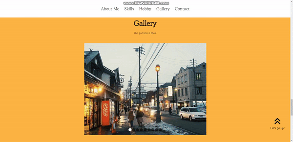
슬라이드가 완성된 모습이다!
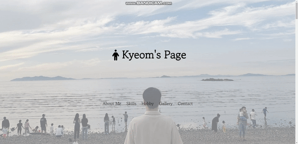
🔝 Arrow - up 버튼 만들기 & Transparent Navbar
페이지가 하단으로 내려갔을 때, 클릭시에 최상위 레이아웃인 header로 한번에 이동하는 버튼을 구현해 보았다.
<button class="arrow-up">
	<i class="fa-solid fa-angles-up"></i>
	<br><p>Let's go up!</p>
</button>
arrow-up 버튼의 HTML 구조이다. 버튼의 디자인은 fontawesome에서 가져왔다. 그리고 해당 버튼의 기능을 알 수 있도록 p 태그로 설명을 적어 놓았다.
.arrow-up {
  position: fixed;
  bottom: 20px;
  width: 150px;
  height: 200px;
  right: 10px;
  font-size: 50px;
  color: var(--color-black);
  border-style: none;
  background: none;
  opacity: 0;
  transition: all var(--animation-duration) ease-in;
  pointer-events: none;
}

.arrow-up.visible {
  opacity: 1;
  pointer-events: auto;
  cursor: pointer;
}

.arrow-up.visible:hover {
  animation: up-down 0.5s infinite ease-in-out alternate;
}
arrow-up 버튼의 CSS 구조이다. 여기서 .visible로 구분을 해놓은 이유는, arrow-up 버튼이 현재 웹사이트가 header에 위치해 있을때는 보이지 않다가 header에서 벗어날 때만 나타나도록 구현할 것이기 때문이다. fixed로 브라우저에 위치를 고정하고, opacity로 visible일때와 아닐때를 구분하였다. 또한 visible이 아닐때는 pointer-events를 none으로 설정해 클릭해도 아무런 기능을 수행하지 않도록 하였다.
마우스를 올렸을 때 버튼을 누르게 끔 hover시에 위 아래로 움직이는 animation 효과 또한 추가하였다.
// Show "arrow up" button when scrolling down
const home = document.querySelector("#header");
const homeHeight = home.getBoundingClientRect().height;
const arrowUp = document.querySelector(".arrow-up");
document.addEventListener("scroll", () => {
  if (window.scrollY > homeHeight / 2) {
    arrowUp.classList.add("visible");
  } else {
    arrowUp.classList.remove("visible");
  }
});

// Handle click on the "arrow up" button
arrowUp.addEventListener("click", () => {
  scrollIntoView("#header");
});
arrow-up 버튼의 Javascript 파일이다. 우선 header의 height를 homeHeight라는 변수에 할당해 window.scrollY, 즉 사용자가 수직으로 header의 height / 2 만큼 스크롤 하였을때 arrow-up 버튼에 visible classList를 추가하도록 하였다. 즉, header의 반 이상 스크롤 하였을 시에 arrow-up.visible이 되어 화면에 나타나게 되는 것이다. 버튼을 클릭시에는 앞서 선언한 scrollIntoView 함수를 통해 header의 id 값으로 이동하게 하는 이벤트 핸들러를 등록하였다.
이와 비슷한 방식으로 transparent Navbar도 구현할 수 있었다.
마치며 ✍🏻
사실, 그 동안 나름 공부도 오래 해왔다고 생각했고 '에이 HTML, CSS 정도야 껌이지!' 하는 생각을 가지고 과제를 시작했었다. 그러나 막히는 부분도 많았고 그동안 HTML, CSS 공부를 게을리 해서 기억이 나지 않는 부분들도 많았던 것 같다. 그러나 한 가지 느낄수 있었던 건, 내가 예전에 HTML, CSS 공부를 하며 느꼈던 그 재미, 내가 만든 것들이 눈앞에 나타나고 더 나은 기능들을 구현하고자 했던 욕심들이 지금의 나에게 아직 남아있다는 것이었다. 어떻게 보면 프론트엔드 개발자가 되기로 마음먹었던 건 이러한 것들 때문이었던 것 같다. 앞으로 더 발전될 나를 그려보면서 이번 1차 과제는 여기서 끝!