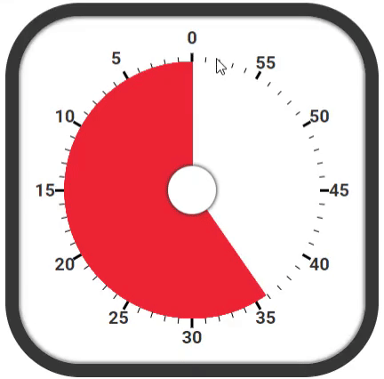
결과물 ( 10배속 타이머 )
이 글은 velog 시계를 만들자 게시물을 참고하여 만들었습니다.
🌟 계기
정보처리기사 시험을 준비하면서, 뽀모도로라는 공부법을 도입해 보았습니다.
뽀모도로를 구글에 검색하면,
뽀모도로 기법(Pomodoro Technique) : 시간 관리 방법론으로, 타이머를 이용해서 25분간 집중해서 일을 한 다음 5분간 휴식하는 방식이다. '뽀모도로'는 이탈리아어로 토마토를 뜻한다
( 5분 휴식이 아니라 30분을 휴식하는 등.. 정확히 지키지는 않았지만... )
얼마나 공부했는지 확인 가능하고, 정보처리기사는 합격했으니 아무튼 효과적이라고 할 수 있겠습니다.
이러한 계기로 뽀모도로 프로그램을 만드려고 했는데, 그 과정에서 타이머가 필요했습니다.
구글에 타이머를 이미지로 검색하면,
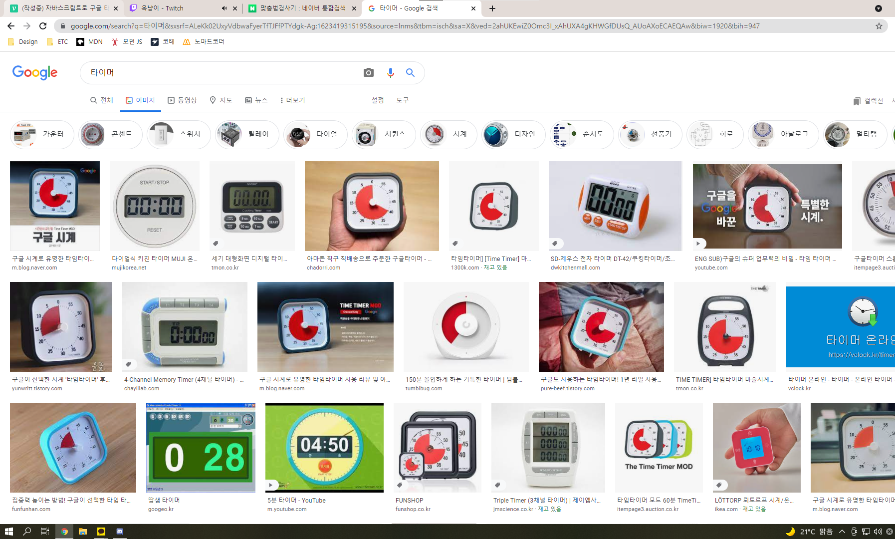
보다시피 이미지의 7할이 구글 타이머라고 알려진 저 빨간색 타이머가 나옵니다.
뽀모도로의 뜻인 토마토와 비슷한 느낌이기도 하여, 이 디자인으로 만들기로 합니다.
🕑 타이머 만들기
테두리
index.html
<div class="timer-container">
  <div id="timer" class="timer">

  </div>
</div>
style.css
.timer-container {
    color: rgb(50, 50, 50);
    font-family: 'Roboto', sans-serif;
    display: inline-block;
    padding: 40px;
    border-radius: 20%;
    border: 15px solid rgb(55, 55, 55);
    box-shadow: inset 0 0 3px 3px rgba(50, 50, 50, 0.3), inset 0 0 1px 2px rgba(50, 50, 50, 0.2);
}

.timer {
    position: relative;
    font-size: 20px;

    width: 15em;
    height: 15em;
}
테두리인 timer-container와 타이머 내부 요소들의 크기, 위치의 기준이 되는 timer입니다.

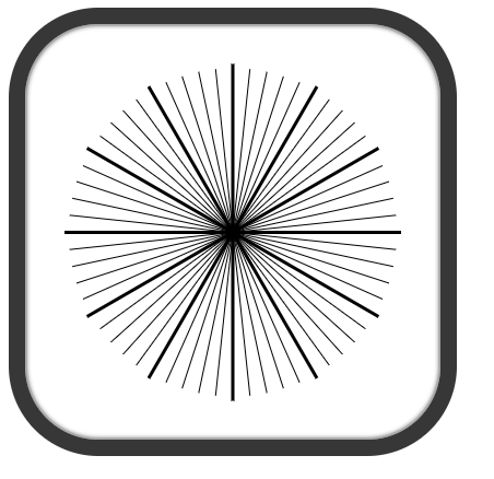
눈금
index.html
<div id="lines"></div>style.css
.timer .line {
    width: 100%;
    height: 1px;
    top: calc(50% - 1px / 2);

    background: #000;
    position: absolute;
}

.timer .line.thick {
    width: calc(100% + .4em);
    left: calc(-.4em / 2);

    height: 3px;
    top: calc(50% - 3px / 2);
}
index.js
const lines = timer.querySelector('#lines');

for(let i=0; i<30; i++) {
  const line = document.createElement('div');
  line.classList.add('line');
  line.style.transform = `rotate(${i*6}deg)`;

  if (i%5 == 0) {
    line.classList.add('thick')
  }

  lines.append(line);
}
360도를 분 단위로 나누면, 6도가 됩니다.(360/60 = 6) 6도씩 회전시킵니다.
5분 단위로 굵게,길게 설정합니다.
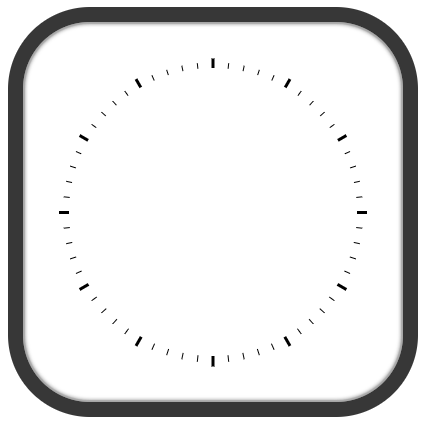
커버
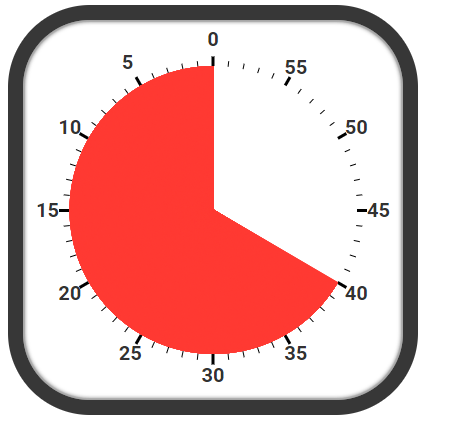
눈금처럼 끝 부분만 보이도록, 가운데 커버를 만들어줍니다.
index.html
<div class="cover1"></div>style.css
.timer .cover1{
    position: absolute;
    width: calc(100% - 4%);
    height: calc(100% - 4%);
    left: calc(4% / 2);
    top: calc(4% / 2);
    border-radius: 50%;
    background: #fff;
    z-index: 1;
}z-index를 설정하여 눈금 위를 덮도록 합니다.
숫자
index.html
<div id="num-container"></div>style.css
.num-box {
    position: absolute;
    display: flex;
    justify-content: space-between;
    align-items: center;

    width: calc(100% + 18%);
    left: calc(-18% / 2);
    height: 40px;
    top: calc(50% - 40px/2);
    font-weight: 600;
}
index.js
const nums = timer.querySelector('#num-container');

let left = 15;
let right = 45;

for (let i=0; i<6; i++) {
  const numBox = document.createElement('div');
  numBox.classList.add('num-box');
  numBox.style.transform = `rotate(${i*30}deg)`;

  const spanLeft = document.createElement('span');
  const spanRight = document.createElement('span');

  const leftText = left - 5*i;
  spanLeft.textContent = leftText<0 ? 60+ leftText : leftText;
  spanRight.textContent = right - (5 * i);

  spanLeft.style.transform = `rotate(${-30*i}deg)`;
  spanRight.style.transform = `rotate(${-30*i}deg)`;

  numBox.append(spanLeft,spanRight);
  nums.append(numBox);
}
left 15, right 45로 시작하여, 5씩 빼줍니다. left는 0보다 작아지면, 60을 더합니다.
5분 단위의 숫자들을 30도씩 조절해줍니다.

남은 시간
index.html
<div id="fins"></div>style.css
.fin {
    position: absolute;
    width: 1px;
    left: calc(50% - 1px / 2);

    height: calc(50% - .3em);
    top: .3em;

    background: rgb(255, 57, 50);
    z-index: 2;
    transform-origin: bottom;
}
index.js
const fins = timer.querySelector('#fins');
const endTime = 40;

 for (let min=0; min<endTime; min++) {
   for (let sec=0; sec<60; sec++) {
     const remainFin = document.createElement('div');
     remainFin.classList.add('fin');

     const deg = min*6+sec*0.1;
     remainFin.style.transform = `rotate(${-deg}deg)`

     fins.append(remainFin);
   }
 }
남은 시간을 나타내는 빨간 영역은, 타이머의 중심에서 끝부분 까지 뻗은 핀을 여러개 생성하여 만듭니다.
핀을 0분 0초부터, 남은시간까지 초 단위로 반복하여, 핀을 생성합니다.
위에서 계산한 것 처럼 1분은 6도이고, 1초는 0.1도 입니다. 6/60 = 0.1
커버2
모양을 위해 중심에 들어갈 두 번째 커버를 만듭니다.
index.html
<div class="cover2"></div>style.css
.timer .cover2 {
    position: absolute;
    width: 18%;
    height: 18%;
    left: calc(50% - 18% / 2);
    top: calc(50% - 18% / 2);

    border-radius: 50%;
    background: #fff;
    z-index: 3;
    box-shadow: 0 0 3px 3px rgba(50, 50, 50, 0.4), 0 0 1px 2px rgba(50, 50, 50, 0.3);
}
재생
function tickSec() {
    const lastFin = fins.lastChild;
    if (lastFin) {
        lastFin.remove();
    }
}

function play() {
    setInterval(tickSec,1000)
}
재생하여, 남은 시간이 없어지는 구현은
초 단위로 만든 핀들을, 1초마다 한 개씩 지우는 방법으로 하였습니다.
🚩결과물

결과물 ( 10배속 타이머 )


디자인 스킬에 감동 받았습니다. 와우.