텍스트나 요소에 그림자(Shadow) 효과를 부여하기 위한 프로퍼티를 선언한다.
📌 text-shadow
텍스트에 그림자 효과를 부여하는 프로퍼티이다.
선택자 { text-shadow: Horizontal-offset Vertical-offset Blur-Radius Shadow-Color; }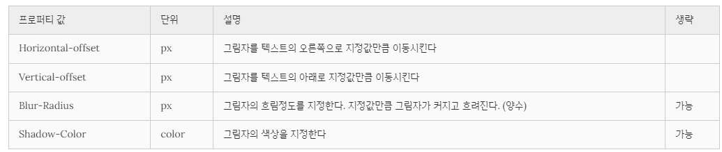
<!DOCTYPE html>
<html>
<head>
  <style>
    h1:nth-child(1) {
      text-shadow: 5px 5px;
    }
    h1:nth-child(2) {
      text-shadow: 5px 5px red;
    }
    h1:nth-child(3) {
      text-shadow: 5px 5px 3px red;
    }
    h1:nth-child(4) {
      color: white;
      text-shadow: 5px 5px 3px black;
    }
    h1:nth-child(5) {
      text-shadow: 0 0 3px red;
    }
    /*Multiple Shadows*/
    h1:nth-child(6) {
      text-shadow: 0 0 3px red, 0 0 10px blue;
    }
    /*Multiple Shadows*/
    h1:nth-child(7) {
      color: white;
      text-shadow: 1px 1px 2px black, 0 0 25px blue, 0 0 5px darkblue;
    }
  </style>
</head>
<body>
  <h1>Text-shadow effect!</h1>
  <h1>Text-shadow effect!</h1>
  <h1>Text-shadow effect!</h1>
  <h1>Text-shadow effect!</h1>
  <h1>Text-shadow effect!</h1>
  <h1>Text-shadow effect!</h1>
  <h1>Text-shadow effect!</h1>
</body>
</html>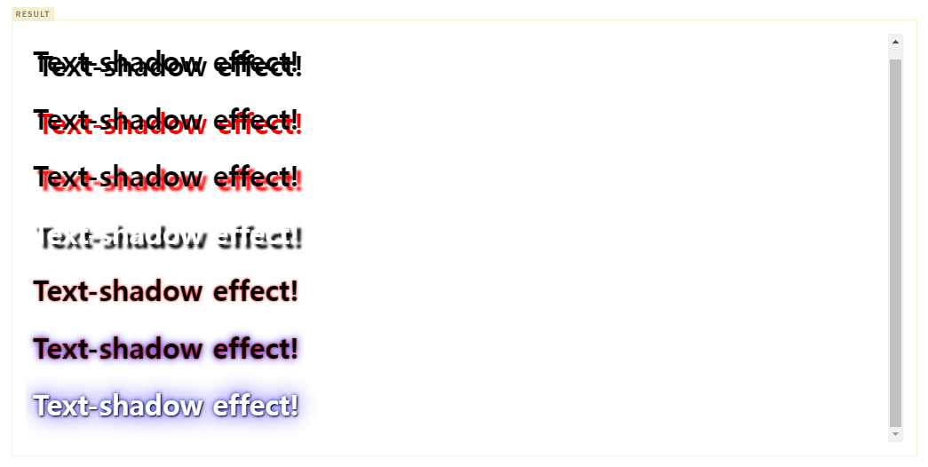

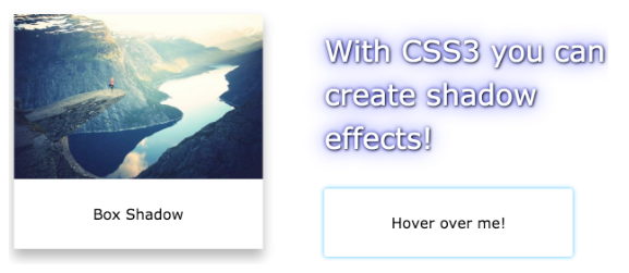
📌 box-shadow
요소에 그림자 효과를 부여하는 프로퍼티이다.
선택자 { box-shadow: Inset Horizontal-offset Vertical-offset Blur-Radius Spread Shadow-Color; }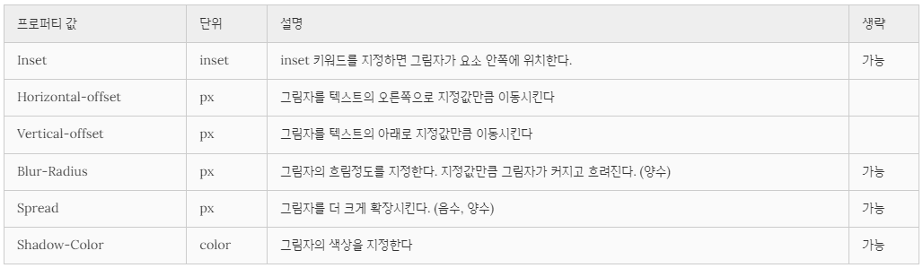
<!DOCTYPE html>
<html>
<head>
  <style>
    div {
      width: 300px;
      height: 100px;
      padding: 15px;
      margin: 20px;
      background-color: yellow;
    }
    /*box-shadow: Inset Horizontal-offset Vertical-offset Blur-Radius Spread Shadow-Color;*/
    /* Horizontal-offset Vertical-offset */
    div:nth-of-type(1) {
      box-shadow: 10px 10px;
    }
    /* Horizontal-offset Vertical-offset Shadow-Color */
    div:nth-of-type(2) {
      box-shadow: 10px 10px blue;
    }
    /* Horizontal-offset Vertical-offset Blur-Radius Shadow-Color */
    div:nth-of-type(3) {
      box-shadow: 10px 10px 5px blue;
    }
    /* Horizontal-offset Vertical-offset Blur-Radius Spread Shadow-Color */
    div:nth-of-type(4) {
      box-shadow: 10px 10px 5px 5px blue;
    }
    /* Inset Horizontal-offset Vertical-offset Blur-Radius Spread Shadow-Color */
    div:nth-of-type(5) {
      box-shadow: inset 10px 10px 5px 5px blue;
    }
    /* Horizontal-offset Vertical-offset Blur-Radius Spread Shadow-Color */
    div:nth-of-type(6) {
      background-color: white;
      box-shadow: 0 4px 8px 0 rgba(0, 0, 0, 0.2), 0 6px 20px 0 rgba(0, 0, 0, 0.19);
    }
  </style>
</head>
<body>
  <div>This is a div element with a box-shadow</div>
  <div>This is a div element with a box-shadow</div>
  <div>This is a div element with a box-shadow</div>
  <div>This is a div element with a box-shadow</div>
  <div>This is a div element with a box-shadow</div>
  <div>This is a div element with a box-shadow</div>
</body>
</html>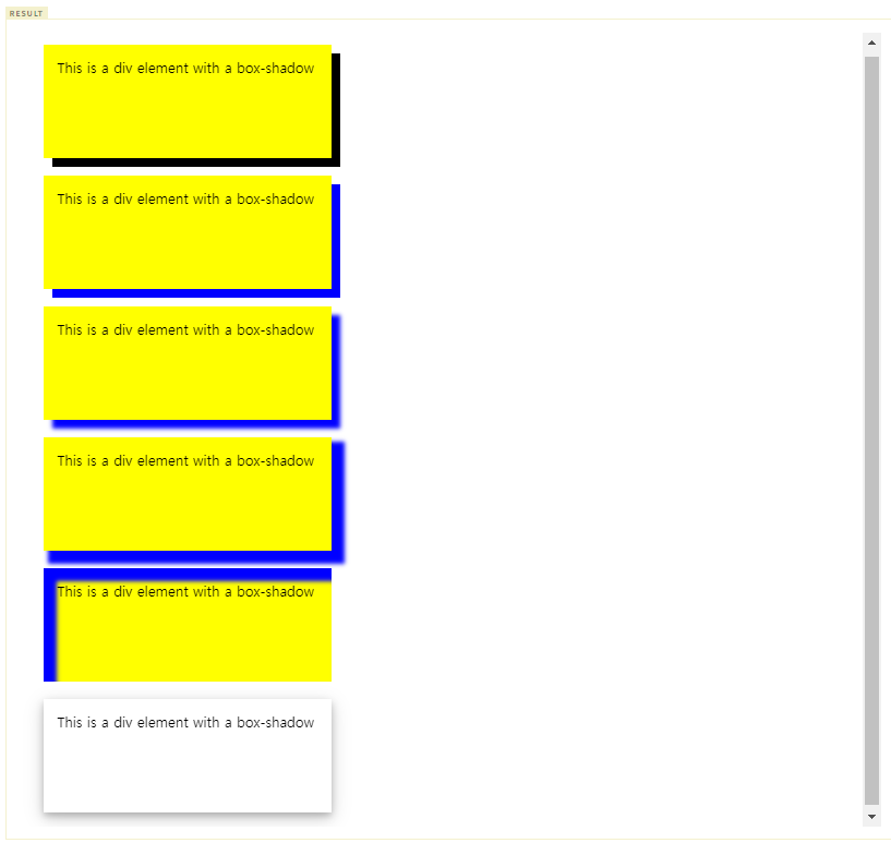
🎁 Reference

필요하다면 공부하는 개발자, 한승준