애니메이션(Animation) 효과는 HTML 요소에 적용되는 CSS 스타일을 다른 CSS 스타일로 부드럽게 변화시킨다. 애니메이션은 애니메이션을 나타내는 CSS 스타일과 애니메이션의 sequence를 나타내는 복수의 키프레임(@keyframes) 들로 이루어진다.
transition으로도 어느 정도의 애니메이션 효과를 표현할 수 있으나 animation보다는 제한적이다. 일반적으로 트랜지션 효과는 요소 프로퍼티값이 다른 값으로 변화할 때 주로 사용하며 요소의 로드와 함께 자동으로 발동되지 않는다. :hover 와 같은 가상 클래스 선택자(Pseudo-Class Selector) 또는 자바스크립트의 이벤트와 같은 부수적 액션에 의해 발동된다.
즉 transition 프로퍼티는 단순히 요소의 프로퍼티 변화에 주안점이 있다면 animation 프로퍼티는 하나의 줄거리를 구성하여 줄거리 내에서 세부 움직임을 시간 흐름 단위로 제어할 수 있고 전체 줄거리의 재생과 정지, 반복까지 제어할 수 있다.
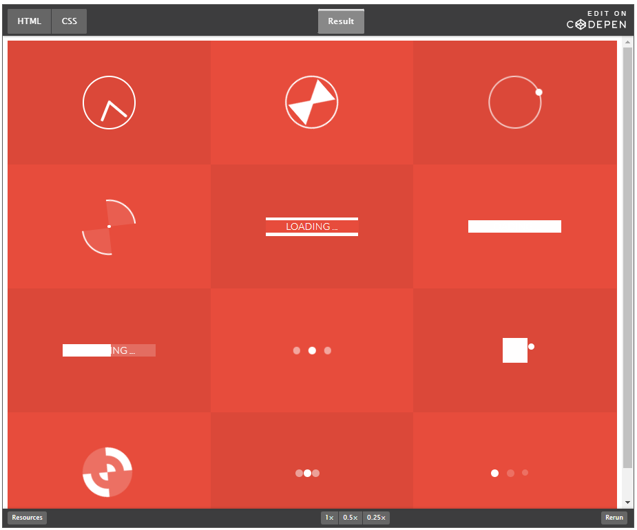
<div class="container">
   <div class="box">
      <div class="clock"></div>
      <p>Clock</p>
    </div>

    <div class="box">
      <div class="hourglass"></div>
      <p>Hourglass</p>
    </div>

    <div class="box">
      <div class="loader1"></div>
      <p>Loader 1</p>
    </div>

    <div class="box">
      <div class="loader2"></div>
      <p>loader 2</p>
    </div>

    <div class="box">
      <div class="loader3"></div>
      <p>loader 3</p>
    </div>

    <div class="box">
      <div class="loader4"></div>
      <p>loader 4</p>
    </div>

    <div class="box">
      <div class="loader5"></div>
      <p>loader 5</p>
    </div>

    <div class="box">
      <div class="loader6"></div>
      <p>loader 6</p>
    </div>

    <div class="box">
      <div class="loader7"></div>
      <p>loader 7</p>
    </div>

    <div class="box">
      <div class="loader8"></div>
      <p>loader 8</p>
    </div>

    <div class="box">
      <div class="loader9"></div>
      <p>loader 9</p>
    </div>

    <div class="box">
      <div class="loader10"></div>
      <p>loader 10 </p>
    </div>
</div>
@import url(https://fonts.googleapis.com/css?family=Lato:300);
.container{
text-align: center;
background-color: #e74c3c;
overflow: hidden;
}
.box:nth-child(2n-1){
background-color: rgba(0,0,0,0.05);
}
.box{
display: inline-block;
height: 200px;
width: 33.3%;
float:left;
position: relative;
/*margin:0 -4px -5px -2px;*/
transition: all .2s ease;
}
.box p{
color: #777;
font-family: Lato,"Helvetica Neue" ;
font-weight: 300;
position: absolute;
font-size: 20px;
width: 100%;
height: 25px;
text-align: center;
bottom: 0px;
margin: 0;
top:160px;
background-color: #fff;
opacity: 0;
text-transform: uppercase;
transition: all .2s ease;
}
.box:hover p{
bottom:0px;
top:175px;
opacity: 1;
transition: all .2s ease;
z-index: 2;
}
/* MEDIA QUERIES */
@media (max-width: 700px){
.box{
width: 50%;
}
.box:nth-child(2n-1){
background-color: inherit;
}
.box:nth-child(4n),.box:nth-child(4n-3) {
background-color: rgba(0,0,0,0.05);
}
}
@media (max-width: 420px){
.box{
width: 100%;
}
.box:nth-child(4n),.box:nth-child(4n-3){
background-color: inherit;
}
.box:nth-child(2n-1){
background-color:rgba(0,0,0,0.05);
}
}
/* -------------- Clock -------------- */
.clock{
border-radius: 60px;
border: 3px solid #fff;
height: 80px;
width: 80px;
position: relative;
top: 28%;
top: -webkit-calc(50% - 43px);
top: calc(50% - 43px);
left: 35%;
left: -webkit-calc(50% - 43px);
left: calc(50% - 43px);
}
.clock:after{
content: "";
position: absolute;
background-color: #fff;
top:2px;
left: 48%;
height: 38px;
width: 4px;
border-radius: 5px;
-webkit-transform-origin: 50% 97%;
transform-origin: 50% 97%;
-webkit-animation: grdAiguille 2s linear infinite;
animation: grdAiguille 2s linear infinite;
}
@-webkit-keyframes grdAiguille{
0%{-webkit-transform:rotate(0deg);}
100%{-webkit-transform:rotate(360deg);}
}
@keyframes grdAiguille{
0%{transform:rotate(0deg);}
100%{transform:rotate(360deg);}
}
.clock:before{
content: "";
position: absolute;
background-color: #fff;
top:6px;
left: 48%;
height: 35px;
width: 4px;
border-radius: 5px;
-webkit-transform-origin: 50% 94%;
transform-origin: 50% 94%;
-webkit-animation: ptAiguille 12s linear infinite;
animation: ptAiguille 12s linear infinite;
}
@-webkit-keyframes ptAiguille{
0%{-webkit-transform:rotate(0deg);}
100%{-webkit-transform:rotate(360deg);}
}
@keyframes ptAiguille{
0%{transform:rotate(0deg);}
100%{transform:rotate(360deg);}
}
/* -------------- Sablier -------------- */
.hourglass{
position: relative;
height: 80px;
width: 80px;
top: 28%;
top: -webkit-calc(50% - 43px);
top: calc(50% - 43px);
left: 35%;
left: -webkit-calc(50% - 43px);
left: calc(50% - 43px);
border: 3px solid #fff;
border-radius: 80px;
-webkit-transform-origin: 50% 50%;
transform-origin: 50% 50%;
-webkit-animation: hourglass 2s ease-in-out infinite;
animation: hourglass 2s ease-in-out infinite;
}
.hourglass:before{
content: "";
position: absolute;
top:8px;
left: 18px;
width: 0px;
height: 0px;
border-style: solid;
border-width: 37px 22px 0 22px;
border-color: #fff transparent transparent transparent;
}
.hourglass:after{
content: "";
position: absolute;
top: 35px;
left: 18px;
width: 0px;
height: 0px;
border-style: solid;
border-width: 0 22px 37px 22px;
border-color: transparent transparent #fff transparent;
}
@-webkit-keyframes hourglass{
0%{-webkit-transform:rotate(0deg);}
100%{-webkit-transform:rotate(180deg);}
}
@keyframes hourglass{
0%{transform:rotate(0deg);}
100%{transform:rotate(180deg);}
}
/* -------------- Loader1 -------------- */
.loader1{
position: relative;
height: 80px;
width: 80px;
border-radius: 80px;
border: 3px solid rgba(255,255,255, .7);
top: 28%;
top: -webkit-calc(50% - 43px);
top: calc(50% - 43px);
left: 35%;
left: -webkit-calc(50% - 43px);
left: calc(50% - 43px);
-webkit-transform-origin: 50% 50%;
transform-origin: 50% 50%;
-webkit-animation: loader1 3s linear infinite;
animation: loader1 3s linear infinite;
}
.loader1:after{
content: "";
position: absolute;
top: -5px;
left: 20px;
width: 11px;
height: 11px;
border-radius: 10px;
background-color: #fff;
}
@-webkit-keyframes loader1{
0%{-webkit-transform:rotate(0deg);}
100%{-webkit-transform:rotate(360deg);}
}
@keyframes loader1{
0%{transform:rotate(0deg);}
100%{transform:rotate(360deg);}
}
/* -------------- loader2 -------------- */
.loader2{
position: relative;
width: 5px;
height: 5px;
top: 49%;
top: -webkit-calc(50% - 43px);
top: calc(50% - 2.5px);
left: 49%;
left: -webkit-calc(50% - 43px);
left: calc(50% - 2.5px);
background-color: #fff;
border-radius: 50px;
}
.loader2:before{
content: "";
position: absolute;
top: -38px;
border-top: 3px solid #fff;
border-right: 3px solid #fff;
border-radius: 0 50px 0px 0;
width: 40px;
height: 40px;
background-color: rgba(255, 255, 255, .1);
-webkit-transform-origin: 0% 100%;
transform-origin: 0% 100% ;
-webkit-animation: loader2 1.5s linear infinite;
animation: loader2 1.5s linear infinite;
}
.loader2:after{
content: "";
position: absolute;
top: 2px;
right: 2px;
border-bottom: 3px solid #fff;
border-left: 3px solid #fff;
border-radius: 0 0px 0px 50px;
width: 40px;
height: 40px;
background-color: rgba(255, 255, 255, .1);
-webkit-transform-origin: 100% 0%;
transform-origin: 100% 0% ;
-webkit-animation: loader2 1.5s linear infinite;
animation: loader2 1.5s linear infinite;
}
@-webkit-keyframes loader2{
0%{-webkit-transform:rotate(0deg);}
100%{-webkit-transform:rotate(360deg);}
}
@keyframes loader2{
0%{transform:rotate(0deg);}
100%{transform:rotate(360deg);}
}
/* -------------- loader3 -------------- */
.loader3{
position: relative;
width: 150px;
height: 20px;
top: 45%;
top: -webkit-calc(50% - 10px);
top: calc(50% - 10px);
left: 25%;
left: -webkit-calc(50% - 75px);
left: calc(50% - 75px);
}
.loader3:after{
content: "LOADING ...";
color: #fff;
font-family: Lato,"Helvetica Neue" ;
font-weight: 200;
font-size: 16px;
position: absolute;
width: 100%;
height: 20px;
line-height: 20px;
left: 0;
top: 0;
background-color: #e74c3c;
z-index: 1;
}
.loader3:before{
content: "";
position: absolute;
background-color: #fff;
top: -5px;
left: 0px;
height: 30px;
width: 0px;
z-index: 0;
opacity: 1;
-webkit-transform-origin: 100% 0%;
transform-origin: 100% 0% ;
-webkit-animation: loader3 10s ease-in-out infinite;
animation: loader3 10s ease-in-out infinite;
}
@-webkit-keyframes loader3{
0%{width: 0px;}
70%{width: 100%; opacity: 1;}
90%{opacity: 0; width: 100%;}
100%{opacity: 0;width: 0px;}
}
@keyframes loader3{
0%{width: 0px;}
70%{width: 100%; opacity: 1;}
90%{opacity: 0; width: 100%;}
100%{opacity: 0;width: 0px;}
}
/* -------------- loader4 -------------- */
.loader4{
position: relative;
width: 150px;
height: 20px;
top: 45%;
top: -webkit-calc(50% - 10px);
top: calc(50% - 10px);
left: 25%;
left: -webkit-calc(50% - 75px);
left: calc(50% - 75px);
background-color: rgba(255,255,255,0.2);
}
.loader4:before{
content: "";
position: absolute;
background-color: #fff;
top: 0px;
left: 0px;
height: 20px;
width: 0px;
z-index: 0;
opacity: 1;
-webkit-transform-origin: 100% 0%;
transform-origin: 100% 0% ;
-webkit-animation: loader4 10s ease-in-out infinite;
animation: loader4 10s ease-in-out infinite;
}
.loader4:after{
content: "LOADING ...";
color: #fff;
font-family: Lato,"Helvetica Neue" ;
font-weight: 200;
font-size: 16px;
position: absolute;
width: 100%;
height: 20px;
line-height: 20px;
left: 0;
top: 0;
}
@-webkit-keyframes loader4{
0%{width: 0px;}
70%{width: 100%; opacity: 1;}
90%{opacity: 0; width: 100%;}
100%{opacity: 0;width: 0px;}
}
@keyframes loader4{
0%{width: 0px;}
70%{width: 100%; opacity: 1;}
90%{opacity: 0; width: 100%;}
100%{opacity: 0;width: 0px;}
}
/* -------------- loader5 -------------- */
.loader5{
position: relative;
width: 150px;
height: 20px;
top: 45%;
top: -webkit-calc(50% - 10px);
top: calc(50% - 10px);
left: 25%;
left: -webkit-calc(50% - 75px);
left: calc(50% - 75px);
background-color: rgba(255,255,255,0.2);
}
.loader5:after{
content: "LOADING ...";
color: #fff;
font-family: Lato,"Helvetica Neue" ;
font-weight: 200;
font-size: 16px;
position: absolute;
width: 100%;
height: 20px;
line-height: 20px;
left: 0;
top: 0;
}
.loader5:before{
content: "";
position: absolute;
background-color: #fff;
top: 0px;
height: 20px;
width: 0px;
z-index: 0;
-webkit-transform-origin: 100% 0%;
transform-origin: 100% 0% ;
-webkit-animation: loader5 7s ease-in-out infinite;
animation: loader5 7s ease-in-out infinite;
}
@-webkit-keyframes loader5{
0%{width: 0px; left: 0px}
48%{width: 100%; left: 0px}
50%{width: 100%; right: 0px}
52%{width: 100%; right: 0px}
100%{width: 0px; right: 0px}
}
@keyframes loader5{
0%{width: 0px; left: 0px}
48%{width: 100%; left: 0px}
50%{width: 100%; right: 0px}
52%{width: 100%; right: 0px}
100%{width: 0px; right: 0px}
}
/* -------------- loader6 -------------- */
.loader6{
position: relative;
width: 12px;
height: 12px;
top: 46%;
top: -webkit-calc(50% - 6px);
top: calc(50% - 6px);
left: 46%;
left: -webkit-calc(50% - 6px);
left: calc(50% - 6px);
border-radius: 12px;
background-color: #fff;
-webkit-transform-origin: 50% 50%;
transform-origin: 50% 50% ;
-webkit-animation: loader6 1s ease-in-out infinite;
animation: loader6 1s ease-in-out infinite;
}
.loader6:before{
content: "";
position: absolute;
background-color: rgba(255, 255, 255, .5);
top: 0px;
left: -25px;
height: 12px;
width: 12px;
border-radius: 12px;
}
.loader6:after{
content: "";
position: absolute;
background-color: rgba(255, 255 ,255 ,.5);
top: 0px;
left: 25px;
height: 12px;
width: 12px;
border-radius: 12px;
}
@-webkit-keyframes loader6{
0%{-webkit-transform:rotate(0deg);}
50%{-webkit-transform:rotate(180deg);}
100%{-webkit-transform:rotate(180deg);}
}
@keyframes loader6{
0%{transform:rotate(0deg);}
50%{transform:rotate(180deg);}
100%{transform:rotate(180deg);}
}
/* -------------- loader7 -------------- */
.loader7{
position: relative;
width: 40px;
height: 40px;
top: 40%;
top: -webkit-calc(50% - 20px);
top: calc(50% - 20px);
left: 43%;
left: -webkit-calc(50% - 20px);
left: calc(50% - 20px);
background-color: rgba(255, 255, 255, .2);
}
.loader7:before{
content: "";
position: absolute;
background-color: #fff;
height: 10px;
width: 10px;
border-radius: 10px;
-webkit-animation: loader7 2s ease-in-out infinite;
animation: loader7 2s ease-in-out infinite;
}
.loader7:after{
content: "";
position: absolute;
background-color: #fff;
top: 0px;
left: 0px;
height: 40px;
width: 0px;
z-index: 0;
opacity: 1;
-webkit-animation: loader72 10s ease-in-out infinite;
animation: loader72 10s ease-in-out infinite;
}
@-webkit-keyframes loader7{
0%{left: -12px; top: -12px;}
25%{left:42px; top:-12px;}
50%{left: 42px; top: 42px;}
75%{left: -12px; top: 42px;}
100%{left:-12px; top:-12px;}
}
@keyframes loader7{
0%{left: -12px; top: -12px;}
25%{left:42px; top:-12px;}
50%{left: 42px; top: 42px;}
75%{left: -12px; top: 42px;}
100%{left:-12px; top:-12px;}
}
@-webkit-keyframes loader72{
0%{width: 0px;}
70%{width: 40px; opacity: 1;}
90%{opacity: 0; width: 40px;}
100%{opacity: 0;width: 0px;}
}
@keyframes loader72{
0%{width: 0px;}
70%{width: 40px; opacity: 1;}
90%{opacity: 0; width: 40px;}
100%{opacity: 0;width: 0px;}
}
/* -------------- loader8 -------------- */
.loader8{
position: relative;
width: 80px;
height: 80px;
top: 28%;
top: -webkit-calc(50% - 43px);
top: calc(50% - 43px);
left: 35%;
left: -webkit-calc(50% - 43px);
left: calc(50% - 43px);
border-radius: 50px;
background-color: rgba(255, 255, 255, .2);
border-width: 40px;
border-style: double;
border-color:transparent #fff;
-webkit-box-sizing:border-box;
-moz-box-sizing:border-box;
box-sizing:border-box;
-webkit-transform-origin: 50% 50%;
transform-origin: 50% 50% ;
-webkit-animation: loader8 2s linear infinite;
animation: loader8 2s linear infinite;
}
@-webkit-keyframes loader8{
0%{-webkit-transform:rotate(0deg);}
100%{-webkit-transform:rotate(360deg);}
}
@keyframes loader8{
0%{transform:rotate(0deg);}
100%{transform:rotate(360deg);}
}
/* -------------- loader9 -------------- */
.loader9:before{
content: "";
position: absolute;
top: 0px;
height: 12px;
width: 12px;
border-radius: 12px;
-webkit-animation: loader9g 3s ease-in-out infinite;
animation: loader9g 3s ease-in-out infinite;
}
.loader9{
position: relative;
width: 12px;
height: 12px;
top: 46%;
left: 46%;
border-radius: 12px;
background-color: #fff;
}
.loader9:after{
content: "";
position: absolute;
top: 0px;
height: 12px;
width: 12px;
border-radius: 12px;
-webkit-animation: loader9d 3s ease-in-out infinite;
animation: loader9d 3s ease-in-out infinite;
}
@-webkit-keyframes loader9g{
0%{ left: -25px; background-color: rgba(255, 255, 255, .8); }
50%{ left: 0px; background-color: rgba(255, 255, 255, .1);}
100%{ left:-25px; background-color: rgba(255, 255, 255, .8); }
}
@keyframes loader9g{
0%{ left: -25px; background-color: rgba(255, 255, 255, .8); }
50%{ left: 0px; background-color: rgba(255, 255, 255, .1);}
100%{ left:-25px; background-color: rgba(255, 255, 255, .8); }
}
@-webkit-keyframes loader9d{
0%{ left: 25px; background-color: rgba(255, 255, 255, .8); }
50%{ left: 0px; background-color: rgba(255, 255, 255, .1);}
100%{ left:25px; background-color: rgba(255, 255, 255, .8); }
}
@keyframes loader9d{
0%{ left: 25px; background-color: rgba(255, 255, 255, .8); }
50%{ left: 0px; background-color: rgba(255, 255, 255, .1);}
100%{ left:25px; background-color: rgba(255, 255, 255, .8); }
}
/* -------------- loader10 -------------- */
.loader10:before{
content: "";
position: absolute;
top: 0px;
left: -25px;
height: 12px;
width: 12px;
border-radius: 12px;
-webkit-animation: loader10g 3s ease-in-out infinite;
animation: loader10g 3s ease-in-out infinite;
}
.loader10{
position: relative;
width: 12px;
height: 12px;
top: 46%;
left: 46%;
border-radius: 12px;
-webkit-animation: loader10m 3s ease-in-out infinite;
animation: loader10m 3s ease-in-out infinite;
}
.loader10:after{
content: "";
position: absolute;
top: 0px;
left: 25px;
height: 10px;
width: 10px;
border-radius: 10px;
-webkit-animation: loader10d 3s ease-in-out infinite;
animation: loader10d 3s ease-in-out infinite;
}
@-webkit-keyframes loader10g{
0%{background-color: rgba(255, 255, 255, .2);}
25%{background-color: rgba(255, 255, 255, 1);}
50%{background-color: rgba(255, 255, 255, .2);}
75%{background-color: rgba(255, 255, 255, .2);}
100%{background-color: rgba(255, 255, 255, .2);}
}
@keyframes loader10g{
0%{background-color: rgba(255, 255, 255, .2);}
25%{background-color: rgba(255, 255, 255, 1);}
50%{background-color: rgba(255, 255, 255, .2);}
75%{background-color: rgba(255, 255, 255, .2);}
100%{background-color: rgba(255, 255, 255, .2);}
}
@-webkit-keyframes loader10m{
0%{background-color: rgba(255, 255, 255, .2);}
25%{background-color: rgba(255, 255, 255, .2);}
50%{background-color: rgba(255, 255, 255, 1);}
75%{background-color: rgba(255, 255, 255, .2);}
100%{background-color: rgba(255, 255, 255, .2);}
}
@keyframes loader10m{
0%{background-color: rgba(255, 255, 255, .2);}
25%{background-color: rgba(255, 255, 255, .2);}
50%{background-color: rgba(255, 255, 255, 1);}
75%{background-color: rgba(255, 255, 255, .2);}
100%{background-color: rgba(255, 255, 255, .2);}
}
@-webkit-keyframes loader10d{
0%{background-color: rgba(255, 255, 255, .2);}
25%{background-color: rgba(255, 255, 255, .2);}
50%{background-color: rgba(255, 255, 255, .2);}
75%{background-color: rgba(255, 255, 255, 1);}
100%{background-color: rgba(255, 255, 255, .2);}
}
@keyframes loader10d{
0%{background-color: rgba(255, 255, 255, .2);}
25%{background-color: rgba(255, 255, 255, .2);}
50%{background-color: rgba(255, 255, 255, .2);}
75%{background-color: rgba(255, 255, 255, 1);}
100%{background-color: rgba(255, 255, 255, .2);}
}
VSCODE에서 실행해서 원하는 느낌을 가져가는게 훨씬 좋아보인다.
일반적으로 CSS 애니메이션을 사용하면 기존의 JavaScript 기반 애니메이션 실행과 비교하여 더 나은 렌더링 성능을 제공한다고 알려져 있다. 그러나 경우에 따라서는 JavaScript를 사용하는 것이 나을 수도 있다. jQuery 등의 애니메이션 기능은 CSS보다 간편하게 애니메이션 효과를 가능케 한다.
비교적 작은 효과나 CSS만으로도 충분한 효과를 볼 수 있는 것은 CSS를 사용한다. 예를 들어 요소의 width 변경 애니메이션은 자바스크립트를 사용하는 것보다 훨씬 간편하며 효과적이다.
세밀한 제어를 위해서는 자바스크립트 사용이 바람직하다. 예를 들어 바운스, 중지, 일시 중지, 되감기 또는 감속과 같은 고급 효과는 자바스크립트가 훨씬 유용하다.
가장 중요한 것은 브라우저에서 애니메이션 효과가 부드럽게 실행되는 것이다. 그리고 애니메이션 효과 작성에 소요되는 시간과 수고이다. 여러 사항들을 고려하여 자바스크립트를 사용하여야 할지 CSS를 사용하여야 할지 결정하여야 한다.
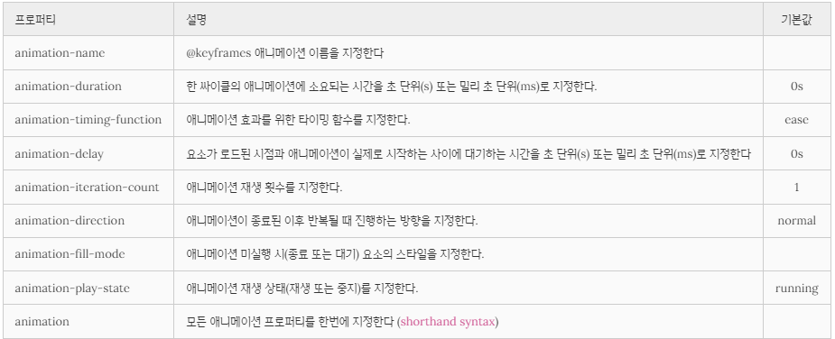
animation : shorthand syntax
📌 @keyframes
CSS 애니메이션과 트랜지션 방식의 주된 차이는 @keyframes rule에 있다. 이 rule을 사용하면 애니메이션의 흐름(sequence) 중의 여러 시점(breakpoint)에서 CSS 프로퍼티값을 지정할 수 있다.
<!DOCTYPE html>
<html>
<head>
  <style>
    div {
      position: absolute;
      width: 100px;
      height: 100px;
      background-color: red;
      animation-name: move;
      animation-duration: 5s;
      animation-iteration-count: infinite;
    }
    /* @keyframes rule */
    @keyframes move {
      /* keyframe */
      from {
        left: 0;
      }
      /* keyframe */
      to {
        left: 300px;
      }
    }
  </style>
</head>
<body>
  <div></div>
</body>
</html>
VSCODE에서 확인해보는 것이 좋아보인다.
@keyframes rule은 시간의 흐름에 따라 애니메이션을 정의한다. 여러 개의 키프레임을 정의하거나 애니메이션 중에 특정 CSS 프로퍼티에 값을 지정하는 지점을 정의할 수 있다.
위 예제를 보면 @keyframes 뒤에 애니메이션을 대표하는 임의의 이름를 부여하였다.
@keyframes move {}from, to 키워드를 사용하여 애니메이션의 시작과 끝 시점을 정의하였다. 그리고 애니메이션의 시작 시점을 의미하는 from 키프레임 내에는 left 프로퍼티에 값 0을, 애니메이션의 끝 시점을 의미하는 to 키프레임 내에는 left 프로퍼티에 값 300px을 지정하였다. 그 결과, 정지 상태에서 오른쪽으로 300px 이동하는 애니메이션이 실행된다.
@keyframes move {
  /* 애니메이션 시작 시점 */
  from { left: 0; }
  /* 애니메이션 종료 시점 */
  to   { left: 300px; }
}
from, to 키워드 대신 %를 사용할 수 있다. 또한 시작과 끝 키프레임 사이에 % 단위로 키프레임을 삽입할 수 있다.
@keyframes move {
  0%   { left: 0; }
  50%  { left: 100px; }
  100% { left: 300px; }
}
📌 animation-name
위 예제를 보면 @keyframes 뒤에 애니메이션을 대표하는 임의의 이름를 부여하였다.
@keyframes move {}이 이름을 animation-name 프로퍼티값으로 지정하여 사용하고자 하는 @keyframes rule을 선택한다. 하나 이상의 애니메이션 이름을 지정할 수 있다.
<!DOCTYPE html>
<html>
<head>
  <style>
    div {
      position: absolute;
      width: 100px;
      height: 100px;
      animation-name: move, fadeOut, changeColor;
      animation-duration: 5s;
      animation-iteration-count: infinite;
    }
    @keyframes move {
      from { left: 0; }
      to   { left: 300px; }
    }
    @keyframes fadeOut {
      from { opacity: 1; }
      to   { opacity: 0; }
    }
    @keyframes changeColor {
      from { background-color: red; }
      to   { background-color: blue; }
    }
  </style>
</head>
<body>
  <div></div>
</body>
</html>
VSCODE에서 확인하는 것이 좋을 듯
📌 animation-duration
한 싸이클의 애니메이션에 소요되는 시간을 초 단위(s) 또는 밀리 초 단위(ms)로 지정한다.
animation-duration: .5s;
animation-duration: 500ms;
animation-duration은 반드시 지정해야 한다. 지정하지 않는 경우 기본값 0s가 셋팅되어 어떠한 애니메이션도 실행되지 않는다.
📌 animation-timing-function
애니메이션 효과를 위한 수치 함수를 지정한다. 수치 함수에 대한 설명은 트랜지션 transition-timing-function 프로퍼티를 참조하기 바란다.
📌 animation-delay
요소가 로드된 시점과 애니메이션이 실제로 시작하는 사이에 대기하는 시간을 초 단위(s) 또는 밀리 초 단위(ms)로 지정한다.
animation-delay: 2s;📌 animation-iteration-count
애니메이션 주기의 재생 횟수를 지정한다. 기본값은 1이며 infinite로 무한반복 할 수 있다.
animation-iteration-count: 3;📌 animation-direction
애니메이션이 종료된 이후 반복될 때 진행하는 방향을 지정한다.

<!DOCTYPE html>
<html>
<head>
  <style>
    div {
      width: 100px;
      height: 100px;
      background: red;
      position: relative;
      animation: myAnimation 5s infinite;
      /*홀수번째는 normal로, 짝수번째는 reverse로 진행*/
      animation-direction: alternate;
    }
    @keyframes myAnimation {
      0%   { background: red;    left: 0px;   top: 0px; }
      25%  { background: yellow; left: 200px; top: 0px; }
      50%  { background: blue;   left: 200px; top: 200px; }
      75%  { background: green;  left: 0px;   top: 200px; }
      100% { background: red;    left: 0px;   top: 0px; }
    }
  </style>
  </head>
  <body>
    <div></div>
  </body>
</html>
VSCODE에서 수정하면서 공부해보기
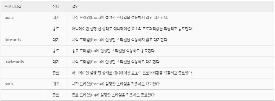
📌 animation-fill-mode
애니메이션 미실행 시(대기 또는 종료) 요소의 스타일을 지정한다.
<!DOCTYPE html>
<html>
<head>
  <style>
    div {
      width: 100px;
      height: 100px;
      font: bold 1em/100px san-serif;
      text-align: center;
      color: #fff;
      background: red;
      margin-bottom: 10px;
      position: relative;
      /*name duration timing-function delay iteration-count direction fill-mode play-state*/
      animation: myAnimation 2s linear 2s;
    }
    div:nth-of-type(1) {
      animation-fill-mode: none;
    }
    div:nth-of-type(2) {
      animation-fill-mode: forwards;
    }
    div:nth-of-type(3) {
      animation-fill-mode: backwards;
    }
    div:nth-of-type(4) {
      animation-fill-mode: both;
    }
    @keyframes myAnimation {
      0%   { left: 0px;   background: yellow; }
      100% { left: 200px; background: blue; }
    }
  </style>
</head>
<body>
  <h1>animation-fill-mode</h1>

  <div>none</div>
  <p>대기 : 시작 프레임(from)에 설정한 스타일을 적용하지 않고 대기한다.</p>
  <p>종료 : 애니메이션 실행 전 상태로 애니메이션 요소의 프로퍼티값을 되돌리고 종료한다.</p>

  <div>forwards</div>
  <p>대기 : 시작 프레임(from)에 설정한 스타일을 적용하지 않고 대기한다.
  <p>종료 : 종료 프레임(to)에 설정한 스타일을 적용하고 종료한다.

  <div>backwards</div>
  <p>대기 : 시작 프레임(from)에 설정한 스타일을 적용하고 대기한다.
  <p>종료 : 애니메이션 실행 전 상태로 애니메이션 요소의 프로퍼티값을 되돌리고 종료한다.

  <div>both</div>
  <p>대기 : 시작 프레임(from)에 설정한 스타일을 적용하고 대기한다.
  <p>종료 : 종료 프레임(to)에 설정한 스타일을 적용하고 종료한다.
</body>
</html>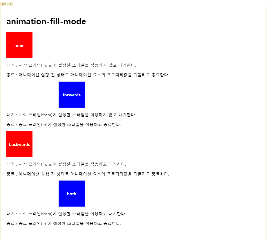
VSCODE 에서 확인하면서 공부하기
📌 animation-play-state
애니메이션 재생 상태(재생 또는 중지)를 지정한다. 기본값은 running이다.
<!DOCTYPE html>
<html>
<head>
  <style>
    div {
      width: 100px;
      height: 100px;
      background: red;
      position: relative;
      /*name duration timing-function delay iteration-count direction fill-mode play-state*/
      animation: move 5s infinite;
    }
    div:hover {
      background: blue;
      animation-play-state: paused;
    }
    div:active {
      background: yellow;
      animation-play-state: running;
    }
    @keyframes move {
      from { left: 0px; }
      to   { left: 200px; }
    }
  </style>
</head>
<body>
  <h1>animation-play-state</h1>
  <div></div>
</body>
</html>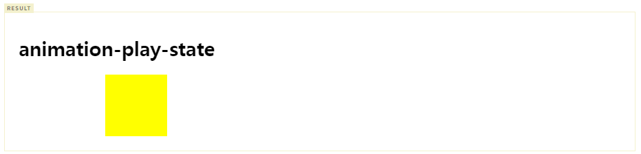
VSCODE에서 확인하면서 공부하기
<!DOCTYPE html>
<html>
<head>
  <style>
    .box {
      position: relative;
      width: 100px;
      height: 100px;
      background-color: red;
      animation-name: move;
      animation-duration: 5s;
      animation-play-state: paused; /* 초기 애니메이션 재생 상태: 정지 */
      animation-iteration-count: infinite;
    }

    /* @keyframes rule */
    @keyframes move {
      from {
        left: 0;
      }

      to {
        left: 300px;
      }
    }
  </style>
</head>
<body>
  <div class="box"></div>
  <button class="start">start animation</button>
  <button class="pause">pause animation</button>

  <script>
    const box = document.querySelector('.box');

    document.querySelector('.start').addEventListener('click', function () {
      // trigger animation
      // prefixes would be needed...
      box.style.animationPlayState = 'running';
    });

    document.querySelector('.pause').addEventListener('click', function () {
      // pause animation
      // prefixes would be needed...
      box.style.animationPlayState = 'paused';
    });
  </script>
</body>
</html>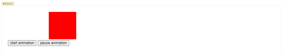
📌 animation
모든 애니메이션 프로퍼티를 한번에 지정한다. 값을 지정하지 않은 프로퍼티에는 기본값이 지정된다. 지정 방법은 다음과 같다.
animation: name duration timing-function delay iteration-count direction fill-mode play-stateanimation-duration은 반드시 지정해야 한다. 지정하지 않는 경우 기본값 0s가 셋팅되어 어떠한 애니메이션도 실행되지 않는다. 기본값은 아래와 같다.
none 0 ease 0 1 normal none running
🎁 Reference