1. 학습내용
- Pandas2
- Matplotlib
- Sklearn
2. 상세내용
import pandas as pd
from pandas import Series, DataFrame
births = pd.read_csv('https://raw.githubusercontent.com/jakevdp/data-CDCbirths/master/births.csv')births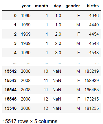
births['decade'] = births['year'] // 10 * 10 # // 나누기하고 나머지 버림births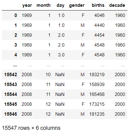
births.pivot_table('births', index='decade', columns = 'gender', aggfunc='sum')
import matplotlib.pyplot as pltbirths.pivot_table('births', index='year', columns = 'gender', aggfunc='sum').plot()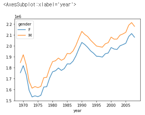
import matplotlib.pyplot as pltimport numpy as np
x = np.linspace(0, 10, 100)plt.plot(x, np.sin(x))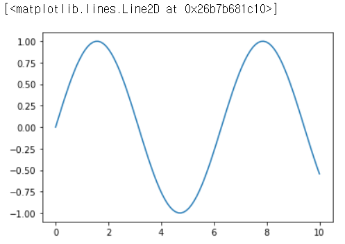
plt.plot(x, np.cos(x))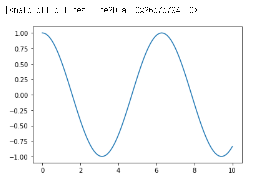
plt.plot(x, np.sin(x))
plt.plot(x, np.cos(x))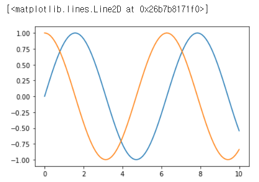
fig = plt.figure()
plt.plot(x, np.sin(x), '-')
plt.plot(x, np.cos(x), '--')
fig.savefig('my_figure.png')               #이미지 파일 저장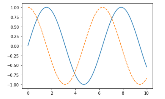

from IPython.display import Image                     #저장되어있는 이미지를 불러오는것
Image('my_figure.png')
fig.canvas.get_supported_filetypes()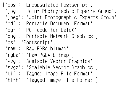
plt.figure()
plt.subplot(2, 1, 1)      #위쪽그림
plt.plot(x, np.sin(x))

plt.subplot(2, 1, 2)      #아랫쪽그림
plt.plot(x, np.cos(x))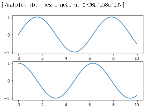
plt.plot(x, np.sin(x-0), color='blue')
plt.plot(x, np.sin(x-1), color='g')                    #초록색
plt.plot(x, np.sin(x-2), color='0.75')                 #25% 정도 컬러가 살아있음을 의미함
plt.plot(x, np.sin(x-3), color='#FFDD44')              #RGB(빛의 삼원색)
plt.plot(x, np.sin(x-4), color=(1.0,0.2,0.3))          #튜플방식
plt.plot(x, np.sin(x-5), color='chartreuse')           #연두색(칼라이름 직접 작성)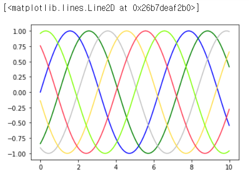
plt.plot(x, x+0, linestyle='solid')
plt.plot(x, x+1, linestyle='dashed')
plt.plot(x, x+2, linestyle='dashdot')
plt.plot(x, x+3, linestyle='dotted')

plt.plot(x, x+4, linestyle='-')
plt.plot(x, x+5, linestyle='--')
plt.plot(x, x+6, linestyle='-.')
plt.plot(x, x+7, linestyle=':')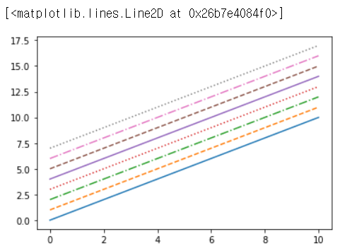
plt.plot(x, x+0, '-g')
plt.plot(x, x+1, '--c')
plt.plot(x, x+2, '-.k')
plt.plot(x, x+3, ':r')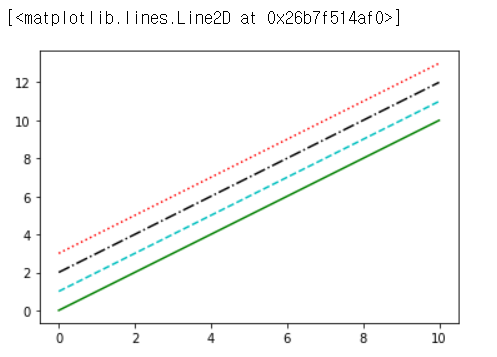
plt.plot(x, np.sin(x))
plt.xlim(10, 0)
plt.ylim(1.2, -1.2)
plt.plot(x, np.sin(x))
plt.axis([1, 11, -1.5, 1.5])
plt.plot(x, np.sin(x))
plt.axis('tight')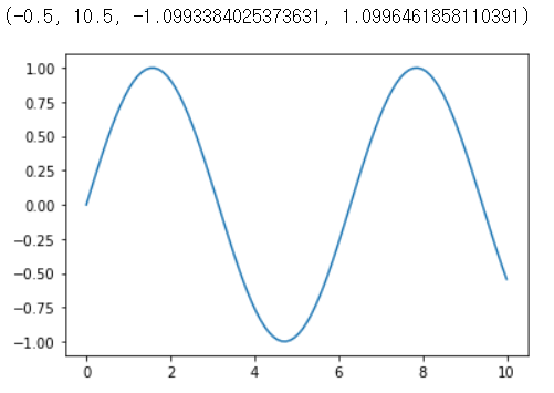
plt.plot(x, np.sin(x))
plt.axis('equal')
plt.plot(x, np.sin(x))
plt.title('A Sine Curve')
plt.xlabel('x')
plt.ylabel('sin(x)')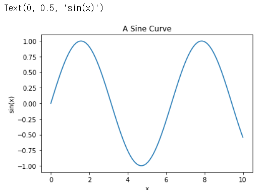
plt.plot(x, np.sin(x), '-g', label='sin(x)')
plt.plot(x, np.cos(x), ':b', label='cos(x)')
plt.axis('equal')

plt.legend()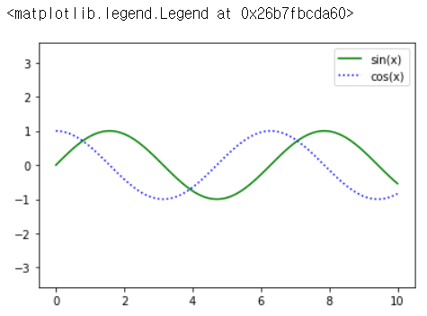
x = np.linspace(0, 10, 30)
plt.plot(x, np.sin(x), 'o', color='k')
rng = np.random.RandomState(0)
for marker in ['o', ',', ',', 'x', '+', 'v', '^', '<', '>', 's', 'd' ]:
    plt.plot(rng.rand(5), rng.rand(5), marker,
             label='marker={0}'.format(marker)
            )
    plt.legend()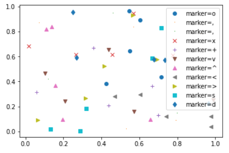
y = np.sin(x)
plt.plot(x, y , '-ok')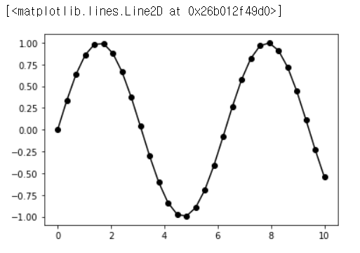
plt.plot(x, y, '-p', color='gray',
         markersize=15,
         linewidth=4,
         markerfacecolor='white',
         markeredgecolor='gray',
         markeredgewidth='2'
        )
plt.scatter(x,y)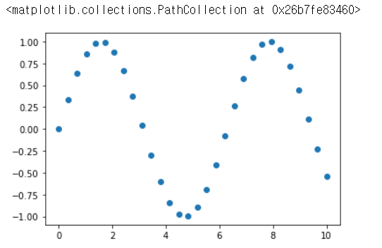
rng = np.random.RandomState(0)
x = rng.randn(100)
y = rng.randn(100)
color = rng.rand(100)
sizes = 1000 * rng.rand(100)

plt.scatter(x, y, c=color, s=sizes, alpha=0.3, cmap='viridis')
plt.colorbar()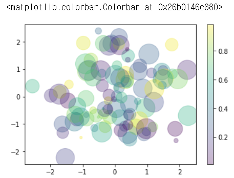
from sklearn.datasets import load_iris
iris = load_iris()

features = iris.data.T
plt.scatter(features[0], features[1], alpha=0.2,
s=features[3]*100, cmap='viridis',
c=iris.target)
plt.xlabel(iris.feature_names[0])
plt.ylabel(iris.feature_names[1])
#errorbar(에러의 오차, 범위)

x = np.linspace(0, 10 ,50)
dy = 0.8   #오차범위
y = np.sin(x) + dy * np.random.randn(50)

plt.errorbar(x, y, yerr=dy, fmt='.k')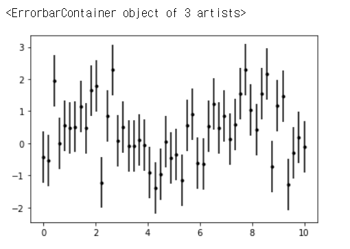
plt.style.use('seaborn-whitegrid')
plt.errorbar(x, y, yerr=dy, fmt='o', color='black', ecolor='lightgray', elinewidth=3)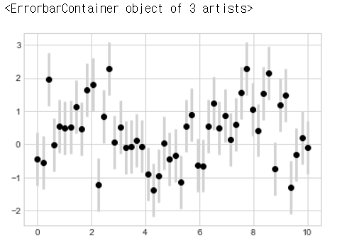
import sklearn
from sklearn.datasets import load_iris

iris_dataset = load_iris()

print(f'iris_dataset key:{iris_dataset.keys()}')
#print(iris_dataset['data'])
#print(iris_dataset['data'].shape)
#print(iris_dataset['feature_names'])
#print(iris_dataset['target'])
#print(iris_dataset['target_names'])
print(iris_dataset['DESCR'])

from sklearn.model_selection import train_test_split

train_input, test_input, train_label, test_label = train_test_split(iris_dataset['data'],iris_dataset['target'],
                                                                    test_size=0.25, random_state=42)
print(train_input.shape)
print(test_input.shape)
print(train_label.shape)
print(test_label.shape)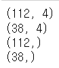
from sklearn.neighbors import KNeighborsClassifier

knn = KNeighborsClassifier(n_neighbors=3)
knn.fit(train_input, train_label)predict_label = knn.predict(test_input)print(predict_label)
print(test_label)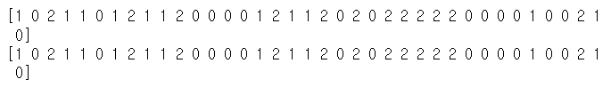
import numpy as npprint(f'test accuracy: {np.mean(predict_label == test_label)}')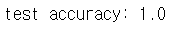
3. 금일소감
<ol>
	<li>Pandas를 잘하면, 통계에 대한 정리강점을 가질듯</li>
	<li>Matplotlib을 잘하면 통계에 대한 보고강점을 가질듯</li>
    <li>SKlearn의 cheatsheet를 보고 알고리즘 배울게 엄청 많다는 것을 느꼈음</li>
    <li>지금 AI이론은 단기간에 배우고있는데,
    이걸 지금 다 마스터하겠다라는 생각보다는
    배운 것들을 꾸준히 기록하고 이걸 나중에
    볼 생각을 해야할 것으로 보인다.</li>
</ol>
필요하다면 공부하는 개발자, 한승준