0. 목차
1. 반응형 CSS 복습②
-
결과물부터!
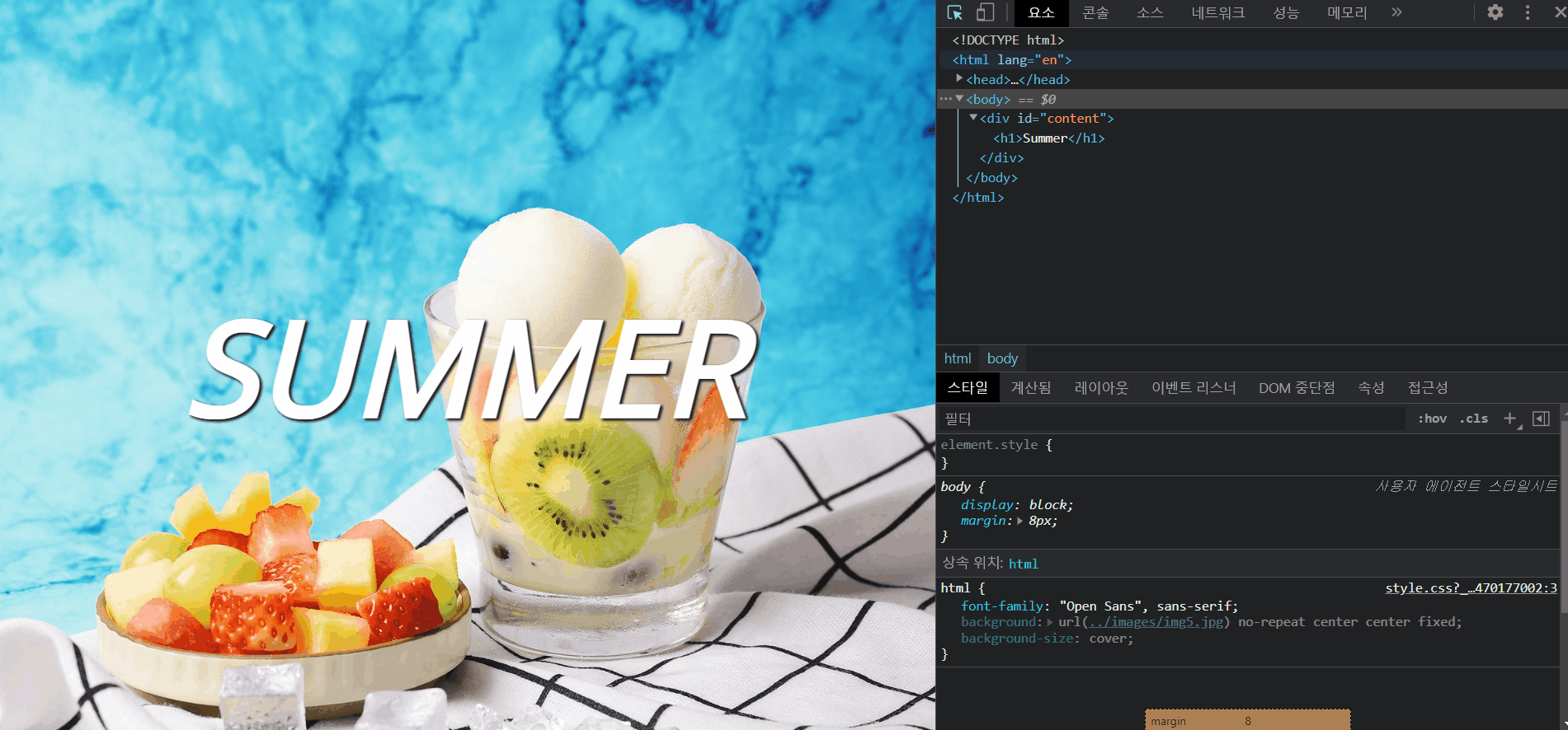
→ 미디어 쿼리는 이제 익숙해지고, CSS 코드 몇개를 까먹었던게 있어서 다시 되짚어 보려고 한다. -
CSS
#content {
position:absolute;
top:50%;
left:50%;
transform: translate(-50%, -50%);
}
→ SUMMER 정중앙에 놓을 수 있는 코드! 기억해두자!
background-image: url("../images/img5.jpg");
background-repeat: no-repeat;
background-attachment: fixed;
background-position: center center;
background-position: x-position y-position
x-position : left, center, right
y-position : top, center, bottom,
→ 이미지를 배경으로 쓸 때, 이미지 반복을 없애야한다.(no-repeat)
→ background-attachment는 fixed, scroll, local 이 있고, fixed랑 scroll은 뒤의 배경의 모습이 좀 다르다. local은 배경이 고정되지 않고 같이 스크롤 된다. ★★
→ background-position 은 위처럼 표현 가능하다. 이것도 내용 중요함! ★★★
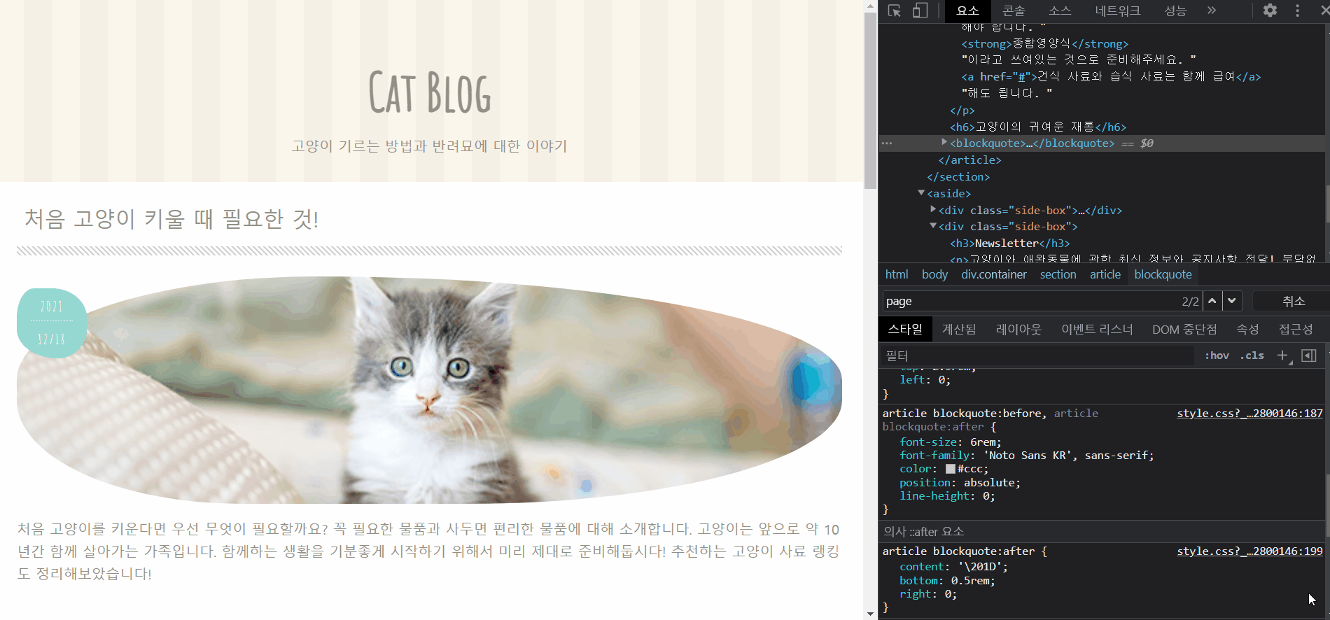
2. 고양이가 최고①
- 현재 진행 상황!
-
HTML
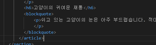
→ blockquote 는 인용문을 쓸 때 사용하는 태그이다. -
CSS
img{ border-style: none; vertical-align: bottom;}
→ vertical-align은 inline을 쓸 때만 사용가능
.post-img{
width: 100%;
height:260px;
object-fit: cover;
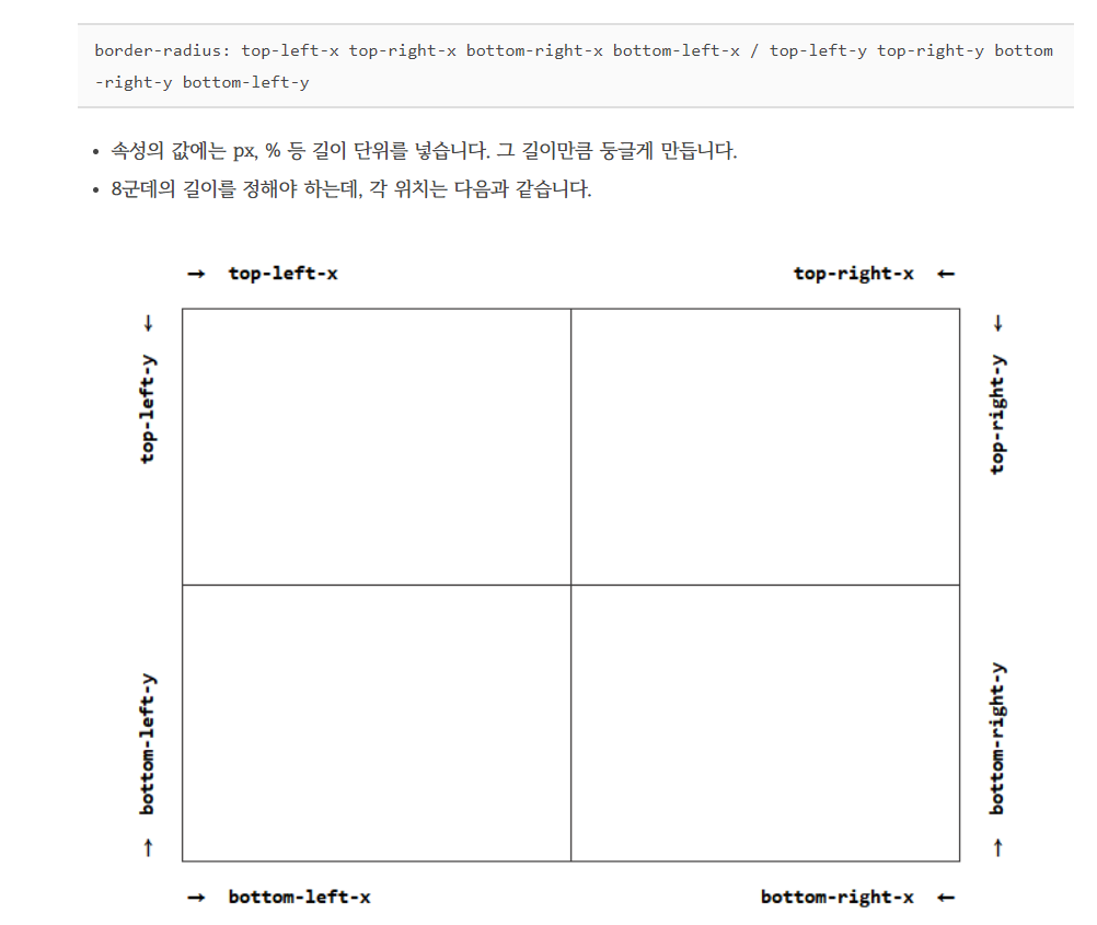
border-radius: 40% 70% 50% 30%/50%;
}
→ object-fit은 보통 개별img나 item에 걸어주며, cover를 쓰면 이미지의 종횡비를 유지한 상태에서 이쁘게 이미지를 확대해줌
→ border-radius 는 다음의 이미지를 보고 이해하자.
er{
max-width: 1000px;
margin:0 auto;
padding: 1.5rem;
background: #fff;
border-radius: 0 0 10px 10px;
}
→ max-width를 사용하면 미디어 쿼리를 딱 맞게 조절가능해보인다. (글씨 튀어나옴 방지)
article ol li{
counter-increment: list;
}
article ol li:before{
content:counter(list);
}
→ list의 앞 부분에 번호를 자동으로 매겨주는 코드 조합이다.
근데 li:before 에 counter-increment: list; 와 content: counter(list); 를 같이 적어도 된다.
→ counter-increment 뒤에 ". " 이런 식으로 구분자를 둘 수도 있다.
article blockquote:before{
content:'\201C';
top: 2.5rem;
left:0;
}
article blockquote:after{
content:'\201D';
bottom: .5rem;
right:0;
}
→ 왼쪽은 \201C, 오른쪽 \201D 를 사용하면 큰따옴표가 나온다.
소감
→ 복습하는 느낌이었지만, 몰랐던 태그들이 많아서 아직 갈 길이 멀다라고 생각했다.