✅ 결과물부터!

☑️ header
HTML
<!DOCTYPE html>
<html lang="ko">
<head>
  <meta charset="UTF-8">
  <meta http-equiv="X-UA-Compatible" content="IE=edge">
  <meta name="viewport" content="width=device-width, initial-scale=1.0">
  <title>헤더 영역</title>
  <link rel="stylesheet" href="./css/header.css">
</head>
<body>
  <!-- header -->
  <header>
    <div class="container">
      <h1>
        <button>LOGO</button>
      </h1>
      <nav>
        <ul>
          <li>
            <button>About</button>
          </li>
          <li>
            <button>Features</button>
          </li>
          <li>
            <button>Portfolio</button>
          </li>
          <li>
            <button>Contact</button>
          </li>
        </ul>
      </nav>
    </div>
  </header>
  <!-- //end header -->
</body>
</html>
CSS
/* header.css */
*{
  margin:0;
  padding:0;
  box-sizing:border-box;
}

a, a:link, a:visited{
  color:inherit;
  text-decoration:none;
}

li{
  list-style:none;
}

/* 기준 너비를 유지하는 역할  */
.container{
  width:1140px;
  margin:0 auto;
}

/* 스크롤 내리더라도 상단 고정  */
header{
  /*position:absolute; *//* 13.3.3 absolute -> fixed */
  position:fixed;
 /* color:black;*/ /* 13.3.3 black -> white */  /*main 적용 후에 white로 변경 */
  color:white;
  top:0;
  z-index:1;   /*header가 위로 오게 하기 위해 지정 */
  width:100%;
  padding:1rem;
}

header .container{
  display:flex;
  justify-content:space-between; /*양 끝으로 배치 */
  align-items:center;   /*수직정렬*/
  width:100%;
}

header nav ul{
  display:flex;  /*메뉴 가로 배치*/
}

header nav ul li{
  padding:10px;
}

header button{
  background: transparent;
  border:0;
  cursor: pointer;
  /* 13.3.3 에서 추가*/
  color:white;     /*main 적용 후에 white로 변경 */
}
header h1 button{
  font-size: 2rem;
  font-weight: bold;
}
header nav ul li button{
  font-size: 1.2rem;
}
/* 13.10.2에 추가- js 적용할 때 그 때 아래부분 작성하기 */

header.active{
  background-color:rgba(0,0,0);
  animation:fadeIn 0.5s ease-in-out;
}
@keyframes fadeIn{
  0%{
    opacity:0;
  }
  100%{
    opacity:1;
  }
}

/* End header.css */
☑️ main
HTML
<!DOCTYPE html>
<html lang="ko">
<head>
<meta charset="UTF-8">
<meta http-equiv="X-UA-Compatible" content="IE=edge">
<meta name="viewport" content="width=device-width, initial-scale=1.0">
<title>메인 영역</title>
<link rel="stylesheet" href="https://cdnjs.cloudflare.com/ajax/libs/font-awesome/6.1.1/css/all.min.css" integrity="sha512-KfkfwYDsLkIlwQp6LFnl8zNdLGxu9YAA1QvwINks4PhcElQSvqcyVLLD9aMhXd13uQjoXtEKNosOWaZqXgel0g==" crossorigin="anonymous" referrerpolicy="no-referrer" />
<link rel="stylesheet" href="./css/main.css">
</head>
<body>
<!-- main -->
<main id="main">
<div class="container">
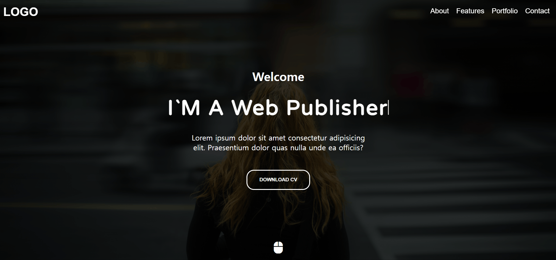
<h4>Welcome</h4>
<!-- 13.10.1에서 span 태그의 내용이 비워집니다. -->
<h2>I`M A <span>Front-End Developer</span></h2>
<p>Lorem ipsum dolor sit amet consectetur adipisicing elit. Praesentium dolor quas nulla unde ea officiis?</p>
<button class="download">DOWNLOAD CV</button>
<button class="mouse"><i class="fa-solid fa-computer-mouse"></i></button>
</div>
</main>
<!-- //end Main -->
</body>
</html>CSS
/* main.css */
/* import 구문은 항상 CSS 파일의 맨 윗줄에 작성  */
@import url('https://fonts.googleapis.com/css2?family=Poppins:wght@400;700&family=Varela+Round&display=swap');
main{
  width:100%;
  height:100vh;
  color:white;
  background:linear-gradient(rgba(0,0,0,0.8), rgba(0,0,0,0.8)), url('../images/me.jpg') center center;/* 배경색이 이미지를 덮는 효과*/
  background-size:cover;
  display:flex;
  justify-content:center;
  align-items:center;
  text-align:center;
}
main h4{
  font-size:2rem;
}
main h2{
  font-size:3.5rem;
  margin:2rem 0;
  letter-spacing:3px;
  font-family:'Varela Round', sans-serif; /* 웹 폰트 추가 */
}
main p{
  max-width:500px;
  margin:0 auto;
  font-size:1.25rem;
}
main button.download{
  background-color:transparent;
  border:3px solid white;
  border-radius:20px;
  padding:1rem 2rem;
  margin-top:3rem;
  color:white;
  font-weight:bold;
  cursor:pointer;
}
/*  아이콘 폰트로 추가한 마우스 모양의 버튼에 스타일 속성을 추가
마우스가 위아래로 움직이는 애니메이션을 구현 */
main button.mouse{
  background-color:transparent;
  border:none;
  color:white;
  font-size:2rem;
  position:absolute;
  bottom:1rem;
  left:50%;
  transform:translateX(-50%);
  animation:upDown 1s ease-in-out infinite;
  cursor:pointer;
}
@keyframes upDown{
  0%{
    bottom:1rem;
  }
  50%{
    bottom:1.5rem;
  }
  100%{
    bottom:1rem;
  }
}

/*  텍스트 타이핑 효과 구현하기-메인 화면의 글자가 지워졌다가 다시 채워지는 기능
 ::after 가상 요소 선택자로 텍스트 마지막에 너비 3px, 높이 40px 크기의 배경색이 투명한 막대(bar)를 만듭니다.
 그리고 애니메이션을 넣어서 막대 부분이 커서가 깜빡이는 것처럼 보이게 구현합니다.
  */
main h2 span::after{
  content:"";
  height:40px;
  width:3px;
  background-color:#fff;
  display:inline-block;
  animation: blink .7s ease-in-out infinite;
}
@keyframes blink {
  0%{
    opacity: 1;
  }
  100%{
    opacity: 0;
  }
}
☑️ about-me
HTML
<!DOCTYPE html>
<html lang="ko">
<head>
  <meta charset="UTF-8">
  <meta http-equiv="X-UA-Compatible" content="IE=edge">
  <meta name="viewport" content="width=device-width, initial-scale=1.0">
  <title>About 영역</title>
  <link rel="stylesheet" href="https://cdnjs.cloudflare.com/ajax/libs/font-awesome/6.1.1/css/all.min.css" integrity="sha512-KfkfwYDsLkIlwQp6LFnl8zNdLGxu9YAA1QvwINks4PhcElQSvqcyVLLD9aMhXd13uQjoXtEKNosOWaZqXgel0g==" crossorigin="anonymous" referrerpolicy="no-referrer" />
  <link rel="stylesheet" href="./css/about_me.css">
</head>
<body>
  <!-- About Me -->
  <section id="about" class="about">
    <div class="container">
      <div class="title">
        <h4>Who Am I</h4>
        <h2>About Me</h2>
      </div>
      <div class="about-self">
        <div class="left">
          <img src="./images/me_alone.jpg" alt="">
        </div>
        <div class="right">
          <h3>Hello, <strong>I`m Sucoding</strong></h3>
          <p>I`m Web Publisher And Web Front-End Developer.</p>
          <p>Lorem ipsum dolor sit amet consectetur adipisicing elit. Saepe veritatis aperiam accusantium.</p>
          <p>Lorem ipsum dolor sit amet consectetur adipisicing elit. Sit praesentium doloremque quos quis est officiis.</p>
          <p>Lorem, ipsum dolor sit amet consectetur adipisicing elit. Autem, omnis quibusdam.</p>
          <div class="social">
            <a href="#">
              <i class="fa-brands fa-facebook"></i>
            </a>
            <a href="#">
              <i class="fa-brands fa-instagram"></i>
            </a>
            <a href="#">
              <i class="fa-brands fa-twitch"></i>
            </a>
            <a href="#">
              <i class="fa-brands fa-youtube"></i>
            </a>
          </div>
        </div>
      </div>
    </div>
  </section>
  <!-- end About Me -->
</body>
</html>
CSS
/* about_me.css */
/* 섹션 영역 전체 글꼴과 배경색 설정 */
section{
  font-family:'Poppins', sans-serif;
  padding:5rem 0;
}
section:nth-child(2n){
  background-color:#f8f8f8;
}
/* 섹션 영역 전체 글꼴과 배경색 설정 끝 */
/* 섹션 영역 전체 제목 설정 */
section .title{
  margin-bottom:3rem;
}
section .title h4{
  font-size:1.35rem;
  color:#ed4848;
  position:relative;
}
section .title h2{
  font-size:3.5rem;
}
section .title p{
  font-size:1.15rem;
}
/* 섹션 영역 전체 제목 설정 끝 */

/* 본문은 텍스트와 이미지를 왼쪽과 오른쪽으로 나눕니다.
이를 about-self 클래스 하위에 left 클래스와 right 클래스로 구분합니다.
이 부분은 float 속성으로 레이아웃을 분할하고 각각 너비의 절반씩 차지하도록 지정 */

/* float 속성 해제 */
section .about-self::after{
  content:"";
  clear:both;
  display:block;
}

/* 본문 너비 절반 지정 & 왼쪽 배치 */
section .about-self .left{
  width:50%;
  float:left;
}
/* 이미지 크기가 부모 영역을 넘지 않도록 부모 영역의 최대 크기로 지정 */
section .about-self .left img{
  max-width:100%;
}
/* 본문 너비 절반 지정 & 오른쪽 배치 */
section .about-self .right{
  width:50%;
  float:left;
  padding:0 2rem;
}

/* About Me 영역 본문 세부 */

/* 본문 오른쪽 h3 태그의 글자 크기와 여백 지정 */
section .about-self .right h3{
  font-size:2.25rem;
  margin-bottom:1rem;
}
/* 본문 오른쪽 h3 태그의 strong 태그 색상 강조 */
section .about-self .right h3 strong{
  color:#ed4848;
}
/* 본문 오른쪽 p 태그의 크기와 여백 지정 */
section .about-self .right p{
  font-size:1.15rem;
  margin:1rem 0;
}
/* 본문 오른쪽의 아이콘 폰트 크기와 여백 지정 */
section .about-self .right .social a{
  font-size:2.5rem;
  margin-right:0.2rem;
}
☑️ what i do
HTML
<!DOCTYPE html>
<html lang="ko">
<head>
  <meta charset="UTF-8">
  <meta http-equiv="X-UA-Compatible" content="IE=edge">
  <meta name="viewport" content="width=device-width, initial-scale=1.0">
  <title>What I Do</title>
  <link rel="stylesheet" href="https://cdnjs.cloudflare.com/ajax/libs/font-awesome/6.1.1/css/all.min.css" integrity="sha512-KfkfwYDsLkIlwQp6LFnl8zNdLGxu9YAA1QvwINks4PhcElQSvqcyVLLD9aMhXd13uQjoXtEKNosOWaZqXgel0g==" crossorigin="anonymous" referrerpolicy="no-referrer" />
  <link rel="stylesheet" href="./css/what_i_do.css">
</head>
<body>
  <!-- What I Do -->
  <section id="features" class="do">
    <div class="container">
      <div class="title">    <!-- title 영역 앞이랑 유사 -->
        <h4>Features</h4>
        <h2>What I Do</h2>
      </div>
      <!-- 사각형 모양으로 3단 분리된 본문 -->
      <div class="do-me">
        <div class="do-inner">  <!-- 하나의 사각형을 나타내는 do-inner 클래스-->
          <div class="icon">
            <i class="fa-brands fa-html5"></i>
          </div>
          <div class="content">
            <h3>HTML5</h3>
            <p>Lorem ipsum dolor sit amet consectetur adipisicing elit. Illo culpa magni laboriosam sit excepturi quibusdam adipisci, vero debitis?</p>
          </div>
        </div>
        <div class="do-inner">  <!-- 하나의 사각형을 나타내는 do-inner 클래스-->
          <div class="icon">
            <i class="fa-brands fa-css3-alt"></i>
          </div>
          <div class="content">
            <h3>CSS3</h3>
            <p>Lorem ipsum dolor sit amet consectetur adipisicing elit. Illo culpa magni laboriosam sit excepturi quibusdam adipisci, vero debitis?</p>
          </div>
        </div>
        <div class="do-inner">  <!-- 하나의 사각형을 나타내는 do-inner 클래스-->
          <div class="icon">
            <i class="fa-brands fa-bootstrap"></i>
          </div>
          <div class="content">
            <h3>BootStrap v5.0</h3>
            <p>Lorem ipsum dolor sit amet consectetur adipisicing elit. Illo culpa magni laboriosam sit excepturi quibusdam adipisci, vero debitis?</p>
          </div>
        </div>
      </div>
    </div>
  </section>
  <!-- //end What I Do -->
</body>
</html>
CSS
/* what_i_do.css */

/* 제목은 전체 스타일에 적용하게 작성했으므로 What I Do 영역의 제목에도 같은 디자인이 적용되어서 표시
 do-inner 클래스로 그룹 지은 본문만 스타일을 작성*/

/* float 속성 해제*/
section .do-me::after{
  content:"";
  display:block;
  clear:both;
}
/* 사각형 크기와 간격, 내부 여백 설정 */
/* 사각형이 3개이므로 전체 너비의 90%가 됩니다. 그리고 첫 번째 사각형과 두 번째 사각형은 오른쪽에 너비의 5%씩 외부 여백을 주도록 margin-right 속성을 적용합니다. 이렇게 하면 총 100%가 되어 전체 너비를 사용
첫 번째와 두 번째 사각형에 각각 margin-right 속성을 지정하지 않아도 됩니다. do-inner 클래스를 가지고 있는 div 태그에 모두 margin-right 속성을 적용하고 :last-child 가상 클래스 선택자로 마지막 사각형의 margin-right 속성만 0으로 설정 */
section .do-me .do-inner{
  background-color:#fff;
  width:30%;
  padding:2rem;
  float:left;
  margin-right:5%;
  cursor:pointer;
}
/* 마지막 사각형의 외부 여백 설정 */
section .do-me .do-inner:last-child{
  margin-right:0;
}
/* 아이콘 폰트 크기와 색상 */
section .do-me .do-inner .icon i{
  font-size:2.5rem;
  color:#ff6a6a;
}
/* HTML5, CSS3, BootStrap v5.0 텍스트 크기와 간격 */
section .do-me .do-inner .content h3{
  font-size:2rem;
  margin:1rem 0;
}
/* 사각형 텍스트 크기 */
section .do-me .do-inner .content p{
  font-size:1.15rem;
}
/* do-inner 클래스에 마우스를 올리면 배경색과 텍스트 색상 변경 */
section .do-me .do-inner:hover{
  background-color:lightcoral;
  color:white;
}
/* do-inner 클래스에 마우스를 올리면 아이콘 폰트 색상 변경 */
section .do-me .do-inner:hover i{
  color:white;
}

/* End what_i_do.css */
☑️ background
HTML
<!DOCTYPE html>
<html lang="ko">
<head>
  <meta charset="UTF-8">
  <meta http-equiv="X-UA-Compatible" content="IE=edge">
  <meta name="viewport" content="width=device-width, initial-scale=1.0">
  <title>background 영역</title>
  <link rel="stylesheet" href="./css/background.css">
</head>
<body>
  <!-- Background -->
  <!-- 배경 영역은 아무런 정보를 전하지 않는 단순히 디자인적 요소이므로 h2~h6 태그를 사용할 필요가 없습니다.
    section 태그 대신에 div 태그를 사용했음. -->
  <div class="bg"></div>
  <!-- //end Background-->
</body>
</html>
CSS
/* background.css */
/*  background-attachment 속성을 fixed로 지정하면 웹 페이지를 스크롤할 때 배경이 고정됨 */
.bg{
  background:url('../images/background.jpg') center center;
  background-size:cover;
  background-attachment:fixed;
  height:650px;
}
/* End background.css */
☑️ portfolio
HTML
<!DOCTYPE html>
<html lang="ko">
<head>
  <meta charset="UTF-8">
  <meta http-equiv="X-UA-Compatible" content="IE=edge">
  <meta name="viewport" content="width=device-width, initial-scale=1.0">
  <title>portfolio 영역</title>
  <link rel="stylesheet" href="./css/portfolio.css">
</head>
<body>
  <!-- PortFolio -->
  <!-- what_i_do 영역과 유사  -->
  <section id="portfolio" class="portfolio">
    <div class="container">
      <div class="title">
        <h4>PORTFOLIOBACK</h4>
        <h2>PortFolio</h2>
      </div>
      <div class="portfolio-me">
        <div class="portfolio-inner">
          <img src="images/mock1.png" alt="">
          <strong>BRANDING</strong>
          <h3>Package Design</h3>
        </div>
        <div class="portfolio-inner">
          <img src="images/mock2.png" alt="">
          <strong>DEVELOPMENT</strong>
          <h3>Tablet App Dev</h3>
        </div>
        <div class="portfolio-inner">
          <img src="images/mock3.png" alt="">
          <strong>MARKETING</strong>
          <h3>Coka Cola </h3>
        </div>
        <div class="portfolio-inner">
          <img src="images/mock4.png" alt="">
          <strong>APP</strong>
          <h3>FaceBook Clone</h3>
        </div>
        <div class="portfolio-inner">
          <img src="images/mock5.png" alt="">
          <strong>APP</strong>
          <h3>Netflix Clone</h3>
        </div>
        <div class="portfolio-inner">
          <img src="images/mock6.png" alt="">
          <strong>WEB</strong>
          <h3>FirmBee Web</h3>
        </div>
      </div>
    </div>
  </section>
  <!-- //end PortFolio -->
</body>
</html>
CSS
/* portfolio.css */
/* clear 속성으로 float 속성값 해제*/
/* 제목은 다른 섹션 영역과 같음 */
/* 본문도 세부 디자인은 조금 다르지만, 레이아웃은 What I Do 영역의 본문과 같습니다.
하나의 사각형 코드를 작성하고, 이를 복사해서 붙여 넣으면 됩니다. */
section.portfolio::after{
  content:"";
  display:block;
  clear:both;
}
/* portfolio-inner 사각형 꾸미기 */
/*  portfolio-inner 클래스를 선택자로 지정해 사각형 형태로 꾸며 줍니다.
이때 사각형의 너비와 여백을 지정하면 영역의 기준 너비와 사각형의 너비를 계산해 기준 너비를 초과할 경우 자동으로 줄 바꿈합니다. 그리고 사각형들이 수평으로 배치되도록 float 속성을 left로 지정합니다. float 속성과 항상 함께 사용해야 하는 clear 속성까지 적용합니다. */
section.portfolio .portfolio-inner{
  width:30%;
  margin-right:5%;
  padding:1rem 1rem 1.5rem 1rem;
  float:left;
  background-color:#f8f8f8;
  border:1px solid #ccc;
  margin-bottom:3rem;
}
/* 3번째마다 margin-right 0 적용 */
section.portfolio .portfolio-inner:nth-child(3n){
   margin-right:0;
}

/* 사각형에 넣을 이미지와 텍스트의 크기, 여백을 지정 */
/* 이미지의 크기가 부모 요소를 넘지 않도록 100%로 지정 */
section.portfolio .portfolio-inner img{
  width:100%;
  display:block;
}
/* strong 태그 색상과 간격 */
section.portfolio .portfolio-inner strong{
  color:#ff6a6a;
  margin:0.5rem 0;
  display:block;
}
/* h3 태그 색상과 간격 */
section.portfolio .portfolio-inner h3{
  font-size:1.75rem;
}
/* End portfolio.css */
☑️ contact with me
HTML
<!DOCTYPE html>
<html lang="ko">
<head>
  <meta charset="UTF-8">
  <meta http-equiv="X-UA-Compatible" content="IE=edge">
  <meta name="viewport" content="width=device-width, initial-scale=1.0">
  <title>Contact With Me</title>
  <link rel="stylesheet" href="https://cdnjs.cloudflare.com/ajax/libs/font-awesome/6.1.1/css/all.min.css" integrity="sha512-KfkfwYDsLkIlwQp6LFnl8zNdLGxu9YAA1QvwINks4PhcElQSvqcyVLLD9aMhXd13uQjoXtEKNosOWaZqXgel0g==" crossorigin="anonymous" referrerpolicy="no-referrer" />
  <link rel="stylesheet" href="./css/contact_with_me.css">
<body>
  <!-- Contact With Me -->
  <section id="contact" class="contact">
    <div class="container">
      <div class="title">
        <h4>CONTACT</h4>
        <h2>Contact With Me</h2>
      </div>

      <!-- Contact With Me 영역의 본문은 크게 왼쪽(phone, email, address)과 오른쪽(입력 양식 폼)으로 나눌 수 있습니다. 그래서 다음과 같이 contact-me 클래스를 가지는 div 태그 안에 left 클래스를 가지는 div 태그와 right 클래스를 가지는 div 태그로 영역을 구분합니다. -->
      <div class="contact-me">
        <div class="left">
          <div class="card">
            <div class="icon">
              <i class="fa-solid fa-phone-volume"></i>
            </div>
            <div class="info-text">
              <h3>phone</h3>
              <p>010-2222-1111</p>
            </div>
          </div>
          <div class="card">
            <div class="icon">
              <i class="fa-solid fa-envelope-open-text"></i>
            </div>
            <div class="info-text">
              <h3>email</h3>
              <p>sucoding@naver.com</p>
            </div>
          </div>
          <div class="card">
            <div class="icon">
              <i class="fa-solid fa-location-crosshairs"></i>
            </div>
            <div class="info-text">
              <h3>address</h3>
              <p>Samseong-ro, Gangnam-gu, Seoul, Republic of Korea</p>
            </div>
          </div>
        </div>
        <div class="right">
          <form action="#">
            <div class="form-group">
              <label for="name">name</label>
              <input type="text" id="name">
            </div>
            <div class="form-group">
              <label for="email">email</label>
              <input type="text" id="email">
            </div>
            <div class="form-group">
              <label for="msg">message</label>
              <textarea id="msg"></textarea>
            </div>
            <button>send</button>
          </form>
        </div>
      </div>
    </div>
  </section>
  <!-- end Contact With Me -->
</body>
</html>
CSS
/* contact_with_me.css */

/* 너비는 왼쪽이 30%, 오른쪽이 65%가 되도록 지정합니다. 이때 남은 5%는 오른쪽에 margin-left 속성값으로 지정 */
section.contact .contact-me::after{
  content:"";
  display:block;
  clear:both;
}
section.contact .contact-me .left{
  width:30%;
  float:left;
}
section.contact .contact-me .right{
  float:left;
  width:65%;
  margin-left:5%;
}
/* card 클래스를 가지고 있는 div 태그의 그룹만 꾸미면 모두 같은 스타일이 적용
수평 방향으로 나란히 배치합니다. 테두리, 내부 여백, 간격도 지정
icon 클래스와 info-text 클래스를 가지고 있는 div 태그 - 가로 한 줄로 배치
수직 방향으로 중앙에 위치하도록 align-items 속성을 지정 */
section.contact .contact-me .left .card{
  border:1px solid #ccc;
  padding:1rem;
  display:flex;
  align-items:center;
  margin-bottom:1.25rem;
}
/* Contact With Me 영역 본문 왼쪽 아이콘 폰트 꾸미기 */
section.contact .contact-me .left .card .icon i{
  font-size:2rem;
  margin-right:5px;
}
/* 오른쪽 */
section.contact .contact-me .right{
  float:left;
  width:65%;
  margin-left:5%;
  margin-bottom:2rem;
  border:1px solid #ccc;
  padding:1rem;
}
/* Contact With Me 영역 본문 오른쪽 폼 요소 */
/* form-group 사이 간격 지정 */
section.contact .contact-me .right .form-group{
  margin-bottom:1.25rem;
}
/* label 태그가 인라인 성격이어서 외부 여백을 적용하기 위해 block으로 변경 */
section.contact .contact-me .right .form-group label{
  display:block;
  margin-bottom:0.85rem;
}
/* input 요소 꾸미기 */
section.contact .contact-me .right .form-group input{
  padding:0.625rem;
  width:100%;
  outline:none;
  border:1px solid #ccc;
  border-radius:10px;
}
/* :focus 가상 클래스 선택자로 입력 요소에 커서가 활성화되면 파란색 테두리와 그림자 효과 추가 */
section.contact .contact-me .right .form-group input:focus{
  border:1px solid #719ECE;
  box-shadow:0 0 10px #719ECE;
}
/* textarea 요소 꾸미기 */
section.contact .contact-me .right .form-group textarea{
  height:300px;
  width:100%;
  resize:none;
  border:1px solid #ccc;
  border-radius:10px;
}
/* textarea 요소에 커서 활성화가 되면 파란색 테두리와 그림자 효과 추가 */
section.contact .contact-me .right .form-group textarea:focus{
  outline:none;
  border:1px solid #719ECE;
  box-shadow:0 0 10px #719ECE;
}
/* 버튼 요소 꾸미기 */
section.contact .contact-me .right button{
  width:100%;
  padding:1rem;
  background-color:#f78b00;
  border:none;
  color:white;
}

/* End contact_with_me.css */
☑️ JAVASCRIPT CODE
💯 메인 영역의 텍스트 타이핑 효과
// 텍스트 타이핑 효과
// 먼저 메인 영역의 h2 태그 안에 있는 span 태그의 텍스트를 지웁니다.
// span 요소 노드 가져오기
const spanEl = document.querySelector("main h2 span");
// 화면에 표시할 문장 배열
const txtArr = ['Web Publisher', 'Front-End Developer', 'Web UI Designer', 'UX Designer', 'Back-End Developer'];
// 배열의 인덱스 초깃값
let index = 0;
// 화면에 표시할 문장 배열에서 요소를 하나 가져온 뒤, 배열로 만들기
let currentTxt = txtArr[index].split("");
// 실행결과  ['W', 'e', 'b', ' ', 'P', 'u', 'b', 'l', 'i', 's', 'h', 'e', 'r']
// 텍스트가 입력되는 효과의 핵심은 currentTxt 변수에 할당된 배열 요소를 앞에서부터 한 개씩 출력하는 것입니다. 그러면 마치 텍스트가 한 글자씩 작성되는 것처럼 보이게 됩니다. 이를 위해 다음처럼 writeTxt() 함수를 만들어 배열 요소를 한 개씩 출력하게 합니다.

function writeTxt(){
    spanEl.textContent += currentTxt.shift(); // ①
    if(currentTxt.length !== 0){ // ②
       setTimeout(writeTxt, Math.floor(Math.random() * 100));
    }else{ // ③
      currentTxt = spanEl.textContent.split("");
      setTimeout(deleteTxt, 3000);
    }
  }
  writeTxt();
// ① 배열의 요소를 앞에서부터 한 개씩 출력해야 합니다. 이럴 때 사용하는 메서드가 Array 객체의 shift()입니다. shift() 메서드는 파괴적 메서드로, 배열에서 맨 앞의 요소를 추출하고 추출한 요소를 원본 배열에서 삭제합니다. 만약 currentTxt 변수에 ['W', 'e', 'b', ' ', 'P', 'u', 'b', 'l', 'i', 's', 'h', 'e', 'r'] 배열이 할당된 상태라면 배열의 첫 번째 요소인 W를 배열에서 추출하고, 배열에서 W를 삭제합니다.
// ② if 문으로 currentTxt 변수에 할당된 배열의 길이가 0인지 확인합니다. 확인하는 이유는 배열의 길이가 0이 아니라면 아직 출력해야 하는 단어가 남아 있다는 뜻이어서 배열 요소를 모두 출력할 때까지 writeTxt() 함수를 반복 호출하기 위해서입니다. 그래서 if 문의 코드를 보면 setTimeout() 메서드로 일정 시간이 흐른 뒤에 writeTxt() 함수를 다시 호출합니다. 여기서 setTimeout() 메서드의 두 번째 인자는 시간(밀리초)을 의미합니다. 이 값은 호출할 때마다 Math 객체의 random() 메서드로 0부터 100 사이의 숫자가 무작위로 구해져, 작성되는 글자 속도를 매번 달라지게 합니다.
// ③ else 문이 실행된다는 건 결국 currentTxt 배열이 비었다는 뜻입니다. 다르게 말하면 배열 안의 모든 텍스트가 전부 화면에 출력됐다는 의미죠. 그러면 텍스트 작성 함수를 끝내기 전에 텍스트를 지우기 위해 화면에 표시된 텍스트를 가져와서 split() 메서드로 다시 단어 단위로 분리해 배열에 할당합니다. 그리고 3초 뒤에 텍스트를 지우는 함수인 deleteTxt() 함수를 호출하는 것까지가 텍스트를 입력하는 writeTxt() 함수의 역할입니다.


// 텍스트 삭제는 입력 과정과 비슷합니다. 텍스트를 입력할 때는 배열의 앞에서부터 요소를 추출해 한 글자씩 출력했는데, 텍스트를 삭제할 때는 뒤에서부터 요소를 추출해 한 글자씩 줄어드는 것처럼 표현
function deleteTxt(){
    currentTxt.pop(); // ①
    spanEl.textContent = currentTxt.join("");// ②
    if(currentTxt.length !== 0){ // ③
      setTimeout(deleteTxt, Math.floor(Math.random() * 100));
    }else{ // ④
      index = (index + 1) % txtArr.length;
      currentTxt = txtArr[index].split("");
      writeTxt();
    }
  }
//   ① 가장 먼저 currentTxt 변수에서 pop() 메서드를 실행합니다. 현재 currentTxt 변수에는 deleteTxt() 함수를 실행하기 전에 화면에 표시된 텍스트를 가져와서 split() 메서드로 분리한 배열이 할당되어 있습니다. 지금 작성하는 코드를 기준으로 첫 번째 문장인 ‘Web Publisher’를 출력했으니 현재 currentTxt 변수에는 ['W', 'e', 'b', ' ', 'P', 'u', 'b', 'l', 'i', 's', 'h', 'e', 'r']이 할당되어 있습니다.

// 이 상태에서 Array 객체의 pop() 메서드로 배열 요소를 끝에서부터 한 개씩 삭제합니다. pop() 메서드는 파괴적 메서드라서 원본 배열에서 요소가 삭제됩니다. 그래서 변수에 할당된 배열은 끝에서 요소가 하나 삭제되고 변수에는 ['W', 'e', 'b', ' ', 'P', 'u', 'b', 'l', 'i', 's', 'h', 'e']가 할당된 상태가 됩니다.

// ② 다음으로 Array 객체의 join() 메서드로 현재 배열에 있는 요소를 하나의 문자열로 합칩니다. 그러면 ‘Web Publishe’라는 문자열이 span 요소의 텍스트로 할당됩니다. 따라서 사용자 눈에는 한 글자가 삭제된 것처럼 보입니다.

// ③ 그러고 나서 writeTxt() 함수처럼 if 문으로 currentTxt 변수에 할당된 배열이 비었는지 확인합니다. 만약 값이 남아 있으면 다시 deleteTxt() 함수를 호출합니다. 이때 호출되는 시간은 0에서 0.1초(0~100) 사이에서 무작위로 설정합니다.

// ④ 모든 배열이 pop() 메서드에 의해 삭제되면 else 문이 실행됩니다. else 문에서는 다음 문장을 출력하기 위해 배열에 다시 접근합니다. 이때 index 숫자를 1 증가시키는데, 그 이유는 index 숫자가 문장이 담긴 배열(txtArr)의 길이를 넘지 않게 하기 위해서입니다. index 숫자를 1 증가시키고 나면 문장 배열에 접근해 새로운 문장을 가져옵니다. 작성된 순서대로라면 ‘Front-End Developer’에 접근합니다. 이를 split() 메서드를 사용해 배열로 만드므로 currentTxt 변수에는 ['F', 'r', 'o', 'n', 't', '-', 'E', 'n', 'd', ' ', 'D', 'e', 'v', 'e', 'l', 'o', 'p', 'e', 'r'] 배열이 할당됩니다. 그러면 다시 할당된 currentTxt 변수의 배열로 writeTxt() 메서드를 호출해 지금까지 한 과정을 무한히 반복합니다.
💯 헤더 영역의 디자인 변경 효과
// 웹 브라우저의 수직 스크롤 위치는 window 객체의 pageYOffset 속성으로 참조할 수 있습니다.
// 속성값이 0보다 크면 스크롤됐다고 볼 수 있으므로 이를 조건으로 처리해서 if 문으로 active 클래스를 추가하거나 삭제하면 됩니다.
// pageYOffset : 스크롤했을 때 화면이 수직으로 이동하는 픽셀 수

const headerEl = document.querySelector("header");
window.addEventListener('scroll', function(){
 const browerScrollY = window.pageYOffset;
  if(browerScrollY > 0){
    headerEl.classList.add("active");   //명시된 클래스를 추가하는 메서드
  }else{
    headerEl.classList.remove("active");  //명시된 클래스를 제거하는 메서드
  }
});
💯 스크롤 이동 효과
// 이번에는 헤더 영역의 메뉴를 클릭하면 메뉴 영역으로 스크롤이 부드럽게 이동하는 효과를 자바스크립트로 작성해 보겠습니다.

// Window 객체의 scrollTo() 메서드에서 behavior 속성을 사용하면 애니메이션 효과를 적용해 스크롤을 부드럽게 이동할 수 있습니다. 단, IE나 iOS 모바일에서는 제대로 동작하지 않습니다. 이 외의 웹 브라우저에서는 정상적으로 작동합니다.

// 일단 이동할 대상 요소를 가리키는 선택자(selector)를 매개변수에 전달받아 이동하려는 대상의 현재 위칫값을 구하는 코드를 작성합니다.
/* 애니메이션 스크롤 이동 */
const animationMove = function(selector){
    // ① selector 매개변수로 이동할 대상 요소 노드 가져오기
    const targetEl = document.querySelector(selector);
    // ② 현재 웹 브라우저의 스크롤 정보(y 값)
    const browserScrollY = window.pageYOffset;
    // ③ 이동할 대상의 위치(y 값) https://developer.mozilla.org/ko/docs/Web/API/Element/getBoundingClientRect
    //getBoundingClientRect(): 윈도우(window)룰 기준으로 특정 엘리먼트의 위치 값을 구하는 방법
    const targetScorllY = targetEl.getBoundingClientRect().top + browserScrollY;
    // ④ 스크롤 이동 https://salgum1114.github.io/css/2019-04-28-scroll-behavior-smooth/
    window.scrollTo({ top: targetScorllY, behavior: 'smooth' });
  };

//   코드가 조금 복잡해 보일 수 있지만, 부드러운 스크롤 이동 효과를 구현하는 데 꼭 필요한 값들입니다. 웹 브라우저의 스크롤 이동을 처리하려면 이동할 대상의 스크롤 위치(y 값)를 당연히 알아야 합니다. 그러려면 이동할 대상의 노드를 가져올 수 있어야 하고(①), 현재 웹 브라우저의 스크롤 위치를 구해야 합니다(②). 그래야 가져온 요소 노드로 구하는 위치의 정확한 y 값을 구할 수 있습니다(③). 그리고 window 객체의 scrollTo() 메서드를 사용해 해당 위치로 이동합니다(④).

// 이제 기존 헤더 영역에서 메뉴에 해당하는 button 태그에 클릭 이벤트를 연결해 앞에서 만든 animationMove() 함수를 실행하겠습니다. 헤더 영역의 메뉴에 사용된 button 태그에 click 이벤트를 연결하기 위해 다음처럼 코드를 수정합니다.
// https://developer.mozilla.org/ko/docs/Learn/HTML/Howto/Use_data_attributes
// https://developer.mozilla.org/en-US/docs/Web/API/HTMLElement/dataset

// 스크롤 이벤트 연결하기
const scollMoveEl = document.querySelectorAll("[data-animation-scroll='true']");
for(let i = 0; i < scollMoveEl.length; i++){
  scollMoveEl[i].addEventListener('click', function(e){
    const target = this.dataset.target;
    animationMove(target);
  });
}
일단 수업 시작하자마자 'Sucoding' 의 수업 내용을 그대로 가지고 온 것이라는 것을 바로 알게 되었다. 아는 지인 추천해주어서 이미 알고 있는 상태였고, 이전에 한번 만들어 본적이 있다. 하지만 JS 파트에서 생각보다 어려움을 느꼈고, Sucoding을 다시 들어봐야겠다는 생각이 들었다. 역시 공부는 꾸준히 해야하는 거 같다.
근데 수업할 때 출처라도 들고오시지 그냥 수업을 진행하는 게 좀 그렇다. 그 부분이 조금 아쉬웠다.

필요하다면 공부하는 개발자, 한승준