

개발하고 있는 뽁 서비스에서 다음과 같이 뽁 서비스에 있는 기능들에 대한 간단한 설명을 툴팁을 통해 보여주는 기능이 있다. 이를 portal을 활용해 구현해 보고자 한다.
1. Portal 이란?
공식 문서에 따르면 Portal은 부모 컴포넌트의 DOM 계층 구조 바깥에 있는 DOM노드로 자식을 렌더링하는 최고의 방법을 제공한다고 되어 있다.
즉, 외부에 존재하는 DOM 노드가 React App DOM 계층 안에 존재하는 것처럼 연결을 해주는 포탈 기능을 제공합니다.
이 말은, 컴포넌트들의 상하 관계, 구조를 가지고 있는 문서인 DOM 상에서, 자식 컴포넌트를 부모 컴포넌트 바깥에 있는 다른 컴포넌트에 전달할 수 있다는 뜻이다.
1-1. Portal을 사용하는 이유?
- DOM tree 상의 부모-자식 컴포넌트 간의 제약에서 독립적인 구조
React의 tree 구조에 따라서 부모 컴포넌트가 렌더링 되면 자식 컴포넌트도 그 영향을 받아서 같이 렌더링이 된다. (=> 자식 컴포넌트 같은 경우 쓸데 없는 렌더링이 일어날 수 있음)
이러한 DOM tree 상의 부모-자식 컴포넌트 간의 제약에서 Portal을 통해 독립적인 구조와 부모-자식 관계를 동시에 유지할 수 있다.
- modal/tooltip이 독립적이지 않고, 부모의 DOM노드 안에서 렌더링 HTML 구조 🙅♀️
modal 이나 tooltip이 독립적이지 않고 부모의 DOM 노드 안에서 렌더링 되는 것이 간결한 HTML 구조 관점에서 좋지 않다.
기본적으로 modal/tooltip은 페이지 위에 표시되는 오버레이이다. 다른 전체 페이지보다도 제일 위에 존재해야한다.
그래서 모달이 다른 HTML 코드 안에 중첩되어 있다면, 기술적으로는 좋은 HTML 구조라고 보기 어렵다.
그래서 이 오버레이 내용이 있는 modal/tooltip이 깊게 중첩되면 안되는 문제를 해결할 수 있게 하는 방법이 바로 Portal이다.
1-2. 기본적인 Portal 사용법
ReactDom의 createPortal 메서드를 이용해서 원하는 컴포넌트를 Portal 시킬 수 있다.
import { createPortal } from 'react-dom';

createPortal(child, container)- child : 엘리먼트, 문자열 혹은 fragment 같은 어떤 종류이든 렌더링 할 수 있는 React 의 자식
- container : DOM element , Portal의 목적지를 뜻한다.
=> 우리가 child 에 넣어둔 컴포넌트는 렌더링 될 때 가까운 부모 컴포넌트가 아닌 container에 설정해둔 컴포넌트에 렌더링이 된다.
2. GlobalPortal 컴포넌트 생성
해당 portal 컴포넌트는 context 를 활용해 구현해보고자 한다.
🔍 구현하기 전에 context Api 개념을 간단히 살펴보고자 한다.
1. context 란?
컴포넌트안에서 전역적으로 데이터를 공유하도록 나온 개념이다.
다음과 같이 context 객체를 생성한다.const MyStore = React.createContext(defaultValue);다른 컴포넌트가 이 context를 가지려면 해당 컴포넌트 상위에 provider로 부터 context를 정의한 변수 myStore를 감싸면 됩니다.
2. Context.Provider<MyStore.Provider value={this.state}> <subComponent1 /> <subComponent2 /> </MyStore.Provider>provider는 정의한 context를 하위 컴포넌트에게 전달하는 역할을 수행한다.
provider하위에 context를 가진 component는 provider의 value로 가진 state가 변화할 때마다, 전부 rerender됩니다
3. Context.Consumer<MyContext.Consumer> {value => /* context 값을 이용한 렌더링 */} </MyContext.Consumer>context 변화를 구독하는 컴포넌트이다.
- global portal 컴포넌트
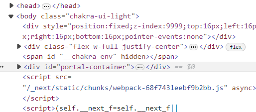
PortalProvider 는 HTML 상단에 portal로 자식이 페이지 상단에 보여질 수 있도록 하는 <div id="portal-container" />를 생성한다.
PortalConsumer 는 prop으로 전달받은 children을 Provider 를 통해 정의한 <div id="portal-container" /> 로 즉, HTML 상단에 자식 컴포넌트가 렌더링될 수 있도록 createPortal 메소드를 활용해준다.
'use client';

import type { PropsWithChildren } from 'react';
import { createContext, useState } from 'react';
import { createPortal } from 'react-dom';

const PortalContext = createContext<HTMLDivElement | null>(null);

export const PortalProvider = ({ children }: PropsWithChildren) => {
  const [portalContainerRef, setPortalContainerRef] = useState<HTMLDivElement | null>(null);

  return (
    <PortalContext.Provider value={portalContainerRef}>
      {children}
      <div
        id="portal-container"
        ref={(element) => {
          if (element === null || portalContainerRef !== null) {
            return;
          }
          setPortalContainerRef(element);
        }}
      />
    </PortalContext.Provider>
  );
};

export const PortalConsumer = ({ children }: PropsWithChildren) => {
  return (
    <PortalContext.Consumer>
      {(portalContainerRef) => {
        if (portalContainerRef === null) {
          return null;
        }
        return createPortal(<>{children}</>, portalContainerRef);
      }}
    </PortalContext.Consumer>
  );
};
- layout.tsx
전체 app 화면 루트 레이아웃에 portalProvider 로 감싸준다.
import { pretendard } from './fonts';

import './globals.css';


export default function RootLayout({
  children,
}: Readonly<{
  children: React.ReactNode;
}>) {
  return (
    <html lang="ko">
      <body className={classNames('size-full flex-1', pretendard.className)}>
        <ReactQueryProvider>
          <PortalProvider>
            <ChakraUIProvider>
              <div className="flex flex-col min-h-screen w-full">
                <Header />
                {children}
              </div>
            </ChakraUIProvider>
          </PortalProvider>
        </ReactQueryProvider>
      </body>
    </html>
  );
}
3. 화면 전체를 감싸는 dimmer 컴포넌트 생성
서서히 어두워지는 animation을 추가해보려고 한다. 그러기 위해서는 아래와 같이 tailwind.config.js에 추가해준다.
module.exports = {
  content: ['./src/**/*.{js,ts,jsx,tsx,mdx}'],
  theme: {
    extend: {
    ...중간은 생략
    keyframes: {
        'fade-in-back-drop': {
          '0%': {
            opacity: '0',
          },
          '100%': {
            opacity: '1',
          },
        },
      },
  animation: {
        'fade-in-back-drop': 'fade-in-back-drop 0.3s ease-in-out forwards',
      },
  }
}- dimmer 컴포넌트
isShow 상태값을 prop으로 받아서 background 를 보여줄 지를 정해준다.
import cx from 'classnames';

interface IDimmerProps {
  onClose: () => void;
  isShow: boolean;
  type?: 'tooltip' | 'popup';
}
const Dimmer = ({ onClose, isShow, type = 'tooltip' }: IDimmerProps) => {
  const opacityClassName = type === 'tooltip' ? 'bg-opacity-80' : 'bg-opacity-90';
  return (
    <div
      onClick={() => {
        onClose();
      }}
      className={cx(
        'fixed left-0 top-0 z-50 flex h-full w-full items-center justify-center bg-[#2F2F2F]',
        opacityClassName,
        {
          hidden: !isShow,
          'animate-fade-in-back-drop': isShow,
        },
      )}
    />
  );
};
export default Dimmer;
이렇게 dimmer 컴포넌트도 생성해주면 이제 모든 준비는 끝났다. 첫 화면에 보여질 전체 화면 layer 를 dimmer와 tooltip을 활용해서 컴포넌트를 구현하면 된다.
4. portal tooltip 컴포넌트 생성
아래와 같이 앞에서 정의한 PortalConsumer로 감싸줌으로써 id값 portal-container div에 portal를 시켜주고 dimmer 컴포넌트 보다 앞에 보여야 하는 section만 따로 css z-index를 활용해 더 앞에 보일 수 있게 구현해주면 된다.
return (
    <PortalConsumer>
      <Dimmer isShow={!isCheckDiary} onClose={() => setIsCheckDiary(true)} />
      <section className="flex justify-center">
        <footer className="absolute bottom-0 grid w-full max-w-md grid-cols-3 border-t border-t-gray-15 bg-[#fbfbfb] text-center text-gray-20">
          {BOTTOM_TAP_ARRAY.map((item) => (
            <Tooltip
              key={item}
              hasArrow
              label={'친구와의 일화를 써보세요'}
              isOpen={!isCheckDiary && item === 'Diary'}
              placement="top"
            >
              <FooterSection key={item} item={item} focus={item === focusTab} type="tooltip" onClick={() => {}} />
            </Tooltip>
          ))}
        </footer>
      </section>
    </PortalConsumer>
  );
참고
https://velog.io/@codns1223/React-React-Portal%EC%9D%B4%EB%9E%80-React-Portal%EB%A1%9C-modal-%EA%B5%AC%ED%98%84
https://github.com/depromeet/toks-web/blob/dev/src/common/components/GlobalPortal.tsx