border
border
- 테두리 스타일을 의미한다.
- 형태 : tagname { border: 두께 선스타일 선색 }
- 형태 :
p { border: 1px solid black; }
border-방향
border-top: 4px double red;
border-right: 2px solid #666666;
border-bottom: 6px dashed darkviolet;
border-left: 1px dotted #00ee44;
border-style
dotted: 점선
dashed: 긴 점선
solid: 실선
double: 두줄 실선
groove: 파인선
ridge: 볼룩한 선
inset: 바깥쪽 어둡게
outset: 안쪽 어둡게
border-width
- 요소 테두리 선의 두께
- 단위: px, em, % 등 단위로 지정 (권장)
medium: 중간 두께
thin: 얇은 두께
thick: 두꺼운 두께
(위 세 가지는 사용을 권장하지 않는다.)
border-width은 단축 속성이기 때문에 border-width 단독으로 사용할 경우 상하좌우 전체 적용
border-width: 10px 20px; 차례대로 상하 / 좌우 적용
border-width: 10px 20px 30px; 차례대로 상 / 좌우 / 하 적용
border-width: 10px 20px 30px 40px; 차례대로 상 / 우 / 하 / 좌 적용
border-color
- 요소 테두리 선의 색상을 지정하는 단축 속성
- 색상: 선의 색상
ex)
black: 검정색
transparent:(명)
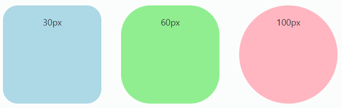
border-radius
- 요소의 모서리를 각지지 않고 둥글게
0: 둥글게 만들지 않는다.
(css에서 0에는 px 단위를 붙이지 않는 것을 권장)- 단위 : px, em, vw 등 단위로 지정
border-radius: 0;
border-radius: 10px;
<style>
	#wrap {
    	display: flex;
    }

    #radius1 {
      width: 200px;
      height: 200px;
      background-color: lightblue;
      margin: 20px;
      border-radius: 30px;
      text-align-center;
    }
    #radius2 {
      width: 200px;
      height: 200px;
      background-color: lightgreen;
      margin: 20px;
      border-radius: 60px;
      text-align-center;
    }
    #radius3 {
      width: 200px;
      height: 200px;
      background-color: lightpink;
      margin: 20px;
      border-radius: 100px;
      text-align-center;
    }
</style>
<div id="wrap">
  <div id="radius1"></div>
  <div id="radius2"></div>
  <div id="radius3"></div>
</div>