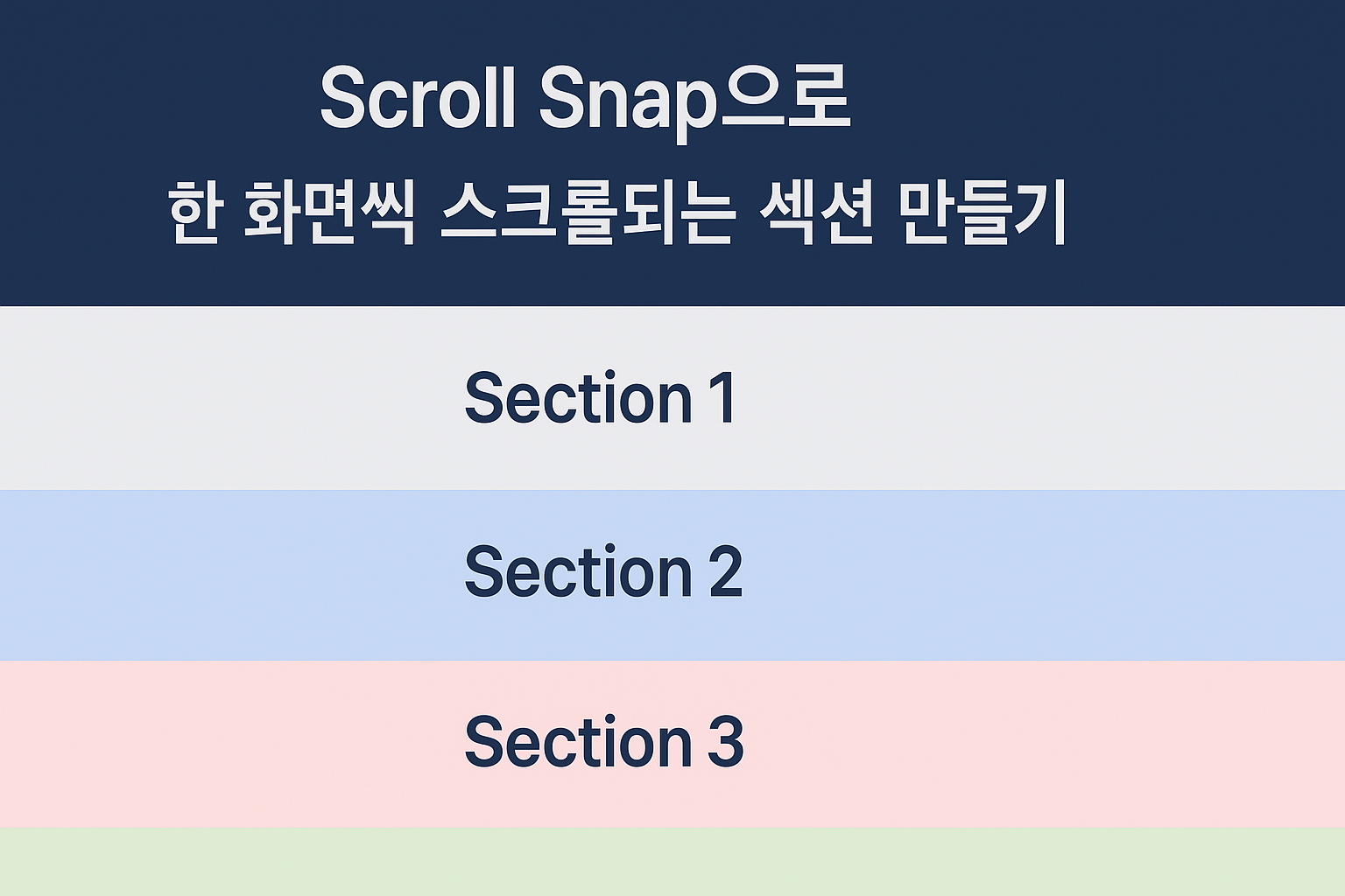
페이지를 구성할 때, 각 섹션이 한 화면을 꽉 채우고 스크롤할 때 부드럽게 넘어가는 구조를 만들고 싶을 때가 있다.
이럴 때 유용한 CSS 속성이 바로 scroll-snap이다.
🧩 사용 방법
- 부모 컨테이너에 스냅을 적용한다.
- 자식 요소마다 스냅 정렬 기준을 지정한다.
- 자식 요소 각각의 높이를 100vh로 설정해 한 화면씩 채운다.
💡 예시 코드
[ HTML ]
    <main>
      <section>Section 1</section>
      <section>Section 2</section>
      <section>Section 3</section>
      <section>Section 4</section>
    </main>
[ CSS ]
html,
body {
  scroll-behavior: smooth;
  height: 100%;
}

main {
  height: 100vh;
  overflow-y: scroll;
  scroll-snap-type: y mandatory; // 세로 방향 스냅
}

section {
  height: 100vh;
  scroll-snap-align: start; // 섹션 시작 지점에 맞춰 스냅
}
🔍 속성 설명
scroll-snap-type
- 스크롤 컨테이너(예: main)에 적용
- 스크롤이 멈출 때 스냅을 적용할지 여부를 결정
scroll-snap-type: y mandatory;- y: 세로 방향 스냅
- x: 가로 방향 스냅
- mandatory: 반드시 스냅
- proximity: 가까운 위치일 때만 스냅
scroll-snap-align
- 자식 요소(예: section)가 부모 컨테이너 내에서 어디에 맞춰 멈출지를 지정
scroll-snap-align: start;- start: 섹션의 시작 부분에 맞춰 멈춤
- center: 중앙 정렬
- end: 끝부분에 맞춰 멈춤
scroll-behavior: smooth
- 스크롤 이동을 부드럽게 할지, 즉시 이동할지를 제어
scroll-behavior: smooth;- auto: 기본값. 즉시 점프하듯 스크롤됨
- smooth: 스크롤이 부드럽게 애니메이션되며 이동
⚙️ 참고 팁
✅ 헤더가 고정되어 있다면, 높이만큼 스냅 기준 조정
section {
  scroll-margin-top: 80px; // 헤더 높이만큼 여백 확보
}
✅ 모바일 대응
모바일 브라우저 주소창 문제로 100vh 대신 100dvh를 쓰면 더 정확하다.
section {
  height: 100dvh;
}
즐겁게 코딩하고 공부해요🍀