position 속성으로 위치 정하기
CSS
* {
box-sizing: border-box;
}
body {
margin: 0;
padding: 0;
}
div {
width: 30%;
background-color: lightgreen;
height: 100px;
text-align: center;
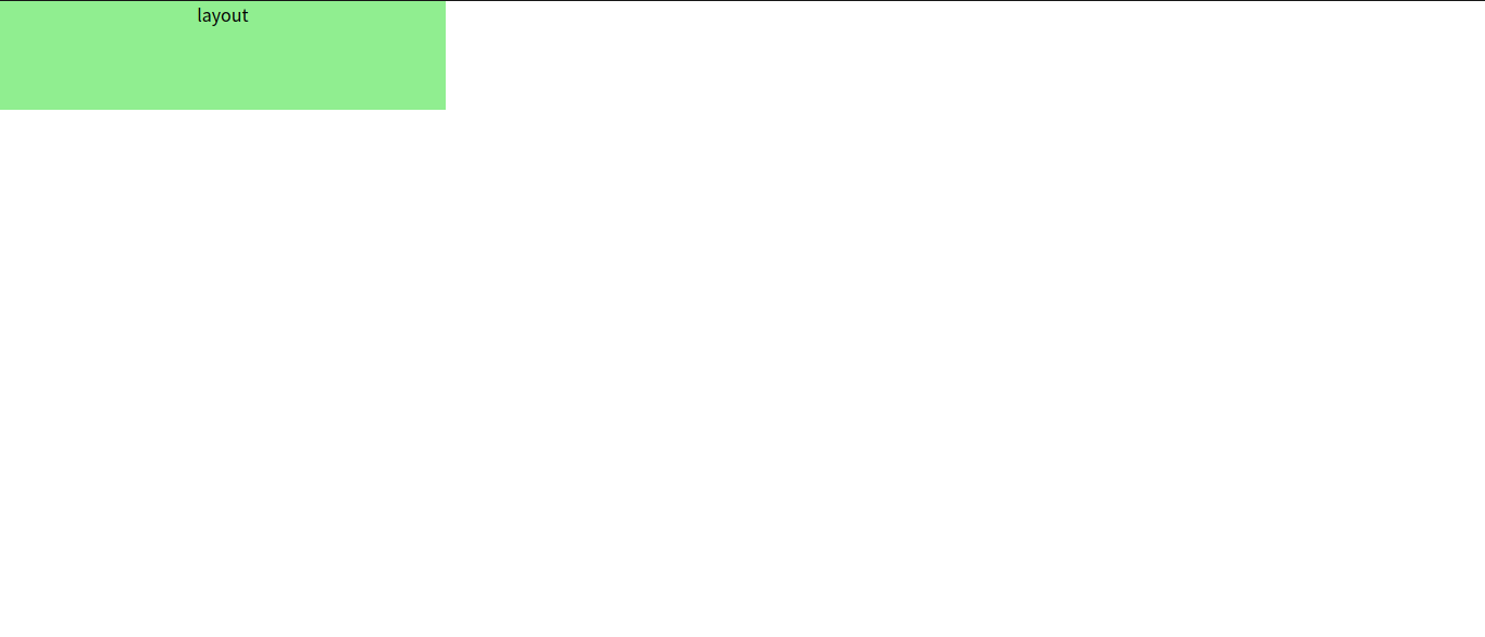
}HTML
<body>
  <div>layout</div>
</body>
위와 같이 폭이 30%인 레이아웃을 해상도에 상관 없이 화면 중앙에 위치시키고 싶었다. 현재 사용 중인 모니터는 WXGA해상도였다.
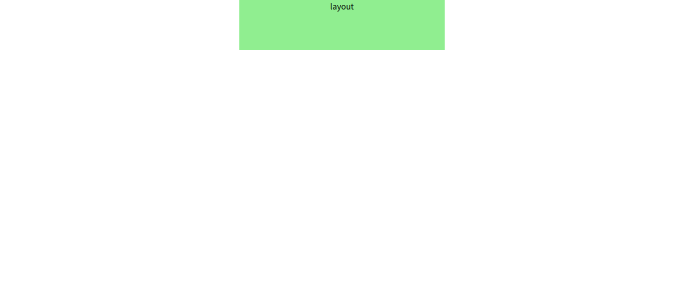
CSS
div {
  width: 30%;
  background-color: lightgreen;
  height: 100px;
  text-align: center;
  position:absolute;
  left: 35%
}
위와 같이 position 속성을 정해 주고 왼쪽으로 35% 만큼 이동시켰다. 이렇게 설정하니 FHD해상도에서도 동일하게 화면 중앙에 위치했다.
주의할 점은 layout의 폭을 절대 수치인 'px'을 사용해 설정했을 경우, 왼쪽 시작점은 동일했지만 (left로 설정) 해상도에 따라 px이 차지하는 공간이 정해저 있어서 가운데 정렬이 되지 않았다는 점이다.
position 속성
- 기본값은 static. left, top 등의 속성에 영향을 받지 않는다.
- relative : 요소가 차지하는 공간은 static일 때랑 동일하지만 left, right, top, bottom속성의 영향을 받는다.
- absolute : relative와 다른 점은 요소를 문서 흐름에서 제거한다는 점이다.(가장 가까운 조상 요소의 영향은 받는다.)

child1의 position이 relative인 경우 부모의 위치에 영향을 받으며, 문서 흐름에 따라 child1아래 child2가 위치한다.
CSS
#parent {
  width: 40%;
  background-color: lightblue;
  height: 300px;
  position: relative;
  left: 30%;
}

#child1 {
  width: 30%;
  background-color: lightgreen;
  height: 100px;
  text-align: center;
  position:relative;
  left: 10%
}

#child2 {
  width: 30%;
  background-color: lightpink;
  height: 100px;
  text-align: center;
  position:relative;
  left: 35%
}
HTML
  <div id="parent">
    <div id='child1'>layout1</div>
    <div id='child2'>layout2</div>
  </div>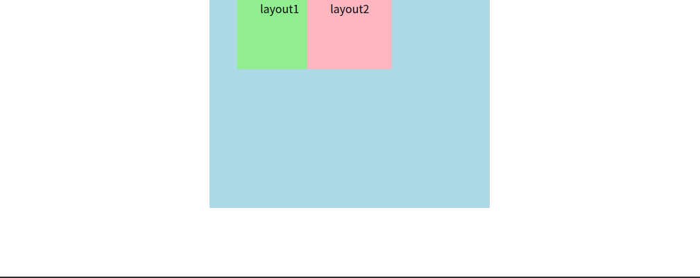
child1의 position이 absolute인 경우 부모의 위치에 영향을 받으며, 문서 흐름에서 벗어났기 때문에 layout2이 layout1아래 위치하지 않고 layout1과 겹치는 것을 볼 수 있다.
CSS
#child1 {
  width: 30%;
  background-color: lightgreen;
  height: 100px;
  text-align: center;
  position:absolute;
  left: 10%
}