Flex로 layout을 만들어보자
처음에는 float: right와 같이 float로 만들어보고 같은 과제를 flex 로 만들어보는 과제였다.
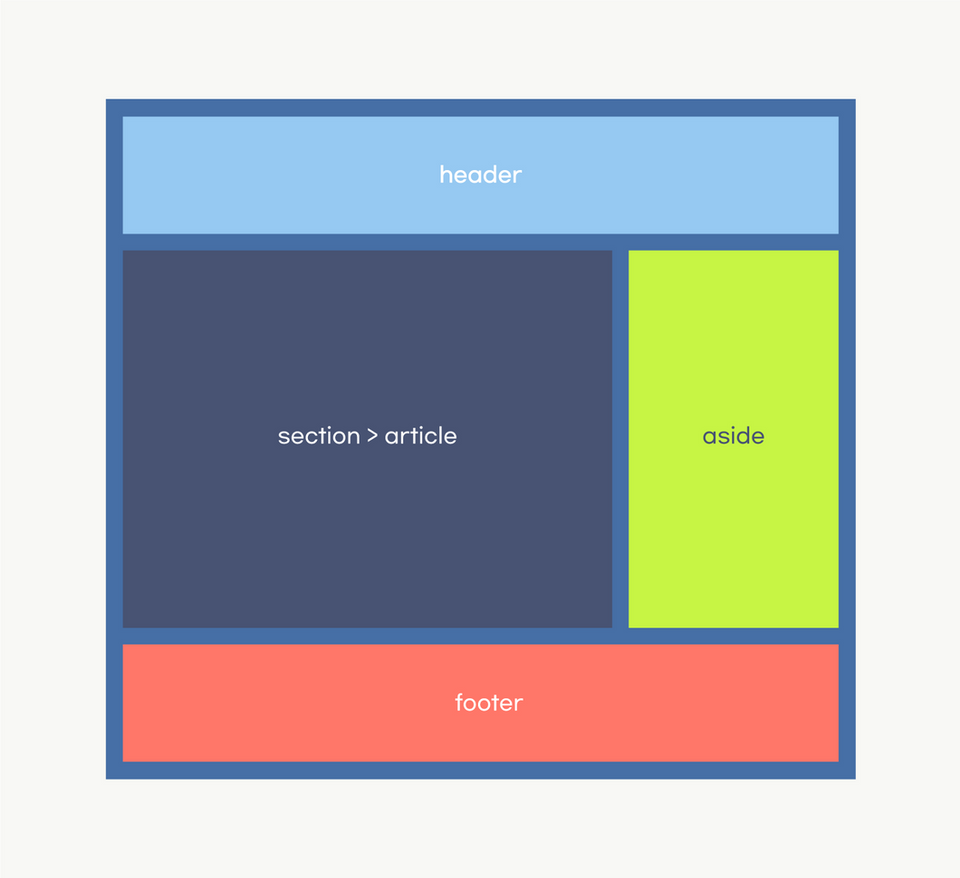
과제 예시
아래의 예시처럼 레이아웃을 flex로 만들어본다. 브라우저 전체 면적을 사용했다.
<body>
    <header>header</header>
    <div class="wrap">
      <section>section</section>
      <aside>aside</aside>
    </div>
    <footer>footer</footer>
  </body>
body {
margin: 0;
width: 100vw;
height: 100vh;
color: white;
font-size: 2rem;
box-sizing: border-box;
display: flex;
flex-direction: column;
gap: 10px;
}
header,
section,
aside,
footer {
display: flex;
justify-content: center;
align-items: center;
}
header {
background-color: blueviolet;
height: 100px;
}
.wrap {
display: flex;
width: 100%;
height: 100%;
gap: 10px;
}
section {
background-color: royalblue;
flex-grow: 2;
}
aside {
background-color: burlywood;
flex-grow: 1;
}
footer {
background-color: lightcoral;
height: 100px;
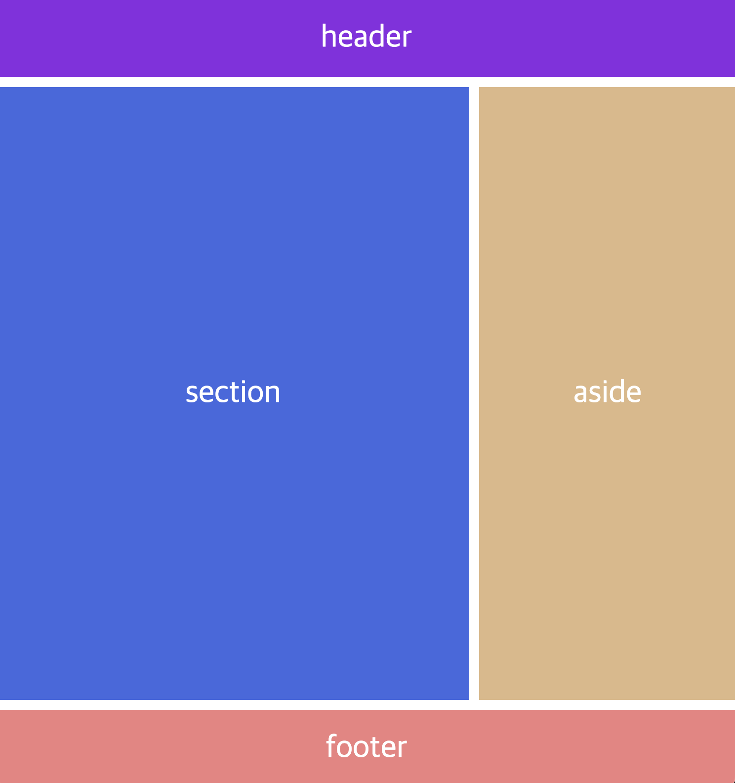
}결과물
Issue 및 해결 방법
body에 width:100vw height:100vh가 적용되어있는 상태에서 margin:0 을 주기전까지는 스크롤바가 생기는 현상이 발생했다. 기본 브라우저의 margin 값때문에 그런 것 같았다. 달리 다른 해결방법은 찾지 못했다. 다른 방법을 찾는다면 다시 기록하자! 지금은 margin:0으로 해결!
몰랐던 것은?
flex에도 gap을 줄 수 있다는 건 처음 알게되었다. grid에서만 사용한다고 생각했는데 각 아이템에 마진을 따로 주지 않고도 손쉽게 gap으로 줄 수 있었다.